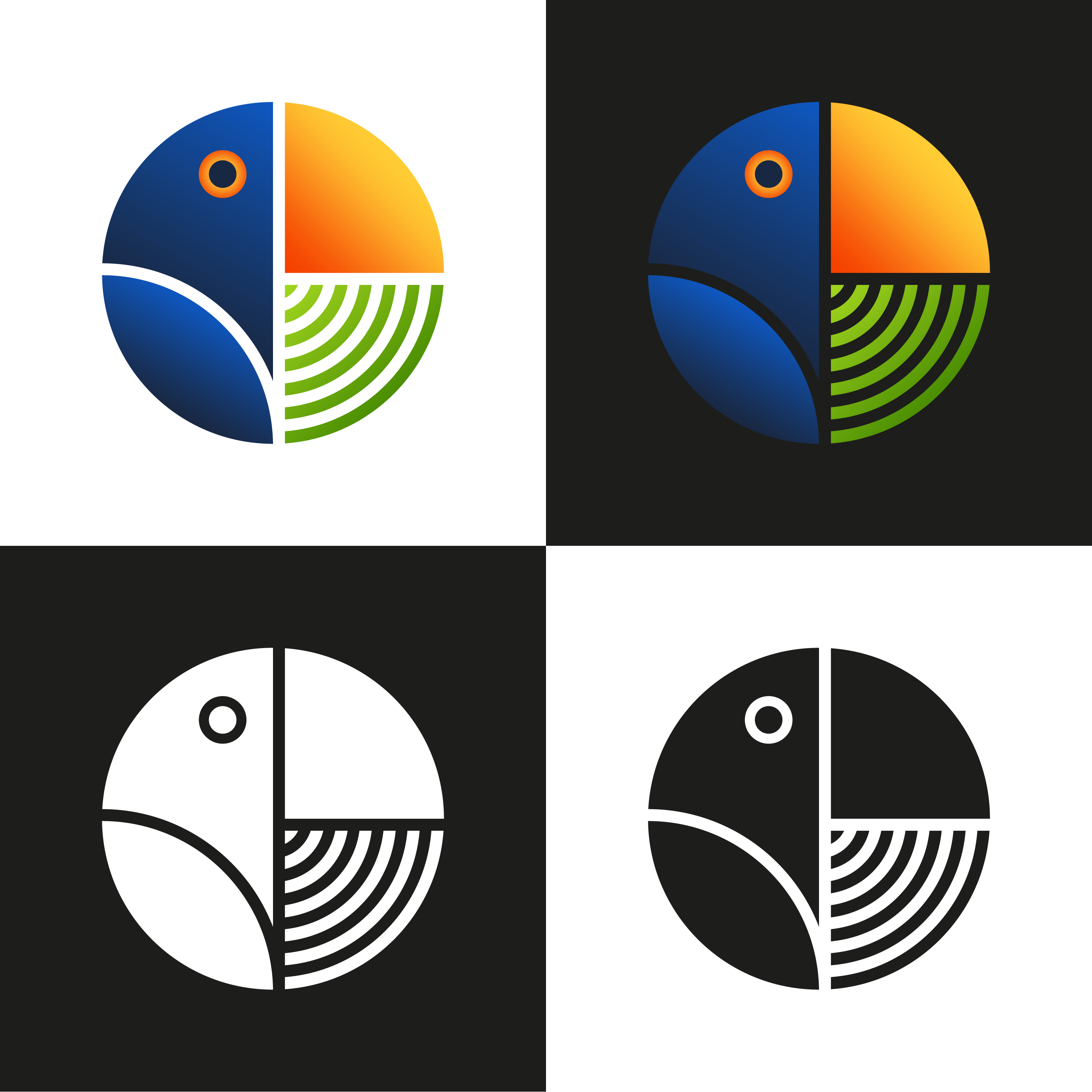
Toucan Logo Mark
- Report
Alex Strøm • 4 years ago
Hi, everyone!
I did this geometric logomark of a toucan, and I'd love some feedback.
See more on my IG @stroem_graphics
I did this geometric logomark of a toucan, and I'd love some feedback.
See more on my IG @stroem_graphics
Cool
11 months ago by Zahrrakh - Reply
I love the design. It's absolutely beautiful and well thought out. I'd love to know if you used the golden ratio at all. If not, I think it would really heighten the design overall. I'm also wondering what the green is meant to be. Is there some sort of connection to the brand? Is it meant to represent something specific?
1 year ago by P - Reply
My goodness this is art! Gorgeous logo
1 year ago by Luke - Reply
The black and white is very modern
1 year ago by Alisha - Reply
Great work!
4 years ago by Abhilash Thekkel - Reply
awesome design
4 years ago by ANJALI SHAW - Reply
I personally would prefer flat colors here (and honestly on any logo). Granted I have no idea what it would look like without the gradients, and neither am I one, whoom's opinion you should take as fact. Regardless, geometrically it's damn genious :) .
4 years ago by Lan Gradi�ek - Reply
I agree that the gradients are a bit offputting
1 year ago by Alisha - Reply
I like how there's a subtle pie chart there.
4 years ago by Enzo - Reply
I love this! The colors are great and the black and white is just soooo good! Great job
4 years ago by Elena - Reply
