Activity Feed


Feedback Leaderboard (Past 30 days)
Remove Ads: Upgrade to Pro
Get feedback on your work
Give feedback to other users!
Give Feedbackfit fits flyer
- Report
Ibrahim Ahmed • 7 hours ago
a flyer for a clothes store. it is name is fit fits
 Like
Like


nothing much to say
7 hours ago by sushil - Reply
Authentic Chicago Chocolateire
- Report
Bobbie Hall • 6 days ago
Chicago, the center of the roaring 20s and the Art Deco style inspires this logo.

This is so creative! Amazing work- well done :)
4 days ago by Lydia Shaw - Reply
Love this!
4 days ago by Bella Ghazaryan - Reply
this design is beautiful
4 days ago by Nita Agustia - Reply
All Comments
Star Interior Design Logo
- Report
Bobbie Hall • 1 week ago
Elegant gold colored logo mark and text underscores the upscale image the company wants to emphasize. Star on inside illustrates the company's name.

Ok
3 days ago by Sahrul - Reply
Nice work
5 days ago by Amy Tulugo - Reply
good
5 days ago by Shree Bhupen Jeet Behera - Reply
All Comments
BeachSquare Logo
- Report
Bobbie Hall • 1 week ago
Color gradient, purple to pink to yellow sun in the background. Silhouette of two palm trees in front.
Black & White same as color but without the color gradient. Sun is white. 80s/90s style graphics.
Black & White same as color but without the color gradient. Sun is white. 80s/90s style graphics.


Nice work
5 days ago by Amy Tulugo - Reply
good work
1 week ago by Rimsha Fatima - Reply
nice artwork...
1 week ago by Rimsha Fatima - Reply
All Comments
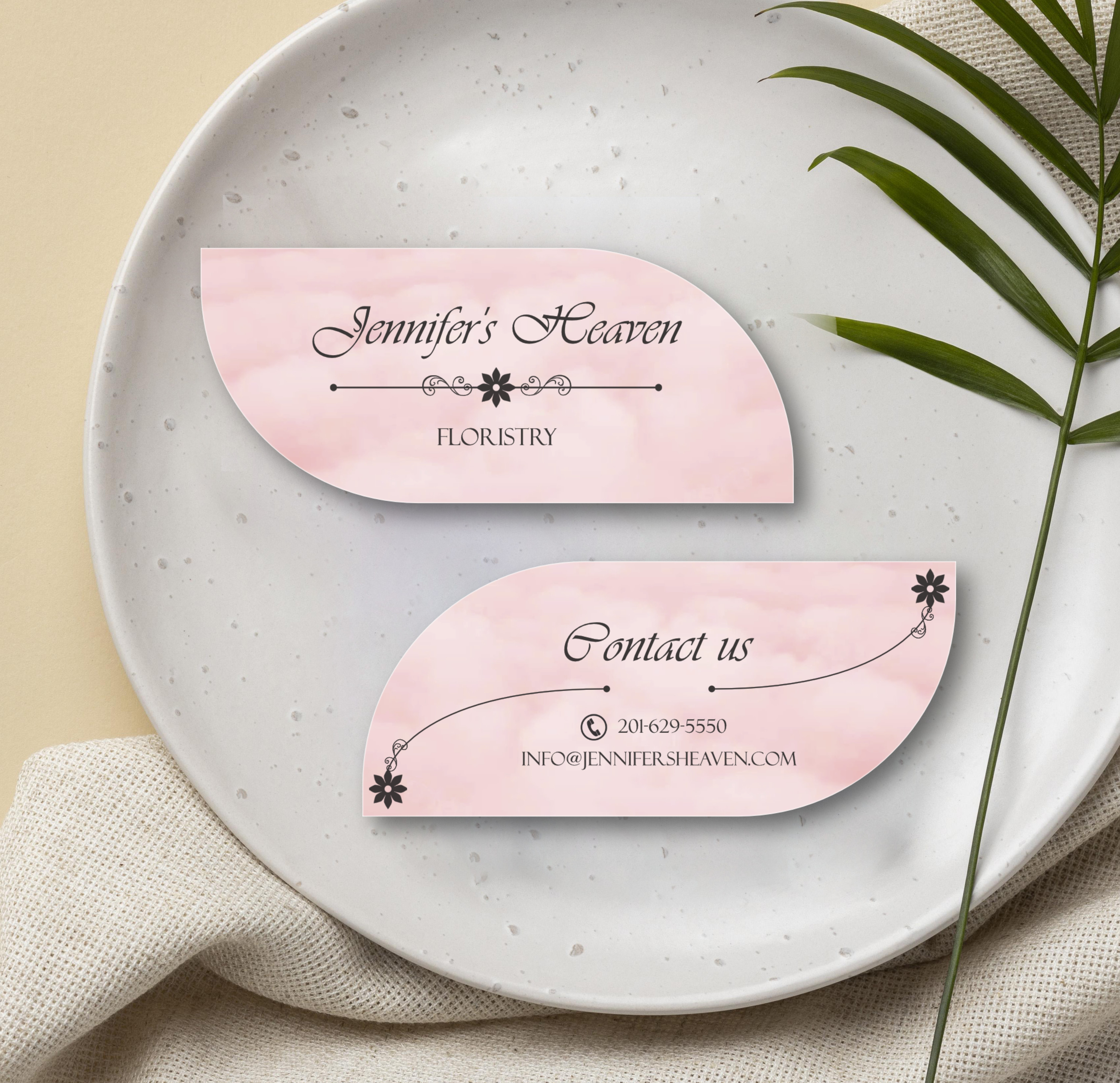
Jennifer's Heaven Business card
- Report
Ibrahim Ahmed • 9 hours ago
A business card for a floristry company

na
7 hours ago by sushil - Reply
Jennifers Heaven Businesscard
- Report
Mohammad Ubais • 13 hours ago
Jennifer's Heavengraphic


nice
9 hours ago by Ibrahim Ahmed - Reply
It's very much basic, and the typograph is so off that the business names is getting no highlights. Little more decoration on the corners should make it look more intense and buisness appearance more clear
9 hours ago by Rewind - Reply
pancake logo with pictorial mark logo style
- Report
shafa ramadhani putri • 1 day ago
pancake shape with butter in the middle. hopefully according to the criteria
Hey,
I'm Pat, creator of Pat's Pancake house. For a while now, I've been looking for a good logo for my business. I like pictorial marks. Can you help me out?
I'm Pat, creator of Pat's Pancake house. For a while now, I've been looking for a good logo for my business. I like pictorial marks. Can you help me out?


It's looking great.
20 hours ago by Haris Ahmad - Reply
Awesome! Although it's suitable for the bakery, it looks like a lucky coin in Southeast Asian culture which is a symbol of wealthy.
1 day ago by Baog - Reply
Logo design
- Report
Hania • 1 day ago
Working hard and trying to do something that you will like give lots of feedbacks and lots of likes.
Som-Numlogo


Yes, this is good, but you need to improve the placement of the text with the image. KEEP UP THE GOOD WORK!!
1 day ago by shafa ramadhani putri - Reply
Good, but too much empty space
1 day ago by shafa ramadhani putri - Reply
Jennifer's Heaven floristry business card
- Report
N3GATIVE • 2 days ago
Hello there! Another work, this time a business card. What do you think? Be honest please!
Jennifer's Heavengraphic

Poster design: Vaza Insurence
- Report
Bella Ghazaryan • 2 days ago
Please let me know what you think about this
Hey There,
I am Odelia, I just founded a new business called Vaza. For a while now, I've been looking for a good designer for my insurance company. We will need a poster to advertise our business. Would you be interested?
I am Odelia, I just founded a new business called Vaza. For a while now, I've been looking for a good designer for my insurance company. We will need a poster to advertise our business. Would you be interested?


Great! All the information is presented in such a simple form
1 day ago by shafa ramadhani putri - Reply
I would center all the icons and text at the lower part of this poster. Other then that, great work!
2 days ago by N3GATIVE - Reply
Thanks!
2 days ago by Bella Ghazaryan - Reply
Load more
