Bobbie Hall
Posts
20
Likes
16
Liked Posts
75
Given Feedback
74
Feedback
Thanks for the suggestion.
5 days ago by Bobbie Hall
Good background contrasts with the text. You might want to make it more of a form using boxes instead of lines for the Number/Email and Password.

6 days ago by Bobbie Hall
Great design. love the pink cloud with the flowers.
1 week ago by Bobbie Hall
Nice design.

1 week ago by Bobbie Hall
Oops, I thought they were palm trees but you're right, they're coconut trees.

1 week ago by Bobbie Hall
The font goes really well with the graphic.
1 month ago by Bobbie Hall
Nice and to the point.
1 month ago by Bobbie Hall
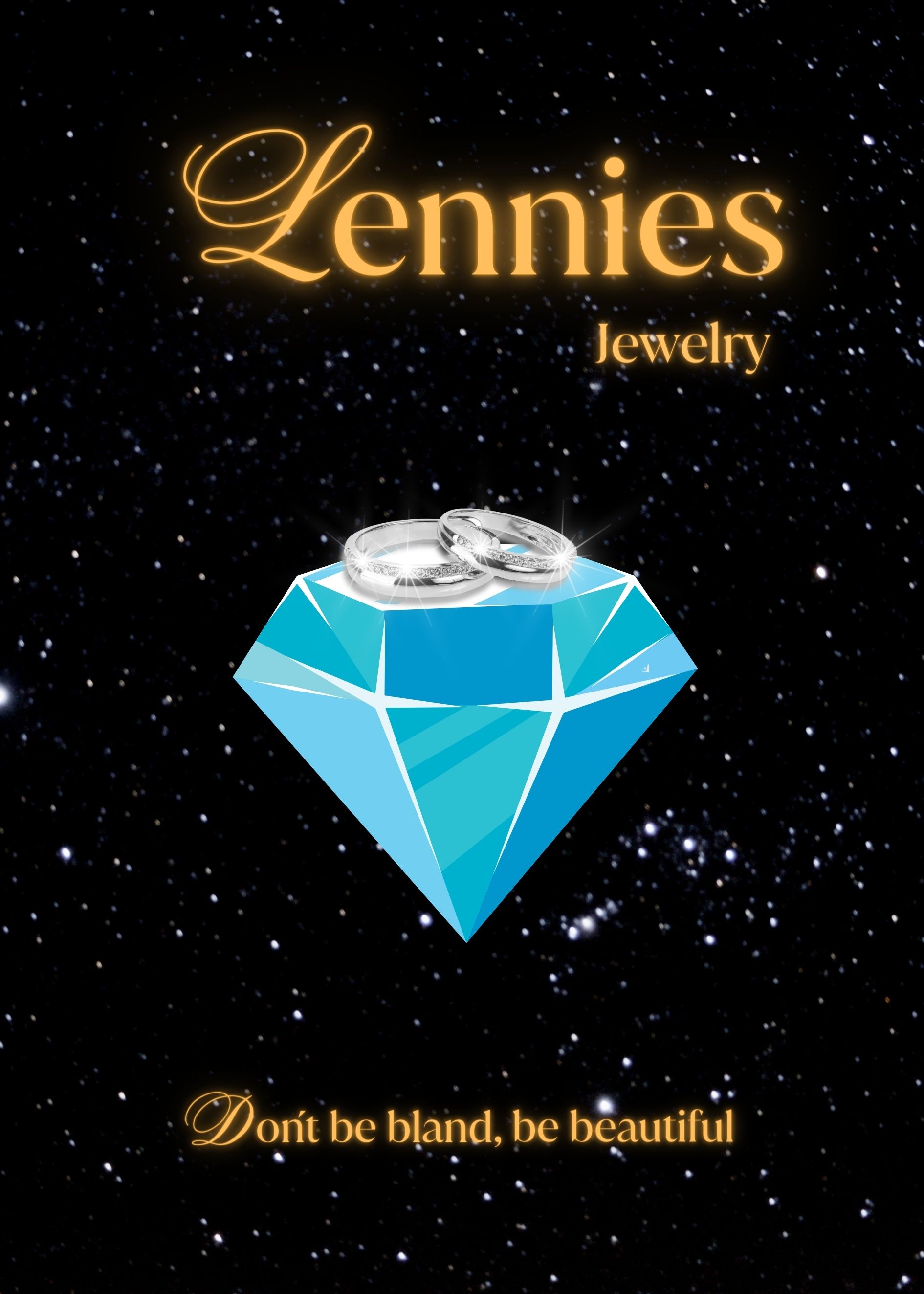
Nice solid design. I like the color of the lettering better than your other version. The rings on top of the stone stand out more also. Maybe combine the lettering and rings with the graphic of your other version.

1 month ago by Bobbie Hall
I love the graphic. One of those designs that looks a lot simpler than it probably was to design (one of the characteristics of an effective logo).
1 month ago by Bobbie Hall
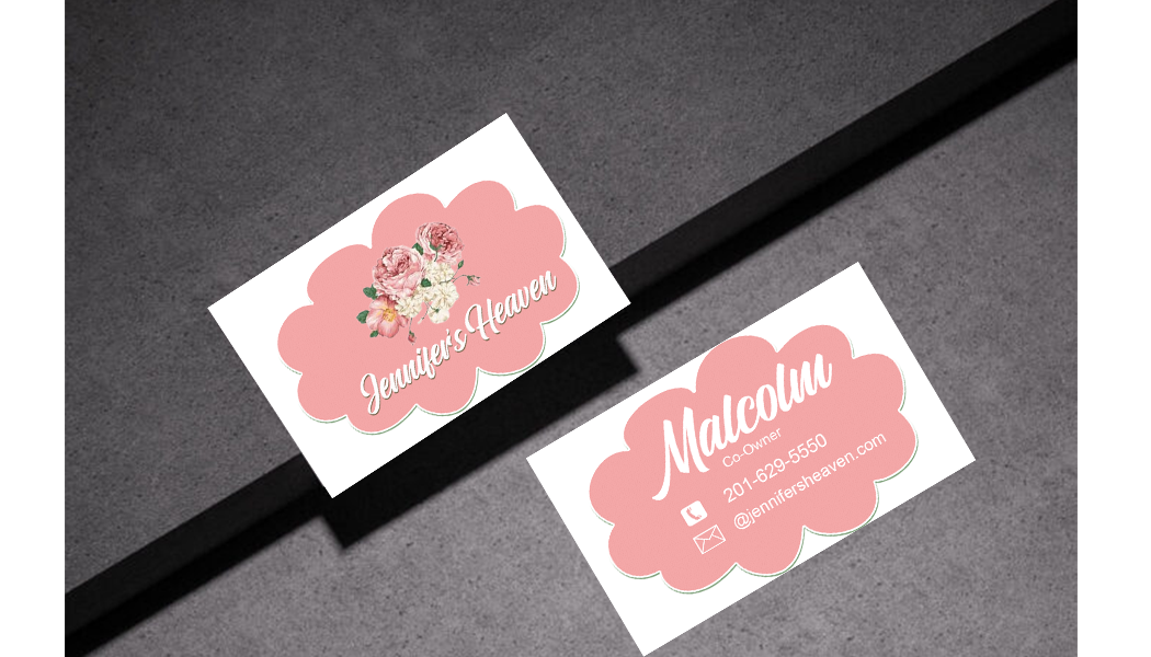
Make up a last name for Malcolm-you would rarely see just a first name on a business card. The color scheme is great, flowers in the corners look nice. Not sure how well a green cloud works, though-maybe just leave it off? All-in-all--a nice design.

1 month ago by Bobbie Hall
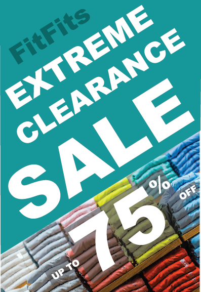
The 75 recedes into the background. I would make it a darker color, probably red. Also the "save up to" overlapping the "75" doesn't work. You need to move it up and off. You might eliminate the "You really likes, when you visit once!" You're not trying gain repeat customers, you're trying to clear out stock.

1 month ago by Bobbie Hall
Good design. Would be effective in other colors, too.

1 month ago by Bobbie Hall
You have two different color schemes between the front and the back. The back you have analogous colors blue and purple creating a nice calm feel. The front you have complementary colors yellow and purple which puts in place some tension. Both sides are good designs. They just don't work that well together.
1 month ago by Bobbie Hall
It's kind of hard to see the lettering and graphics on this photo. Your written descriptions are good. Like another reader suggested, increase contrast a little.
1 month ago by Bobbie Hall
Nice emblem logo. Gold on black used to good effect.
1 month ago by Bobbie Hall
Good design.
1 month ago by Bobbie Hall
The photo cutouts, rainbow ghosting in the background and photo at the top bringing the design all together. Masterful!

1 month ago by Bobbie Hall
I would like to order what's on this poster, please. Very effective.
1 month ago by Bobbie Hall
I would use bolder lines in the steak graphic to go along with the weight of the circle and text.

1 month ago by Bobbie Hall
I would make the abstract shape on the front more geometrical like the image. Small text on back needs to be a little bolder so it doesn't fade away in the background.
1 month ago by Bobbie Hall
I would leave the gray triangles on the front off. Otherwise great design.
1 month ago by Bobbie Hall
Classy
1 month ago by Bobbie Hall
Thank you very much. I use Illustrator mostly and some Photoshop.

1 month ago by Bobbie Hall
Thanks!

1 month ago by Bobbie Hall
Thank you.
1 month ago by Bobbie Hall
I like this one much more than the other fonts you have used.
1 month ago by Bobbie Hall
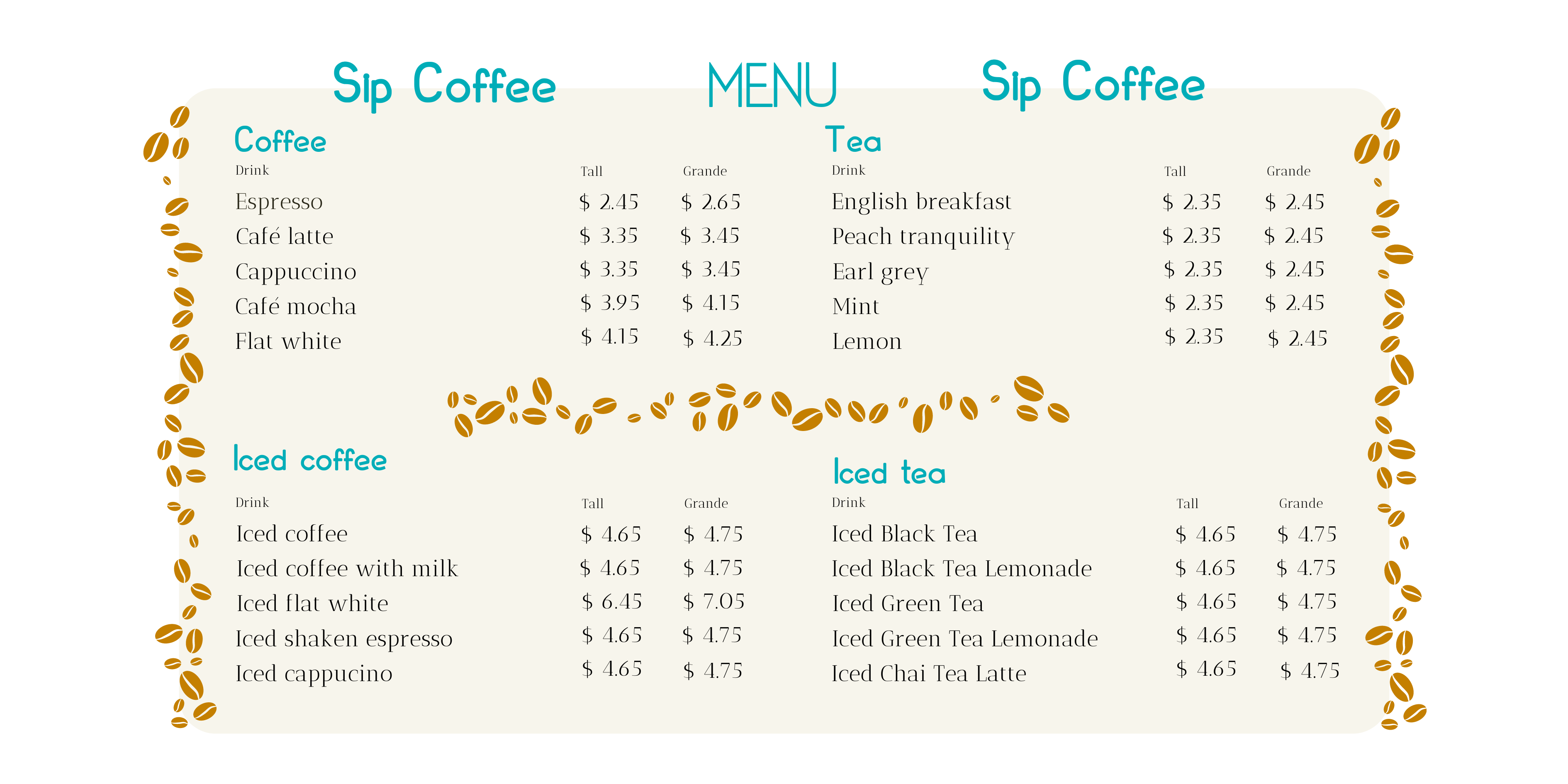
I like this one better. Same comment as I left on your other design. Need to make it easier for the eye to jump from the item to the price. Maybe even put in leading dots . . . . . . . . .
1 month ago by Bobbie Hall
I would create more spacing between the lines or put the prices closer to the item. It's kind of hard for the eye to jump from the item to the price.
1 month ago by Bobbie Hall
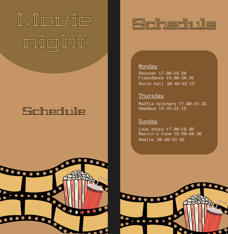
I like the font, graphic and colors.
1 month ago by Bobbie Hall
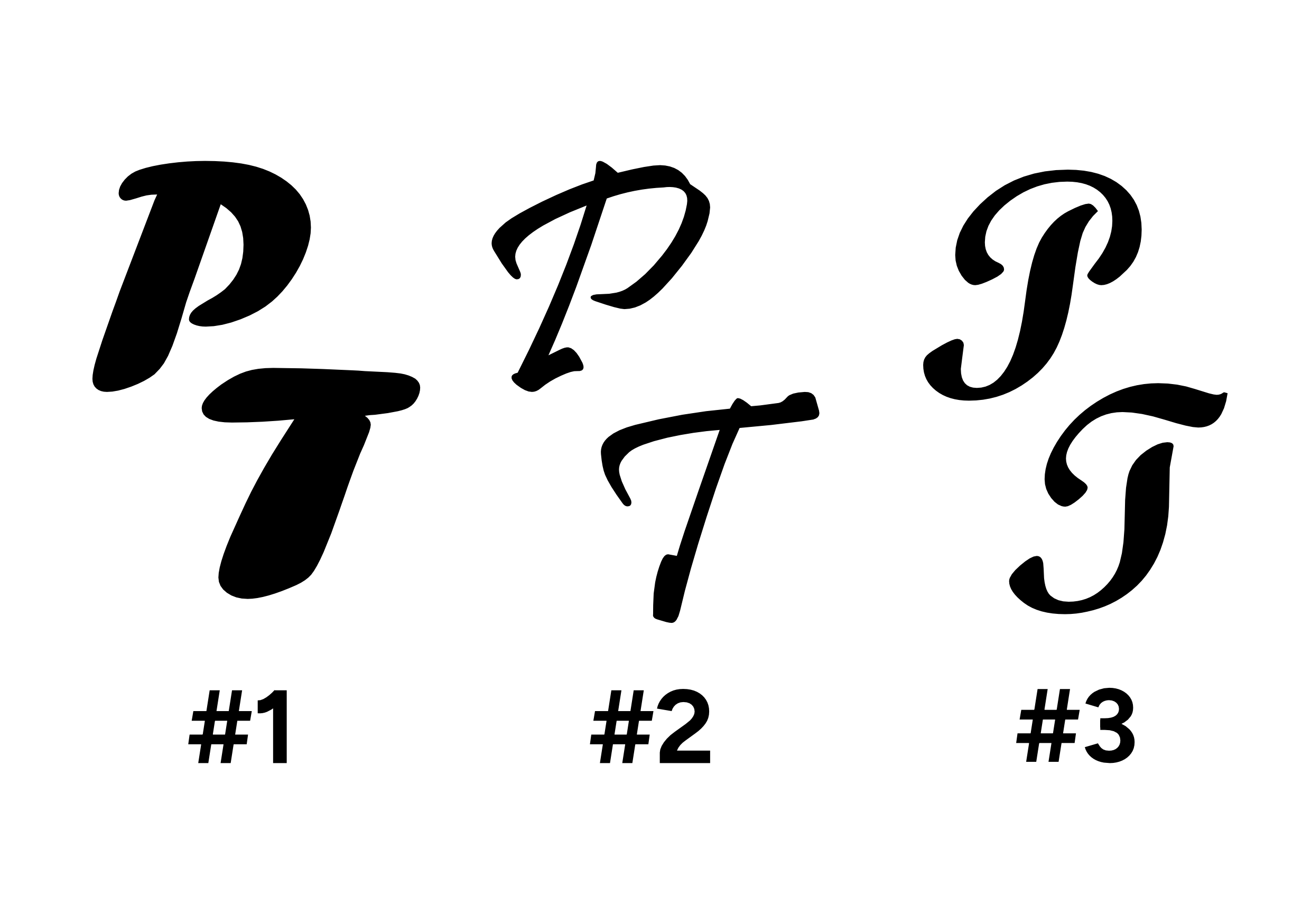
I would make the P&T a little closer together, almost touching
1 month ago by Bobbie Hall
Thank you.
1 month ago by Bobbie Hall
Thank you!
1 month ago by Bobbie Hall
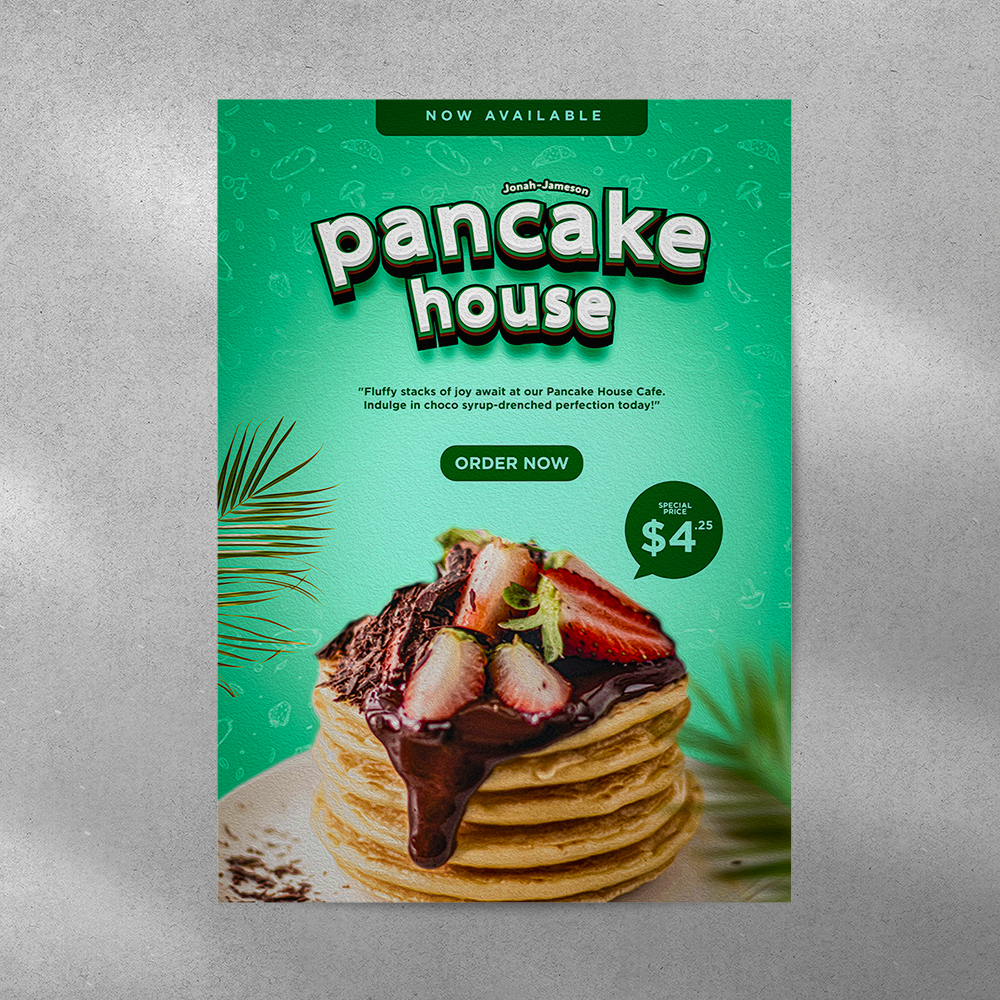
Good layout. Would be better if the veggies and bacon were sharp instead of blurry.
1 month ago by Bobbie Hall
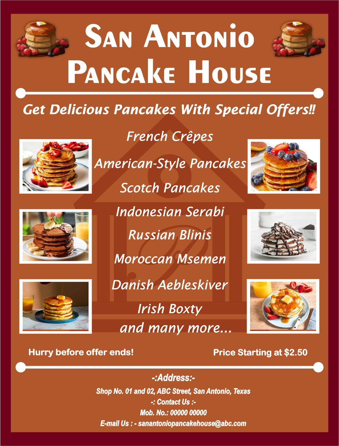
Well laid out. The brown background makes the photos of the pancakes stand out.
1 month ago by Bobbie Hall
You've got a great start.

1 month ago by Bobbie Hall
Good color scheme. Clever presentation of the small photos.

1 month ago by Bobbie Hall
You have at least 5 different font treatments. Try to keep fonts consistent in a small flyer. Good choice of color.
1 month ago by Bobbie Hall
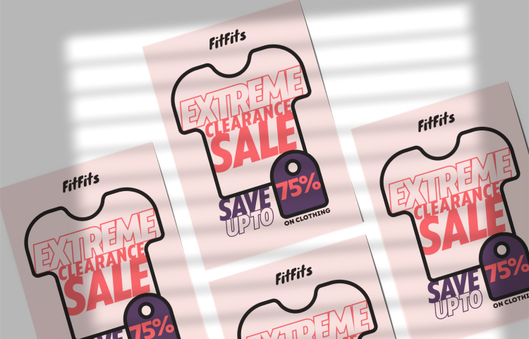
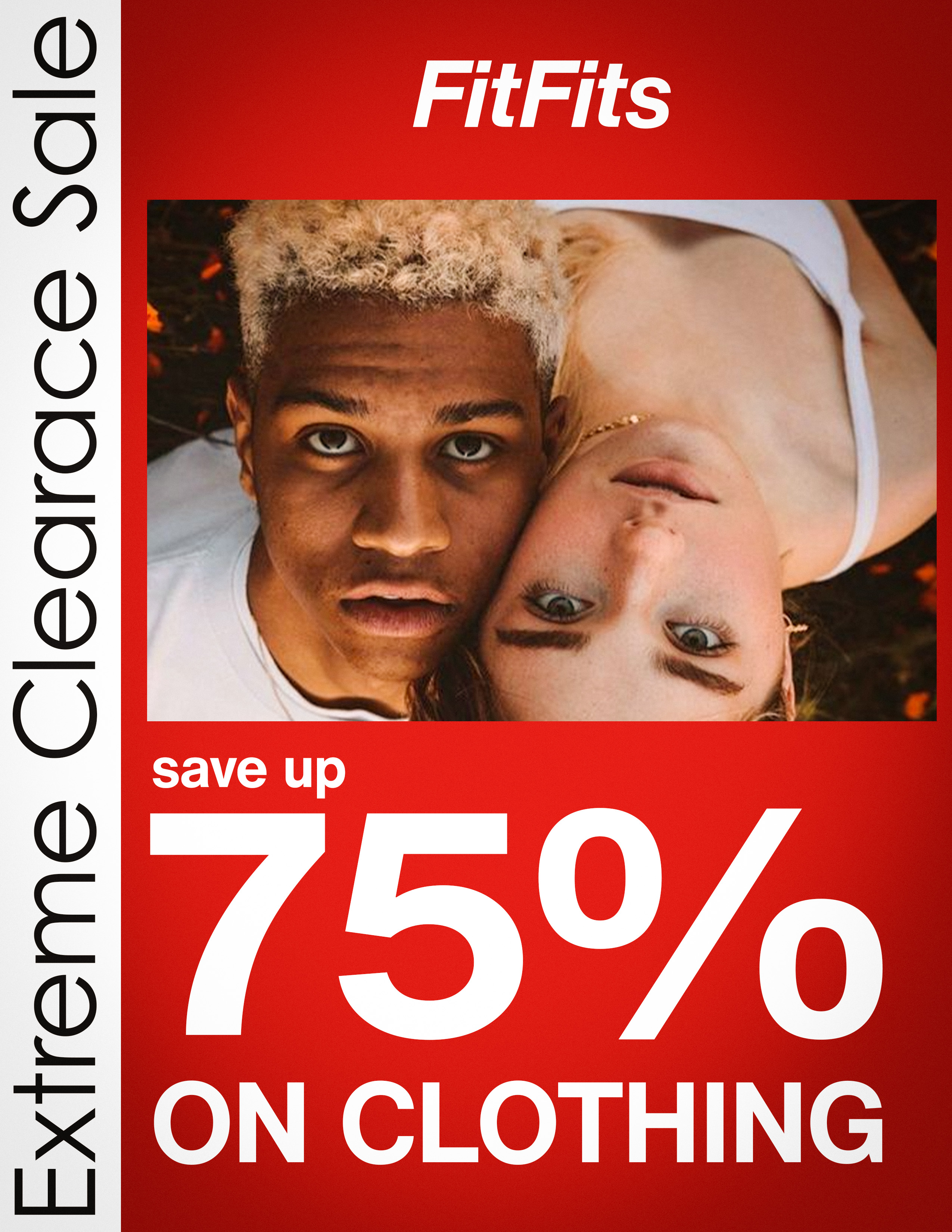
All the basic information is there. Simple design. Tight t-shirt frame reflects the FitFits's name.
1 month ago by Bobbie Hall
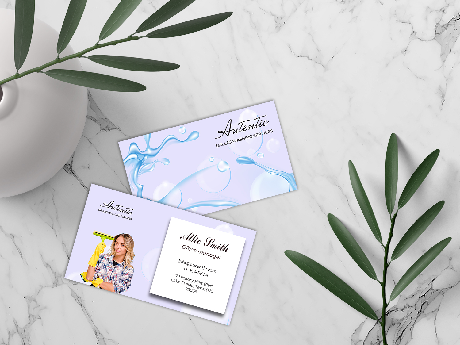
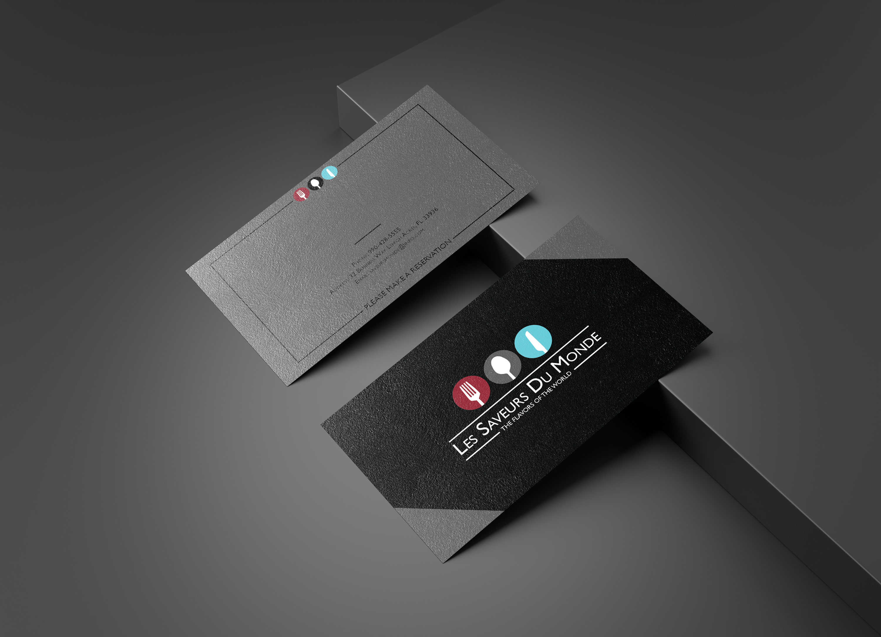
Good use of color. I especially like the deep blue tinting of the photo on the front. Hierarchy great. I'm not sure what the shapes are along the bottom band on the back of the card but it doesn't seem to go with the card. All in all great design.
1 month ago by Bobbie Hall
Nice use of bold and light fonts. Clever A. I might make the middle line a bit skinnier to match the weight of the letters.

1 month ago by Bobbie Hall
Excellent layout. Beautiful use of color scheme. Nice logo.
1 month ago by Bobbie Hall
Thank you
1 month ago by Bobbie Hall
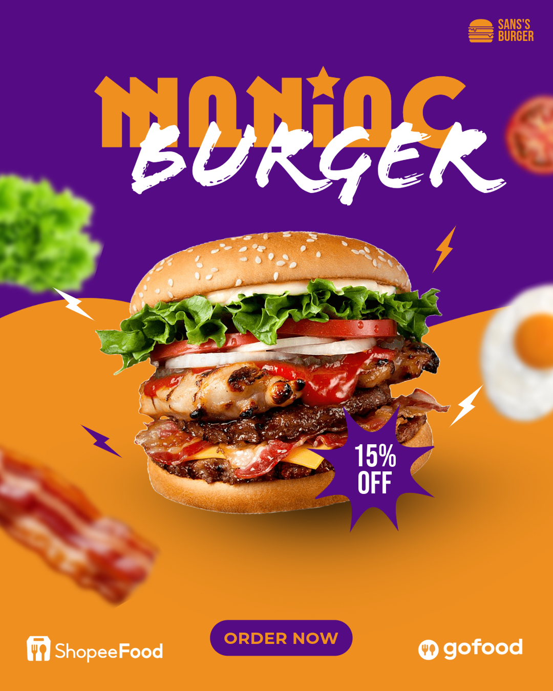
Nice logo. you might consider using a hand lettering font for the text to go along with the hand drawn style of the bun.
1 month ago by Bobbie Hall
Thanks for your input.
1 month ago by Bobbie Hall
Thank you.

1 month ago by Bobbie Hall
Nice simple graphics and font. I generally don't like all caps, but here it works well.
1 month ago by Bobbie Hall
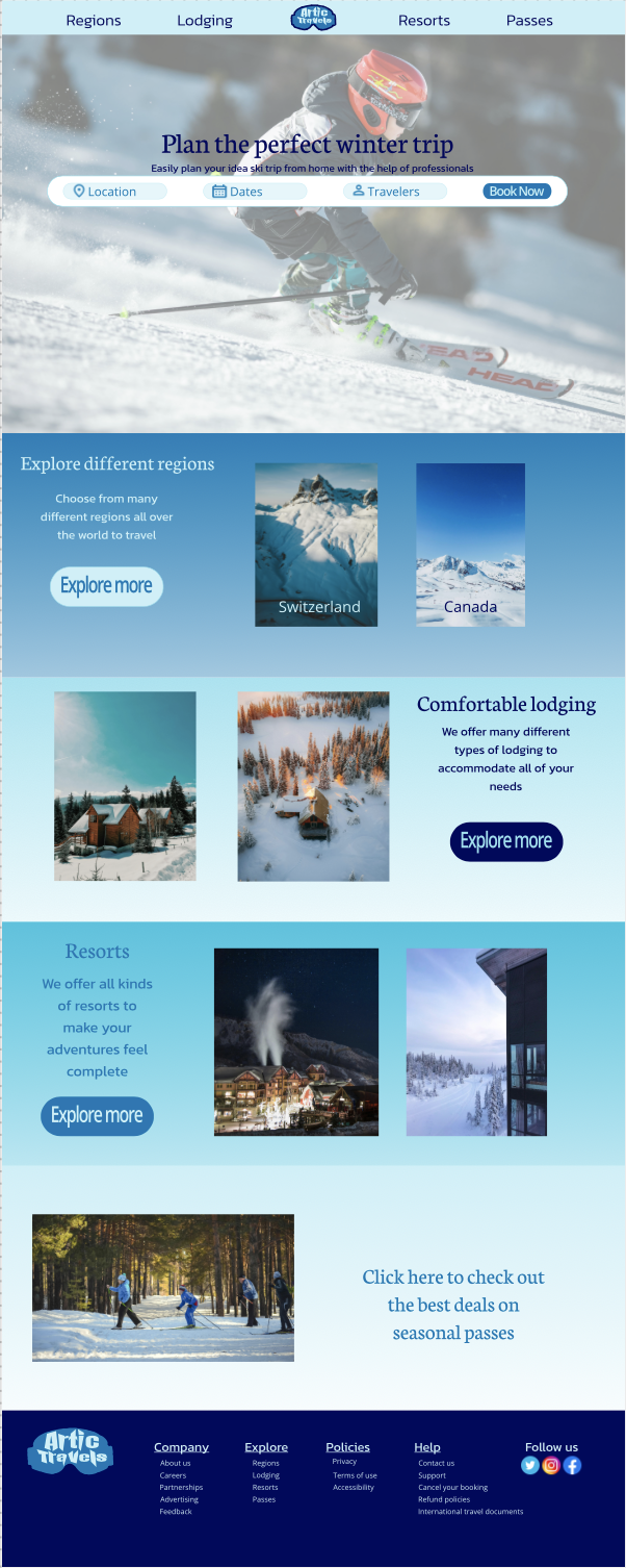
Nice layout. Excellent landing page photo. The subtle gradients of blues in the sections really say, "Winter."
1 month ago by Bobbie Hall
I'd simplify this a lot--perhaps take out one of the photos

1 month ago by Bobbie Hall
Nice minimalistic card. Good color scheme. Simple layout.
1 month ago by Bobbie Hall
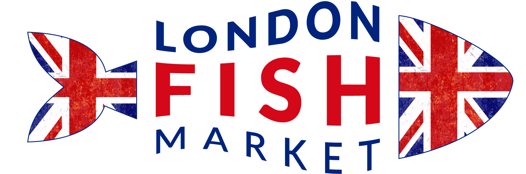
Really neat logo. Love how the lettering as well as the flag follows the lines of the fish.
1 month ago by Bobbie Hall
I love it.
1 month ago by Bobbie Hall
Definitely futuristic. The AI generated graphic is both neat and creepy at the same time.

1 month ago by Bobbie Hall
I like the logo and the buttons. I wish I could see the rest of the page.
1 month ago by Bobbie Hall
I love it! Bold, bright and eye-catching.
1 month ago by Bobbie Hall
Nice logo and colors. Good combination of text and mark.

1 month ago by Bobbie Hall
Nice! Love the rainbow.
1 month ago by Bobbie Hall
Nice overlapping of Letters. Love the little start icon.
1 month ago by Bobbie Hall
I like the reversed out striped flames. Not sure what the image inside the circle in the flames is--a steak maybe? Certainly an abstract mark like the brief called for. Nice choice of colors

1 month ago by Bobbie Hall
Yummy! Nice layout. Good contrast between the two fonts. Colors work well together
1 month ago by Bobbie Hall
Love the font--classy and quirky at the same time. I had to really zoom in to see the ghosted images in the background so you might make them ever so slightly more prominent.
1 month ago by Bobbie Hall
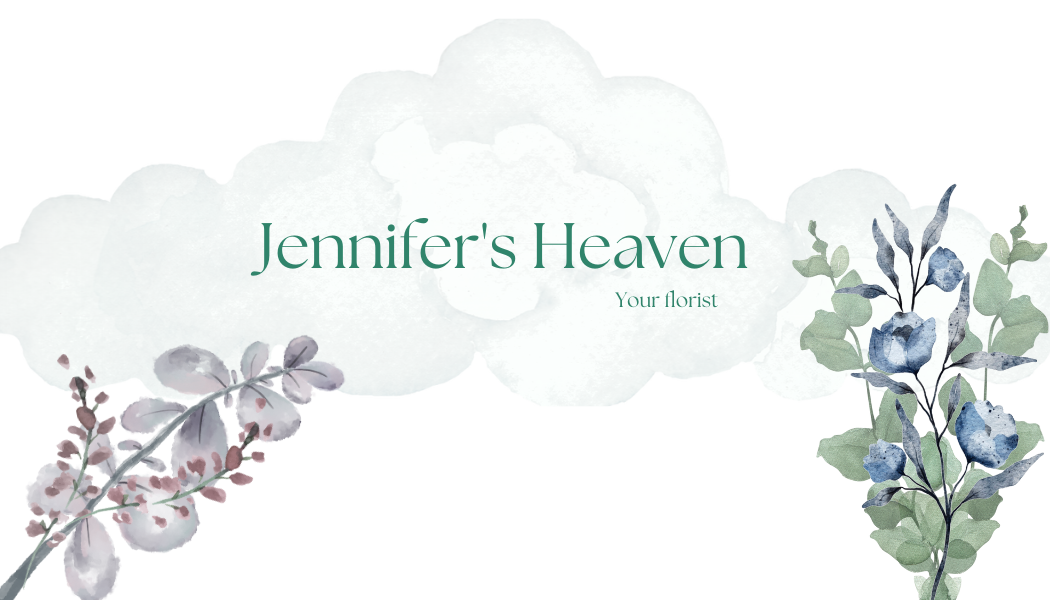
I like the watercolor style of the plants. Plus the rounded leaves and flowers mimic the rounds in the clouds
1 month ago by Bobbie Hall
Nice. I like the colors. It's a lot different from the blues and grays that we're seeing in a lot of the submissions.

1 month ago by Bobbie Hall
I love the flower bouquet. I might turn the sky and clouds a little bluer.

1 month ago by Bobbie Hall
Thanks so much.
2 months ago by Bobbie Hall
You might want to separate the d and T just like you did the T and p. When I first glanced at it I saw dMp. It does contain motion.

2 months ago by Bobbie Hall
I love this. The complimentary color scheme works well. The mark is dynamic.

2 months ago by Bobbie Hall
Well laid out.
2 months ago by Bobbie Hall
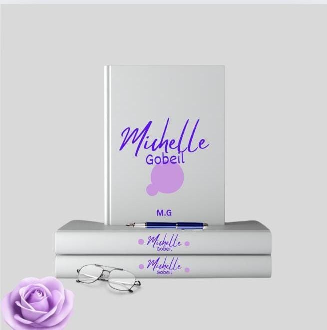
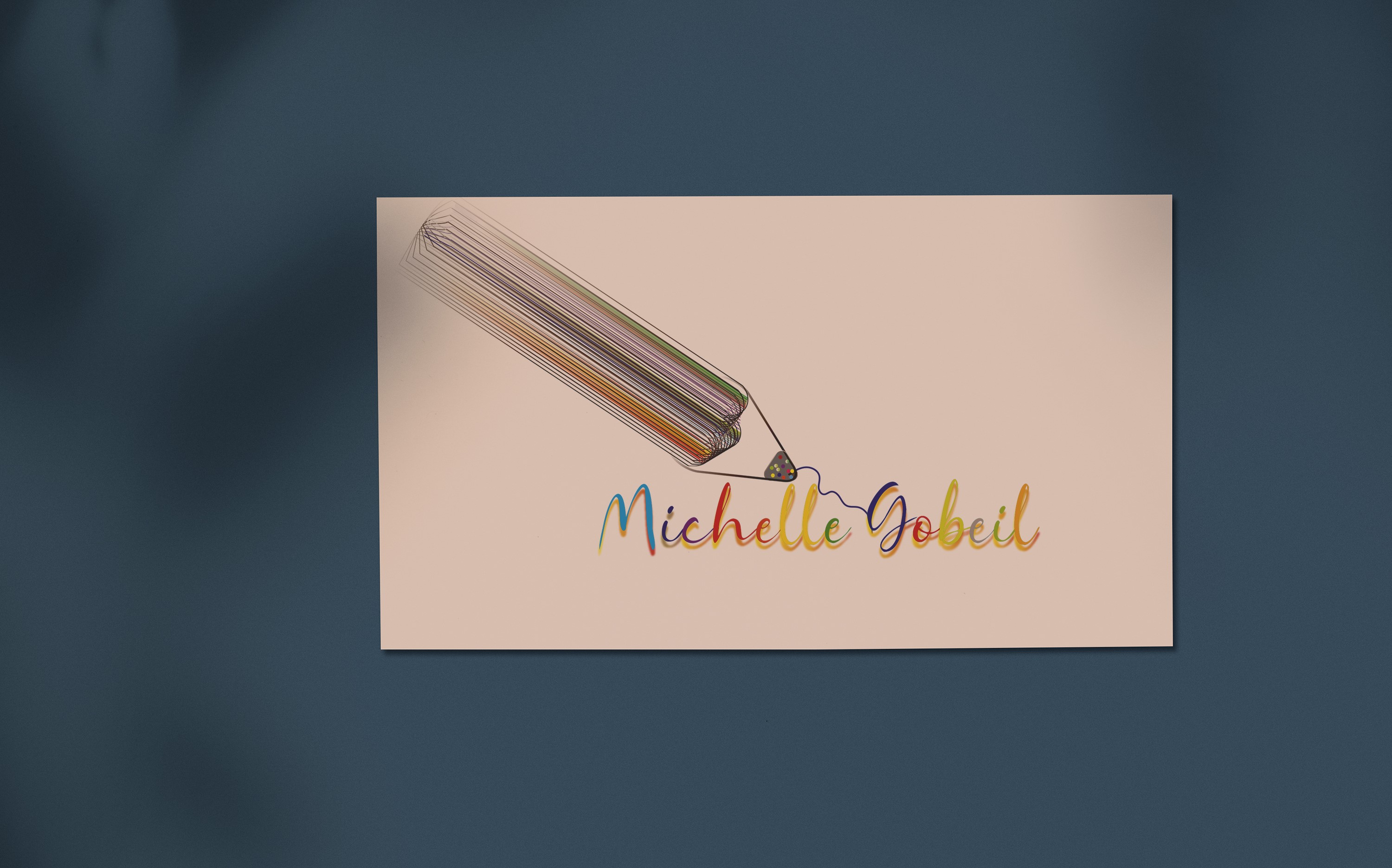
I like the rainbow colors of the text reflected in the rainbow colors of the pencil. You might consider making the pencil a little smaller--it kind of overwhelms the signature.
2 months ago by Bobbie Hall
Beautiful blue and gold color scheme. The watercolor makes it look heavenly. Lots of white space with gold set in the middle creates even more of a heavenly feel.

2 months ago by Bobbie Hall
Nice and simple. You get the message in one glance.
2 months ago by Bobbie Hall
I like how the tape measure makes an M. Mirrors the W below it.

2 months ago by Bobbie Hall
Nice design. Stands out. Small grammatical error-should be An Insurance Company.

2 months ago by Bobbie Hall
Good. I like the mirrored effect

2 months ago by Bobbie Hall
Nice floral design. You might consider doing a white on white background to make it more "heavenly."

2 months ago by Bobbie Hall
Posts
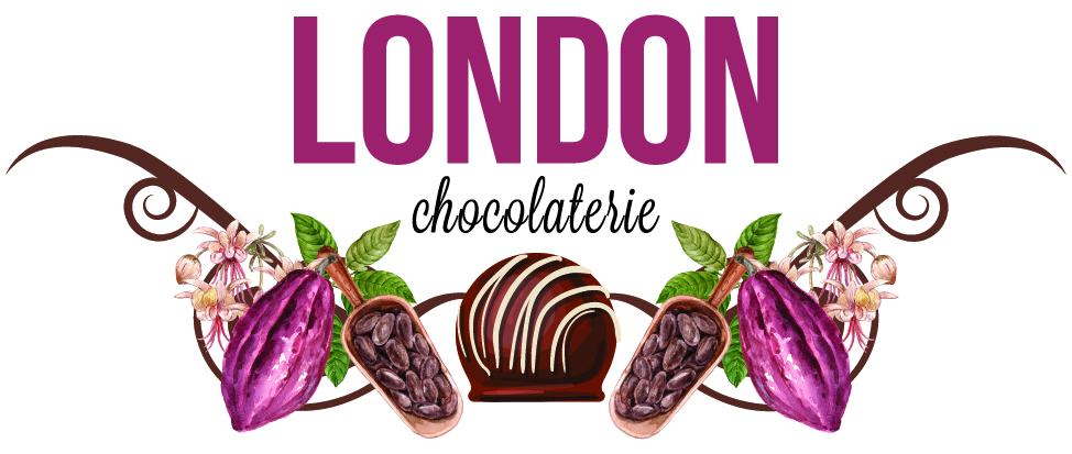
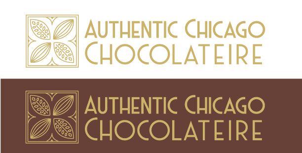
Authentic Chicago Chocolateire
- Report
Bobbie Hall • 6 days ago
Chicago, the center of the roaring 20s and the Art Deco style inspires this logo.


This is so creative! Amazing work- well done :)
4 days ago by Lydia Shaw - Reply
Love this!
4 days ago by Bella Ghazaryan - Reply
this design is beautiful
4 days ago by Nita Agustia - Reply
Nice work
5 days ago by Amy Tulugo - Reply
cool design. really aesthethic
5 days ago by husen - Reply
good
6 days ago by Shree Bhupen Jeet Behera - Reply
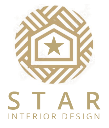
Star Interior Design Logo
- Report
Bobbie Hall • 1 week ago
Elegant gold colored logo mark and text underscores the upscale image the company wants to emphasize. Star on inside illustrates the company's name.

Ok
3 days ago by Sahrul - Reply
Nice work
5 days ago by Amy Tulugo - Reply
good
5 days ago by Shree Bhupen Jeet Behera - Reply
I think you could play with the background lines a bit more, so they're more cleanly connected with eachother and with the "house" bit. Other then that, great work!
6 days ago by N3GATIVE - Reply
Thanks for the suggestion.
5 days ago by Bobbie Hall - Reply
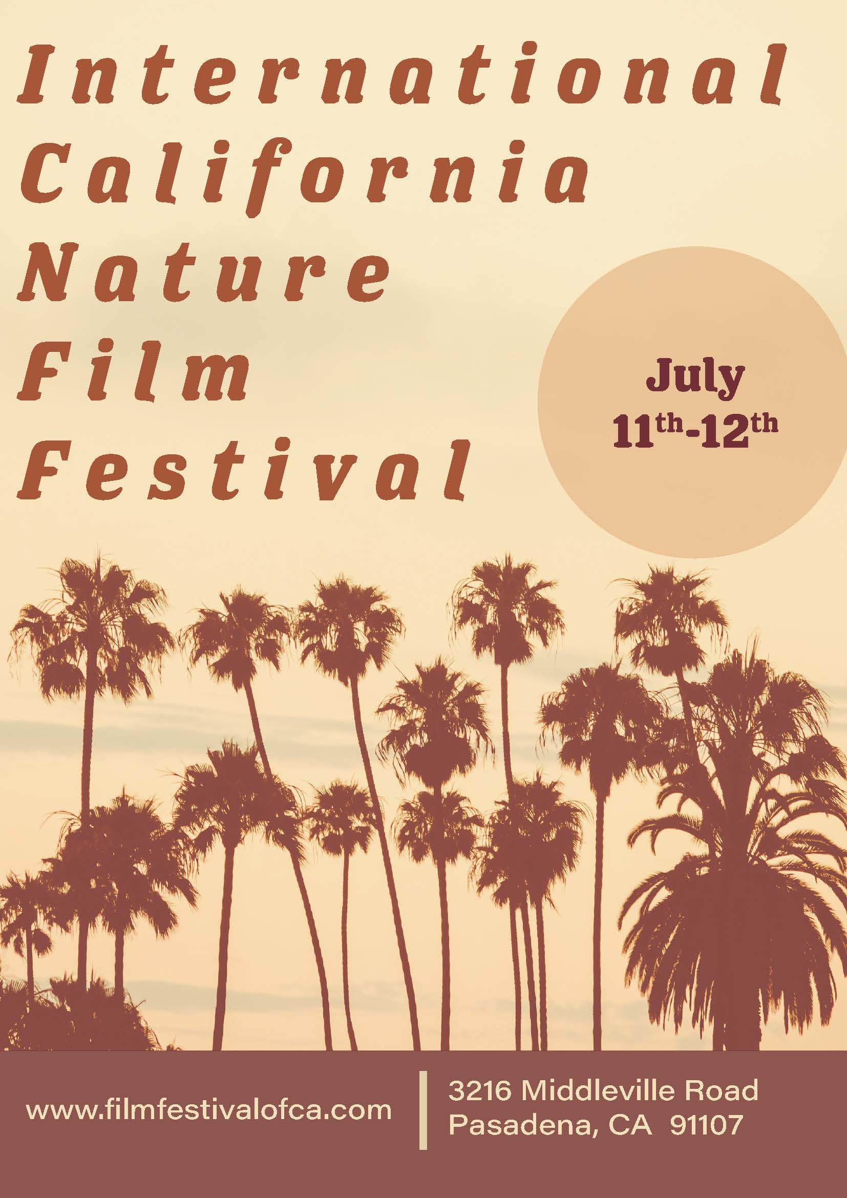
BeachSquare Logo
- Report
Bobbie Hall • 1 week ago
Color gradient, purple to pink to yellow sun in the background. Silhouette of two palm trees in front.
Black & White same as color but without the color gradient. Sun is white. 80s/90s style graphics.
Black & White same as color but without the color gradient. Sun is white. 80s/90s style graphics.

Nice work
5 days ago by Amy Tulugo - Reply
good work
1 week ago by Rimsha Fatima - Reply
nice artwork...
1 week ago by Rimsha Fatima - Reply
good work, but probably you can use a different shape of coconut tree
1 week ago by Niken Galuh Ramadhani - Reply
Oops, I thought they were palm trees but you're right, they're coconut trees.
1 week ago by Bobbie Hall - Reply
Nice one .
1 week ago by Hania - Reply
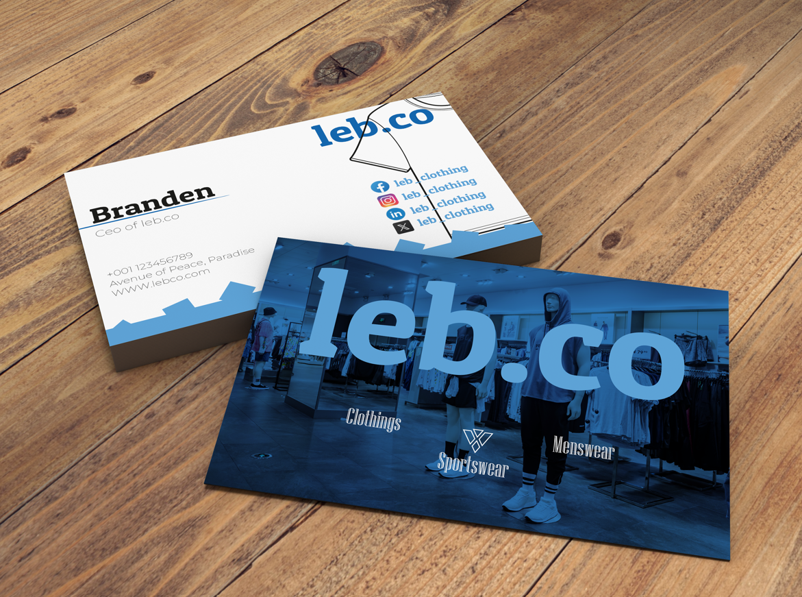
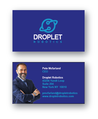
Droplet Robotics Business Card
- Report
Bobbie Hall • 1 month ago
Droplet Robotics, a manufacturing company wants a business card. The lighter color blue is given as an accent color.

its not the best
3 weeks ago by keo - Reply
i am giving it 7 out of 10. you should have to add some more elements.
4 weeks ago by Zainul Abdeen - Reply
Nice design. but I think it would be better if the background color is darker so that the contrast of the lighter blue color can be seen more clearly.
4 weeks ago by Elsalben - Reply
Everything looks great, but I suggest you add hierarchy to the information. On the other hand, it is pleasing to the eyes since you used the accent color wisely. Great Job!
1 month ago by Chloe Nicole - Reply
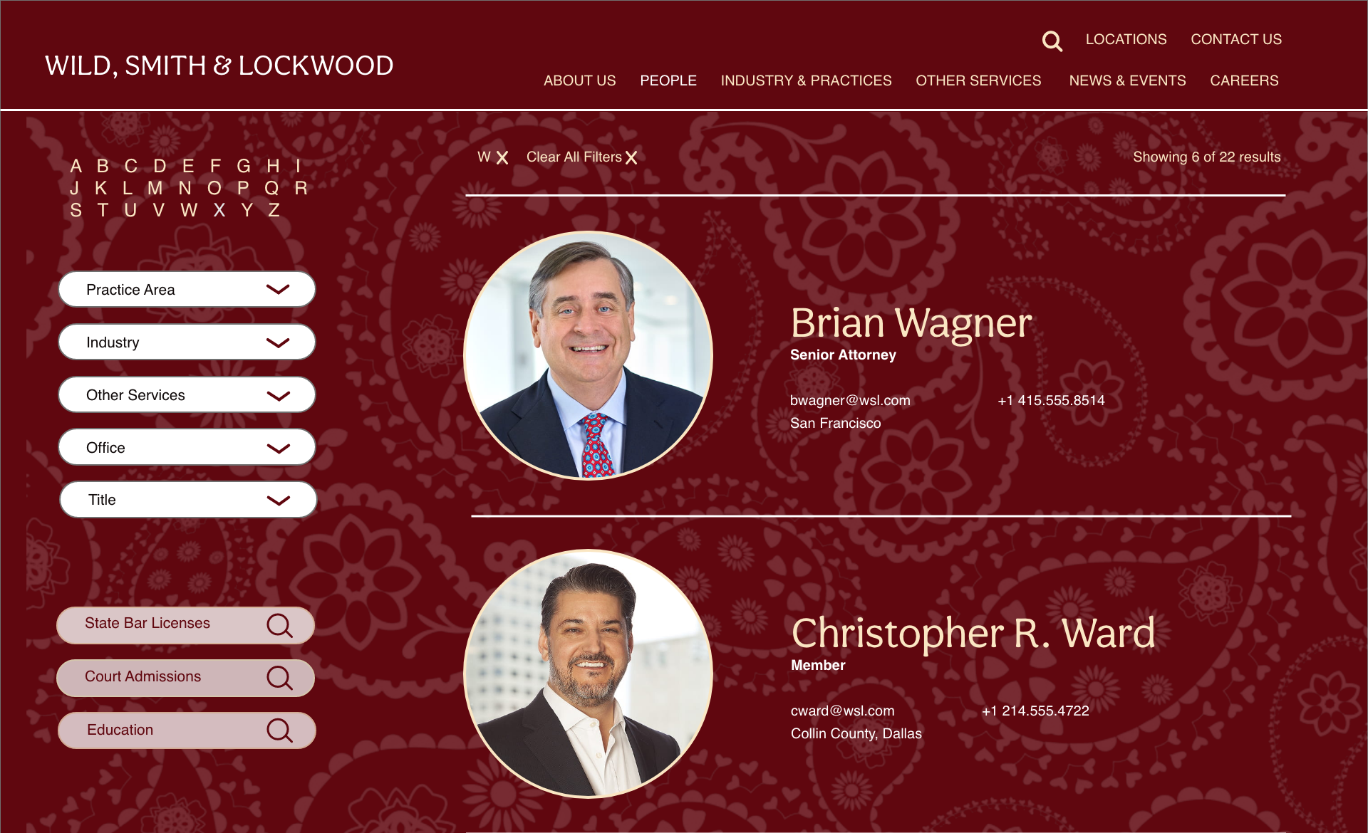
Wild, Smith & Lockwood Personnel Page
- Report
Bobbie Hall • 1 month ago
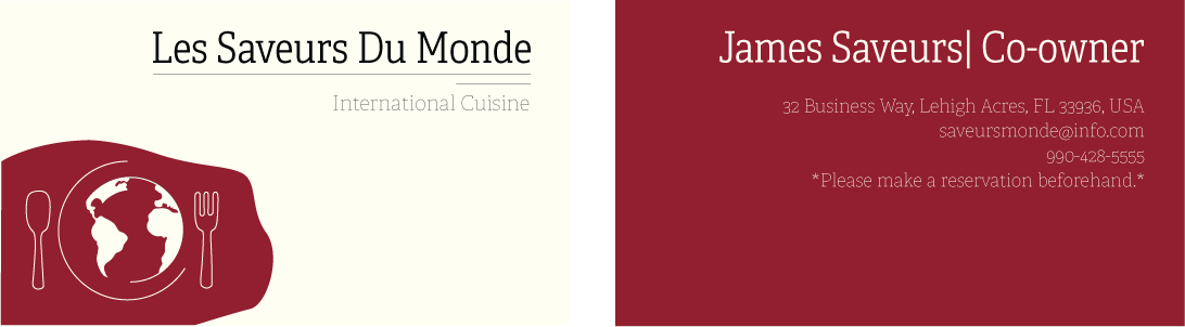
The Offices of Wild, Smith & Lockwood, an international law firm, wants a high-end personnel page in order to index all their employees. They have a specific palette of colors to work with-burgundy, creme, white, and black.

TMI and the design is not matching
3 weeks ago by keo - Reply
Thanks for your trusting
3 weeks ago by lazuardi arga tama - Reply
This looks very nice but I think it would look better with just a solid background color. Maybe a white page would look good with the burgundy used as an accent color
1 month ago by Amir - Reply
very nice
1 month ago by tulikamaity - Reply