Elsalben
Posts
2
Likes
2
Liked Posts
0
Given Feedback
5
Feedback
Looking good, but i think to much composition

2 months ago by Elsalben
I like it. Be better if you use gradiant colour to the text.
2 months ago by Elsalben
very good design, the colors you use are very suitable for the character of the poster.
2 months ago by Elsalben
selection of the right font. But the center feels very empty. Maybe you can add ornamental objects such as shadows or the logo of the hotel as a complement.

2 months ago by Elsalben
Nice design. but I think it would be better if the background color is darker so that the contrast of the lighter blue color can be seen more clearly.
2 months ago by Elsalben
Posts
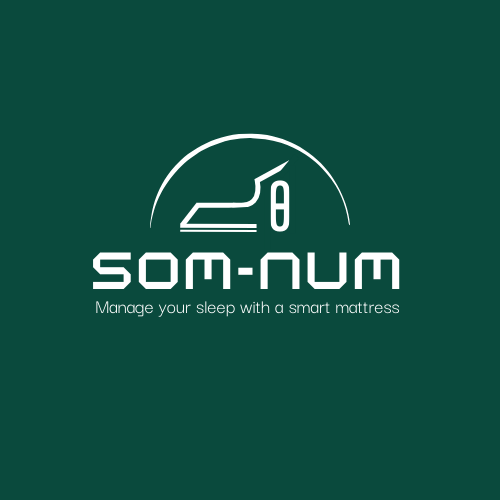
Logo Design SUM-NUM
- Report
Elsalben • 2 months ago
This logo was created with a simple concept and shows the silhouette of a bed vertically.
Som-Numlogo
 Like
Like


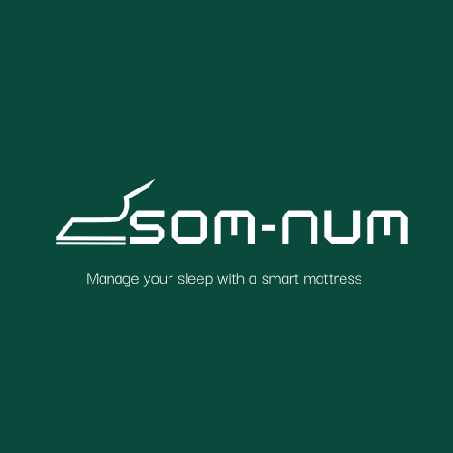
Logo Design SUM-NUM
- Report
Elsalben • 2 months ago
This logo was created with a simple concept and shows the silhouette of a bed vertically. The shape of the logo is made to resemble the letters S and O. The brand name is written clearly as an identity and is remembered by people as a technological product.
#Fakeproject
#Fakeproject
Som-Numlogo