All Feedback Posts
![]()
Logo Design SUM-NUM
Logo Design SUM-NUM
- Report
Elsalben • 2 months ago
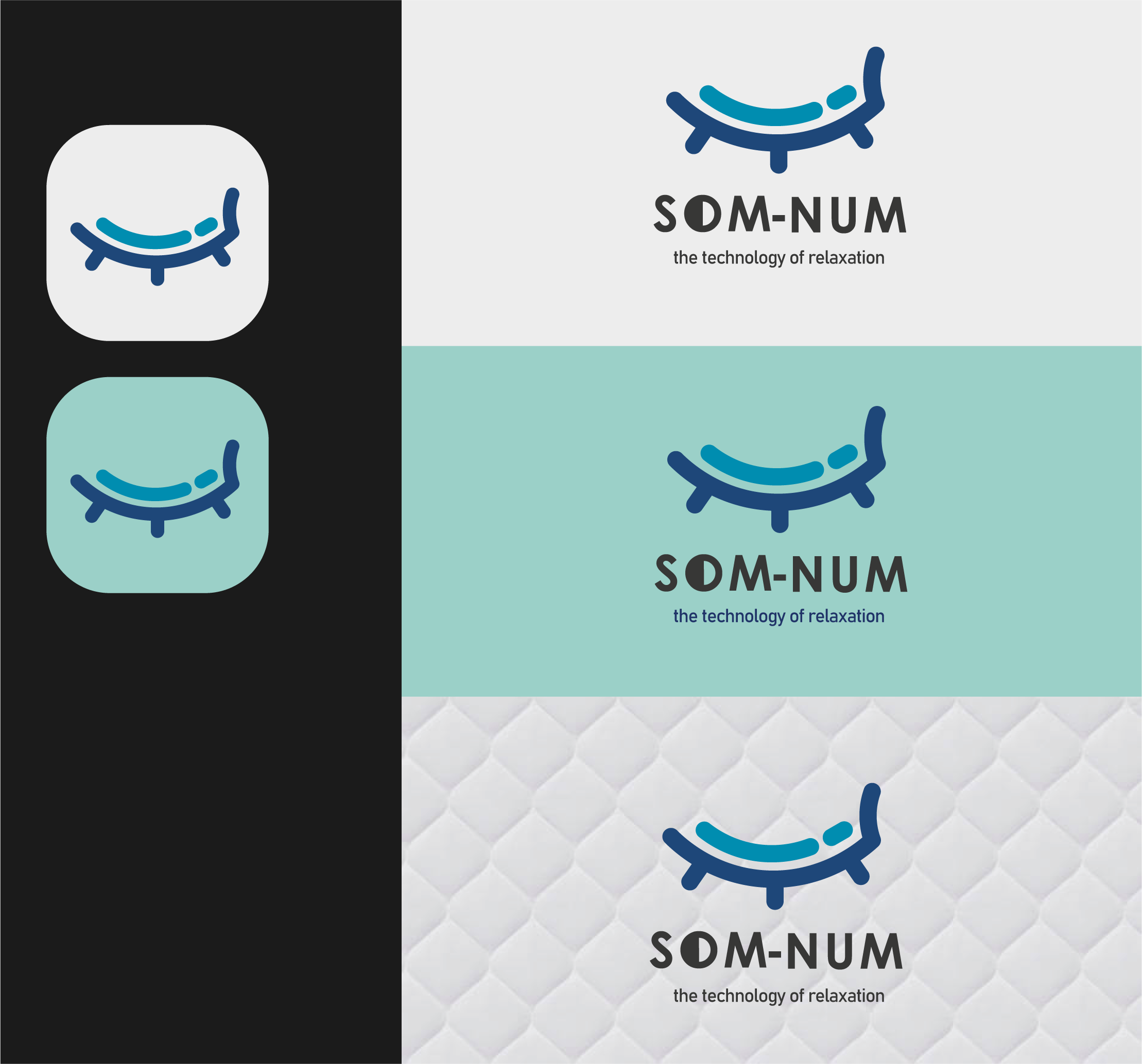
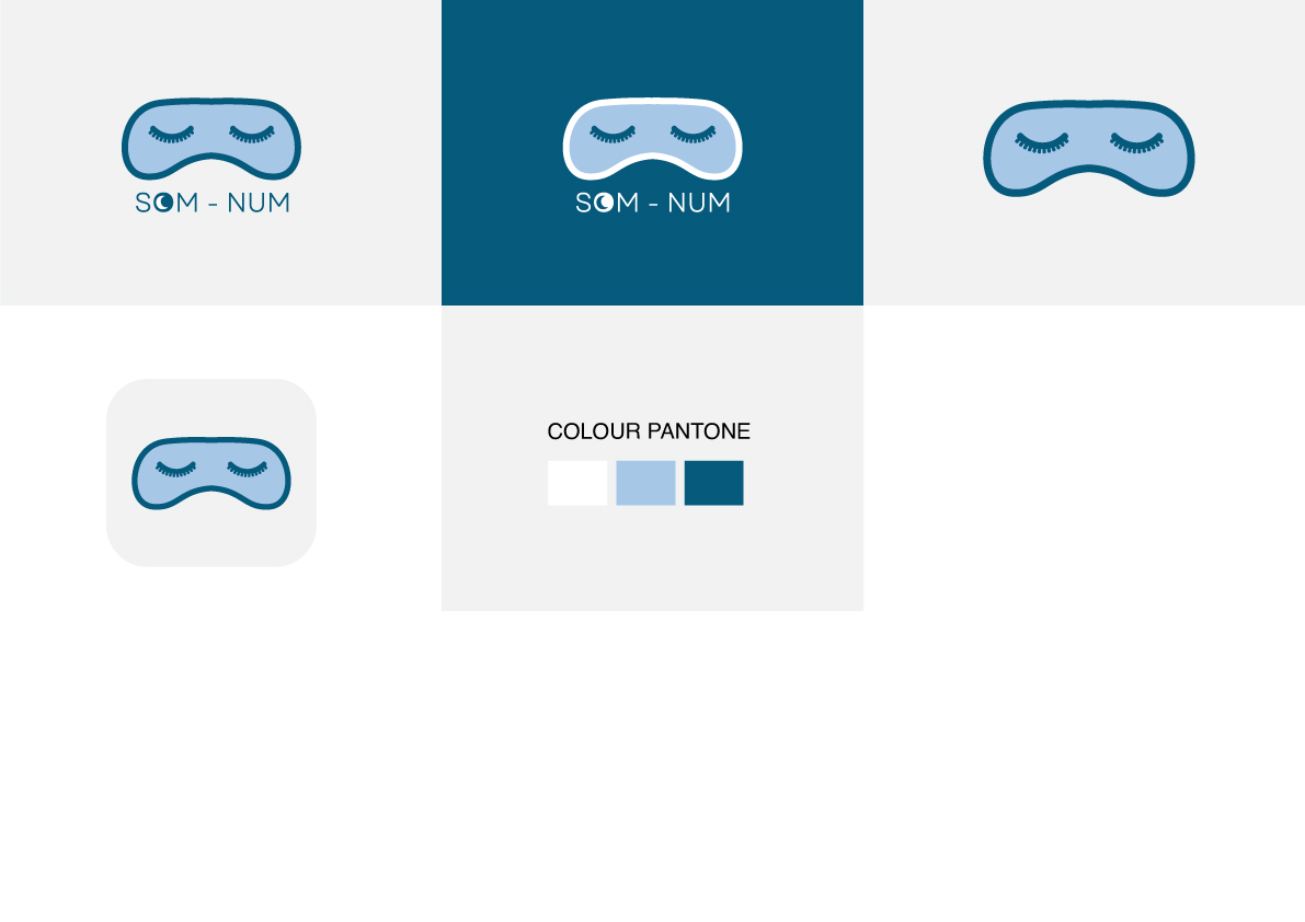
Som-Numlogo
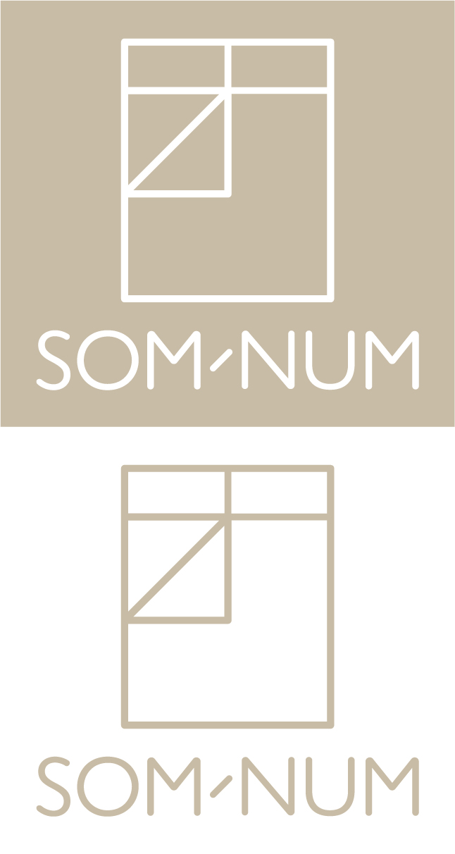
This logo was created with a simple concept and shows the silhouette of a bed vertically. The shape of the logo is made to resemble the letters S and O. The brand name is written clearly as an identity and is remembered by people as a technological product.
#Fakeproject
#Fakeproject