alejandr0000
Posts
2
Likes
156
Liked Posts
1
Given Feedback
0
Posts
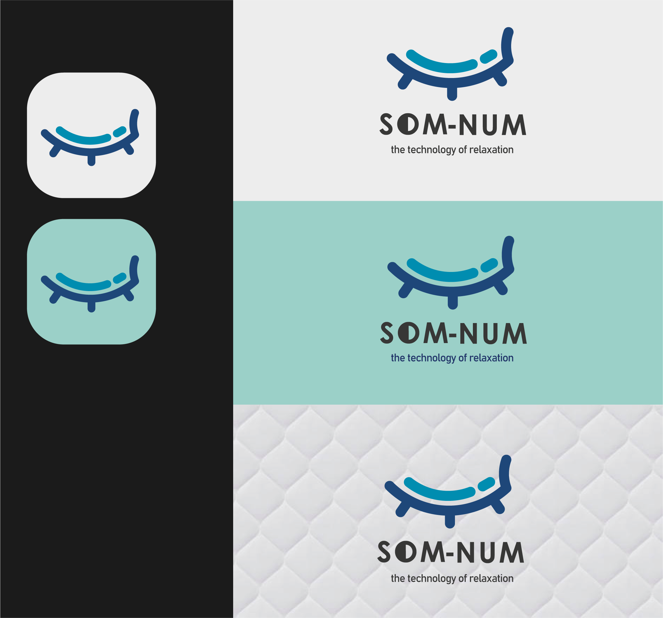
SOM - NUM: The technology of relaxation
- Report
alejandr0000 • 3 years ago
my design is based on a mix between a bed and a closed eye, both related to the concept of sleeping :) the logo in question is intended for a smart mattresses up-and-coming business. more info with the brief below:
Som-Numlogo


This is great!
2 months ago by Jordan Ragsdale - Reply
I like the shape and it's a very clean line. The thing that is missing is the reference to Bluetooth which is an important element of the project.
9 months ago by Adele Varlotta - Reply
Its different its good
10 months ago by Sahar Ali - Reply
My only critique would be to make the icon a bit smaller when with the text, the weight of the lines in the logo should generally be pretty close to the weight of the text
1 year ago by Garett Noll - Reply
oh and how do you upload your work
1 year ago by Sasha Stevens - Reply
it soo cool
1 year ago by Sasha Stevens - Reply
A masterpiece!
1 year ago by Diyana - Reply
So cool! I like how you combined "sleep" and "mattress" in your logo design, and its very professionally presented
1 year ago by Anaya Jobson - Reply
Hi! how can I share my own design?
1 year ago by emp-graphic - Reply
amazing design
1 year ago by Catalina - Reply
Nice concept....I love it
1 year ago by Rexzitek designs - Reply
I love how you've put the two most important elements of the business in one icon: sleep and the mattress. So creative!
3 years ago by Sija - Reply
Hands down the best out of the three I see. Love the play on the mattress and an eyelid.
3 years ago by Joshua Stafford - Reply
Very clever design really like it!
3 years ago by Emma - Reply
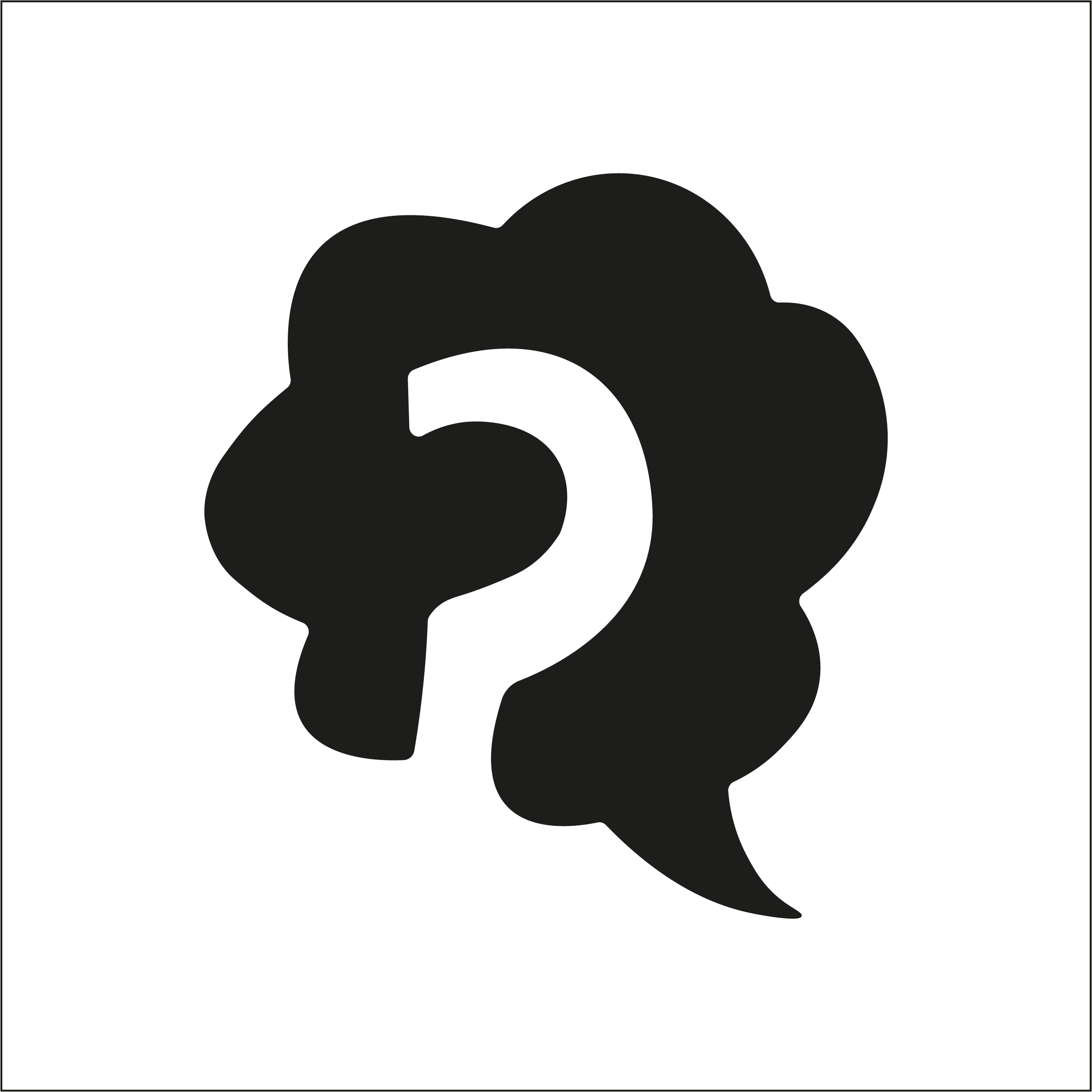
Naiv - Logo Design
- Report
alejandr0000 • 3 years ago
Abstract mark logo for a business called Naiv, the logo concept is the idea of a question mark on a thought bubble
Hey There,
I am Chester, I just founded a new business called Naiv. For a while now, we've been looking for a good logo for our business. I would like the logo to be an abstract mark. Would you be interested?
I am Chester, I just founded a new business called Naiv. For a while now, we've been looking for a good logo for our business. I would like the logo to be an abstract mark. Would you be interested?

Try to add a circle cloud under the design. The concept is good!
3 years ago by Van Brydon Bartolata - Reply