Anaya Jobson
Posts
1
Likes
2
Liked Posts
2
Given Feedback
4
Feedback
Thank you so much for the feedback! I will try your suggestion, and your english is perfect!
1 year ago by Anaya Jobson
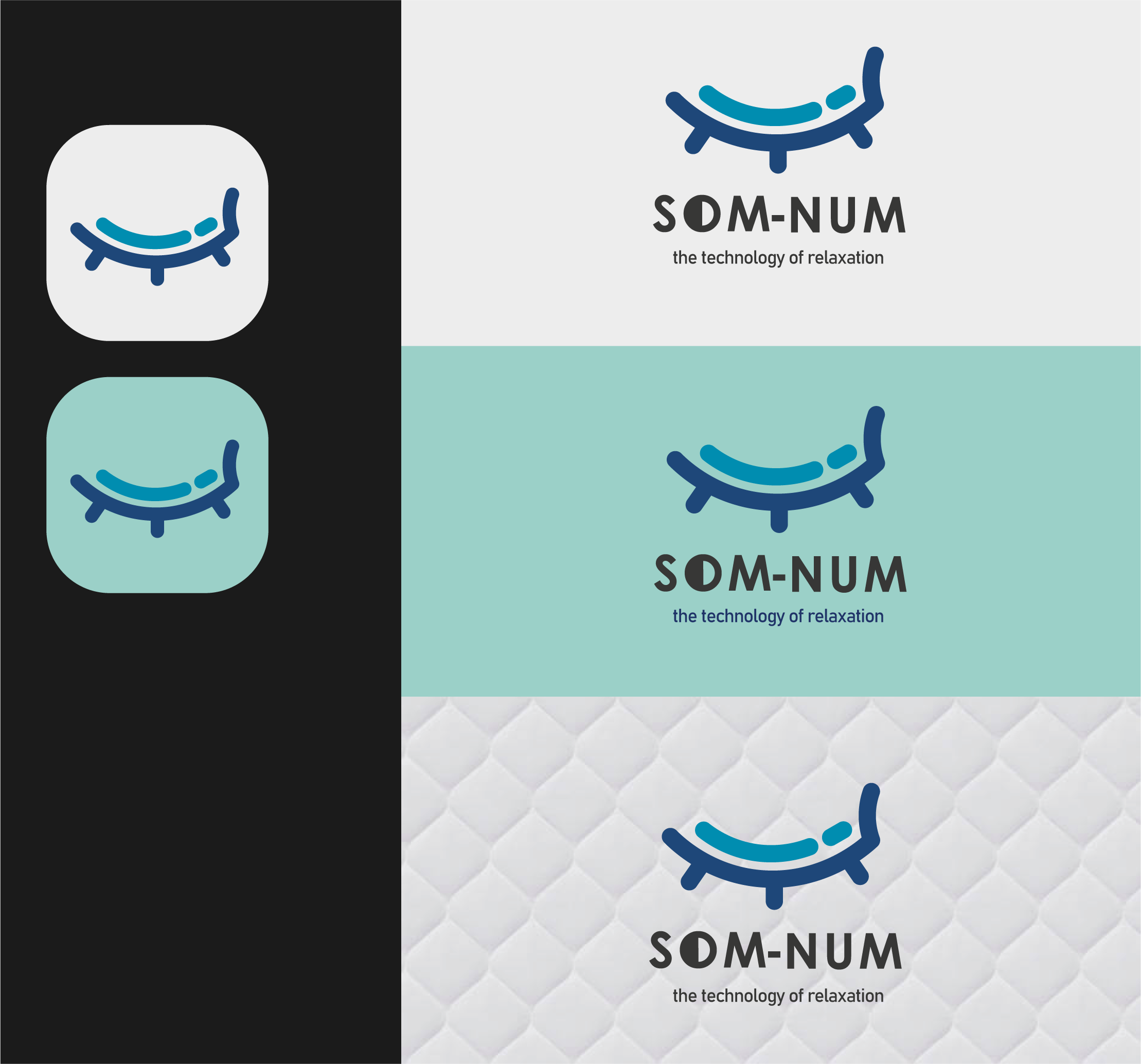
So cool! I like how you combined "sleep" and "mattress" in your logo design, and its very professionally presented
1 year ago by Anaya Jobson
nice, simple yet proffesional :)

1 year ago by Anaya Jobson
very nice, visually represents the company name perfectly and is easy to read

1 year ago by Anaya Jobson
Posts
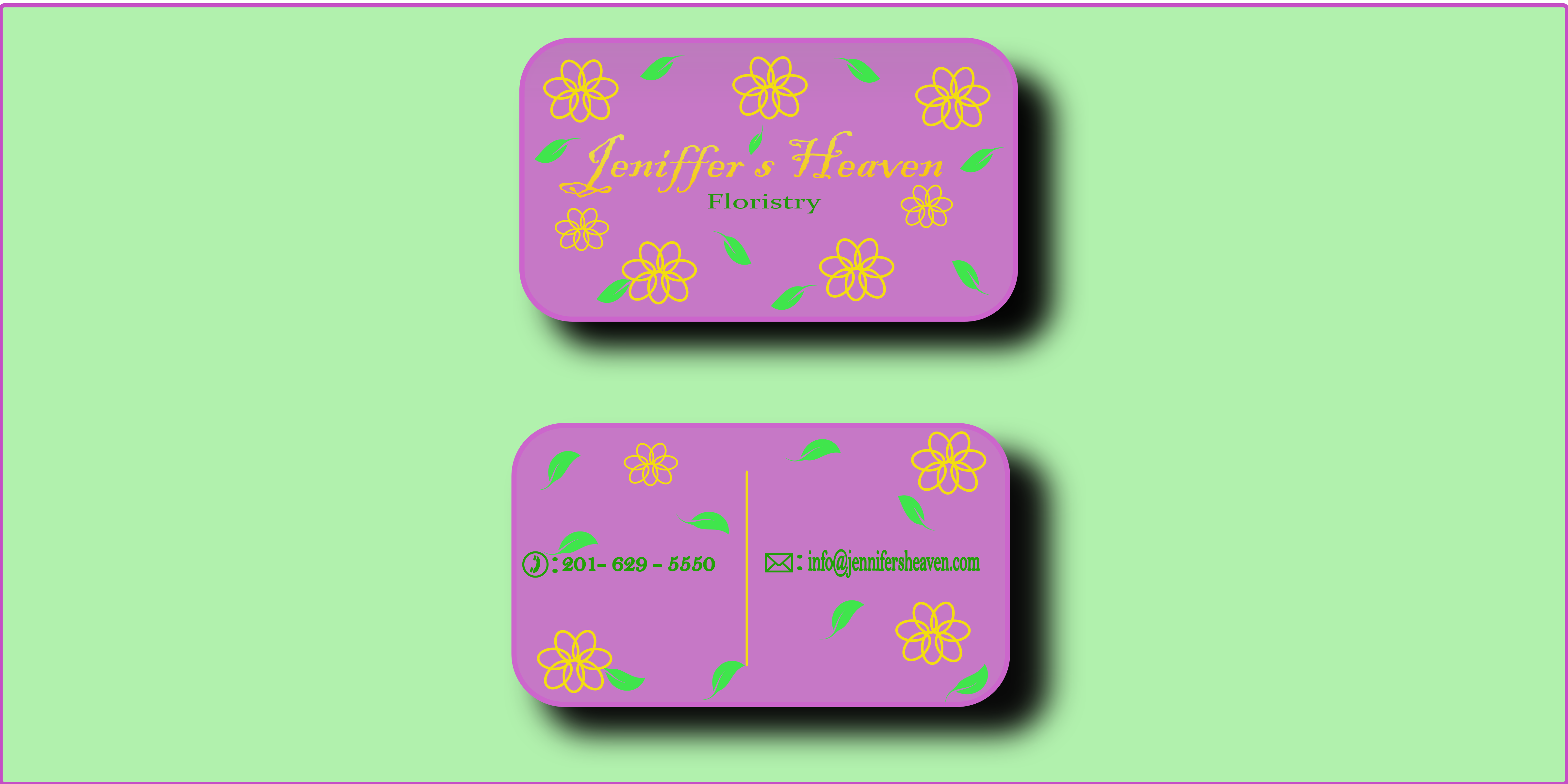
Jeniffer's Heaven Business card
- Report
Anaya Jobson • 1 year ago
This business card, as per clients request, has been designed to have a "heavenly" look and rounded edges as a play on the business name. The use of only three pastel (as to not look childish and overcrowd) colors made the card more welcoming and friendly to draw in more revenue to the company while keeping a professionality and eloquence as represented by the cursive writing. The client also requested to make the card clearly represent a floristry, seen by the leaves and flowers on the design as well as the word "floristry" in green underneath the business name. A professional and eye-catching yet friendly design that would have your business pack full of many more customers in no time.
Jennifer's Heavengraphic


It's great! On point and beautiful, I would use the leaves' green for the letters though, it's a little bit hard to read the information
1 year ago by Krisbell - Reply
Thank you so much for the feedback! I will try your suggestion, and your english is perfect!
1 year ago by Anaya Jobson - Reply
Sorry for my English, I hope you can understand me
1 year ago by Krisbell - Reply