Krisbell
Posts
16
Likes
26
Liked Posts
88
Given Feedback
43
Feedback
Thanks, I really appreciate it!
1 year ago by Krisbell
The style is on point, the mockup would look better with a lighter color for the background though, to appreciate better your design :)
1 year ago by Krisbell
Great use of negative space!

1 year ago by Krisbell
Thanks! I definitely must work on color palettes
1 year ago by Krisbell
I will*

1 year ago by Krisbell
Thank you! It will try it
1 year ago by Krisbell
The idea is very original! Good work with the colors
1 year ago by Krisbell
Thank you so much, your opinion is very helpful to me! :)
1 year ago by Krisbell
Thank you very much!

1 year ago by Krisbell
And shadows too! :)
1 year ago by Krisbell
Hi! I think is very beautiful how you worked with the shapes
1 year ago by Krisbell
That means so much to me, thank you!
1 year ago by Krisbell
Thank you so much!
1 year ago by Krisbell
Thank you!
1 year ago by Krisbell
Great concept! It would look so much better if you fix g letter a little bit
1 year ago by Krisbell
Thanks! I really appreciate it :)
1 year ago by Krisbell
It's an amazing design and it looks fun. The colors were chosen very well

1 year ago by Krisbell
Thank you!
1 year ago by Krisbell
Amazing!
1 year ago by Krisbell
Thanks!
1 year ago by Krisbell
Sorry for my English, I hope you can understand me
1 year ago by Krisbell
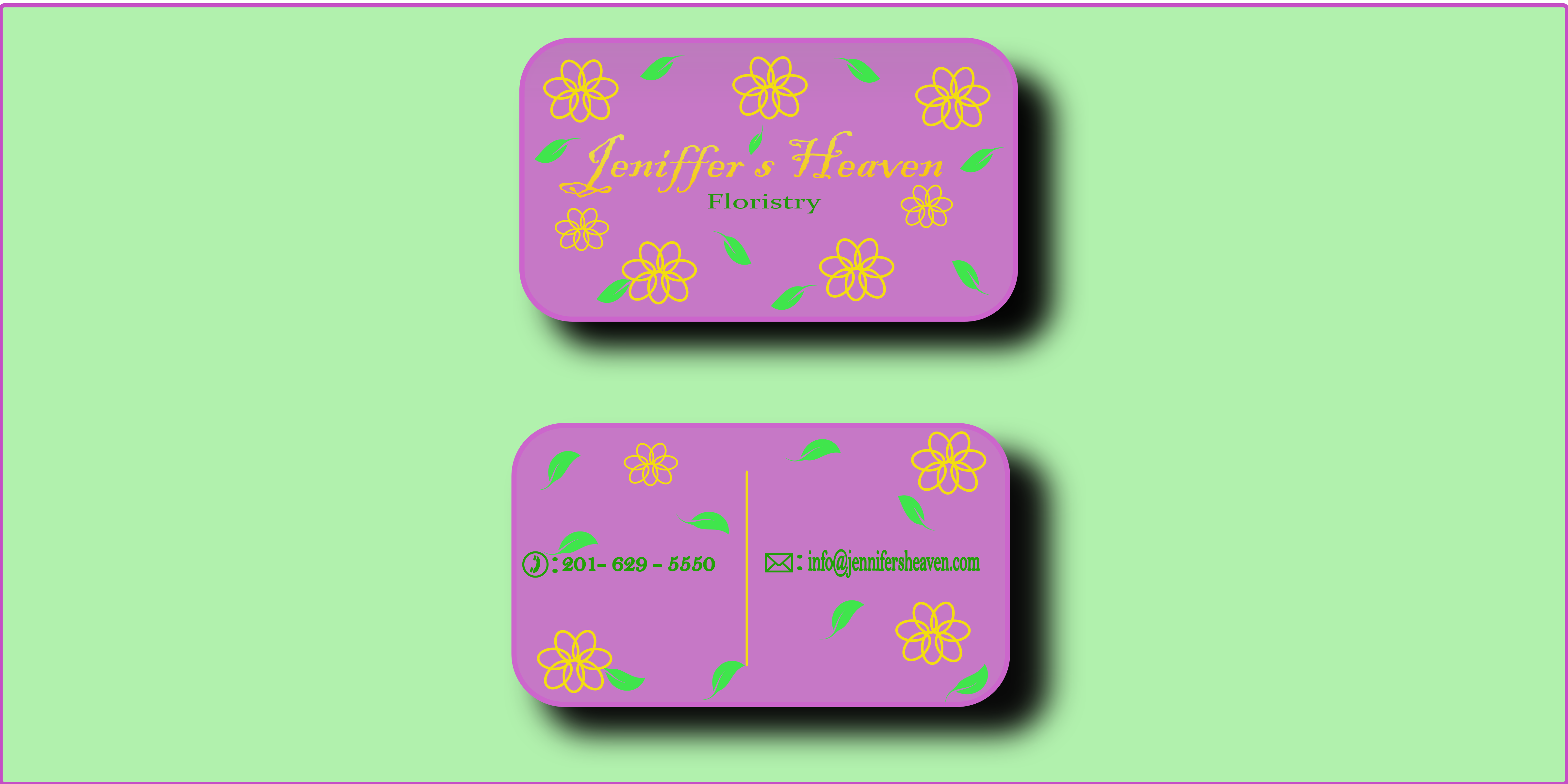
It's great! On point and beautiful, I would use the leaves' green for the letters though, it's a little bit hard to read the information
1 year ago by Krisbell
Thanks!!
1 year ago by Krisbell
Thank you!
1 year ago by Krisbell
The concept is great, I would keep it more simple though. like maybe removing the lips' details and the nose
1 year ago by Krisbell
Thank you! I have to work on that :)

1 year ago by Krisbell
Loved the minimalism! The concept of the stairs is on point
1 year ago by Krisbell
Thanks! Really appreciate it
1 year ago by Krisbell
I agree with you on the shadows, thank you for your feedback! I really appreciate it
1 year ago by Krisbell
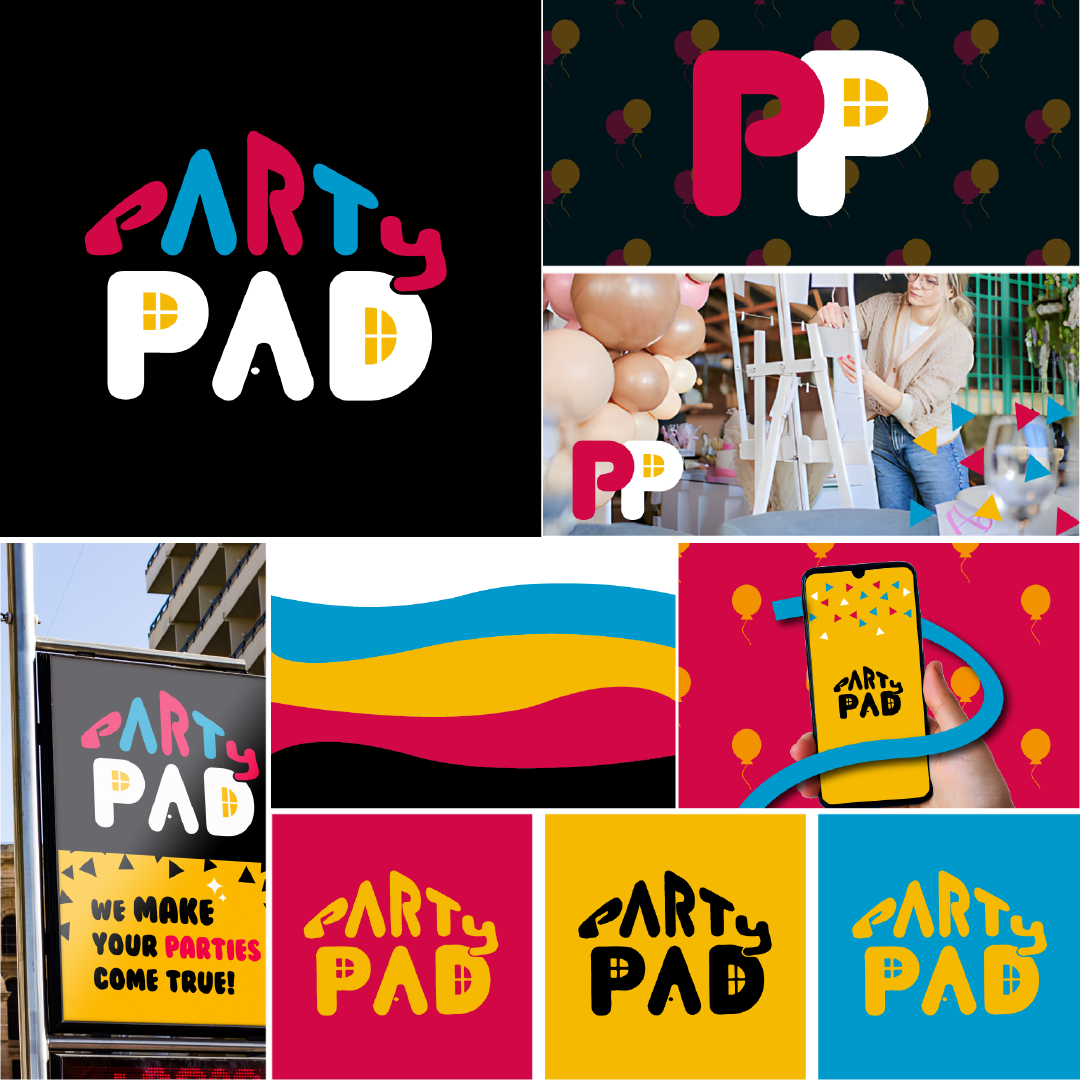
Love the little detail of the “P"
1 year ago by Krisbell
Thanks!

1 year ago by Krisbell
Thank you very much! :D
1 year ago by Krisbell
ª
1 year ago by Krisbell
Thanks, I really appreciate it!
1 year ago by Krisbell
Hi! Thank you so much!
1 year ago by Krisbell
Literally on point! Loved it
1 year ago by Krisbell
Great concept! I would do the steam's stripes more bold, but it looks very cool just as it is
1 year ago by Krisbell
Thank you! You advice is very useful for me

1 year ago by Krisbell
Thank you! <3
1 year ago by Krisbell
Very creative, I love it!

1 year ago by Krisbell
Great concept! Gorgeous color

1 year ago by Krisbell
Very functional and simple, it works very well with the colors and message

1 year ago by Krisbell
Posts
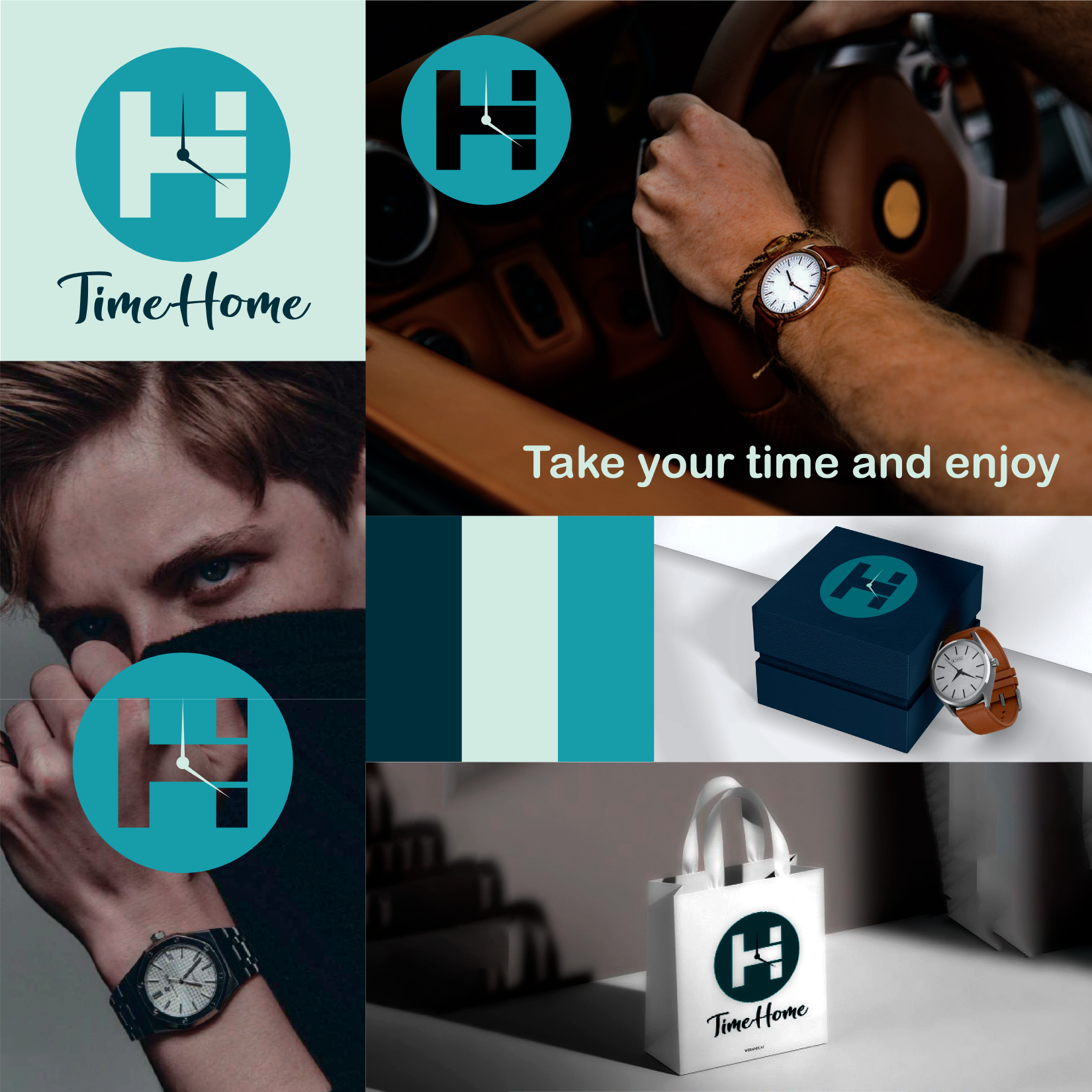
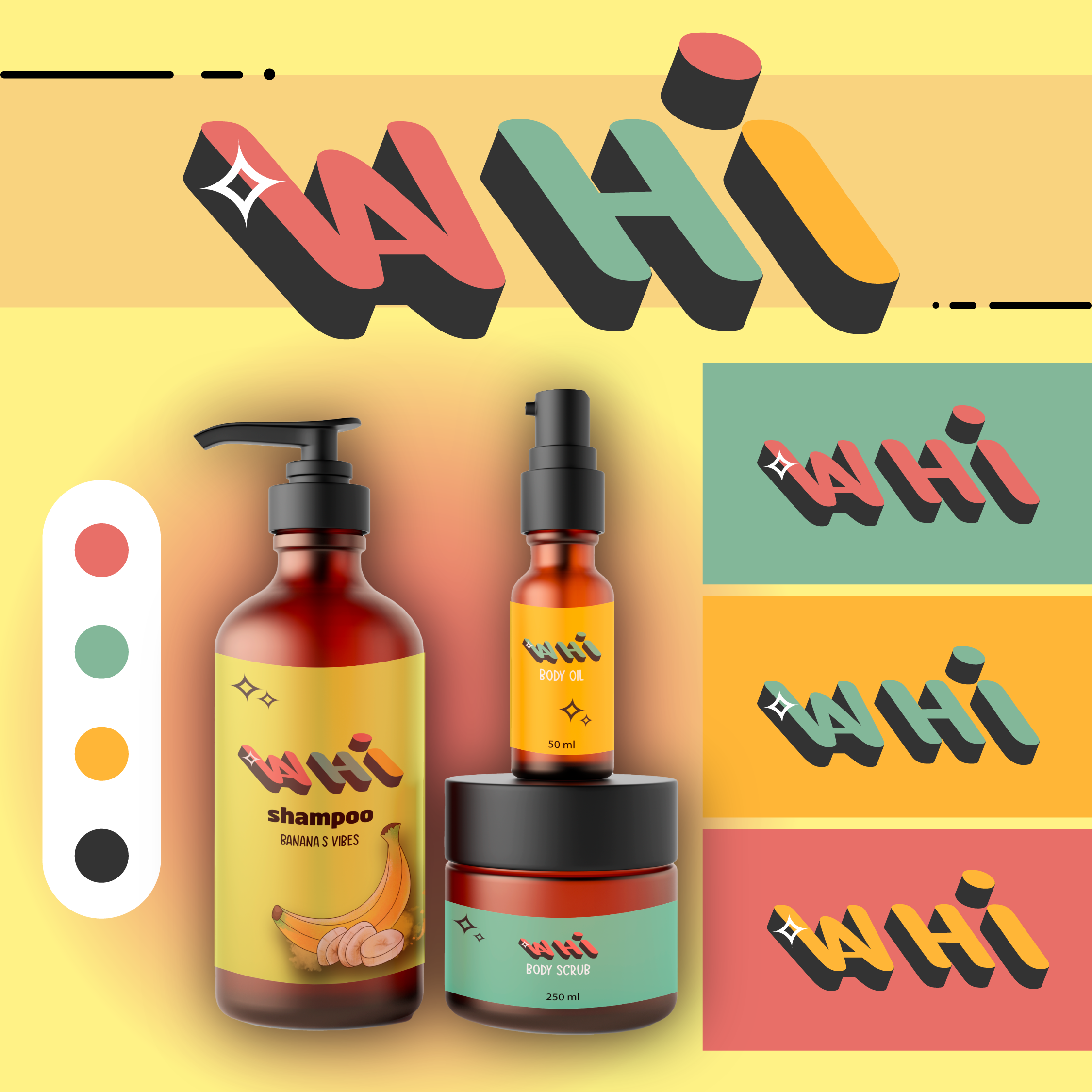
Lettermark for TimeHome
- Report
Krisbell • 1 year ago
I kept it simple and elegant, please tell what you think or how you can I improve it :)
This time I tried to focus on the color palette and the feelings the brand wanted to highlight
This time I tried to focus on the color palette and the feelings the brand wanted to highlight
Hi,
I am Nickie, owner of TimeHome. We are looking for someone that can design a professional logo for our business. I think a lettermark will fit best. Can you help me out?
I am Nickie, owner of TimeHome. We are looking for someone that can design a professional logo for our business. I think a lettermark will fit best. Can you help me out?


I like the creative use of the T and H in the Time Home logo. Nice, clean, and simple.
1 year ago by victoria - Reply
Thanks, I really appreciate it!
1 year ago by Krisbell - Reply
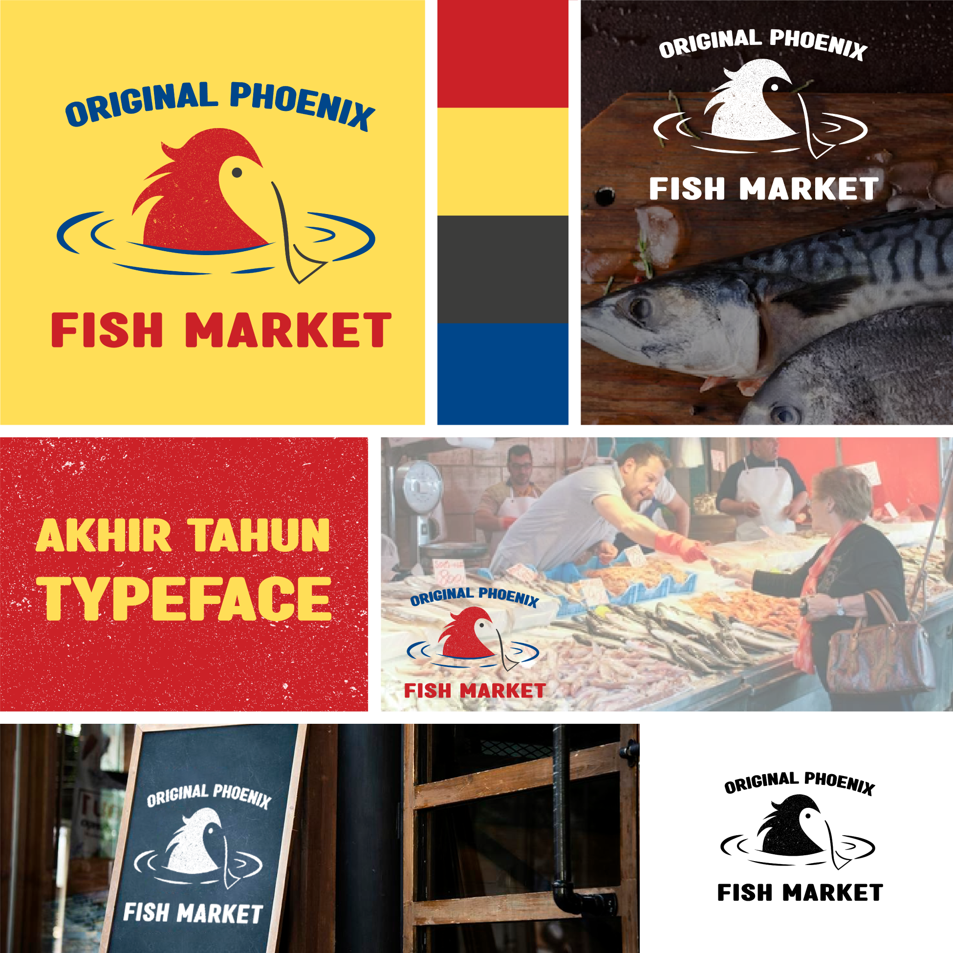
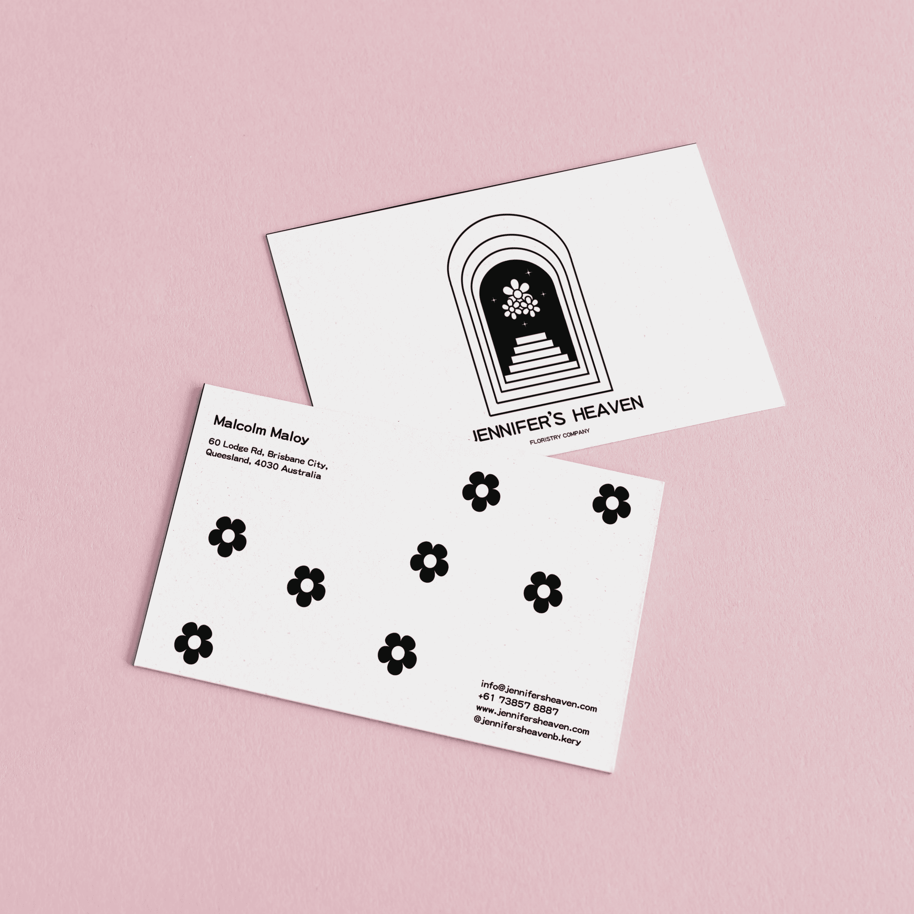
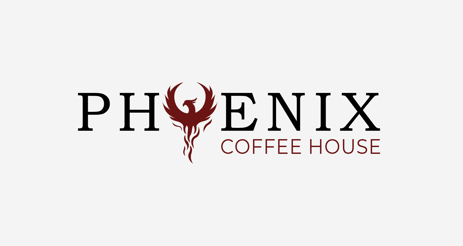
Logo Design for Original Phoenix Fish Market
- Report
Krisbell • 1 year ago
I combined the phoenix concept with the type of business, tried to use the negative space and practice a little bit. Please tell what you think! :D
Hello,
I am Mallory, owner of Original Phoenix Fish market. For a while now, we've been looking for a good logo for our Fish market. I think a combination mark will fit best with the business. Can you help me out?
I am Mallory, owner of Original Phoenix Fish market. For a while now, we've been looking for a good logo for our Fish market. I think a combination mark will fit best with the business. Can you help me out?

Great use of the negative space. The full color pallet is a bit mundane, but the black and white logos really pop. Overall Nice Work.
1 year ago by Angelique Cureton - Reply
Thanks! I definitely must work on color palettes
1 year ago by Krisbell - Reply
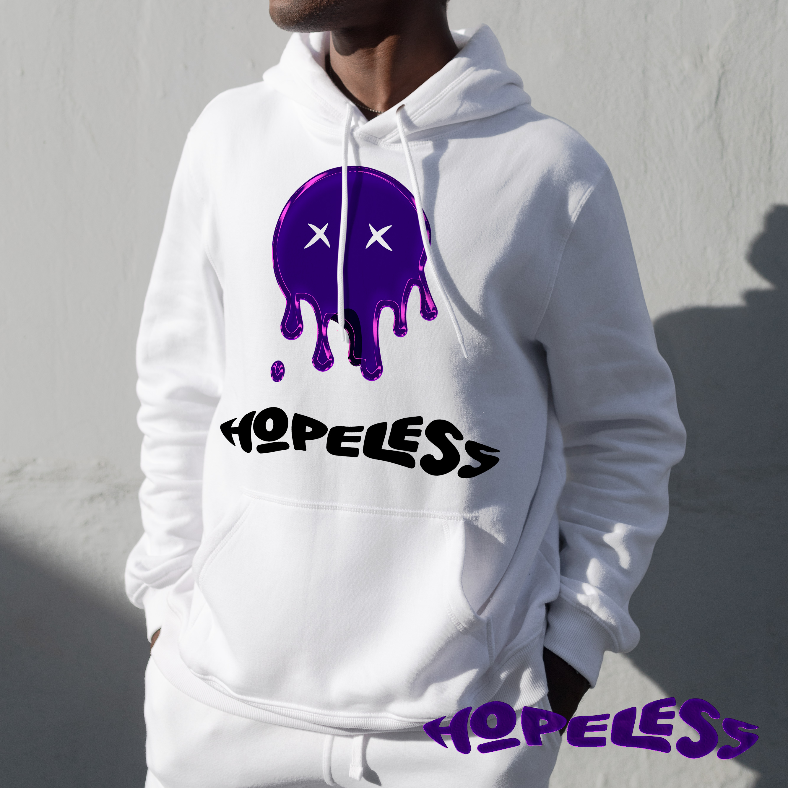
Logo Design for FlightShack
- Report
Krisbell • 1 year ago
I worked with a flying fish as the mascot logo, tried to keep it simple and dinamic
Hi,
I'm Julius, founder of FlightShack. For a while now, I've been looking for a good logo for my business. I love mascot logos. Can you do that?
I'm Julius, founder of FlightShack. For a while now, I've been looking for a good logo for my business. I love mascot logos. Can you do that?

This is really cool and sleek. The two tone makes it look a little like a whale though you could consider darkening the bottom half of the fish.
1 year ago by Sarah Cannon - Reply
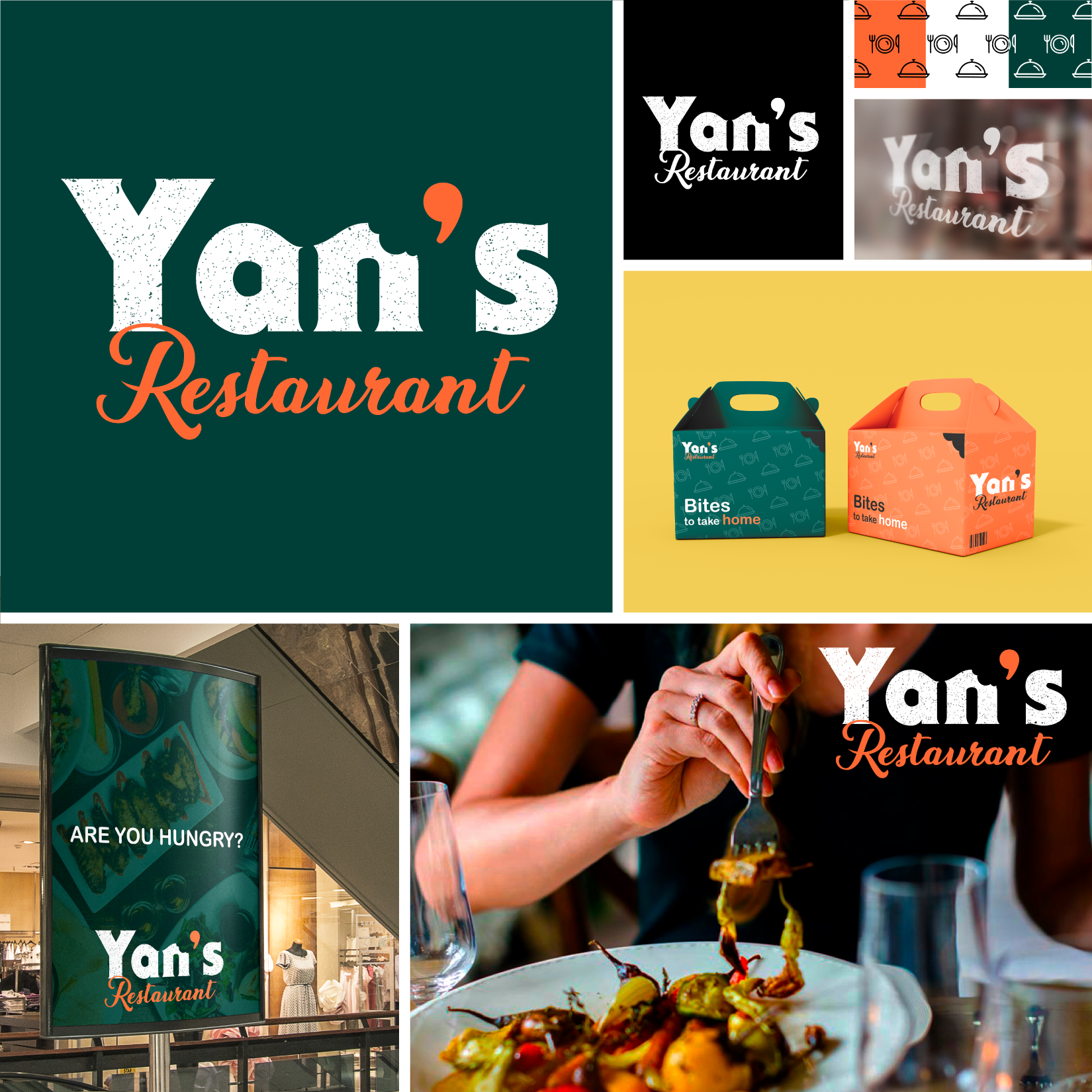
Logo Design for Yan's Restaurant
- Report
Krisbell • 1 year ago
Hope you're doing great!
I tried to use organic and simple shapes, just as the colors. Let me know what you think or how can I improve it :)
I tried to use organic and simple shapes, just as the colors. Let me know what you think or how can I improve it :)
Hey There,
I am Yan, founder of Yan's Restaurant. We are looking for someone that can design a professional logo for our business. I think a wordmark would look cool. We would love to work with you!
I am Yan, founder of Yan's Restaurant. We are looking for someone that can design a professional logo for our business. I think a wordmark would look cool. We would love to work with you!

I´m not an expert, but i do like the colors you choose, not much the font for Restaurant. Overall looks more like a fast food desing rather than a restaurant (to me a restaurant is more elegant and formal). Hope this help you!
1 year ago by Jesica Solange Piuma - Reply
Thank you so much, your opinion is very helpful to me! :)
1 year ago by Krisbell - Reply
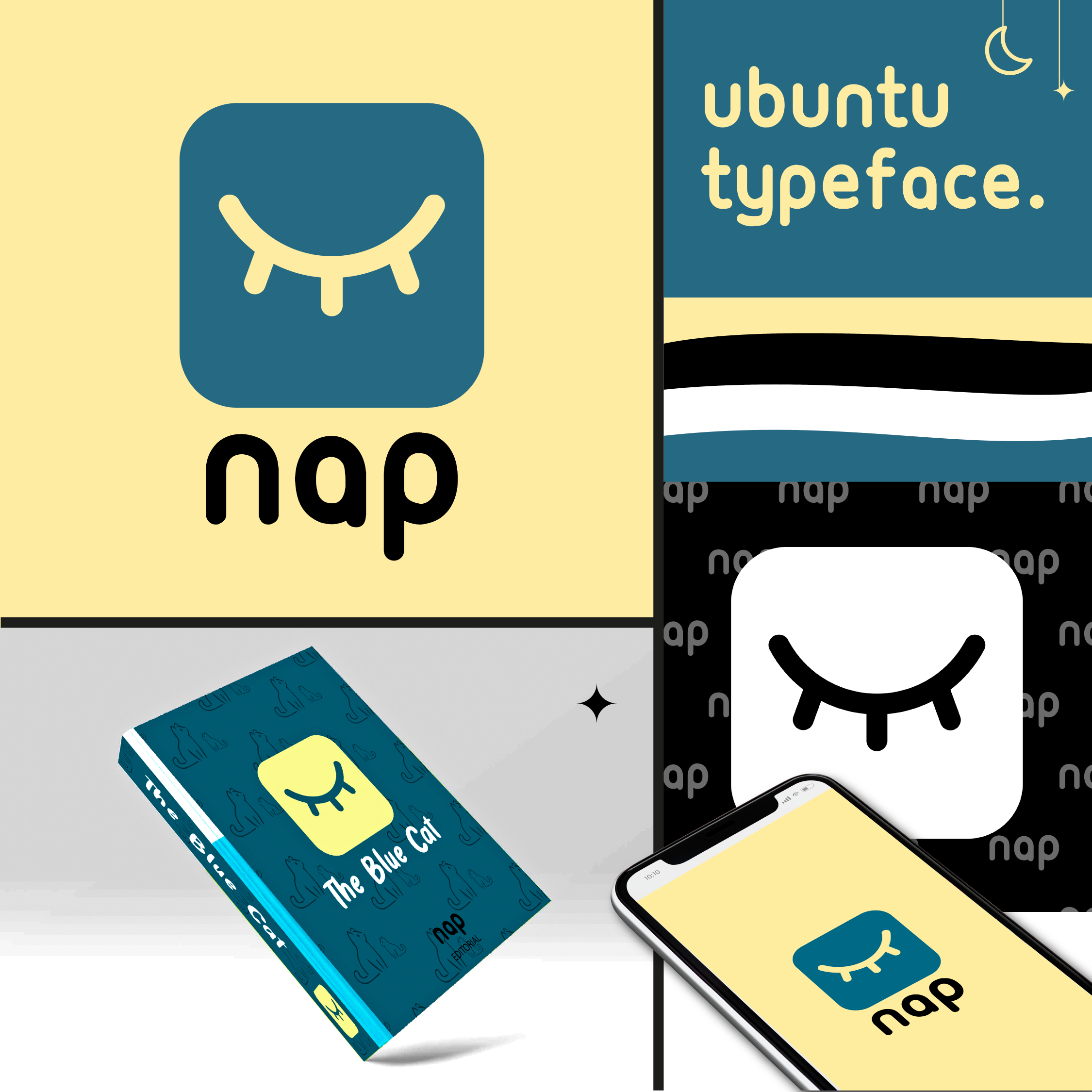
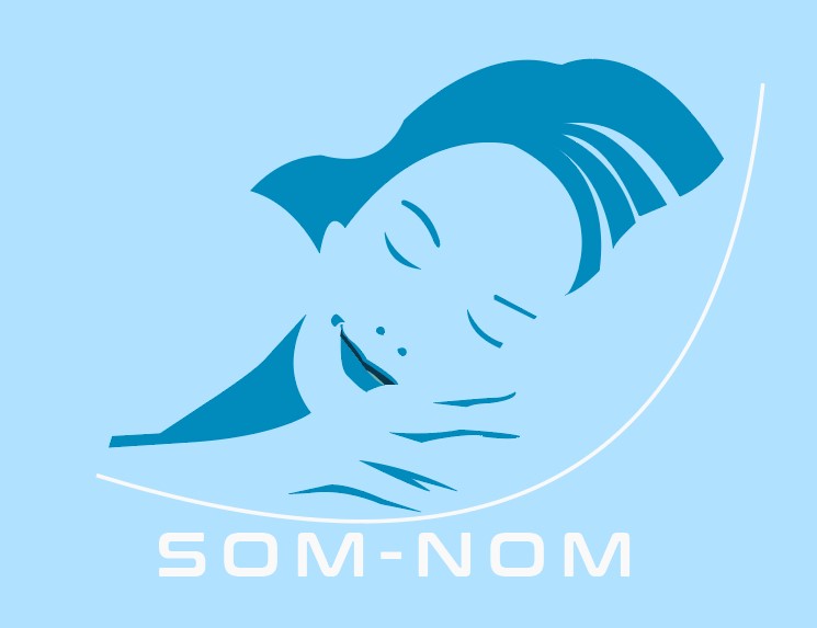
Logo Design for Nap
- Report
Krisbell • 1 year ago
This is a book's company, they specialize on stories for going to sleep. I used calming colors and simple shapes
Hey,
I'm Rhett, creator of Nap. I'm looking for someone that can create a simple logo for my business. I like pictorial marks. Can you do that?
I'm Rhett, creator of Nap. I'm looking for someone that can create a simple logo for my business. I like pictorial marks. Can you do that?

Nice work, i love the solution
1 year ago by Levi Cupul - Reply