Garett Noll
Posts
0
Likes
0
Liked Posts
0
Given Feedback
7
Feedback
I think the icon is a bit chaotic but its a good concept

1 year ago by Garett Noll
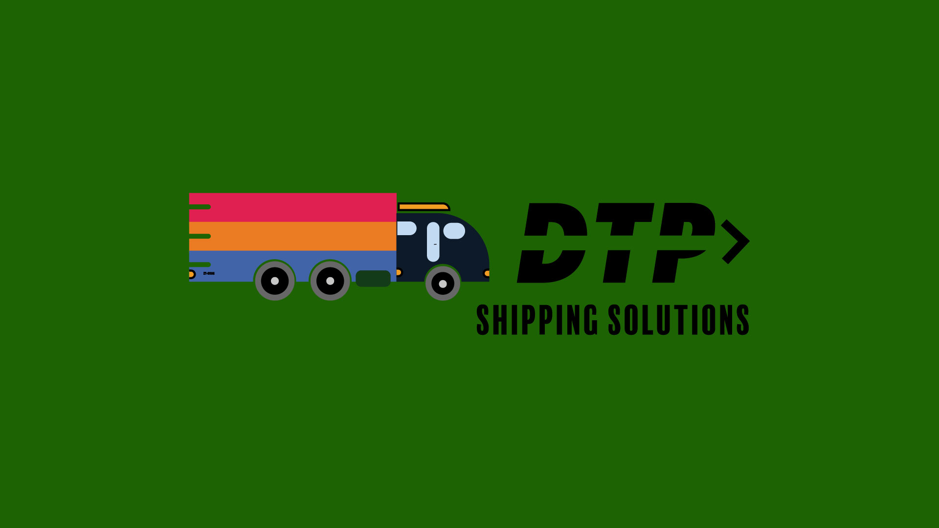
I think the truck should be removed It ruins the scalability and is kind of pointless. I like the letter mark! I think the letter mark should be in white when using a darker background like the green you have here.
1 year ago by Garett Noll
i don't like how the logo and the type have two different shades of black. they might as well be the same. other than that, i like the design.

1 year ago by Garett Noll
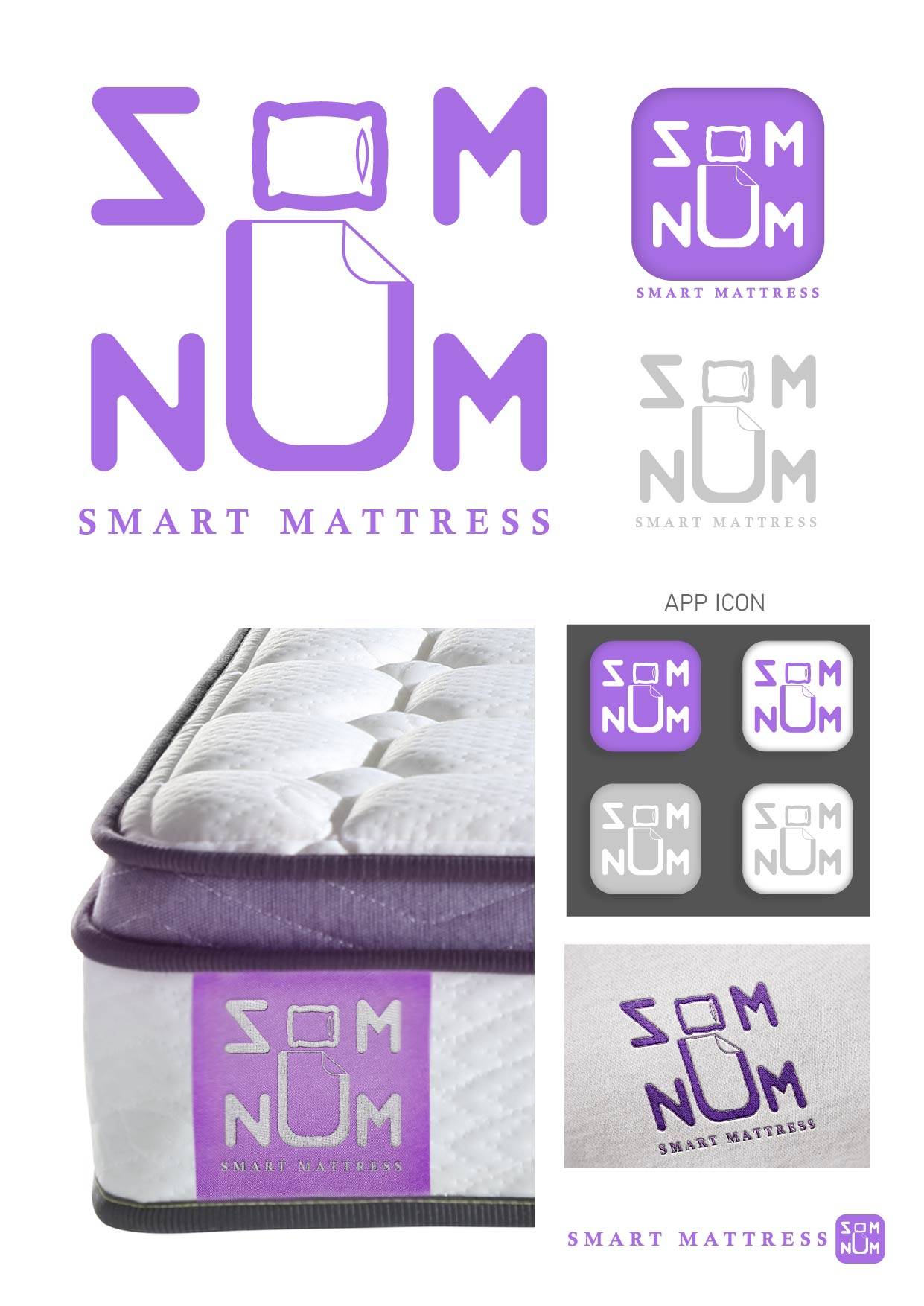
I like the proof of it actually embroidered on the mattress, however the logo and type have a lot of inconsistencies, for instance the weight of the line of the O/pillow is not the same as the text.
1 year ago by Garett Noll
A main point of this logo was to be simple so it can be easily embroidered, I don't think this fits that. Removing the gradient and the extra lines at the bottom would be a good start towards simplifying it

1 year ago by Garett Noll
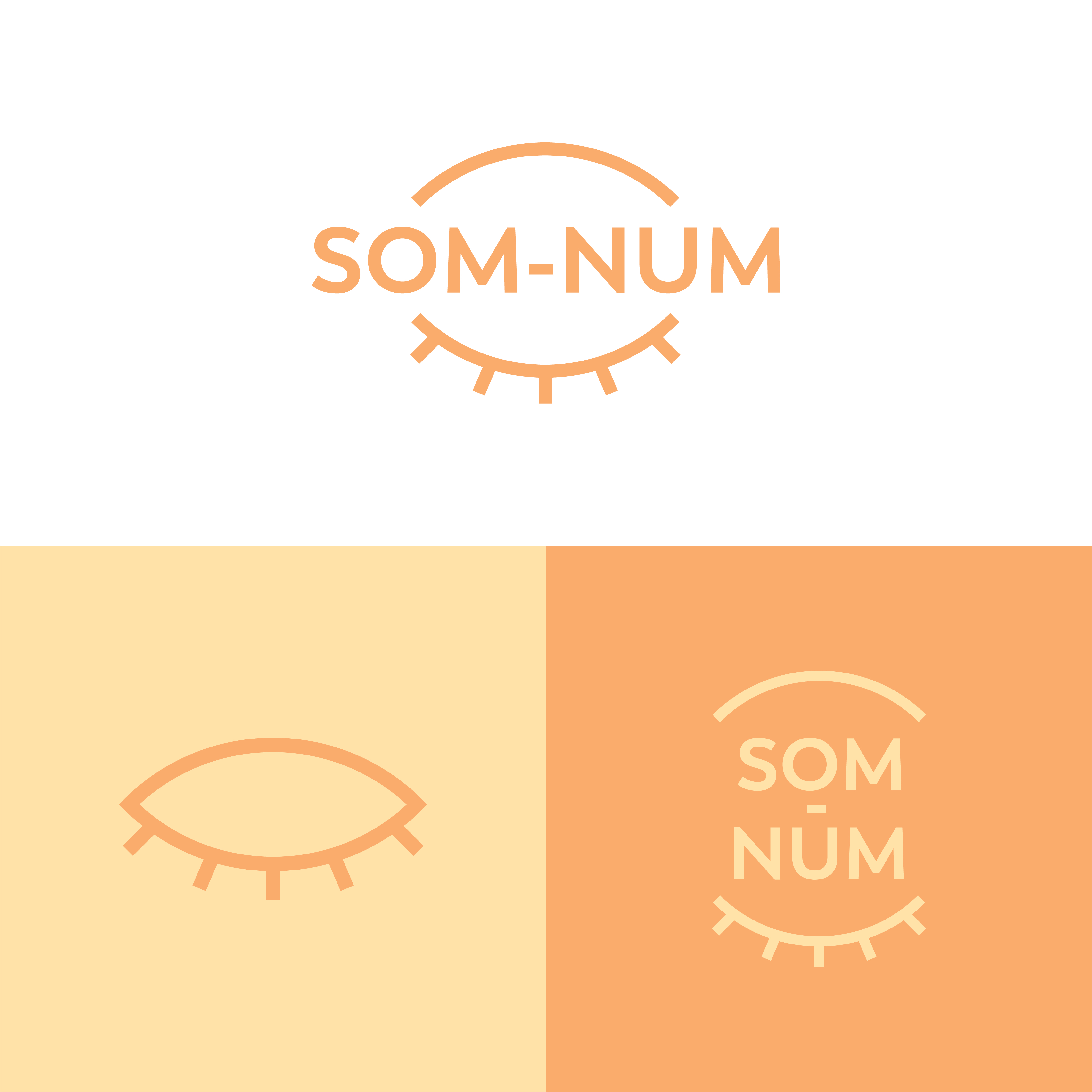
the colors make me think of day. Second its driving crazy that the letters aren't in line
1 year ago by Garett Noll
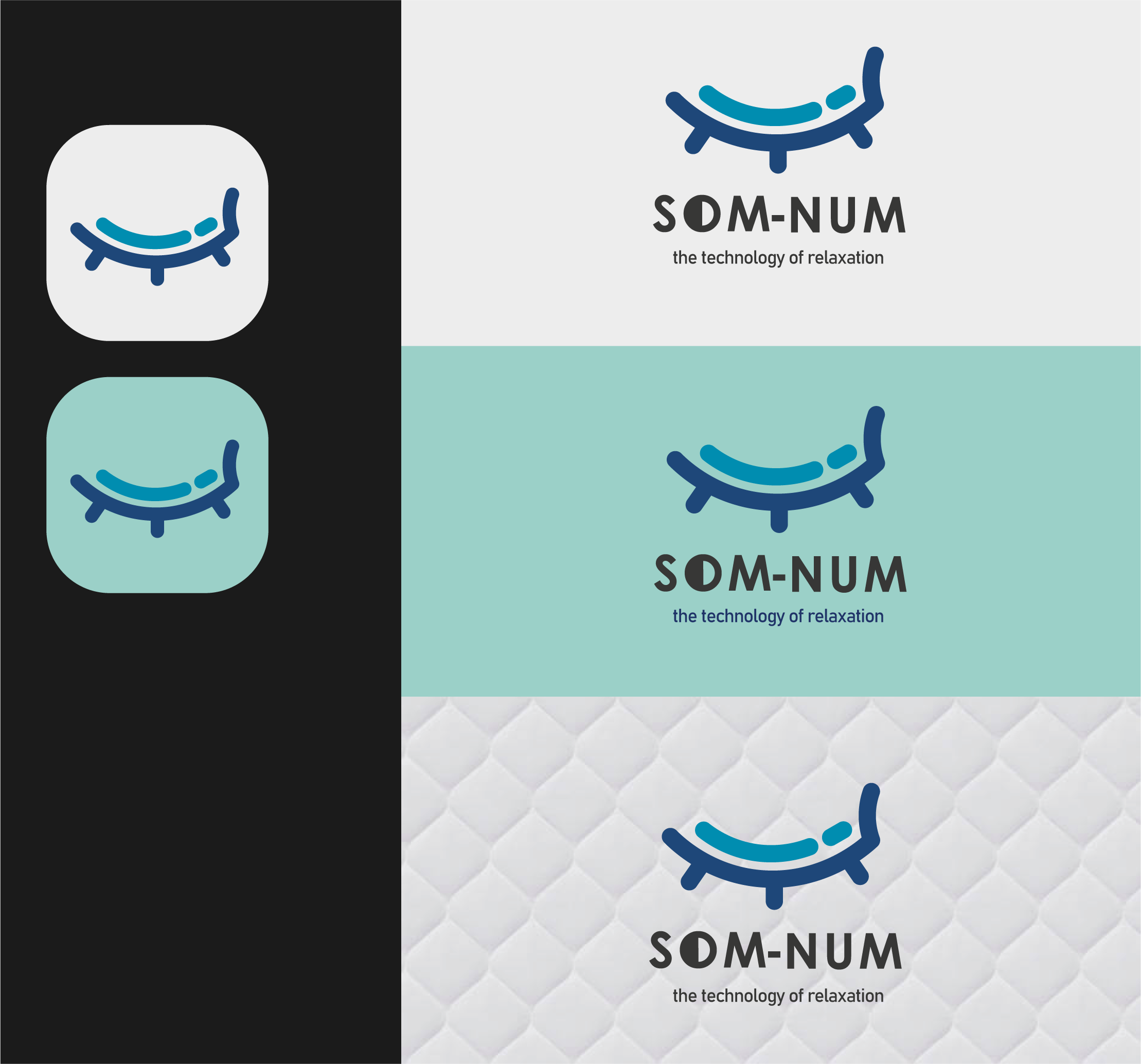
My only critique would be to make the icon a bit smaller when with the text, the weight of the lines in the logo should generally be pretty close to the weight of the text
1 year ago by Garett Noll