Sasha Stevens
Posts
13
Likes
11
Liked Posts
97
Given Feedback
34
Feedback
Thanks mate

1 month ago by Sasha Stevens
Thank you!!!
1 month ago by Sasha Stevens
Thank you!!!
1 month ago by Sasha Stevens
Thank you!!
1 month ago by Sasha Stevens
simple catches more eyes, like the Nike brand. thank you!!!
1 month ago by Sasha Stevens
this was used by Freepik
1 month ago by Sasha Stevens
Your hierarchy is wrong
1 month ago by Sasha Stevens
nice logo tho

1 month ago by Sasha Stevens
your hierarchy is wrong
1 month ago by Sasha Stevens
So cool, I suggest taking away the orange 3 lines, because they are too distracting and overcrowding. I also suggest taking the 2nd wheat illustration out of the smaller one it's unnecessary to have it because it is overcrowded. I recommend moving the orange circle to the centre and making it slightly bigger. It's important for white space also in the logo. The typeface would be better bigger and bolder and your vector to be smaller than the typeface. The typeface doesn't match the vector you designed. Well done keep going!! There is always room for improvement!

2 months ago by Sasha Stevens
Love the colour pallet
2 months ago by Sasha Stevens
woahhhhhh!!!!!!
2 months ago by Sasha Stevens
Amazing and Vey clean!!
3 months ago by Sasha Stevens
this is beautiful
11 months ago by Sasha Stevens
i love this so much, its so pretty

11 months ago by Sasha Stevens
the thing is the logo doesn't really match the theme of the poster you doing
1 year ago by Sasha Stevens
DANMMMM so good Did you illustrate everything
1 year ago by Sasha Stevens
and yes
1 year ago by Sasha Stevens
is I did it for fun
1 year ago by Sasha Stevens
Thank you for telling me, I will take it as a complment to improve
1 year ago by Sasha Stevens
thank you!!!
1 year ago by Sasha Stevens
Thank you for your feedback I will fix it now
1 year ago by Sasha Stevens
Thank you for your feedback!! I will do
1 year ago by Sasha Stevens
I wanna animate it but my layers are a mess 😅🥲
1 year ago by Sasha Stevens
I need criticism so I can improve
1 year ago by Sasha Stevens
I need criticism so I can improve
1 year ago by Sasha Stevens
Thank you!
1 year ago by Sasha Stevens
i love the logo
1 year ago by Sasha Stevens
also keeping it too plain would be boring
1 year ago by Sasha Stevens
it has no meaning
1 year ago by Sasha Stevens
this does'nt connect with the brand at all
1 year ago by Sasha Stevens
hehe scan the QR code I dare you
1 year ago by Sasha Stevens
oh and how do you upload your work
1 year ago by Sasha Stevens
it soo cool
1 year ago by Sasha Stevens
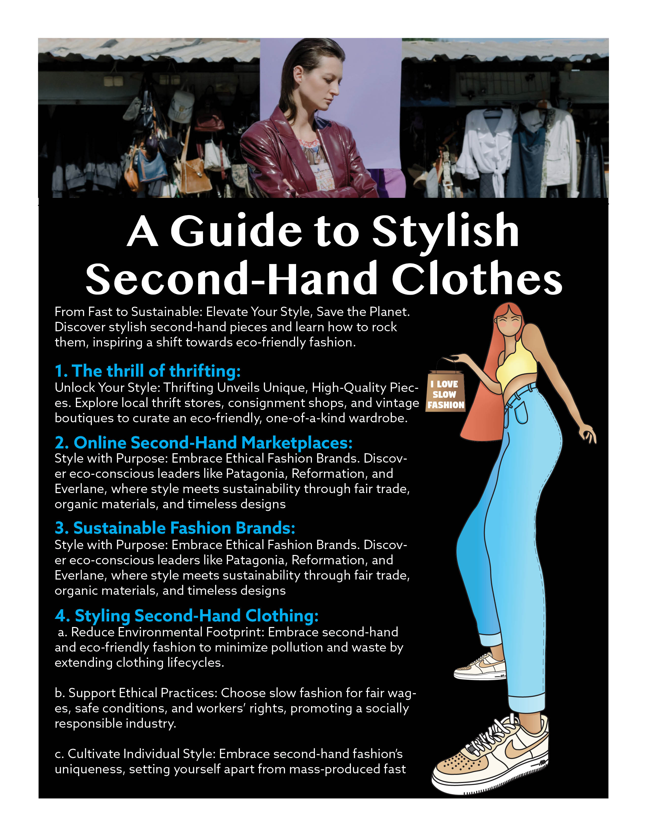
Posts
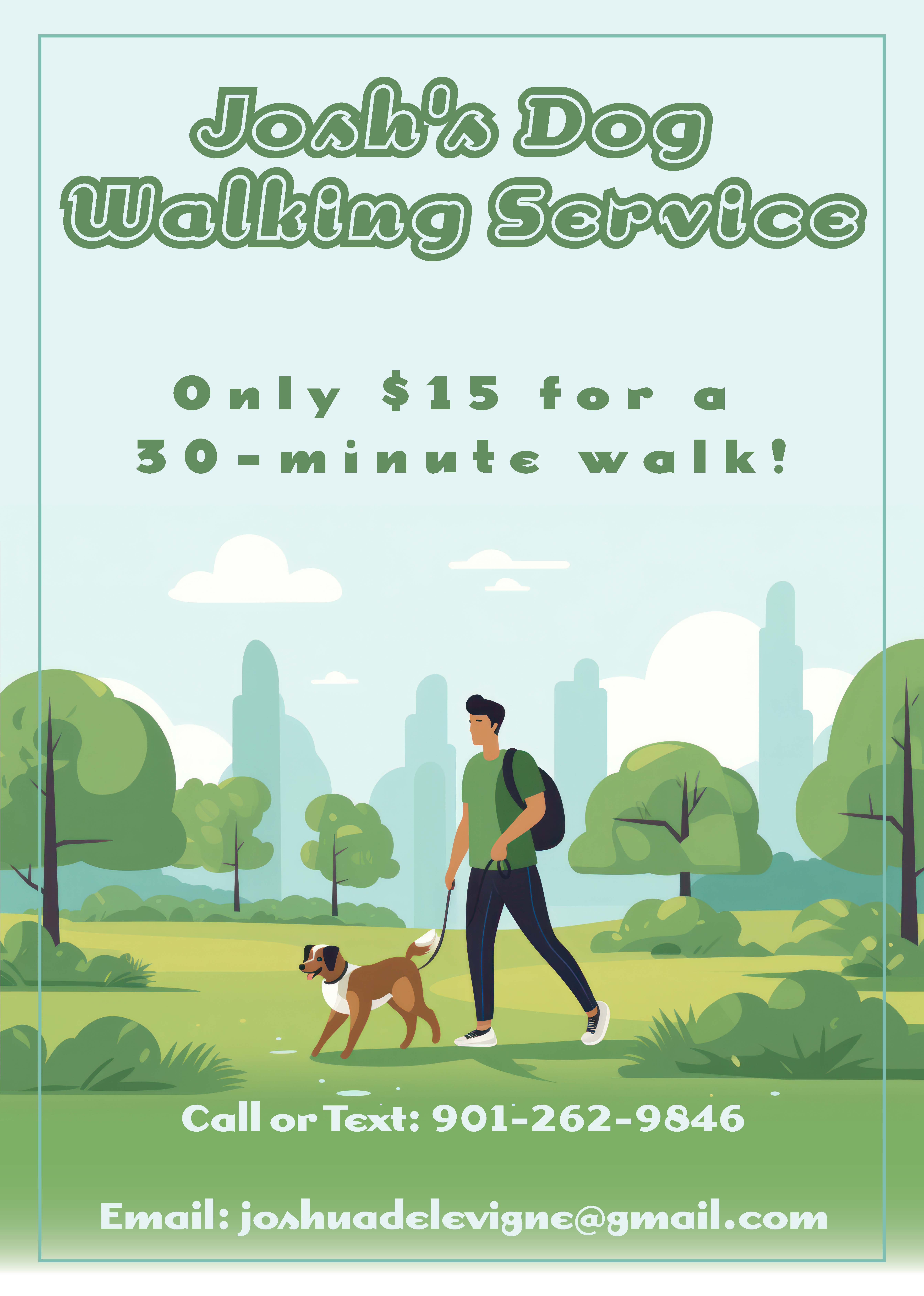
Social media Post Josh' dog walking service
- Report
Sasha Stevens • 1 month ago
I chose to do the social media post instead of a flyer because that's where the world is heading. I want to post it on my design account on Instagram, I am proud of it. 💁🏻♀️


Amazing!
1 month ago by Isha More - Reply
This is really amazing 👏
1 month ago by Taiwo Deborah Iseoluwa - Reply
Thank you!!!
1 month ago by Sasha Stevens - Reply
This is super cute!
1 month ago by Lehavah Nachalah - Reply
Thank you!!!
1 month ago by Sasha Stevens - Reply
Very nicely done mate
1 month ago by Raymond Kalama - Reply
Thanks mate
1 month ago by Sasha Stevens - Reply
This design looked simple but attentive! Love how the collars connected to the ad's headline
1 month ago by Grace Josephine - Reply
simple catches more eyes, like the Nike brand. thank you!!!
1 month ago by Sasha Stevens - Reply
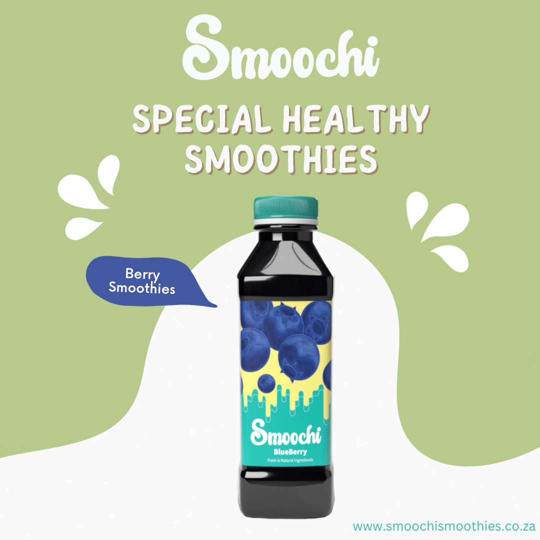
The Smooshi Blue berry smoothie
- Report
Sasha Stevens • 6 months ago
n addition to designing the package, I produced a logo in Adobe Illustrator. After that, I placed it in Adobe Dimension to bring my packaging design to life. The rest of my design process is a secret. I did not copy if. If I told you everything, it would be a 5000 or more word essay.

very cool!
6 months ago by Sir - Reply
This looks really good.
6 months ago by Cindy Wanjiru - Reply
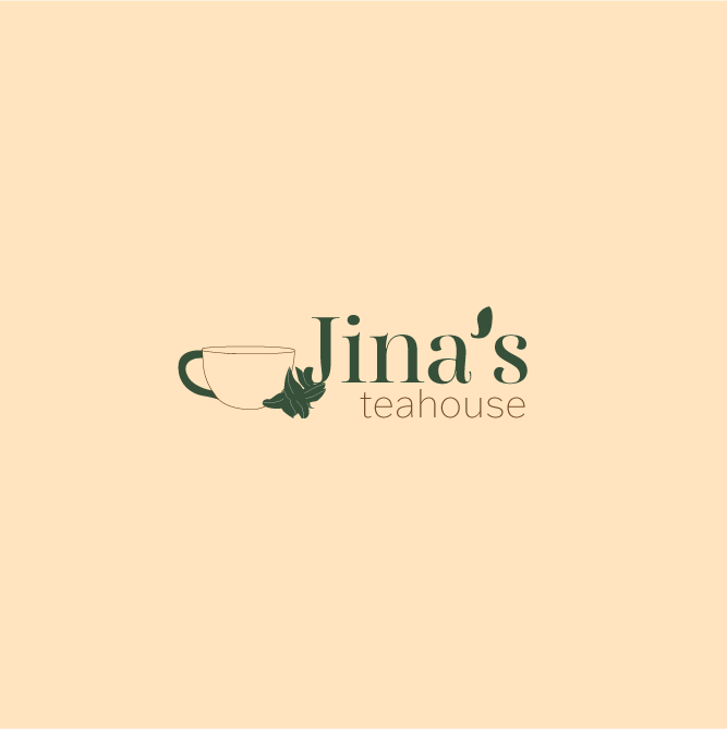
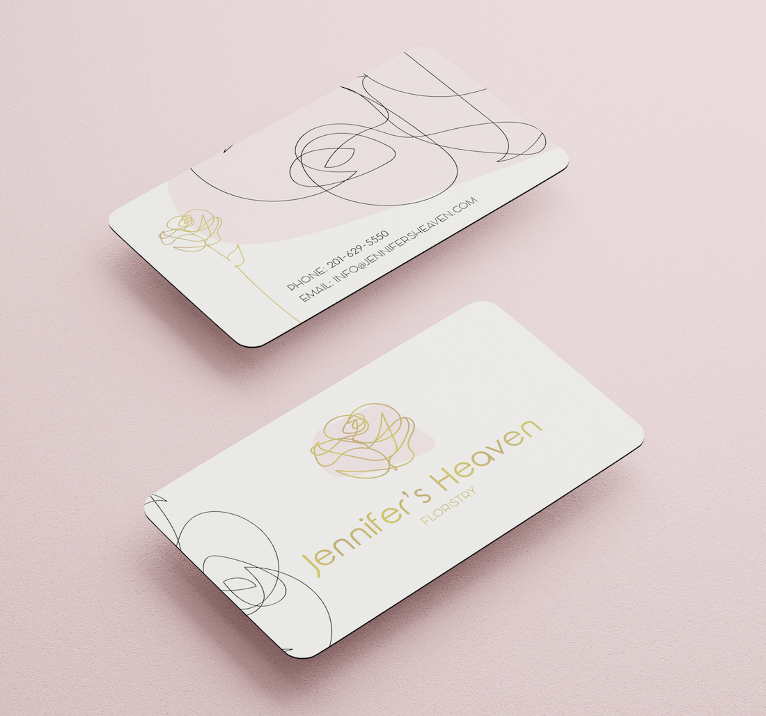
Jina TeaHouse
- Report
Sasha Stevens • 11 months ago
when I think of a tea house I think of the Asian culture, so I made my logo with Japanese vibes. I did research on which culture loves tea the most I was surprised it was Turkey.


this is really creative
11 months ago by Japheth - Reply
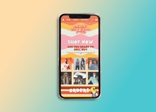

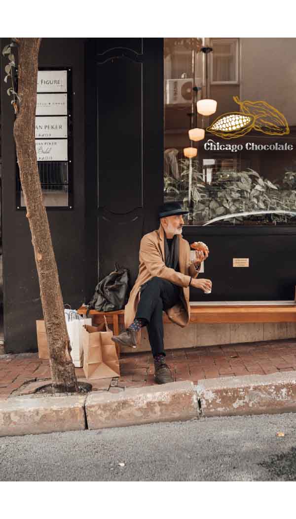
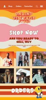
Online vintage store prt 1
- Report
Sasha Stevens • 11 months ago
I wanted it to be viby I'm gonna redo it

beautiful
11 months ago by onose - Reply