Isha More
Posts
10
Likes
10
Liked Posts
5
Given Feedback
47
Feedback
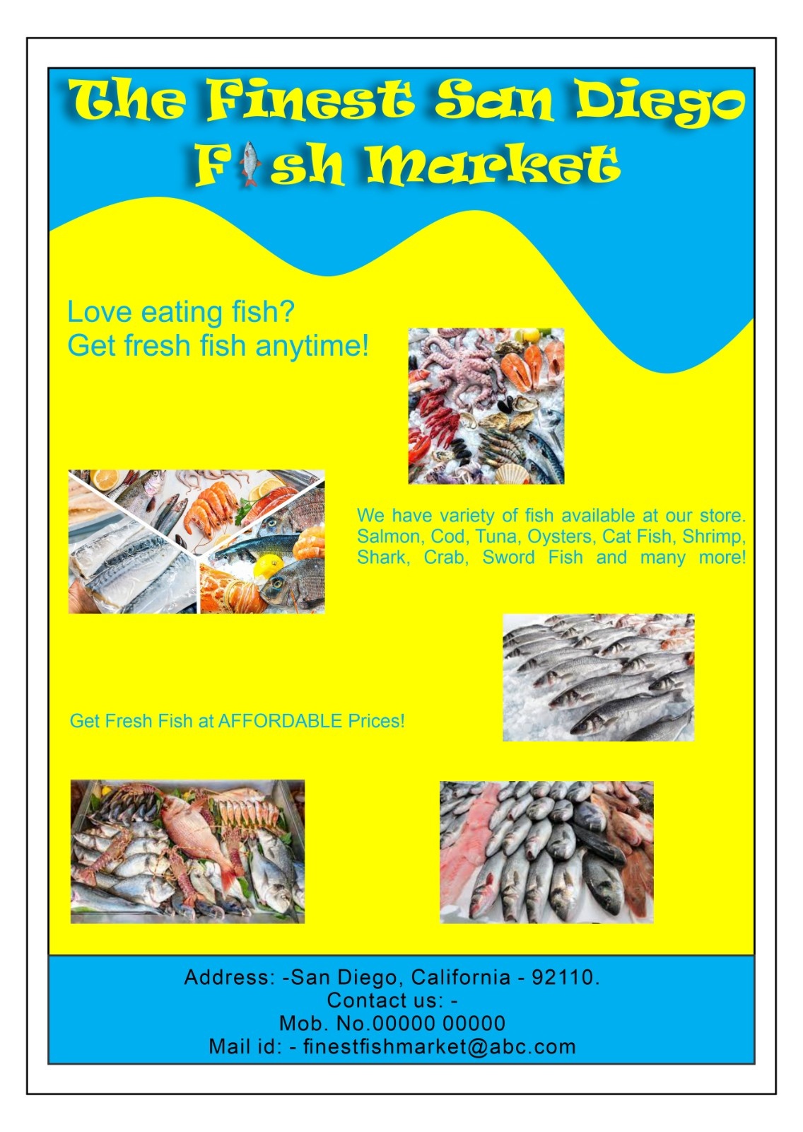
Try changing the font and their is a spelling mistake as well. By the way the logo looks good
1 month ago by Isha More
Thankyou!

2 months ago by Isha More
Thankyou!
2 months ago by Isha More
That's good!

2 months ago by Isha More
Nice!

2 months ago by Isha More
Very Good!!

2 months ago by Isha More
Okay, I won't do it again. I tried to do some modification, which certainly aren't upto the mark I guess. I'll try to make some more vectors without doing "that"😅
2 months ago by Isha More
Thankyou!
2 months ago by Isha More
Thankyou so much.

2 months ago by Isha More
It is good, but it would have looked more beautiful if the logo was there.

2 months ago by Isha More
Thankyou for telling
2 months ago by Isha More
Thankyou
2 months ago by Isha More
Loved it!
2 months ago by Isha More
Which software did you used to create this poster? Please tell.
2 months ago by Isha More
Wow!! I loved the text shadow, the blurred leaf effects and the pancake looks very delicious😋
2 months ago by Isha More
I loved the Logo.
2 months ago by Isha More
Amazing!
2 months ago by Isha More
I loved it!
2 months ago by Isha More
It looks beautiful!
2 months ago by Isha More
I loved the front side, but I think the back side should also be landscape.
2 months ago by Isha More
This one is good.

2 months ago by Isha More
Ultimate. I loved it.
2 months ago by Isha More
Good
2 months ago by Isha More
Try changing the colour combination.
2 months ago by Isha More
Thankyou Very Much😊
2 months ago by Isha More
Thankyou
2 months ago by Isha More
This looks good.
3 months ago by Isha More
Thankyou.
3 months ago by Isha More
Good.

3 months ago by Isha More
Thanks for the feedback. Actually, in the previous post, I had used some other fonts. But, in feedbacks section, I received some suggestions to try changing the fonts. So, yes. That's the reason I chose the different font style than the previous one. If it is not looking appropriate, I'll try using some other font style.
3 months ago by Isha More
Thanks.
3 months ago by Isha More
I agree. The text 'burger' is hiding the text behind it.
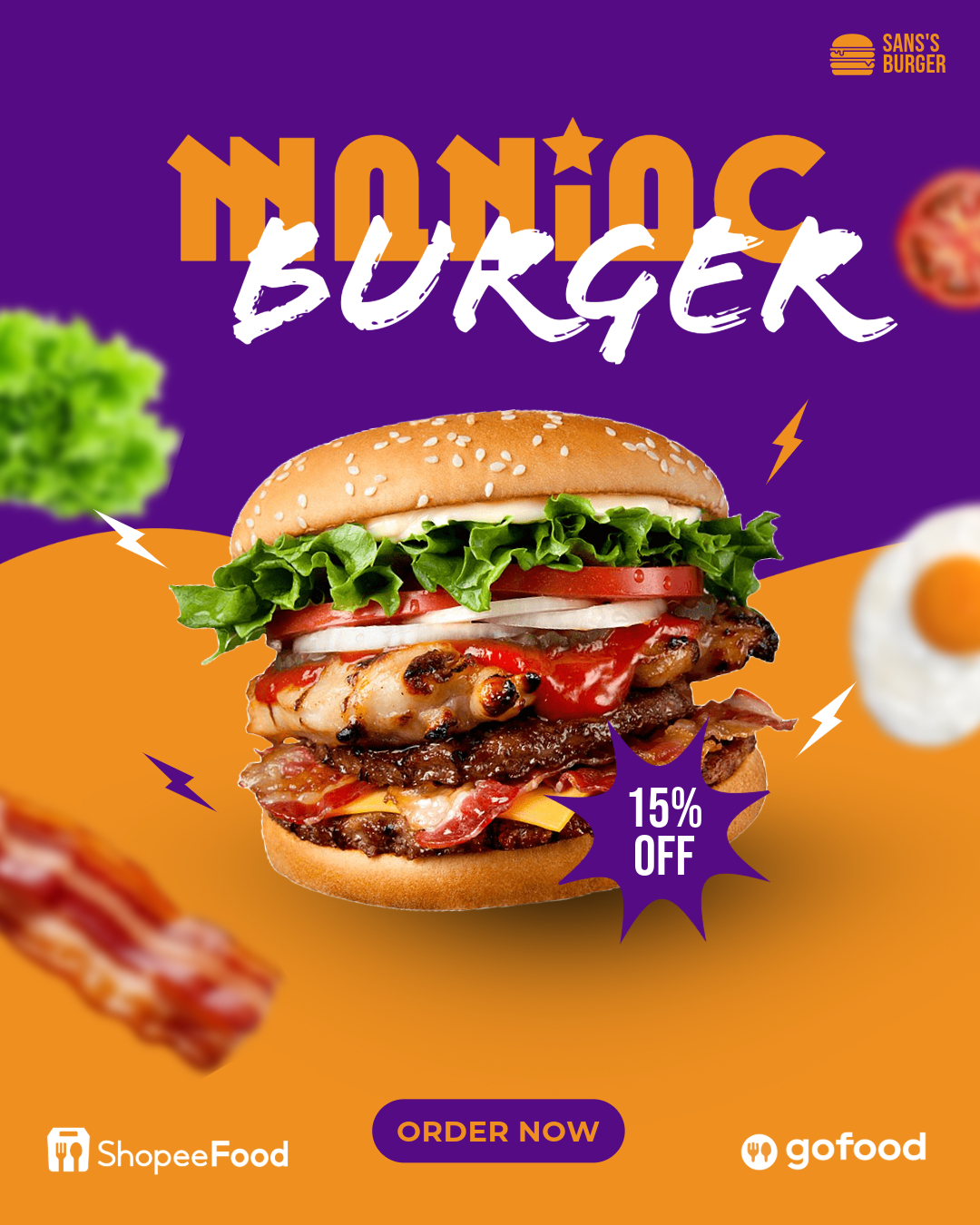
3 months ago by Isha More
Simple and Perfect.
3 months ago by Isha More
Thankyou
3 months ago by Isha More
Thankyou
3 months ago by Isha More
Thankyou for the feedback Devi and Jess Watson. I'll re-make it.
3 months ago by Isha More
Thankyou.
3 months ago by Isha More
Thankyou.
3 months ago by Isha More
Nice. It would have looked more attractive if the buns were brown.
3 months ago by Isha More
I didn't understood the description, but this is Wow!!!

3 months ago by Isha More
It looks pretty.

3 months ago by Isha More
Thankyou.
3 months ago by Isha More
Thanks for your feedback. I'll try to redo it again.
3 months ago by Isha More
I loved the Typography. It's Amazing!!

3 months ago by Isha More
This looks beautiful.

3 months ago by Isha More
Thankyou for the feedback. But I didn't understood about - "pay atention at the margins and create a pattern to the project". Will you please explain?
3 months ago by Isha More
Simple. Sober. Yet good looking.

3 months ago by Isha More
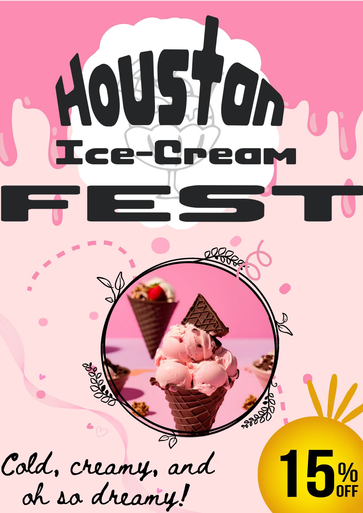
Posts
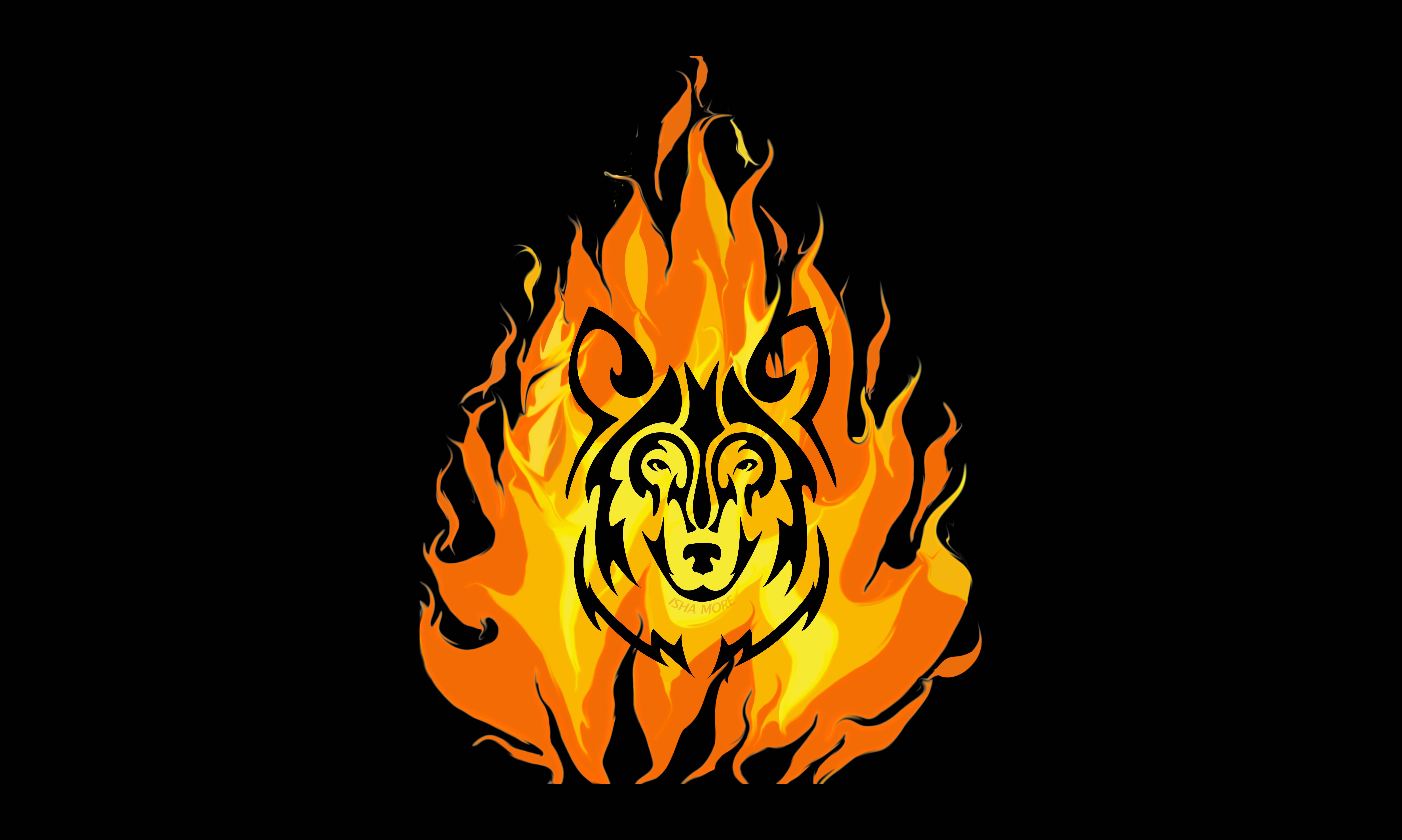
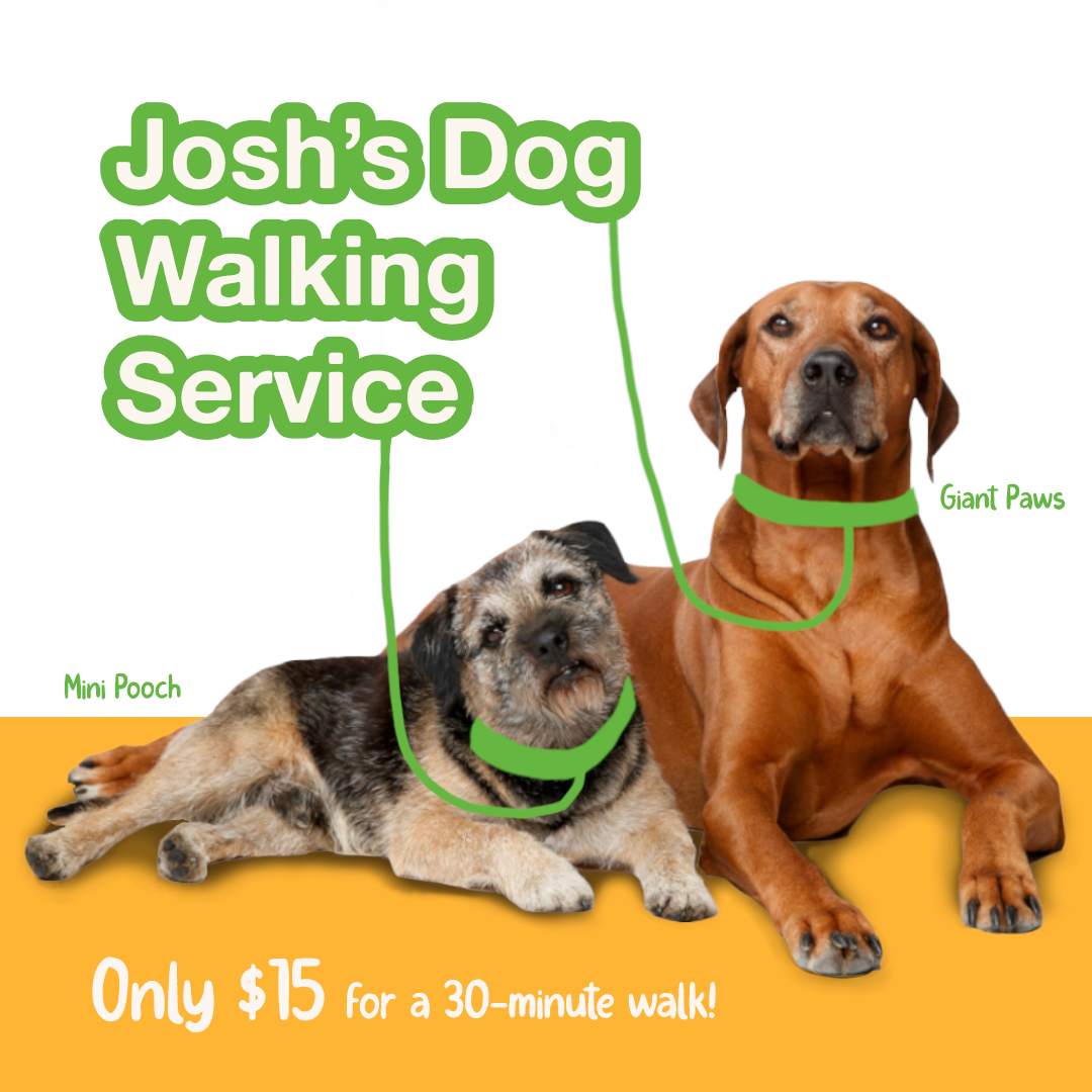
The Fierce Cat
- Report
Isha More • 2 months ago
Feedback Please.


It's cute just keep going
2 months ago by Lehavah Nachalah - Reply
Thankyou!
2 months ago by Isha More - Reply
Make design readable and your font is not readable.
2 months ago by Pratik - Reply
So first of all I think the font is completely wrong, try to find something that screams fierceness but is way more readable. Either place it in the logo or give it some breathing room and place it underneath. Also im pretty sure you just took a vecteezy lion and added whiskers. (Don't do that)
2 months ago by Sverre Stollman - Reply
Okay, I won't do it again. I tried to do some modification, which certainly aren't upto the mark I guess. I'll try to make some more vectors without doing "that"😅
2 months ago by Isha More - Reply

Vector Image
- Report
Isha More • 2 months ago
Hello Friends, I've tried to create this Vector Image. Feedback Please.

Nice work!! The silhouette is on point
2 months ago by fazrian maulana - Reply
Thankyou
2 months ago by Isha More - Reply
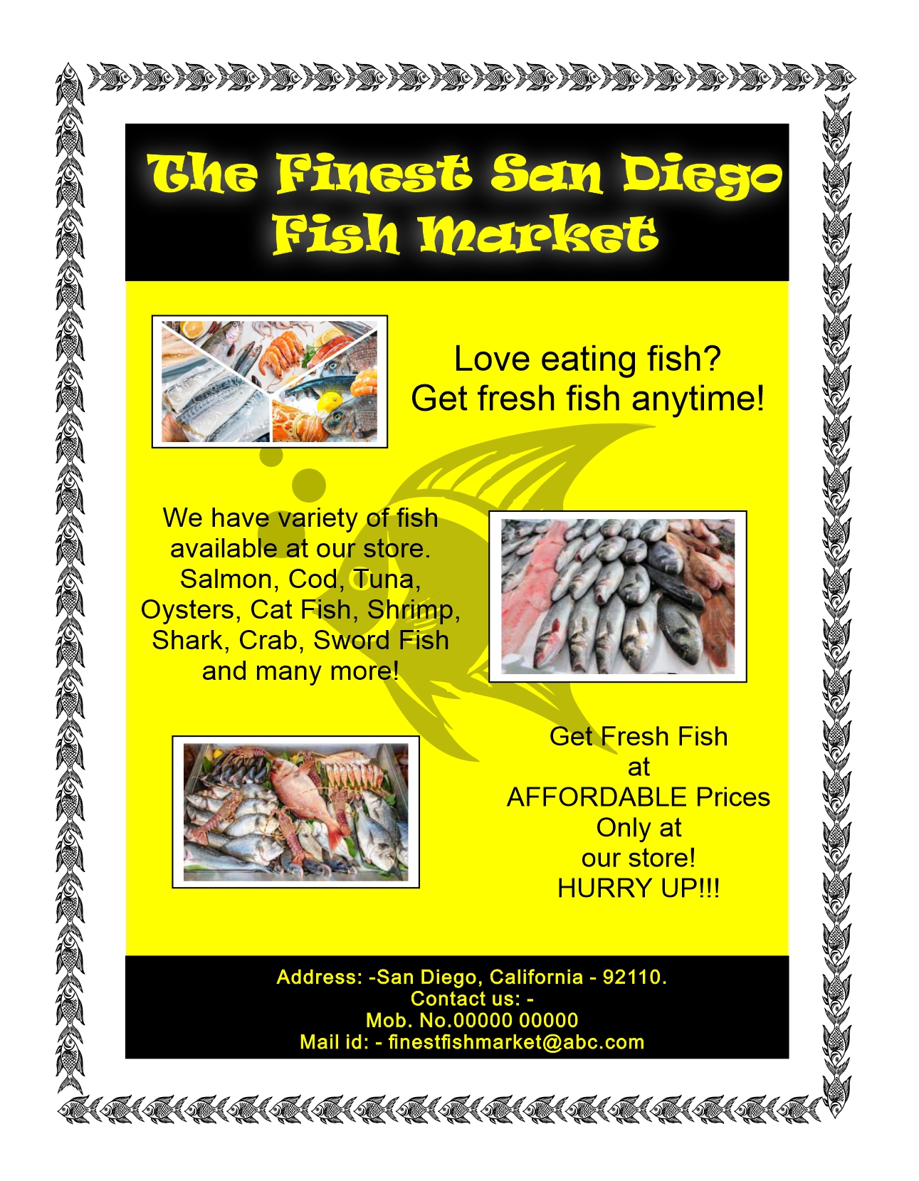
Sube Insurance Company
- Report
Isha More • 2 months ago
I've took some help from Canva. Tell me how you find it.
Hey There,
I am Leona, I just founded a new business called Sube. For a while now, I've been looking for a good designer for my insurance company. We will need a poster to advertise our business. Can you do that?
I am Leona, I just founded a new business called Sube. For a while now, I've been looking for a good designer for my insurance company. We will need a poster to advertise our business. Can you do that?


The 1st picture on top looks quite cute
2 months ago by Lehavah Nachalah - Reply
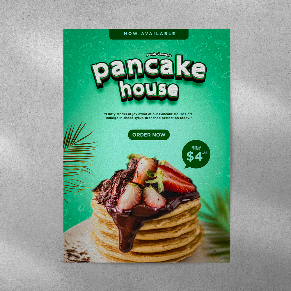
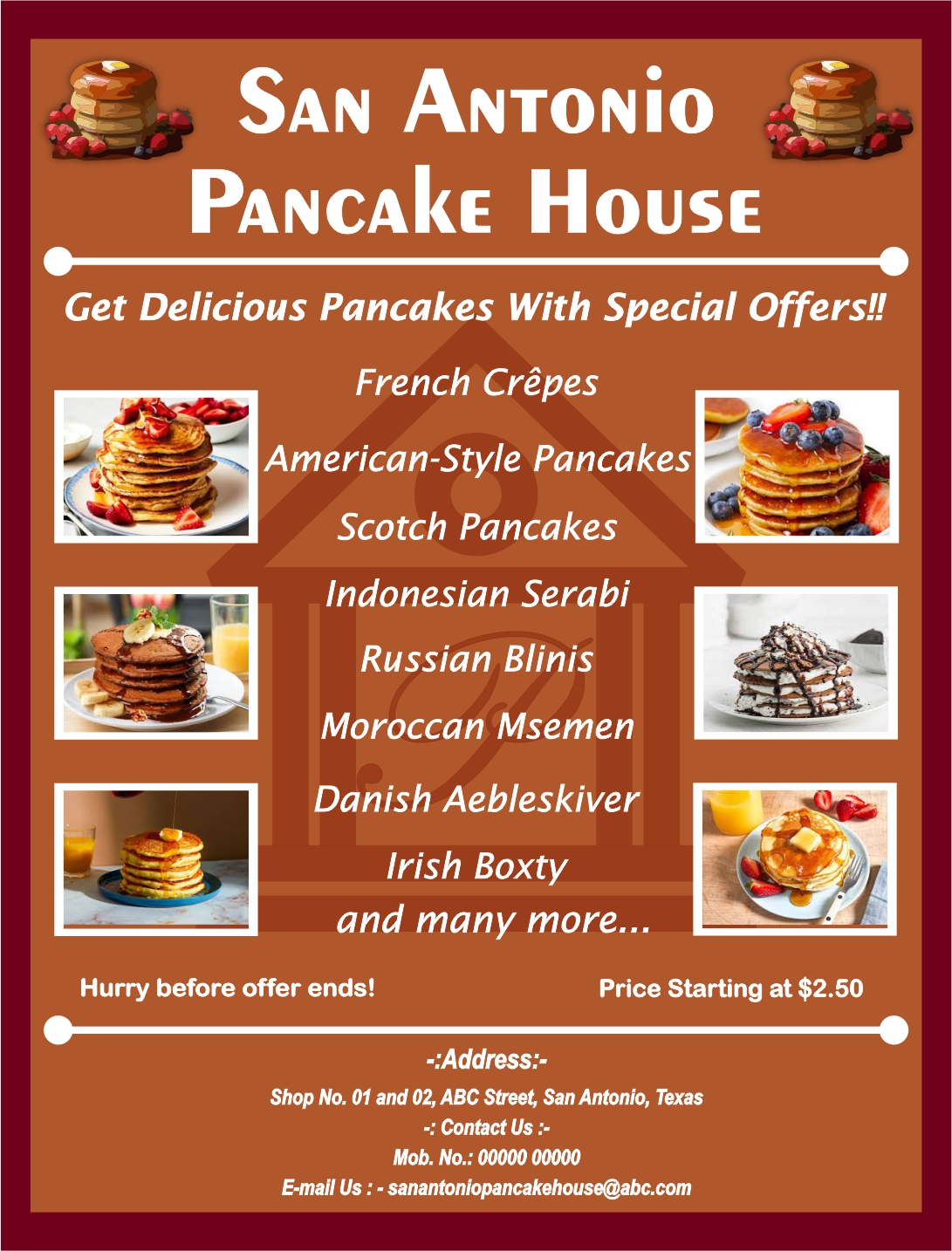
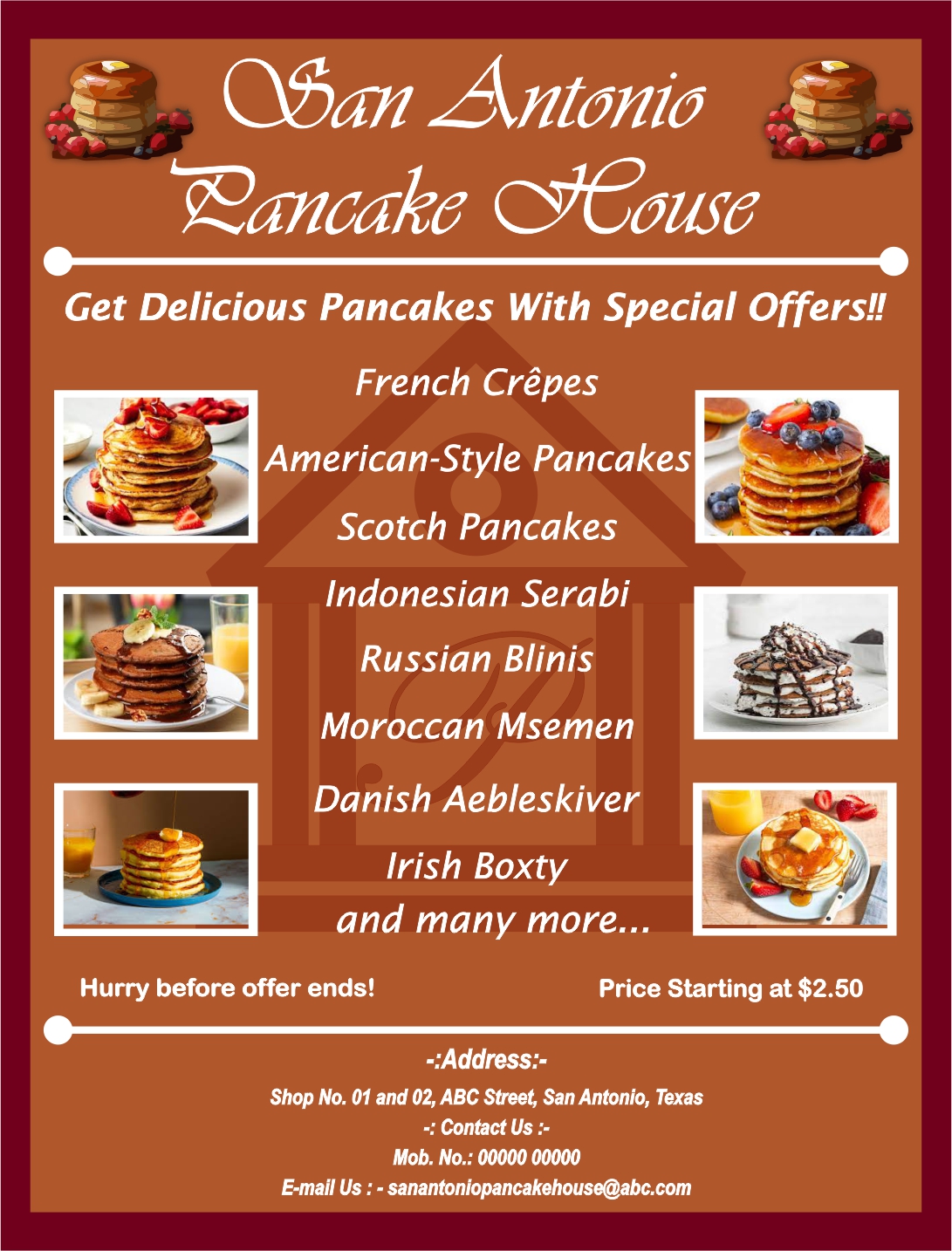
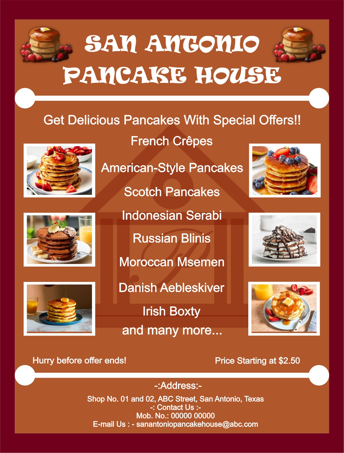
San Antonio Pancake House (Attempt-3)
- Report
Isha More • 3 months ago
This time I have used different font style for the Title (Shop's Name). Feedback Please.
Hey,
I'm Albina, I recently started a new business called San Antonio Pancake house. I'm looking for someone that can design something for my Pancake house. We will need a poster to advertise our business. Can you do that?
I'm Albina, I recently started a new business called San Antonio Pancake house. I'm looking for someone that can design something for my Pancake house. We will need a poster to advertise our business. Can you do that?
)
I like this one much more than the other fonts you have used.
2 months ago by Bobbie Hall - Reply
Thankyou Very Much😊
2 months ago by Isha More - Reply
Well laid out. The brown background makes the photos of the pancakes stand out.
2 months ago by Bobbie Hall - Reply
Thankyou
2 months ago by Isha More - Reply
well aligned and beautiful
3 months ago by Comfort Ndifon - Reply
Thankyou.
3 months ago by Isha More - Reply