Sir
Posts
3
Likes
12
Liked Posts
4
Given Feedback
10
Feedback
so cool!! super efficient and eye-catching logo
4 months ago by Sir
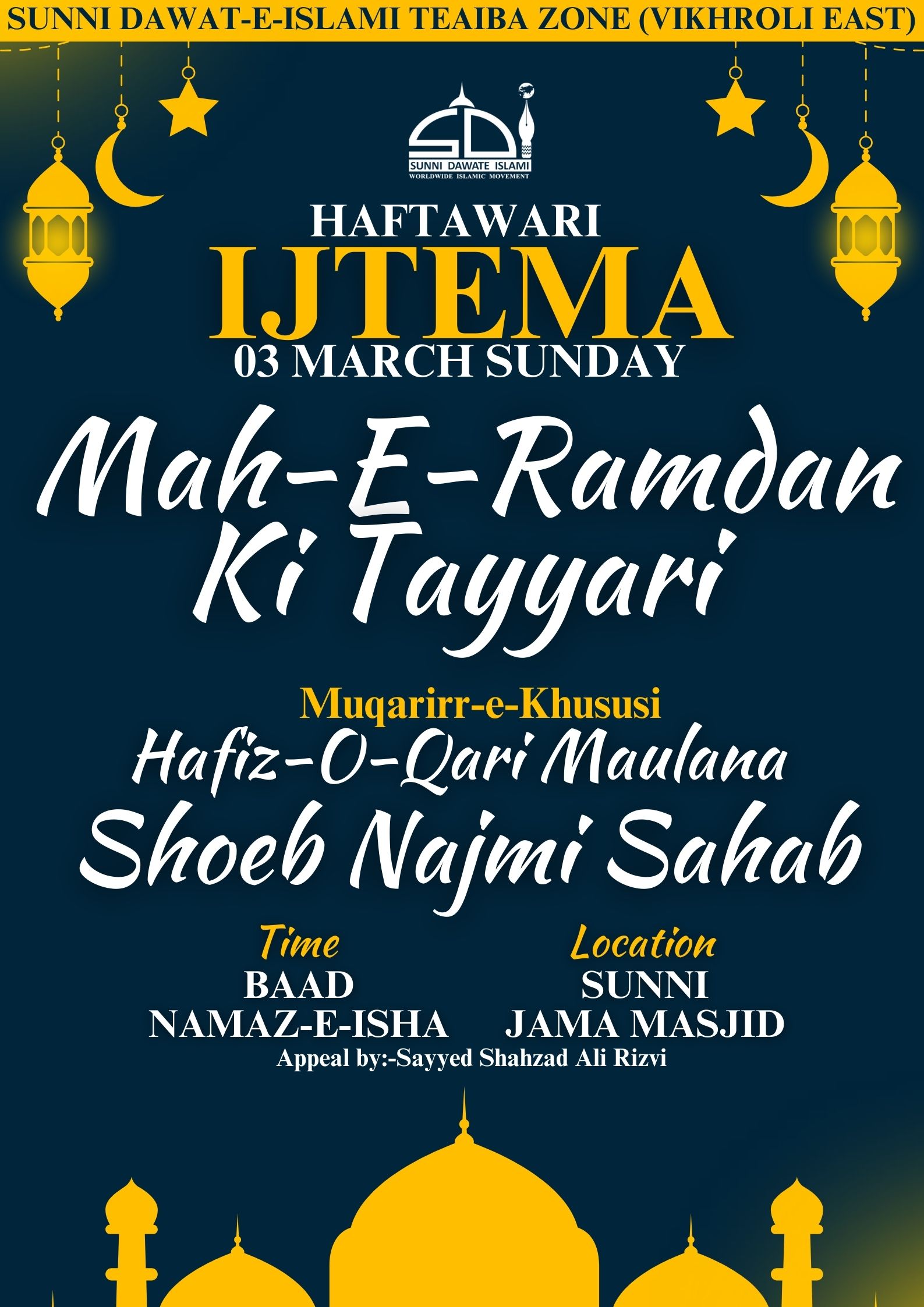
it's a good start but maybe there's a bit too much information on the poster?
4 months ago by Sir
very clean design!
5 months ago by Sir
This logo is very cool, i like the color combination you chose and clever to make a secondary one for social media. I would even say you only need that one!
6 months ago by Sir
cheers!!
6 months ago by Sir
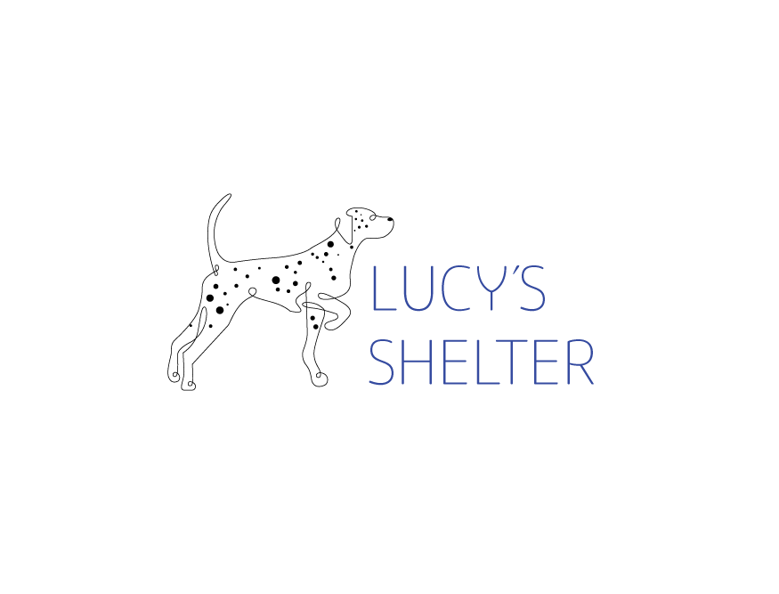
the dog is super cool, i like the one line design! I like that it's looking towards something gives the idea of going somewhere and also draws the eye to the name. I think it might be good to have the name bigger to be more balanced against the dog's size, and also maybe a bolder font with a color less close to the black?
6 months ago by Sir
thank you so much i appreciate the detailed feedback!! :)
6 months ago by Sir
thank you so much! it was my first try so it's nice to have positive feedback
6 months ago by Sir
very cool!
6 months ago by Sir
nice & simple :)
6 months ago by Sir
Posts
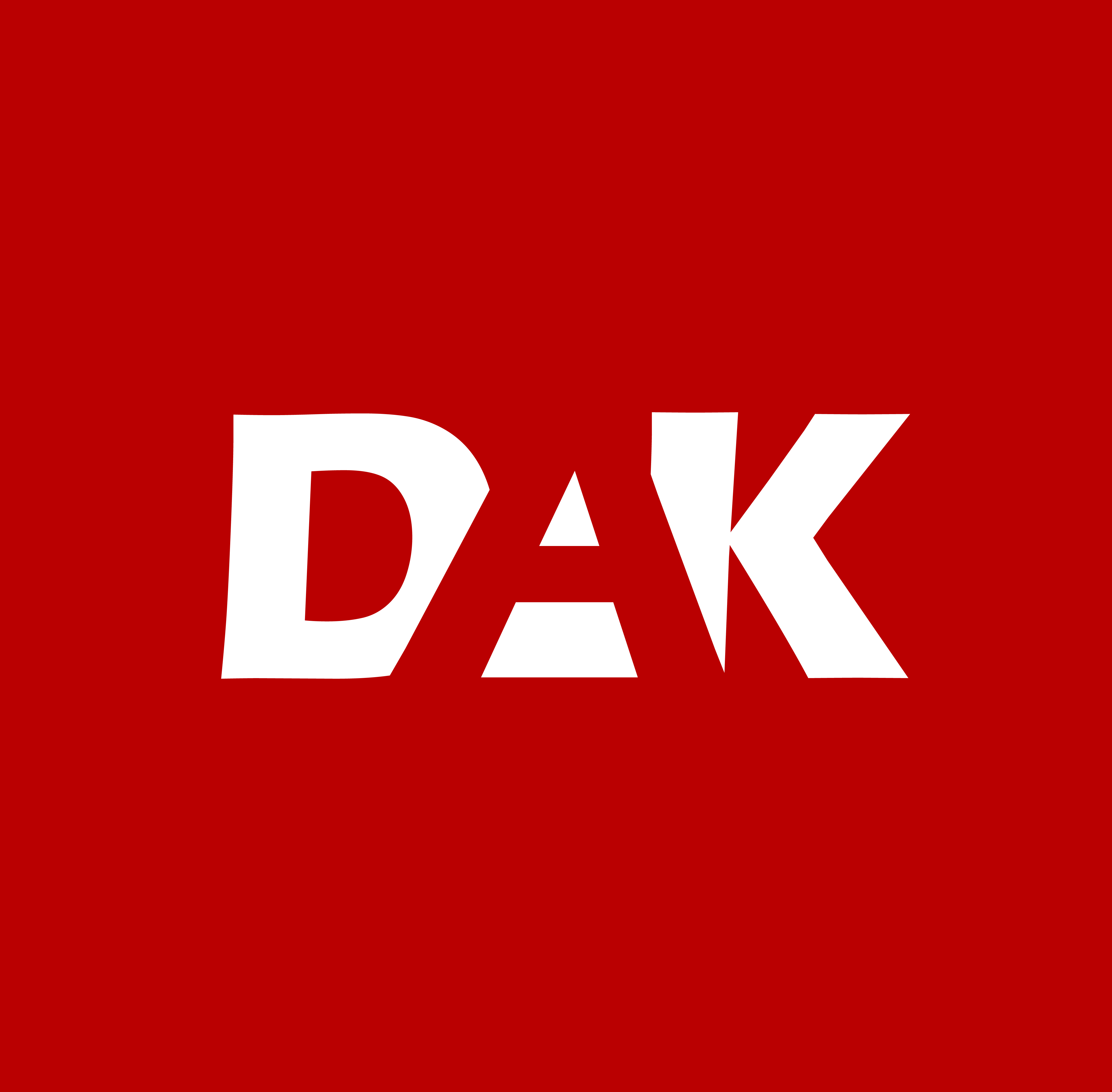
Movie Hut logo design
- Report
Sir • 4 months ago
Designed a logo for the business Movie Hut. Let me know what you think!
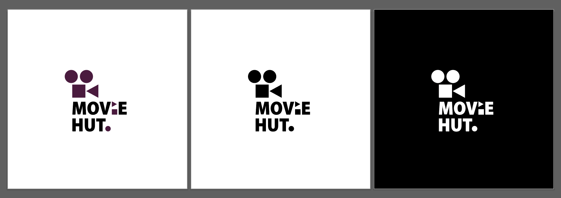


Love what you've done with the "i". Big fan, well done!
4 months ago by Cecilie - Reply
Nice
4 months ago by Ashimi Mashiat - Reply
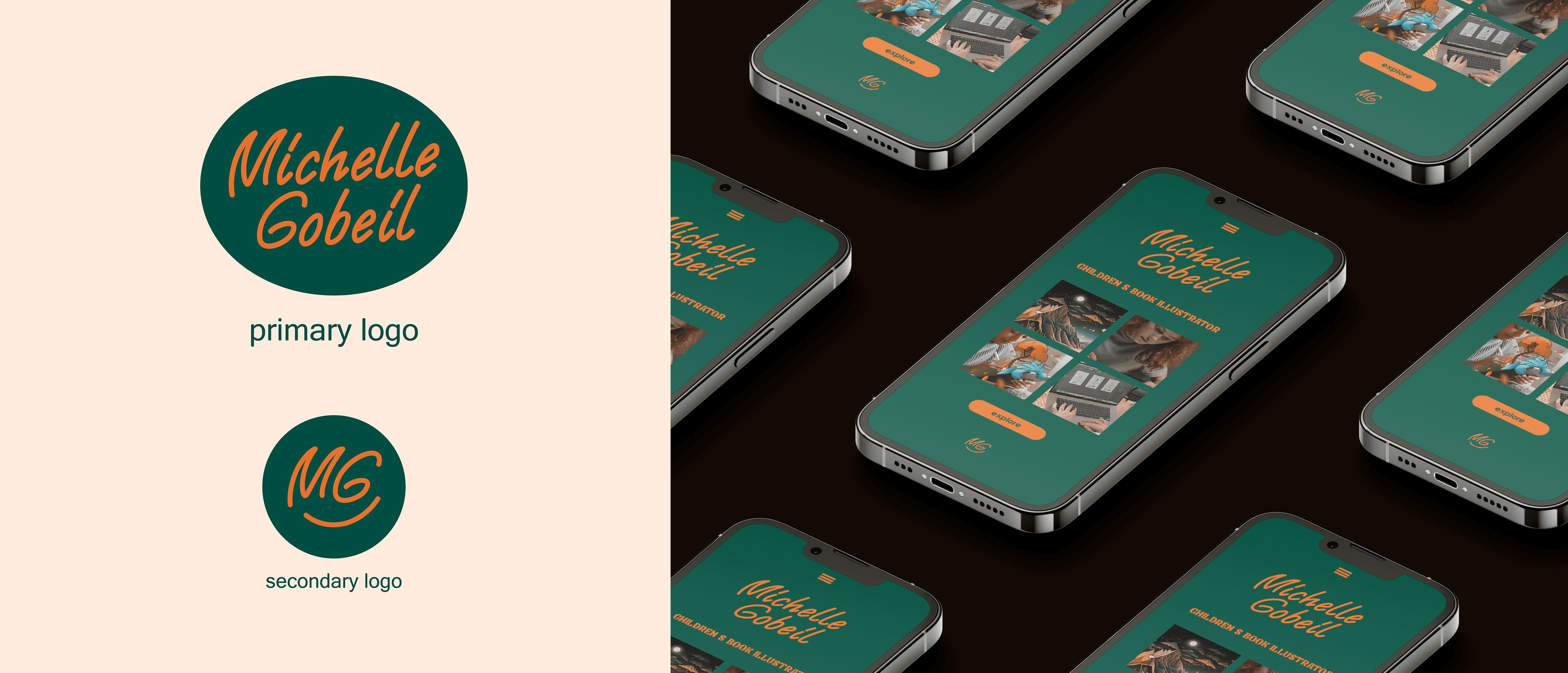
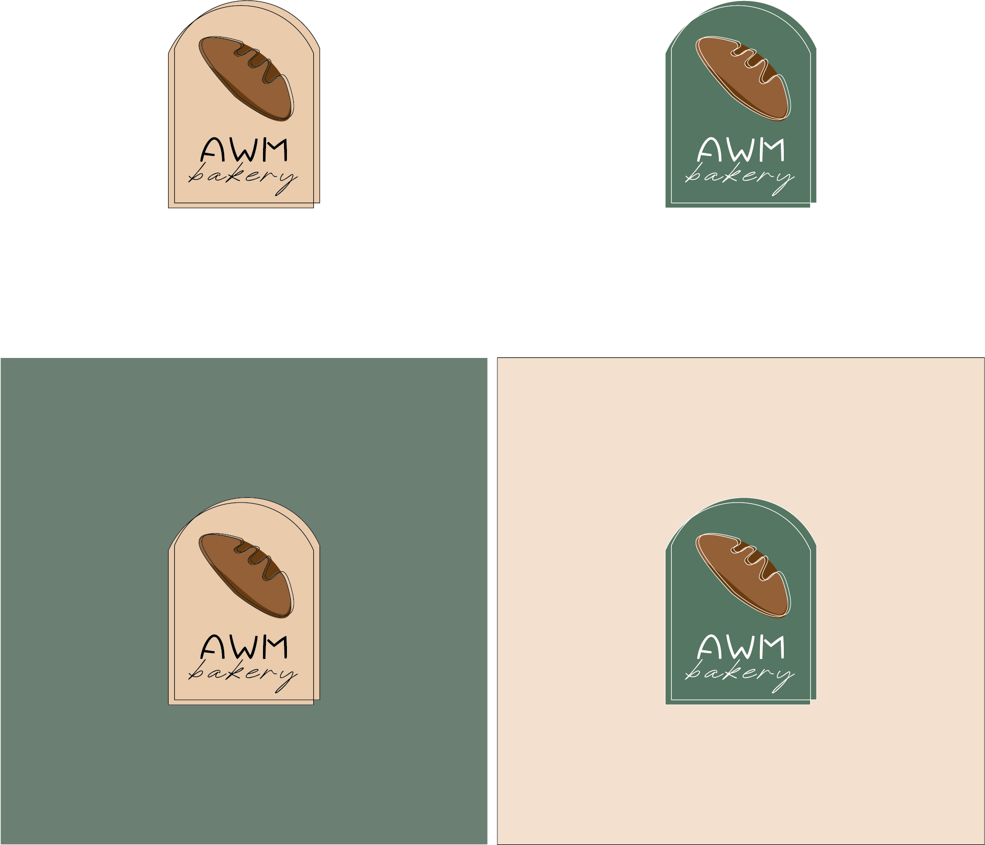
Combination mark logo for AWM Bakery
- Report
Sir • 5 months ago
let me know what you think :) I'm trying to improve so criticism is welcome!!
Hello!
I am Jack, owner of AWM Bakery. For a while now, I've been looking for a good logo for my Bakery. I think a combination mark will fit best with the business. We would love to work with you!
I am Jack, owner of AWM Bakery. For a while now, I've been looking for a good logo for my Bakery. I think a combination mark will fit best with the business. We would love to work with you!

love the color scheme and line work on this design.
5 months ago by erin - Reply
Love the one on the left bottom. The color combinations are great and what is being sold is clear. But the font of the 'bakery' is a bit unclear. Maybe play with the fonts a little?
5 months ago by Nirkkuna Nagaraj - Reply
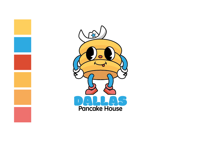
Logo design for Dallas Pancake House
- Report
Sir • 6 months ago
Heya!
Can you please give me feedback on this logo?
The brief was as below:
Pam is looking for someone to design a simple logo for her new business, Dallas Pancake House. She loves mascot logos.
Thank you!! :)
Can you please give me feedback on this logo?
The brief was as below:
Pam is looking for someone to design a simple logo for her new business, Dallas Pancake House. She loves mascot logos.
Thank you!! :)

I love this logo. It looks fun and bouncy. It looks like it would work great in a variety of sizes.
6 months ago by Jack - Reply
cheers!!
6 months ago by Sir - Reply