dk
Posts
8
Likes
17
Liked Posts
68
Given Feedback
65
Feedback
nice
4 months ago by dk
nice
4 months ago by dk
good one!
4 months ago by dk
nice one
4 months ago by dk
good one
4 months ago by dk
Sure!
4 months ago by dk
Good one

4 months ago by dk
Fabulous.

4 months ago by dk
Good idea, logo is simple and remarkable
4 months ago by dk
You should work on contrast because it looks like fire not flowers
4 months ago by dk
color combination is good
4 months ago by dk
good one!
4 months ago by dk
Simple and nice
4 months ago by dk
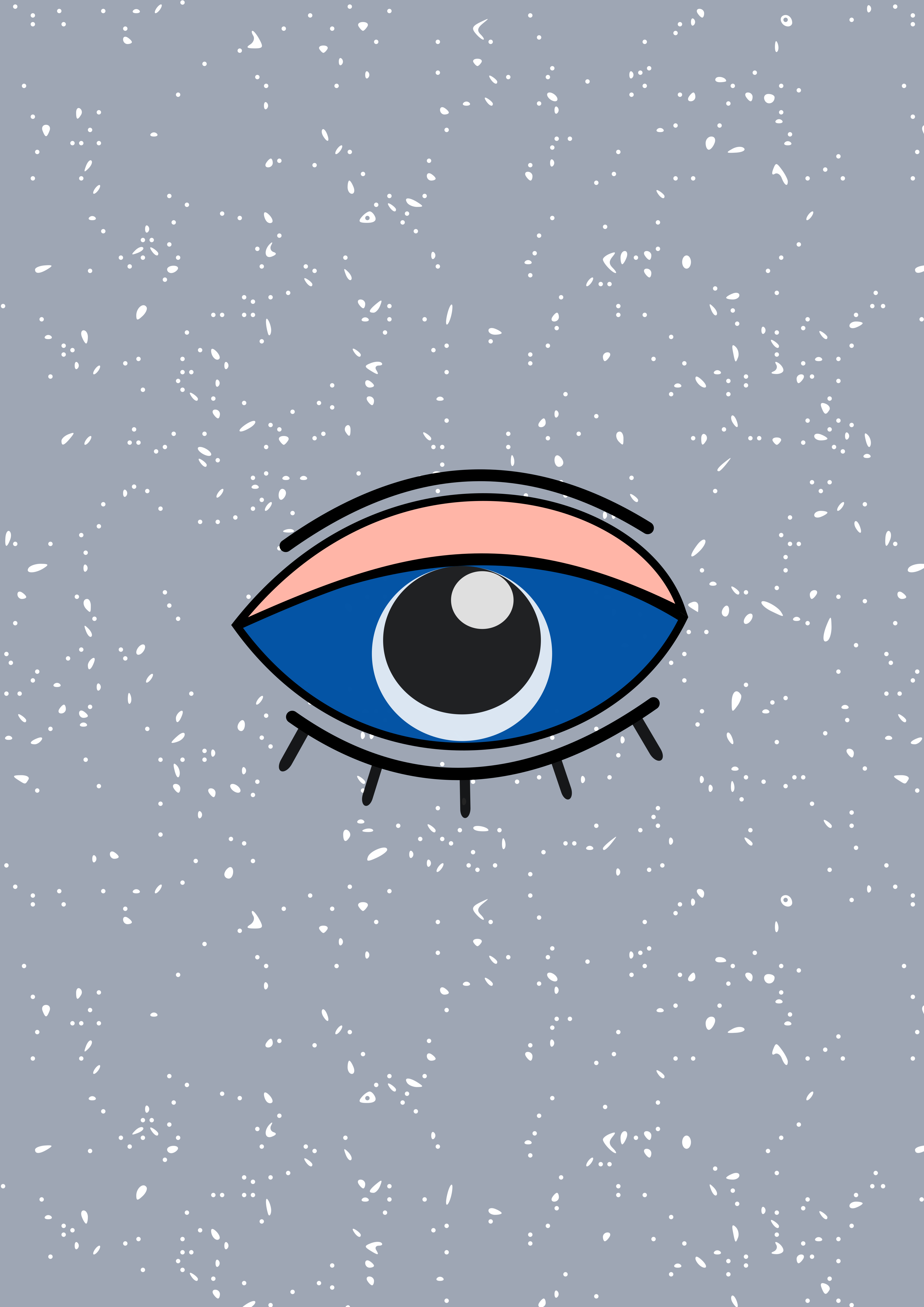
nice idea to design eyes on cup
4 months ago by dk
looking good
4 months ago by dk
colors are elegant
4 months ago by dk
looking nice
4 months ago by dk
font is good
4 months ago by dk
nice looking
4 months ago by dk
nice
4 months ago by dk
first one is good but you should work on color and contrast

4 months ago by dk
good one!
4 months ago by dk
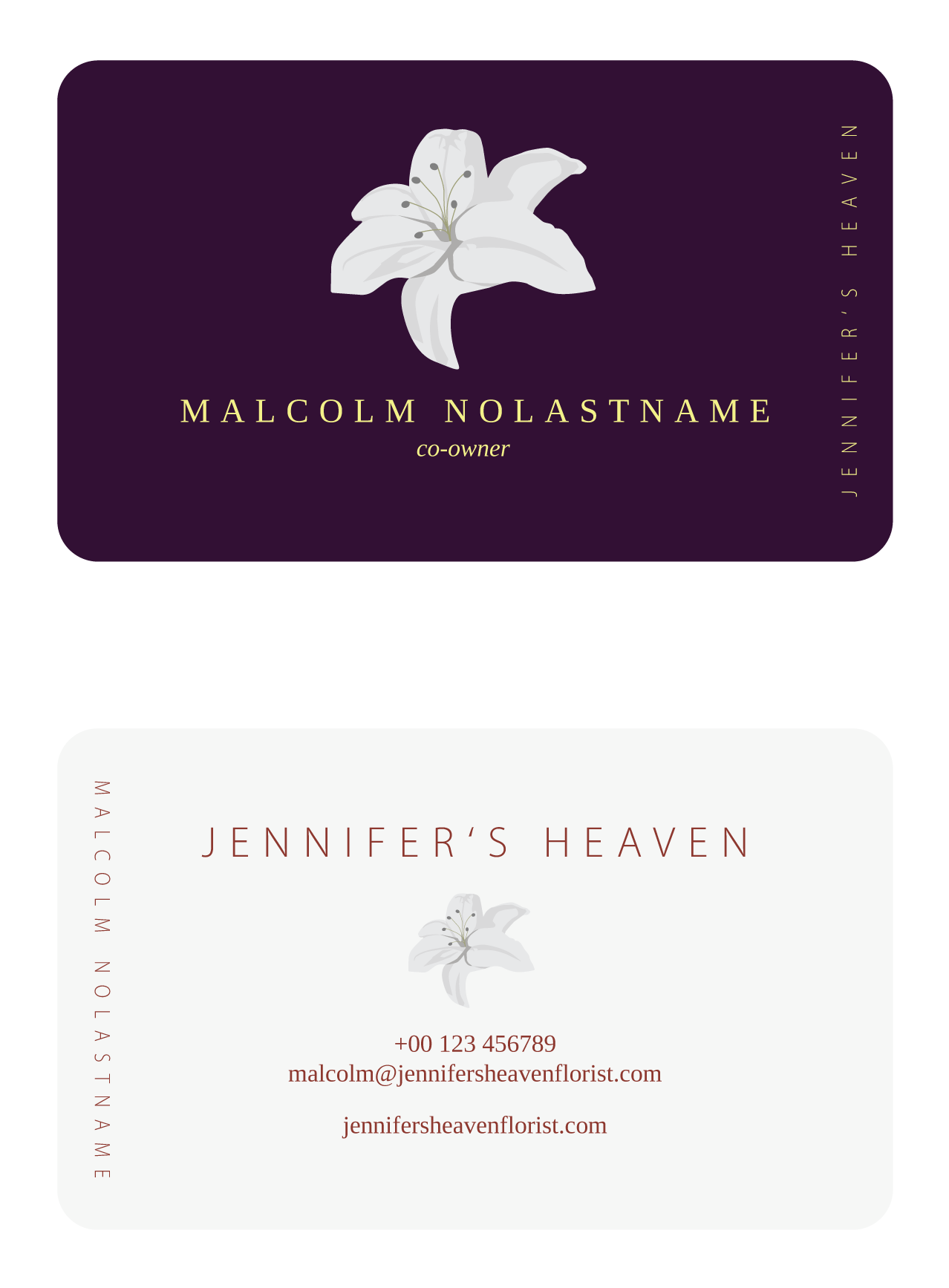
nice card
4 months ago by dk
You can choose catchy tagline instead of "Now" word
4 months ago by dk
color combinations are lovely
4 months ago by dk
Good one!
4 months ago by dk
that caring gesture emerging
5 months ago by dk
nice logo
5 months ago by dk
Sure, thanks for the idea.
5 months ago by dk
that magnified glass is looking nice in book word.
5 months ago by dk
good one
5 months ago by dk
color combination is fantastic, looking beautiful design
5 months ago by dk
This one looks good and unique
5 months ago by dk
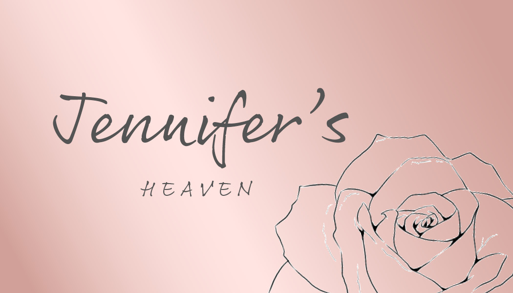
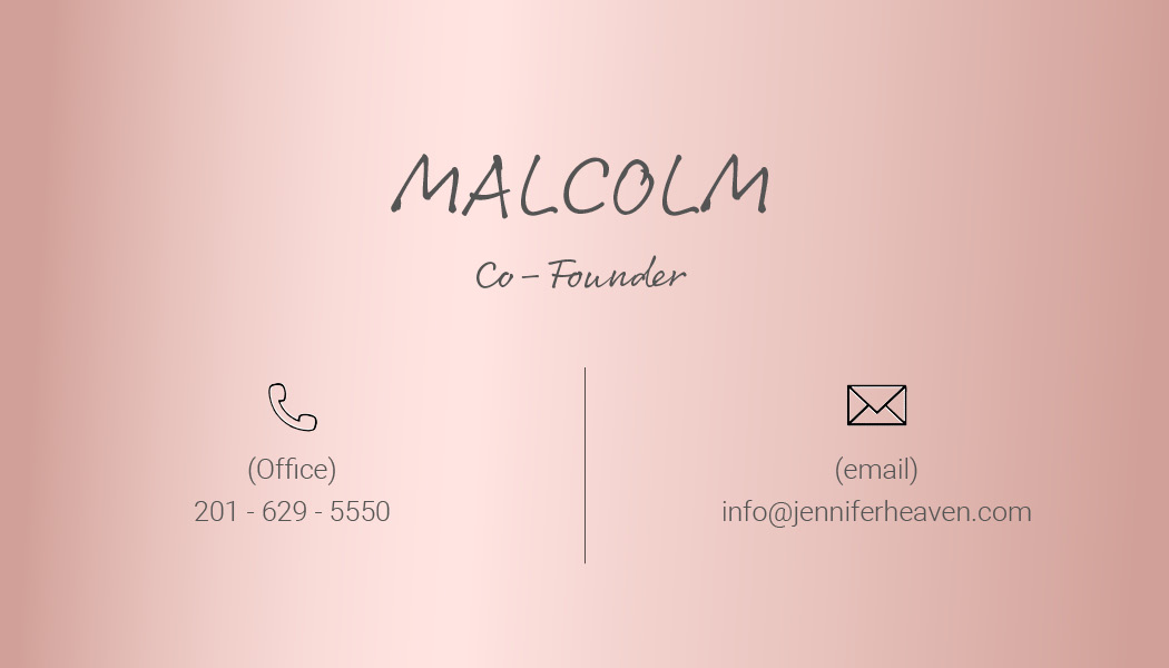
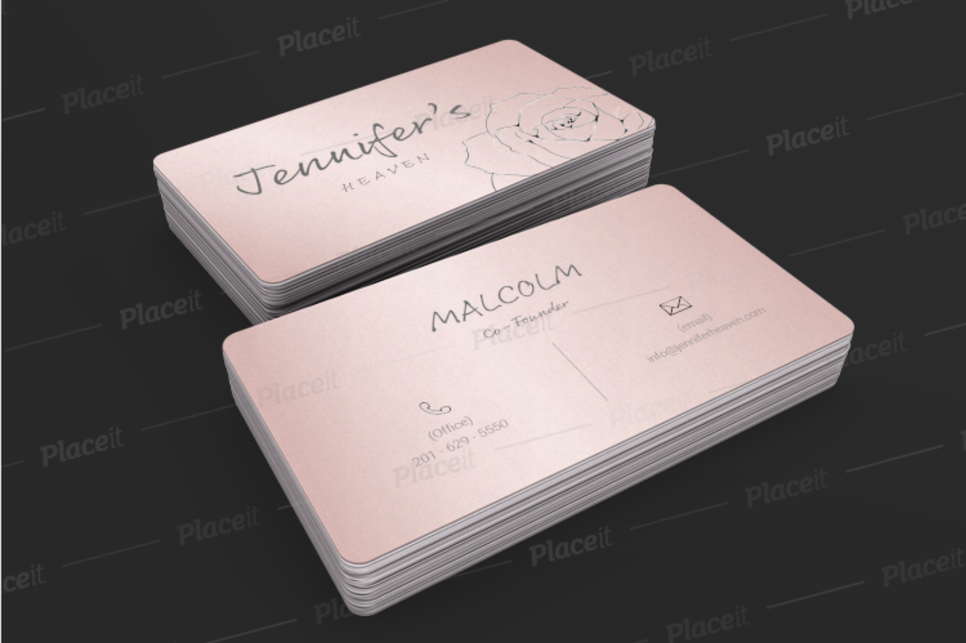
words are not visible, you can use good background color of this card
5 months ago by dk
Thanks a lot!
5 months ago by dk
the blurry black background is not showing good
5 months ago by dk
3rd one is looking nice
5 months ago by dk
good one
5 months ago by dk
you should work on contrast
5 months ago by dk
Overall card is looking good but fonts are not visible
5 months ago by dk
logo is looking nice
5 months ago by dk
Thank you, I will work on it.
5 months ago by dk
nice one
5 months ago by dk
nice one!

5 months ago by dk
well made.
5 months ago by dk
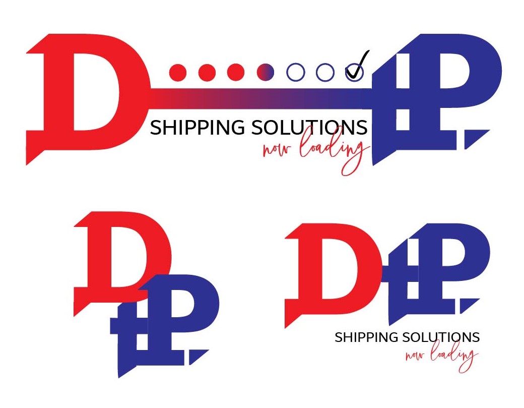
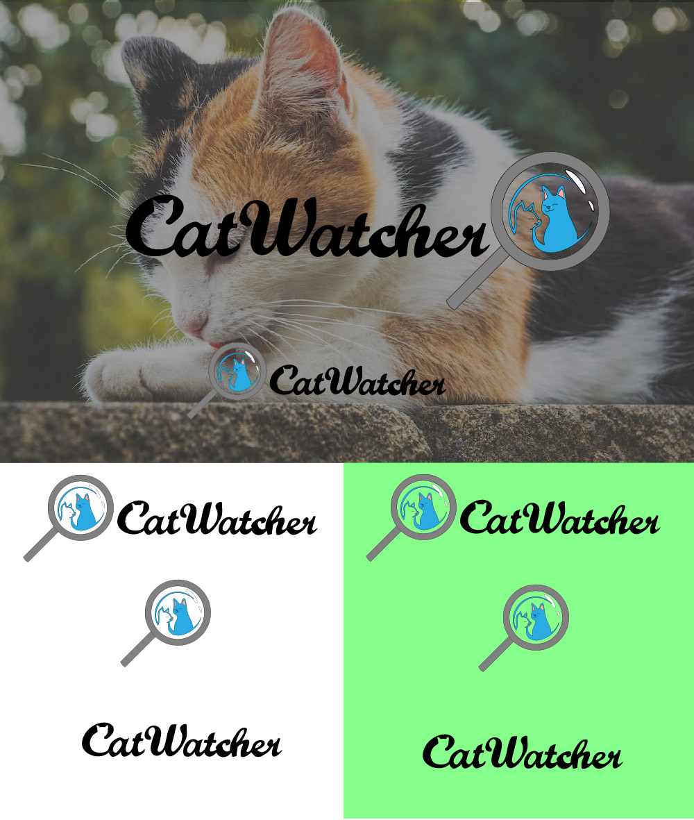
You could highlight the C word as it hard to find that there is hidden cat design.
5 months ago by dk
leaves are very well made
5 months ago by dk
nice one
5 months ago by dk
nice logo
5 months ago by dk
Sure, I will change it.
5 months ago by dk
I like the color combination.
5 months ago by dk
Thanks for your reply!!
6 months ago by dk
I tried to make the logo modern as well as nostalgia. Gradually, I will improve things. Thank you very much for detialed feedback, this will help me to correct the idea of designs. I really appreciate your time!!
6 months ago by dk
really cool, I love this logo and those color palette looks more professional
6 months ago by dk
I like fonts

6 months ago by dk
fantastic look
6 months ago by dk
stroke and color is good but it looks like fork so you can choose any shape which suits chocolate that's my suggestion
6 months ago by dk
I like this, but you can make more attractive.
6 months ago by dk
Inkscape
6 months ago by dk
nice color of the card
6 months ago by dk
Thanks for the feedback!
6 months ago by dk
Thanks for the feedback. I will work on it.
6 months ago by dk
looks horror but good one.
6 months ago by dk
nice art

6 months ago by dk
nice typography
6 months ago by dk
Posts
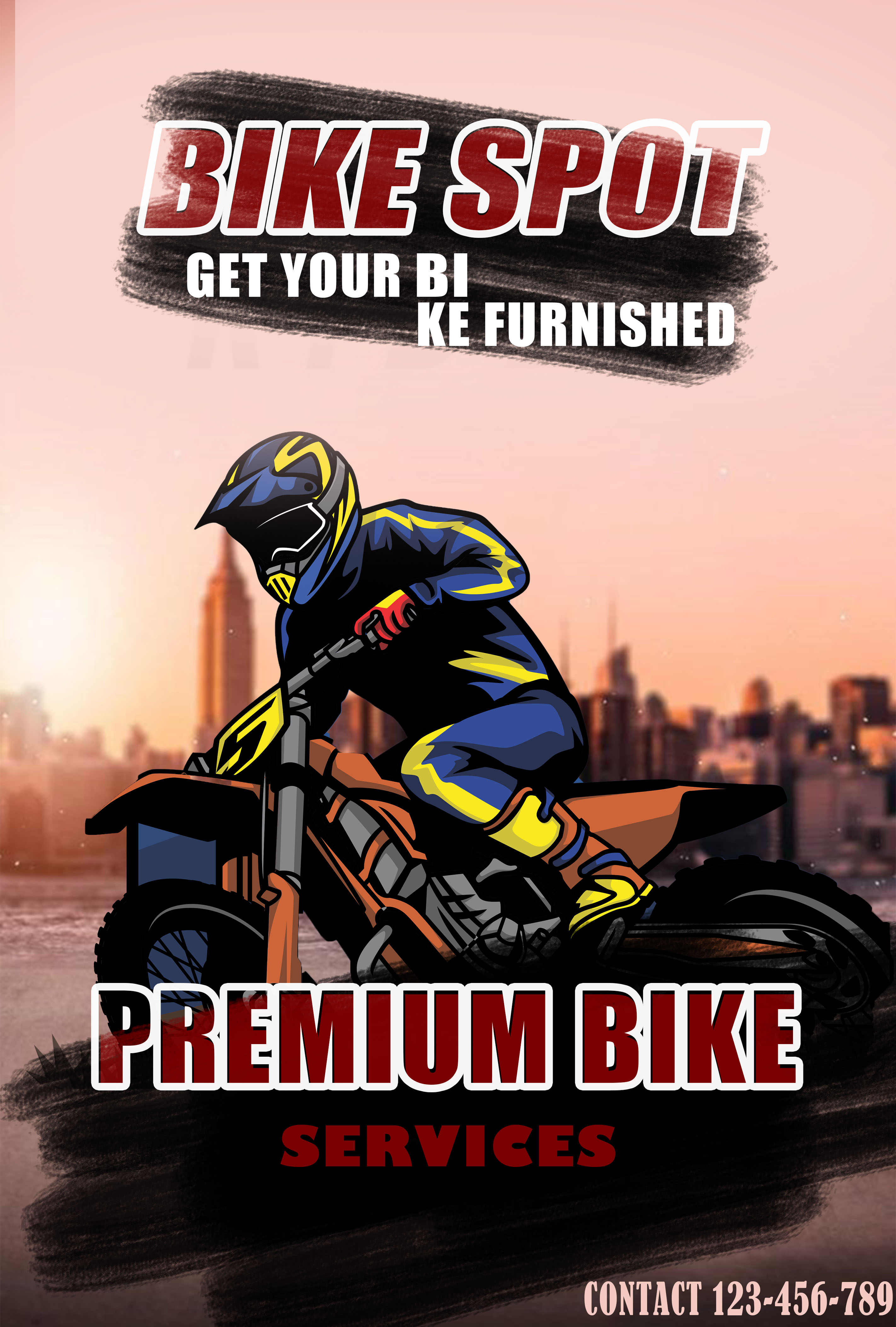
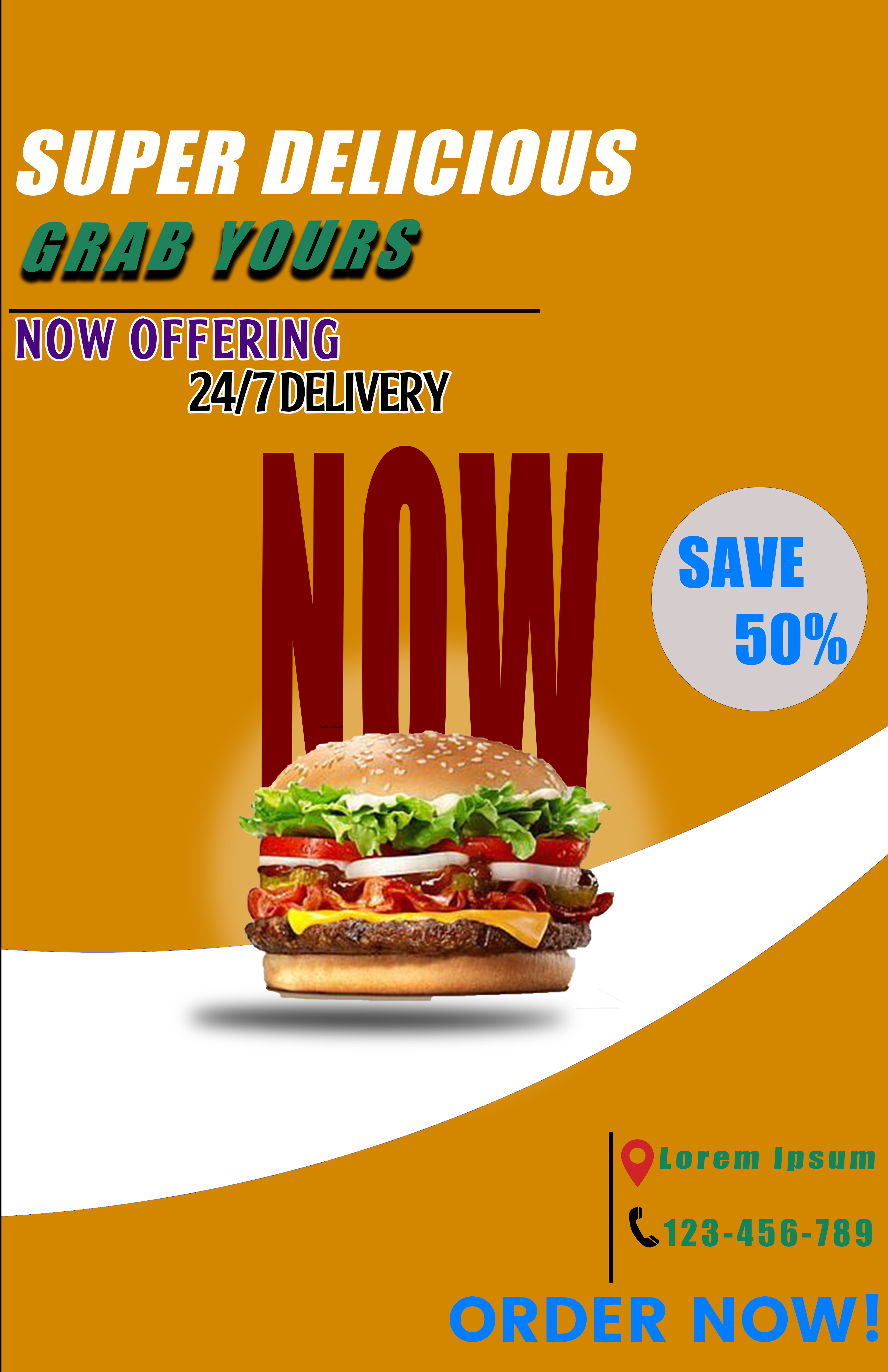
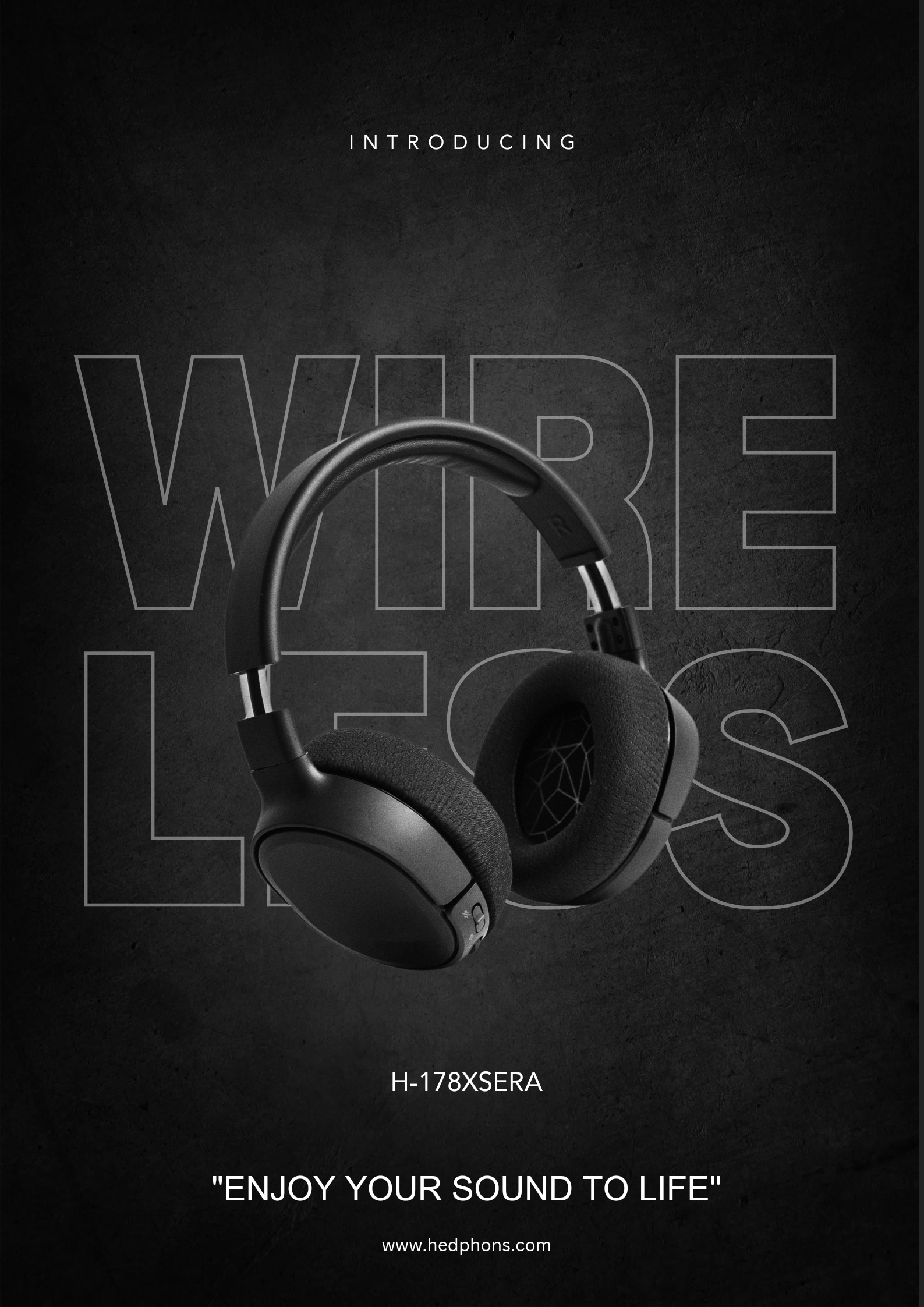
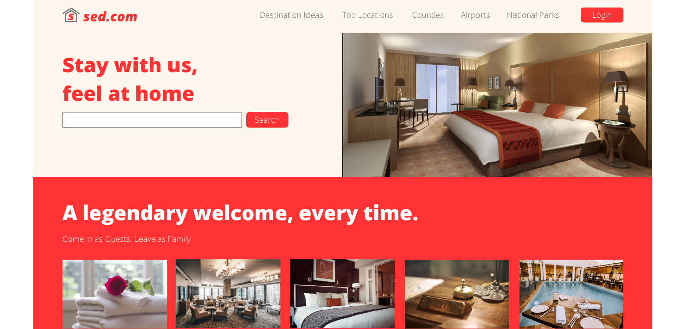
BeachStation Poster
- Report
dk • 4 months ago
This is poster of BeachStation.
I tried to make the best.
Need suggestion to make excellent!
Note: This is screenshot of actual poster because resolution is very high.
I tried to make the best.
Need suggestion to make excellent!
Note: This is screenshot of actual poster because resolution is very high.
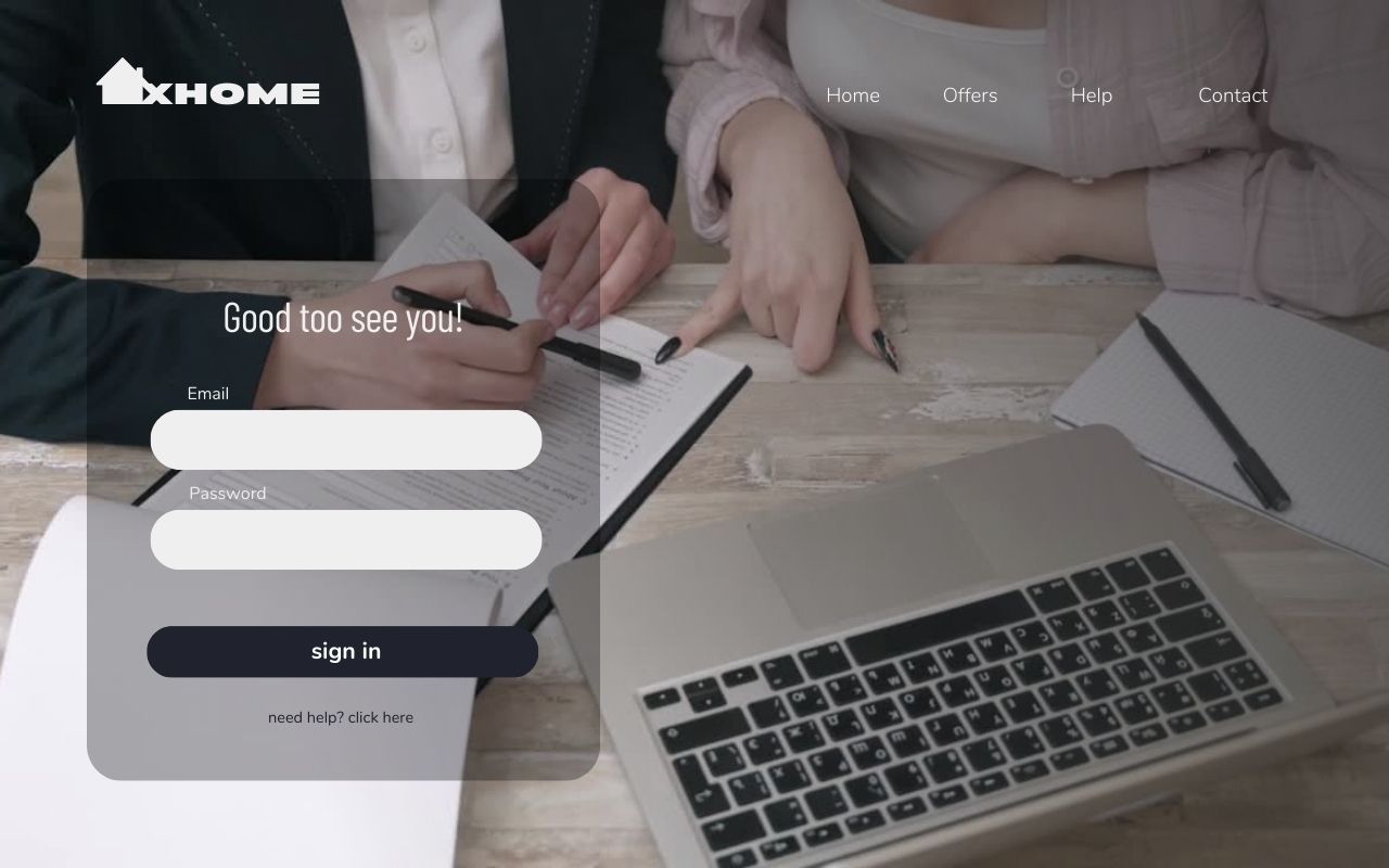
Hey!
I'm Brice, I just founded a new business called BeachStation. For a while now, I've been looking for a good designer for my business. We will need a poster to advertise our business. Can you help me out?
I'm Brice, I just founded a new business called BeachStation. For a while now, I've been looking for a good designer for my business. We will need a poster to advertise our business. Can you help me out?


Is really good! But maybe you can try to work with palettes next time, you can go to a generator of palette in google , working with palettes is always a perfect harmony.
4 months ago by Faïza KJ - Reply
Sure!
4 months ago by dk - Reply
So you can do it in the evening and I will be able to come to the office for a while to get the same time for the same as the tum bhi nahi hai na ki nahi hai na is it possible to get the same time for the same time as well as the same issue is liye nahi hai
4 months ago by Bilal - Reply
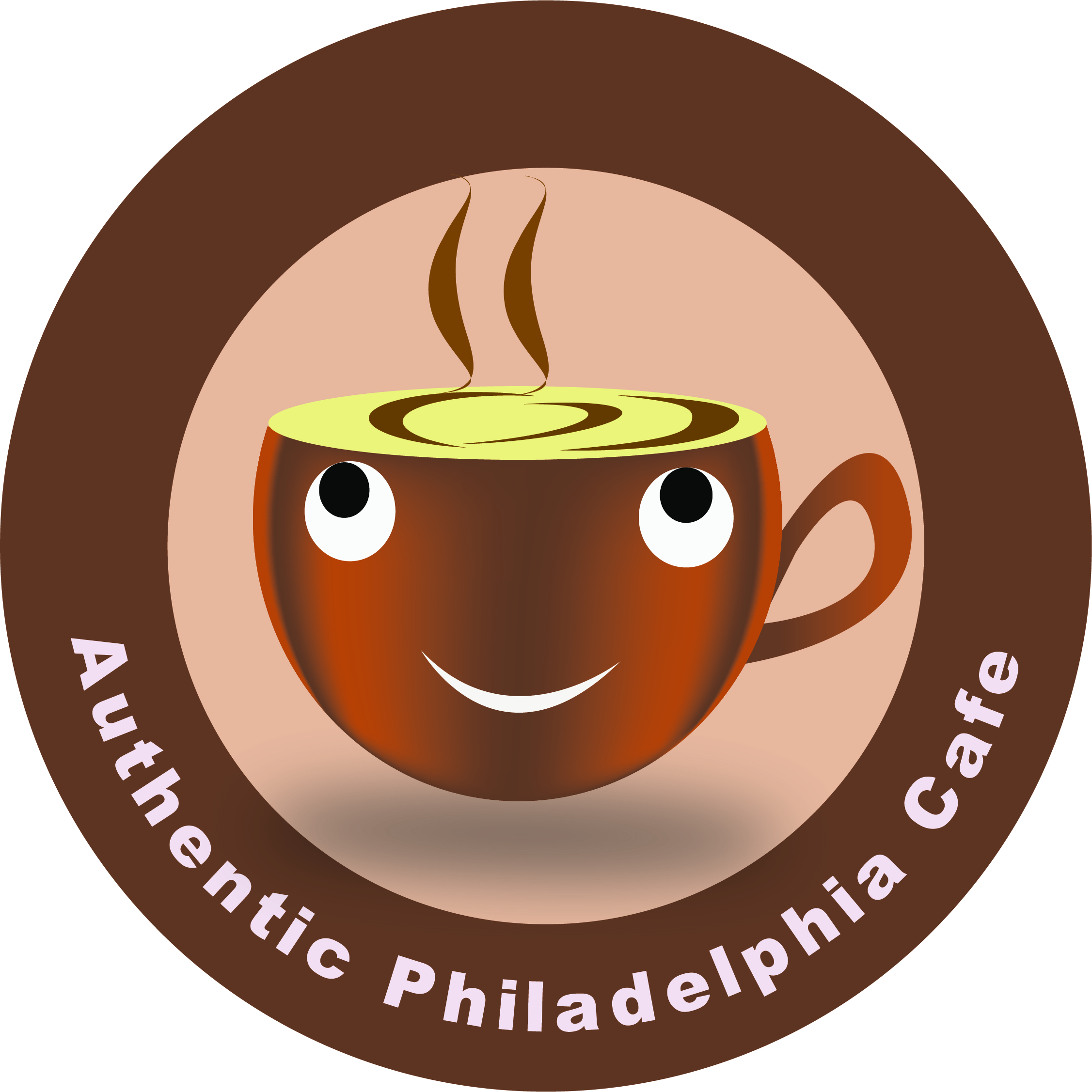
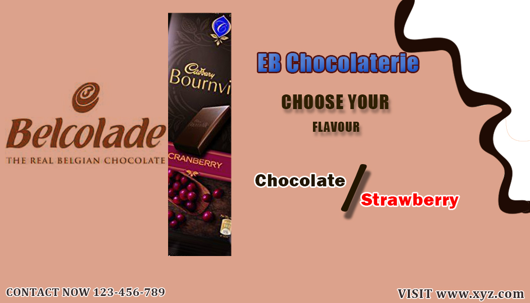
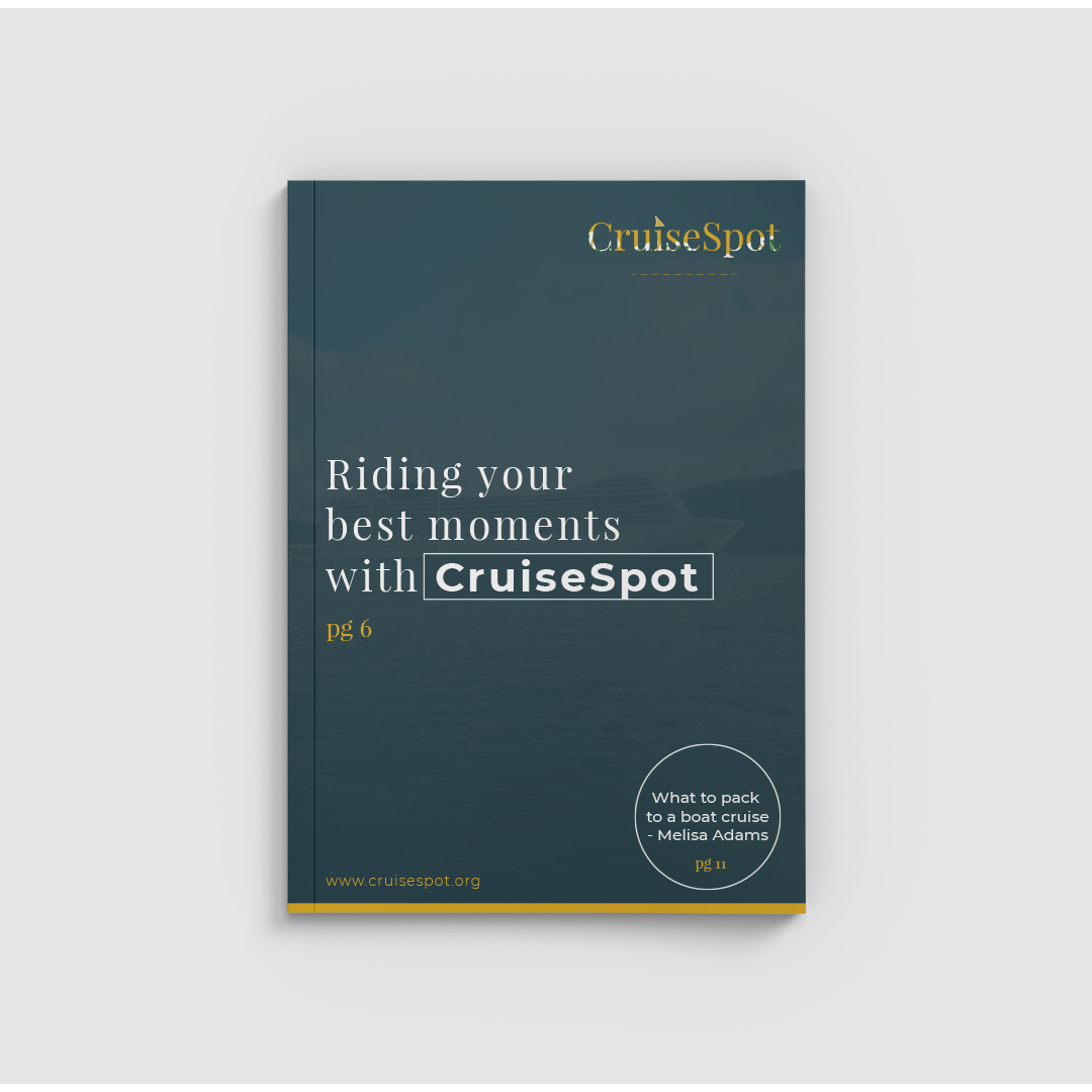
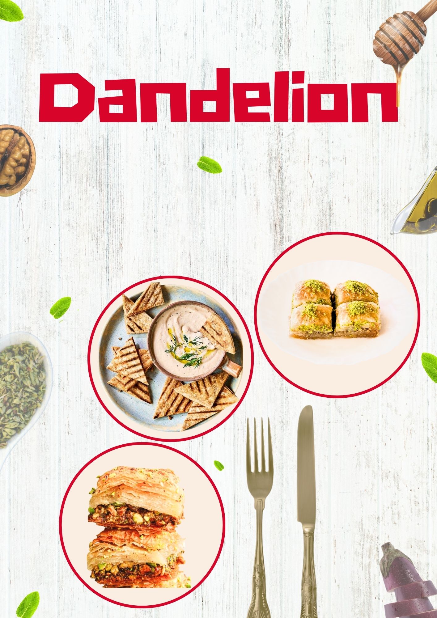
Poster Design
- Report
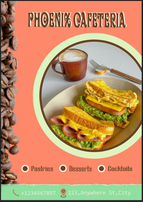
dk • 5 months ago
I tried to make this poster first time.
All comments are welcome!
This is screenshot of poster because actual resolution is bit high.
All comments are welcome!
This is screenshot of poster because actual resolution is bit high.
Hello,
I am Lucius, founder of Phoenix Cafeteria. For a while now, I've been looking for a good designer for my Cafeteria. We will need a poster to advertise our business. Can you do that?
I am Lucius, founder of Phoenix Cafeteria. For a while now, I've been looking for a good designer for my Cafeteria. We will need a poster to advertise our business. Can you do that?

The contact info in the same color palette of the cafe or of the background , so you can easily see it and better.
4 months ago by Faïza KJ - Reply
The colour pallet used should adhere to the sandwiches, that is, the background should have been green as in the lettuce, yellow text because of the cheese, etc...As ide that good job!
5 months ago by Raphael Etim - Reply
Sure, thanks for the idea.
5 months ago by dk - Reply
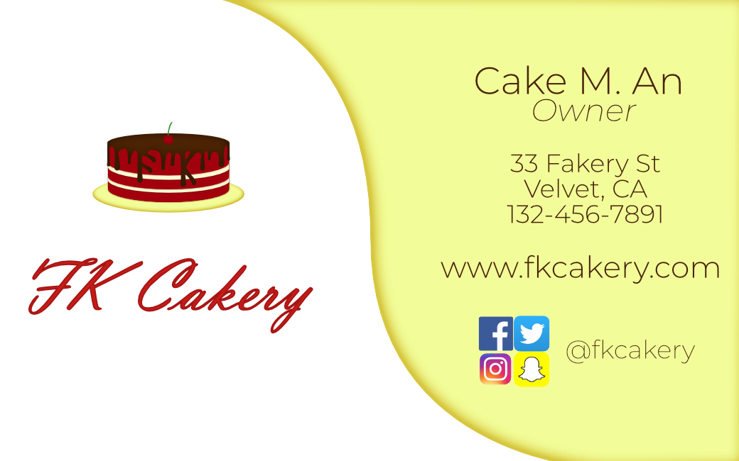
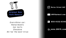
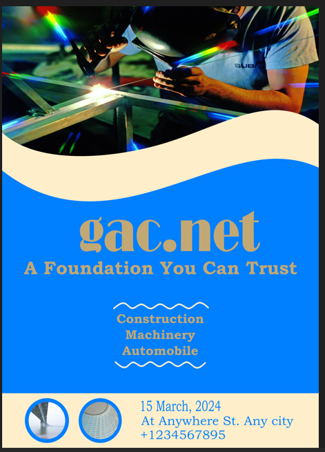
Flyer Design
- Report
dk • 5 months ago
All suggestions are welcome!
File size was too big so I take screenshot.
File size was too big so I take screenshot.
Hey There,
I am James, founder of gac.net. I'm looking for someone that can design something for my steel production company. I would like a simple flyer for an event. We primarily use the color blue (#007fff). Can you help me out?
I am James, founder of gac.net. I'm looking for someone that can design something for my steel production company. I would like a simple flyer for an event. We primarily use the color blue (#007fff). Can you help me out?

Great job! i think that the colour of the letters is not so visible but the fonts you chose is very good and contrast this with the background.
5 months ago by Ioanna Konstantinou - Reply
Thank you, I will work on it.
5 months ago by dk - Reply
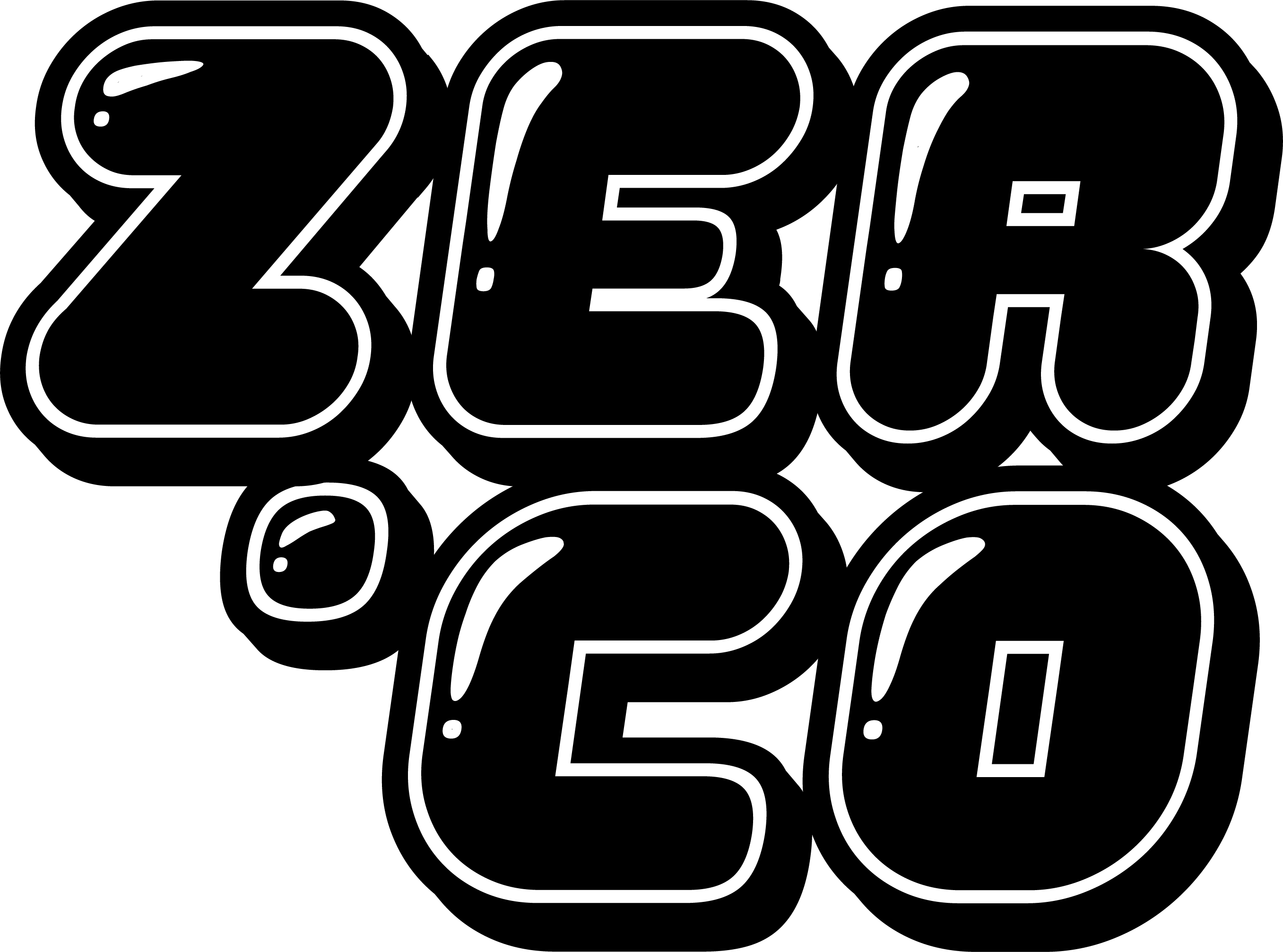
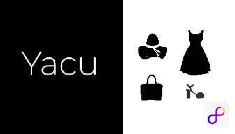
Fashion Logo
- Report
dk • 5 months ago
Is this better?
Please share your opinion
Company Description:
We are a fashion company that sells designer suits. Our items are made with expert craftmanship and are shipped directly to your home. Our target audience is adults. We want to convey a sense of security, while at the same time being inexpensive.
Job Description:
You must create a logo using the information given in this brief. They would prefer an emblem logo that uses the color white.

Pristine
5 months ago by Mujeeb Amoo - Reply
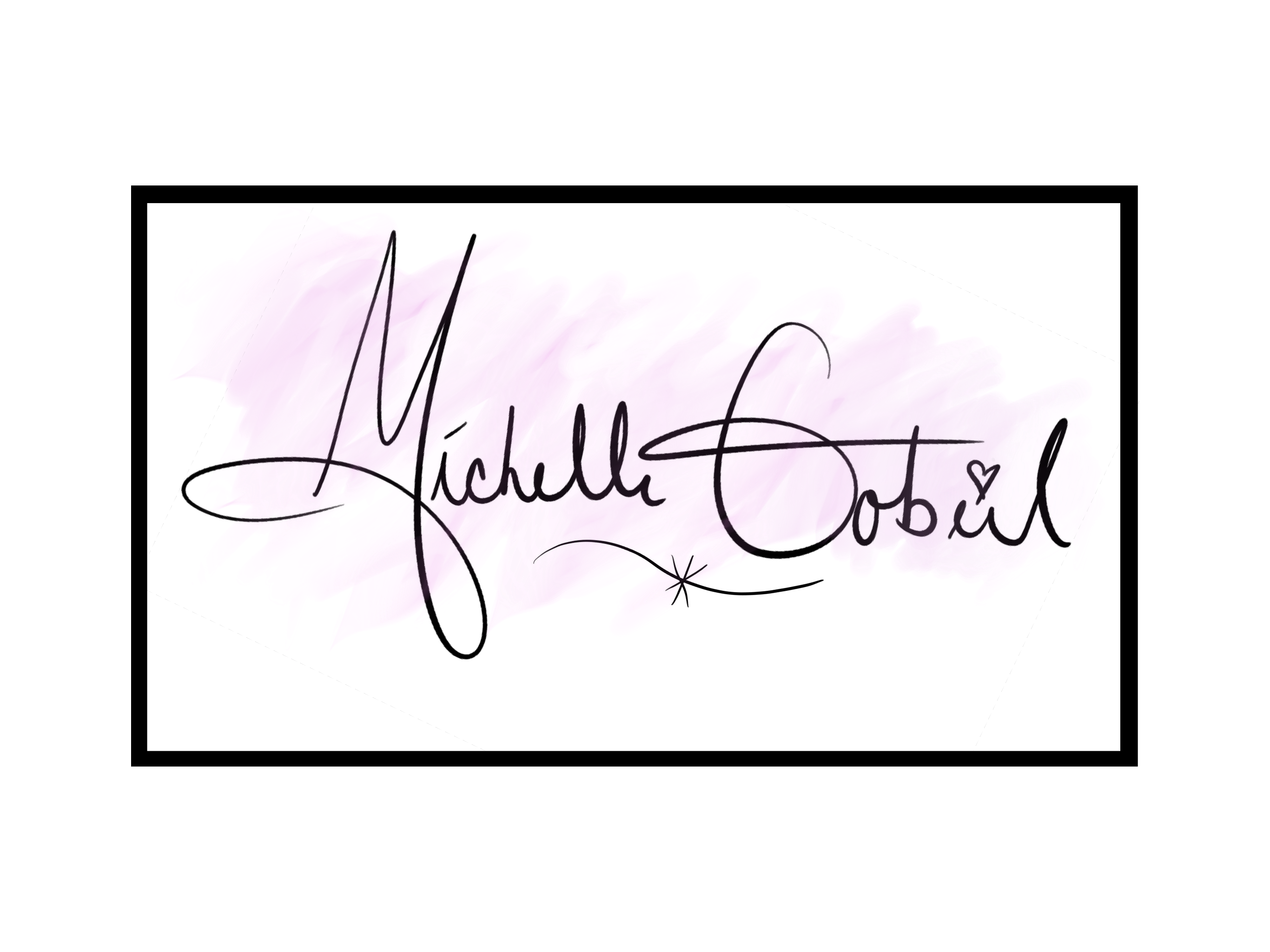
Jewelry Logo
- Report
dk • 5 months ago
Do comment and share your opinion.
Company Description:
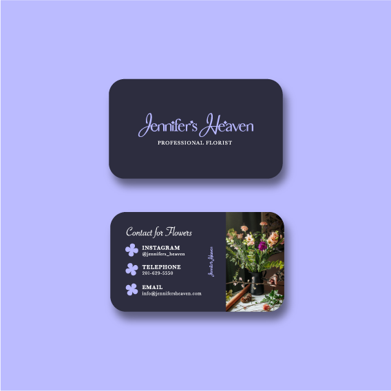
We are a family store that sells jewelry. Our main product stands out because of its reputation and polish. Our target audience is women. We want to convey a sense of bravery, while at the same time being gentle.
Job Description:
You must create a logo using the information. They would prefer a pictorial mark that uses the color white. The logo will be used on the company website.
Company Description:
We are a family store that sells jewelry. Our main product stands out because of its reputation and polish. Our target audience is women. We want to convey a sense of bravery, while at the same time being gentle.
Job Description:
You must create a logo using the information. They would prefer a pictorial mark that uses the color white. The logo will be used on the company website.
