Raphael Etim
Posts
5
Likes
8
Liked Posts
2
Given Feedback
14
Feedback
Nice layout, nice choice of colours.
4 months ago by Raphael Etim
Very new nice, well done!

5 months ago by Raphael Etim
Nice work!
5 months ago by Raphael Etim
Nice job though I would have liked to see the brief...

5 months ago by Raphael Etim
This is veeerryy nice!

5 months ago by Raphael Etim
I particularly like ones on the left and right respectively, discard the middle one. However, the tagline on the one on the right i.e. with the white background, should be placed a bit more closer to the 'DTP' initials. And remove the star in the letter 'D' of the logo on the left. Over all, good job!

5 months ago by Raphael Etim
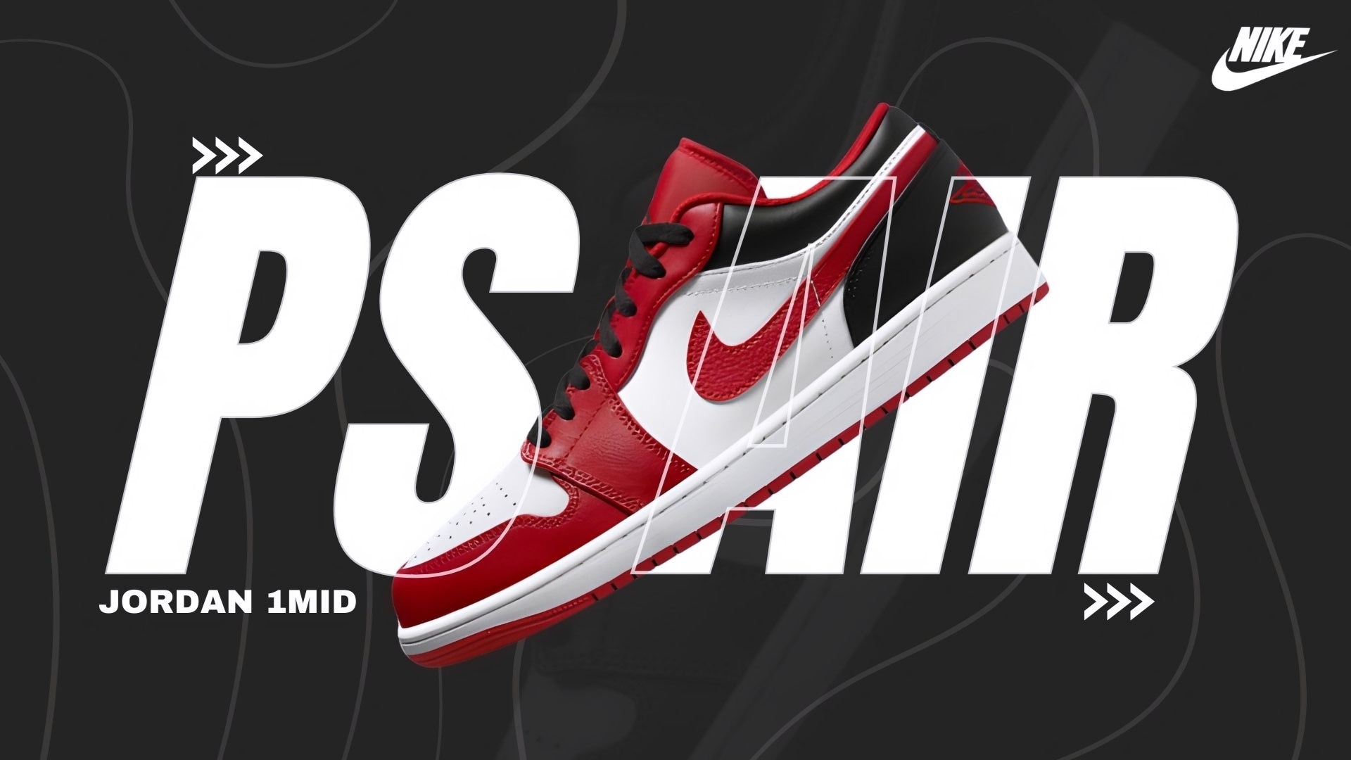
I see what you did here. I like the effect you created, the shoe is neither behind the letters s, a and I, nor Infront of them. You maintained their outline. Good creativity, very nice, Bilal.
5 months ago by Raphael Etim
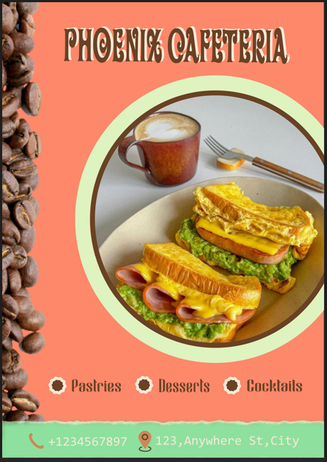
The colour pallet used should adhere to the sandwiches, that is, the background should have been green as in the lettuce, yellow text because of the cheese, etc...As ide that good job!
5 months ago by Raphael Etim
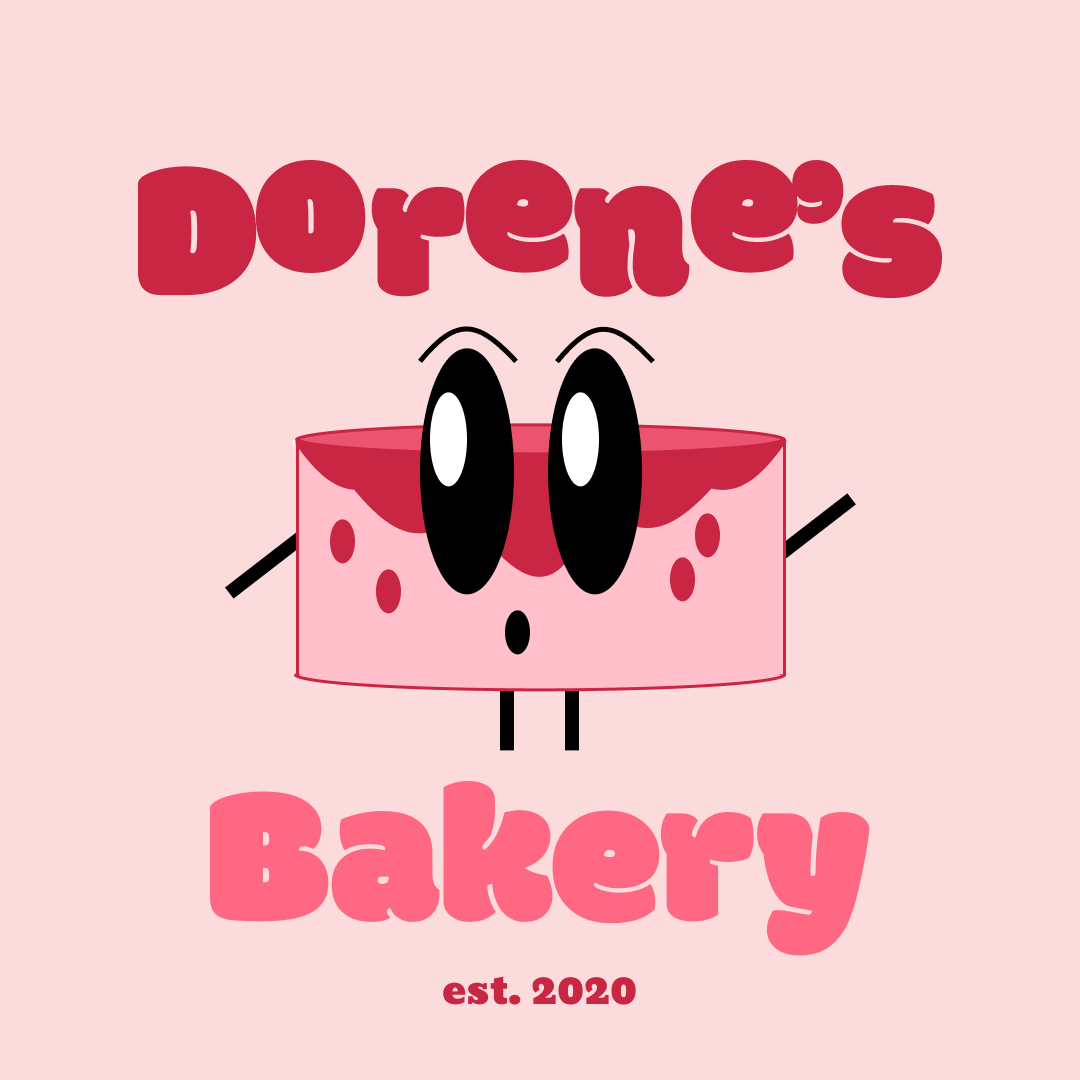
The mascot appears surprised, what comes to mind when you think of a cake? It's taste, right? So, you should have given the mascot a smile to show excitement...
5 months ago by Raphael Etim
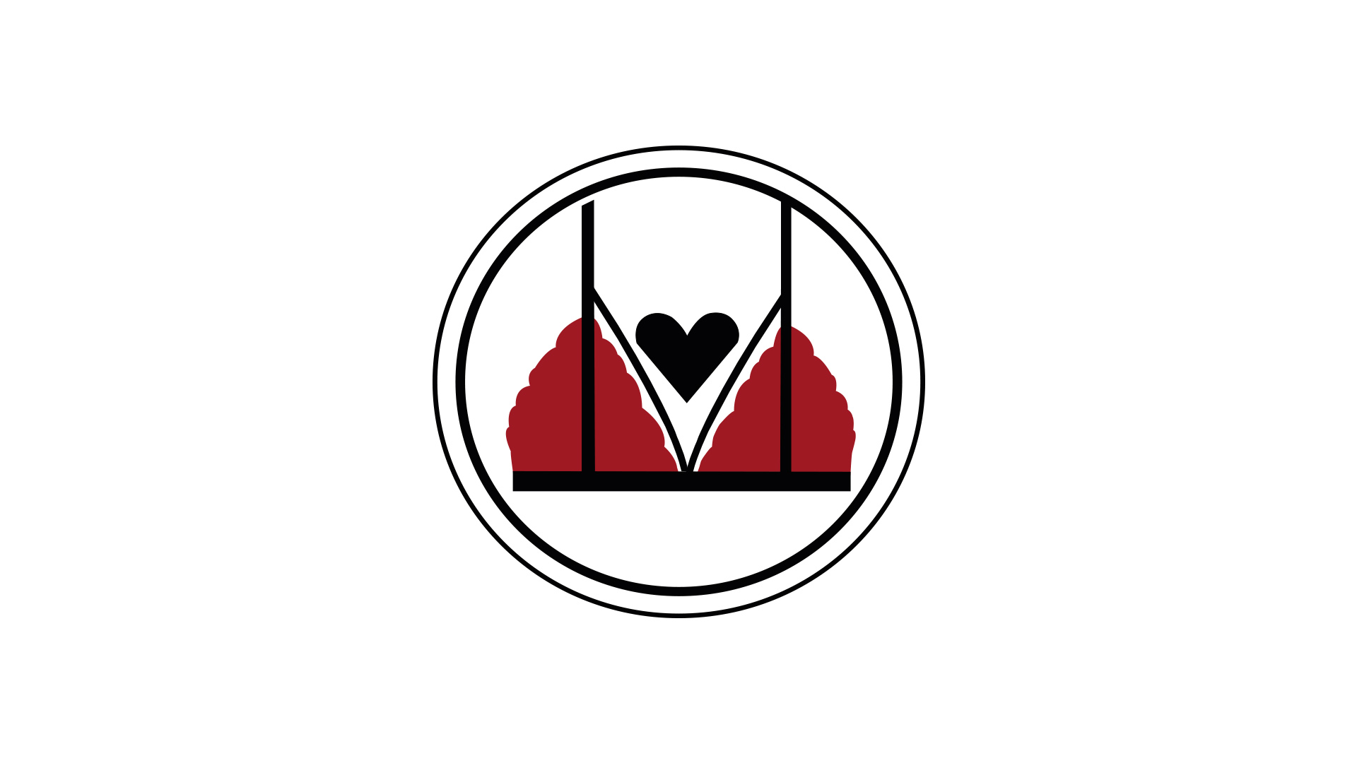
A silhouette of the track of a tractor is a good way to incorporate that. Since it's a word mark kind of logo, use the tracks of a tractor to design the name. The brief said to use white as their color but you used green, so this doesn't adhere to their description. And you didn't show how it connects to women since they are the target audience. The heart shape used doesn't really convey the client's target audience.

5 months ago by Raphael Etim
Thanks for the feedback. This is just the back of the business card, have you seen the front? If so, what's your view?
5 months ago by Raphael Etim
Your logo is not precise, I can't tell what it is.
5 months ago by Raphael Etim
I like your use of pink as background that contrasts with the purple fonts.

5 months ago by Raphael Etim
Nice work, I would have used a different font say sans serif or Calibri. Other than fonts, you did a good job!

5 months ago by Raphael Etim
Posts
Hotel Peyo
- Report
Raphael Etim • 4 months ago
Hey There,
I am Celestina, founder of Peyo. I'm looking for someone that can design something for my hotel. We will need a poster to advertise our business. Can you help me out?
I am Celestina, founder of Peyo. I'm looking for someone that can design something for my hotel. We will need a poster to advertise our business. Can you help me out?
 Like
Like


Good Try! To enhance your design, I recommend checking out some videos on Fonts, Color Theory, Grid Layouts, and Techniques for Creating Contrast. They can provide valuable insights and inspiration!
4 months ago by Malik Blake - Reply
Good efforts! I would say that the text and the fonts used are bland. They need to pop out. It isn't creating a contrast. You can easily fix that by adding drop shadows or outlines.
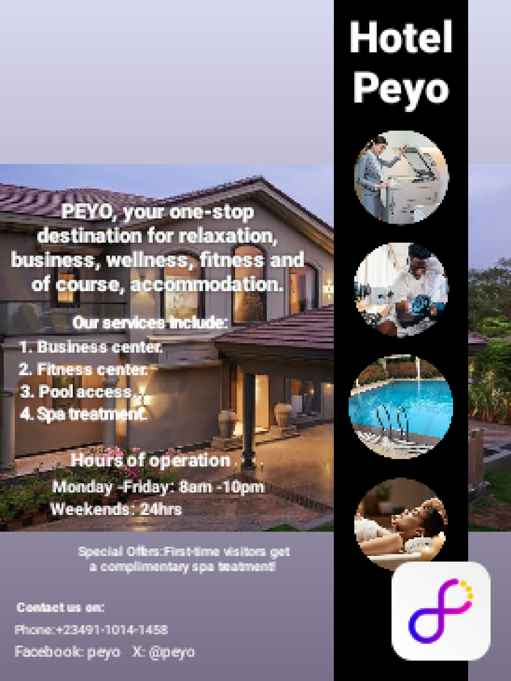
4 months ago by Arya - Reply
Business card for Jennifer's Heaven.
- Report
Raphael Etim • 5 months ago
I just got this done, what do you think? I added a halo to the letter 'H' to add to the heaven touch required.
Jennifer's Heavengraphic


Well job
4 months ago by Ned - Reply
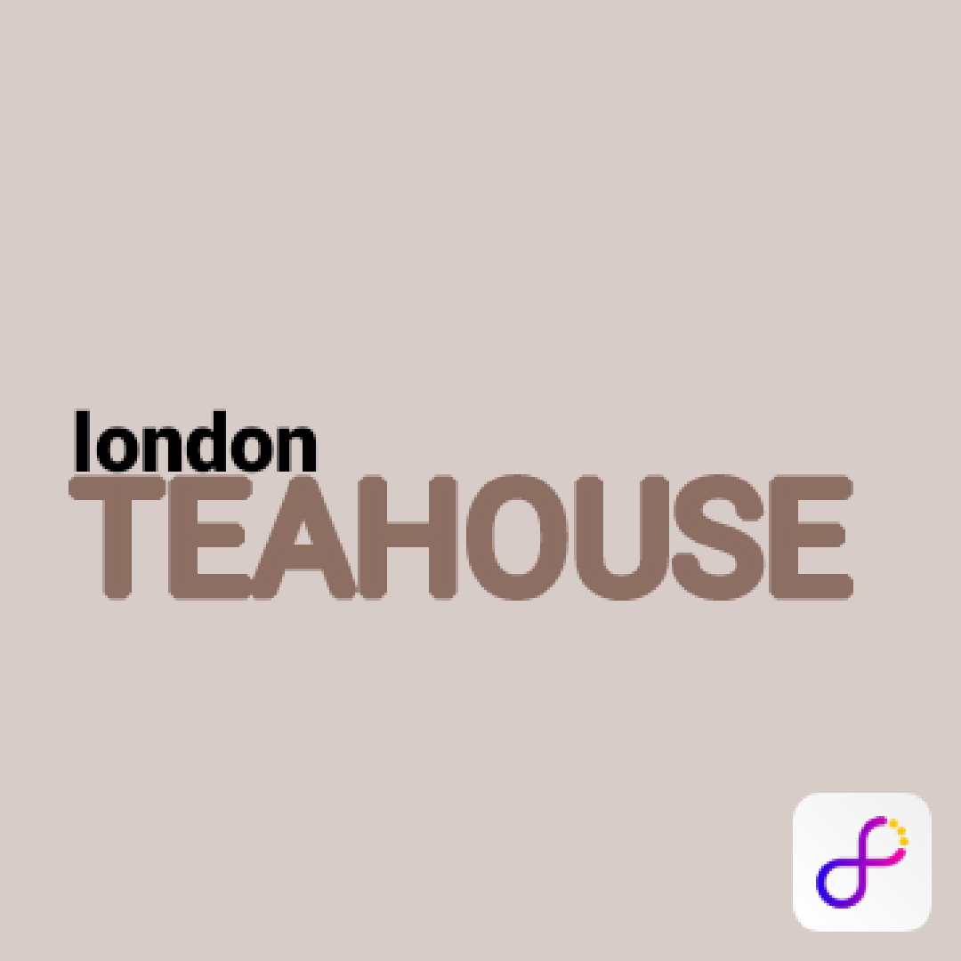
Wordmark logo
- Report
Raphael Etim • 5 months ago
It's a wordmark logo for a teahouse in London.

I like it!
5 months ago by Jade Thompson - Reply
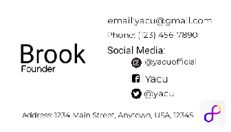
Yacu business card back
- Report
Raphael Etim • 5 months ago
Hey!
I'm Brock, founder of Yacu. For a while now, I've been looking for a good designer for my clothing store. I want to have a business card for myself. Can you help me out?
I'm Brock, founder of Yacu. For a while now, I've been looking for a good designer for my clothing store. I want to have a business card for myself. Can you help me out?

Thanks for the feedback. This is just the back of the business card, have you seen the front? If so, what's your view?
5 months ago by Raphael Etim - Reply
Yacu business card
- Report
Raphael Etim • 5 months ago
I used a black and white background to contrast the business name and services on the front of the card. Then the back is just text in black type with silhouette images of social media icons.(
Hey!
I'm Brock, founder of Yacu. For a while now, I've been looking for a good designer for my clothing store. I want to have a business card for myself. Can you help me out?
I'm Brock, founder of Yacu. For a while now, I've been looking for a good designer for my clothing store. I want to have a business card for myself. Can you help me out?


This one looks good and unique
5 months ago by dk - Reply