srgsfdfa
Posts
7
Likes
5
Liked Posts
11
Given Feedback
8
Feedback
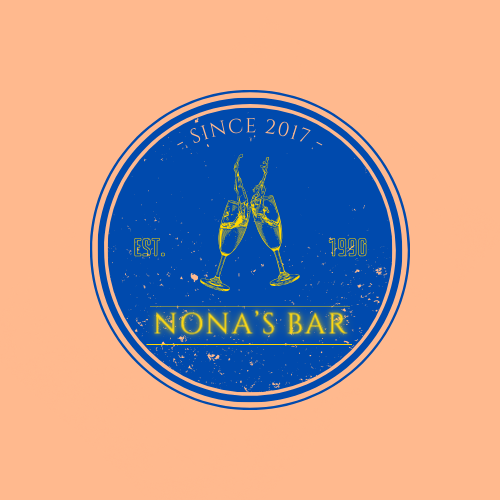
looks nice, words are not visible tho
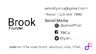
5 months ago by srgsfdfa
Looks really nice
5 months ago by srgsfdfa
nice
5 months ago by srgsfdfa
ugh?
5 months ago by srgsfdfa
The idea is perfect, its just the color combo, you can't quite see the logo because of the background bright pink. Try to play around with colours and bet it would be even better.

5 months ago by srgsfdfa
Thank you much, it looks lots of better! :)
5 months ago by srgsfdfa
Make some space in between the capital M and ‘Restaurant’, other than that its pretty nice IMO.
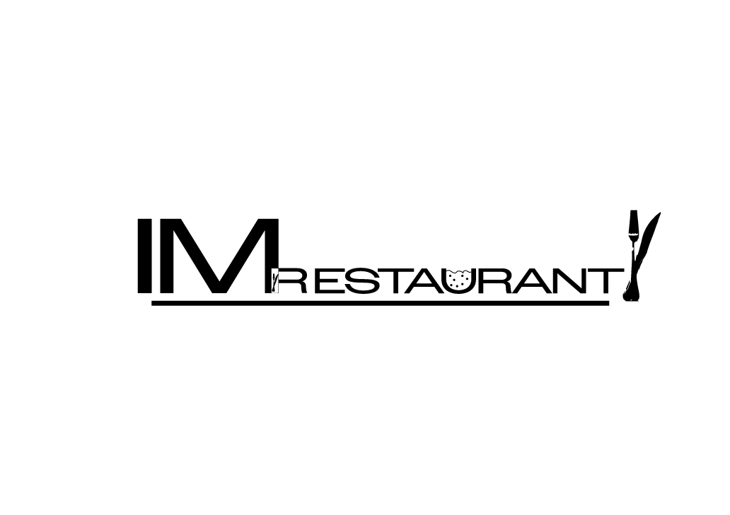
5 months ago by srgsfdfa
keep up with the good work!
5 months ago by srgsfdfa
Posts
Sandy Otter
- Report
srgsfdfa • 5 months ago
I couldn't really think of any other way I could incorporate the symbol of tractors other than some kind of a wheel. Give me feedback so I know what to improve on.
Company description
We are a company that makes high-quality tractors with an emphasis on price. Our target audience is women. We want to convey a sense of fame, while at the same time being kind.
-----------
They would prefer a wordmark that uses the color white. The logo will be used on the company website. Take into account the company's values and preferences.


A silhouette of the track of a tractor is a good way to incorporate that. Since it's a word mark kind of logo, use the tracks of a tractor to design the name. The brief said to use white as their color but you used green, so this doesn't adhere to their description. And you didn't show how it connects to women since they are the target audience. The heart shape used doesn't really convey the client's target audience.
5 months ago by Raphael Etim - Reply
use of color can be improved
5 months ago by Sandeep - Reply
High Five Works
- Report
srgsfdfa • 5 months ago
Comapny Description: We are a company that makes high-quality trucks with an emphasis on customizability. Our target audience is millenials. We want to convey a sense of power, while at the same time being proffessional.
------
They would prefer a lettermark that uses the color yellow. Logo will be printed on the side of vehicles. Take into account the company's values and preferences, and make sure it will work for the planned use-casses.
------
They would prefer a lettermark that uses the color yellow. Logo will be printed on the side of vehicles. Take into account the company's values and preferences, and make sure it will work for the planned use-casses.
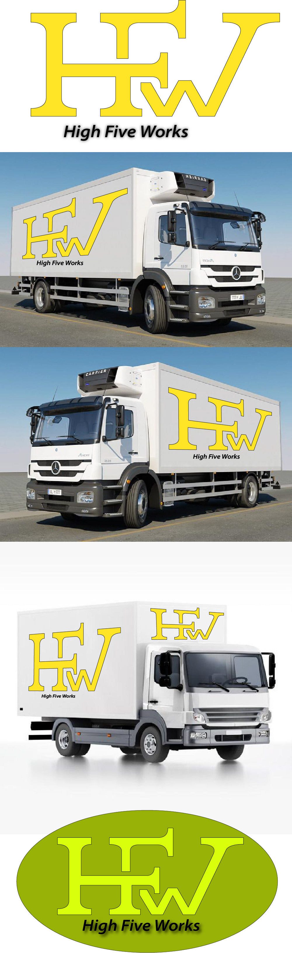

I would suggest using bold and thick lettering to convey power.
5 months ago by Brooke N DeForge - Reply
I suggest using a bold and thick font to convey a sense of power for the company.
5 months ago by Brooke N DeForge - Reply
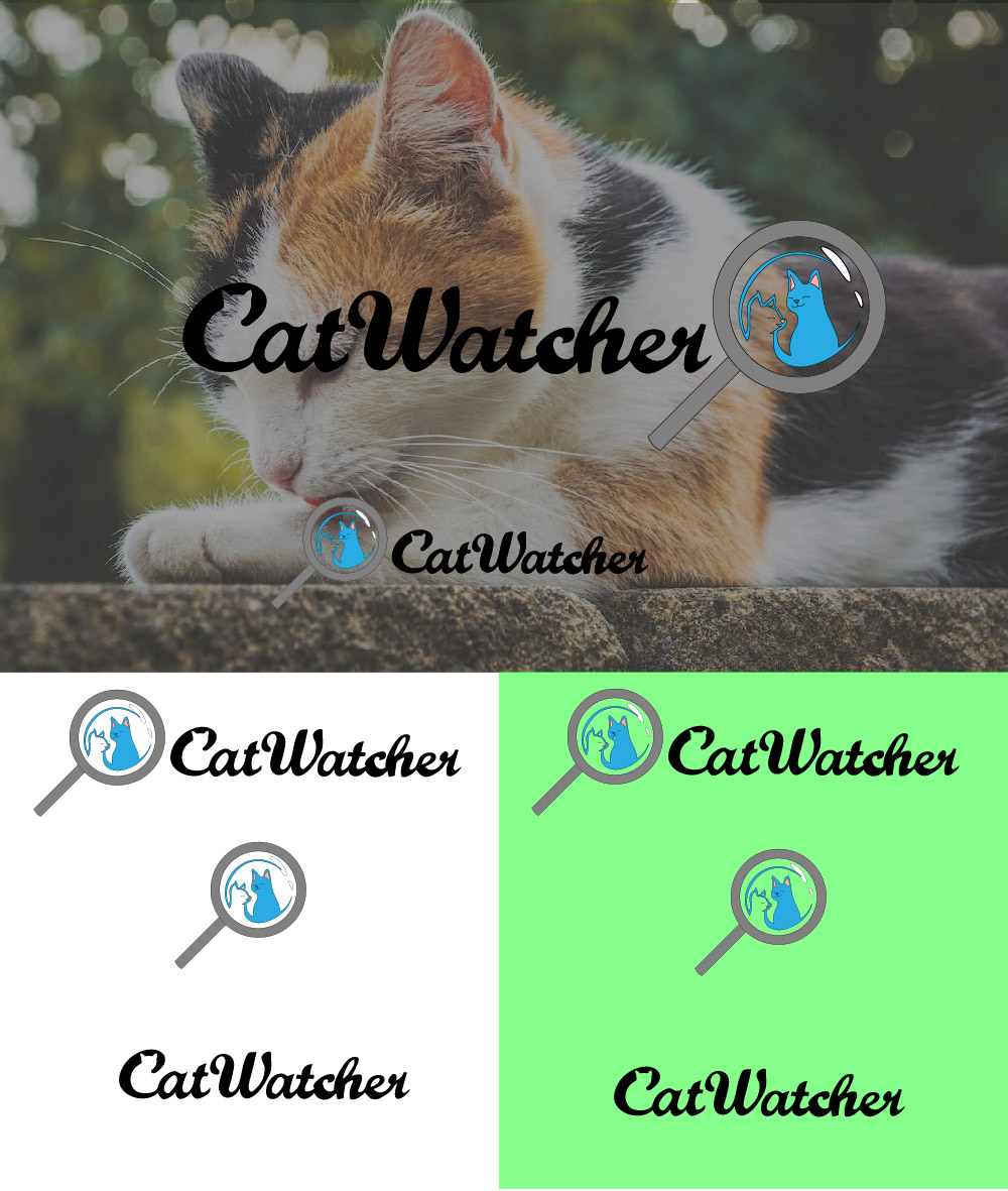
CatWatcher
- Report
srgsfdfa • 5 months ago
All criticism welcome, I'm trying to improve.
Hello!
I'm Britta, I just founded a new business called CatWatcher. We're looking for someone that can create a simple logo for our business. I think a combination mark will fit best with the business. Would you be interested?
I'm Britta, I just founded a new business called CatWatcher. We're looking for someone that can create a simple logo for our business. I think a combination mark will fit best with the business. Would you be interested?

the cat ears in the C are great!
5 months ago by Matilda Lefever - Reply
You could highlight the C word as it hard to find that there is hidden cat design.
5 months ago by dk - Reply
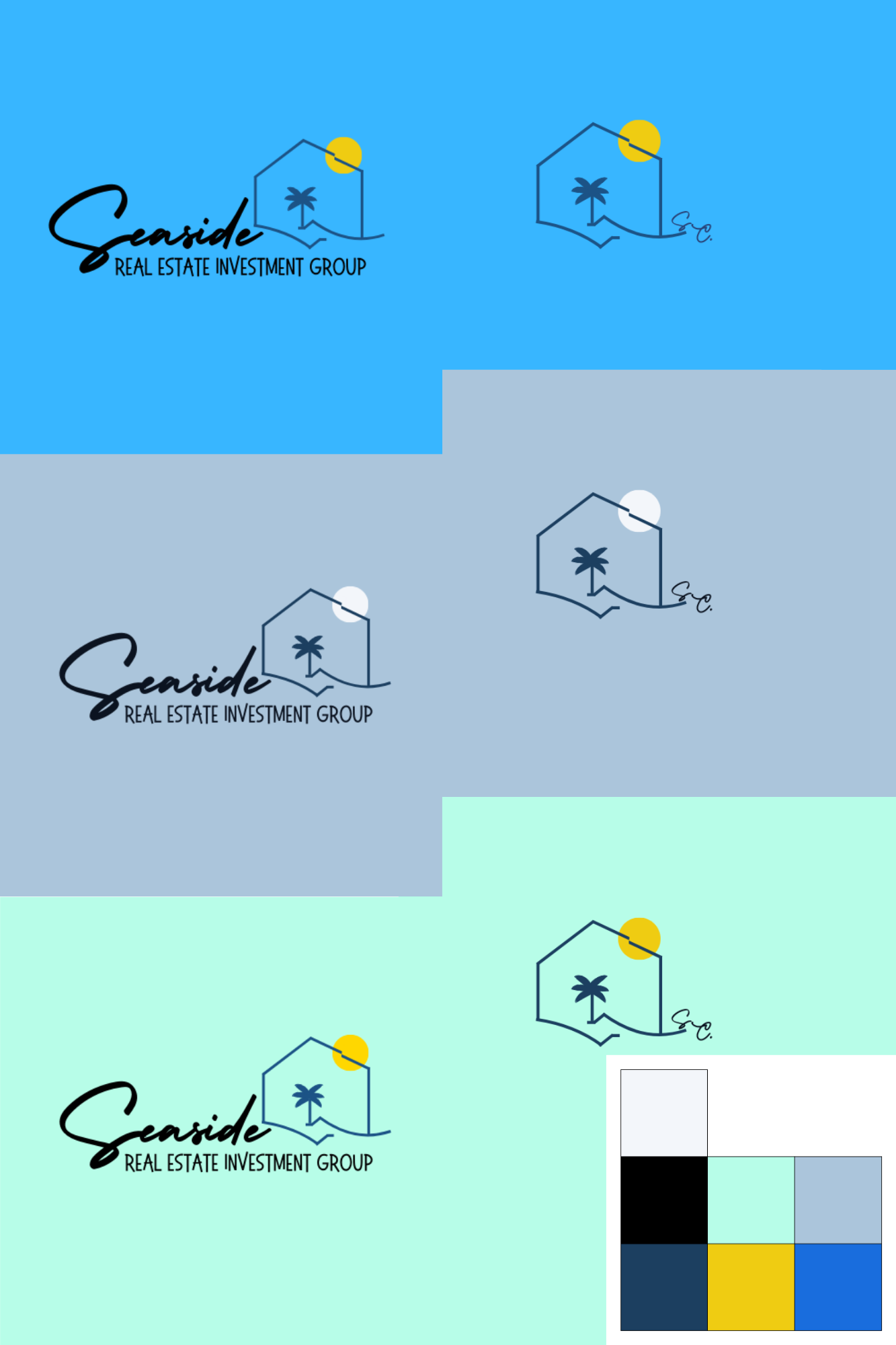
Seaside Capital
- Report
srgsfdfa • 5 months ago
Any ideas on how to make it better?
brief;
- Icon & Wordmark
- They wanted to include the word Seaside but not Capital
- Said the logo would be on signs
- Targeting younger audience.
brief;
- Icon & Wordmark
- They wanted to include the word Seaside but not Capital
- Said the logo would be on signs
- Targeting younger audience.

SwimStation
- Report
srgsfdfa • 5 months ago
Can't quite think of anything that could symbol the word "station" so I put those pinpoints, if you have any other idea I would be thankful!
All criticism is welcome.
brief;
"Hey,
I'm Fredricka, founder of SwimStation. For a while now, I've been looking for a good logo for my business. I think a lettermark will fit best. We would love to work with you!"
All criticism is welcome.
brief;
"Hey,
I'm Fredricka, founder of SwimStation. For a while now, I've been looking for a good logo for my business. I think a lettermark will fit best. We would love to work with you!"
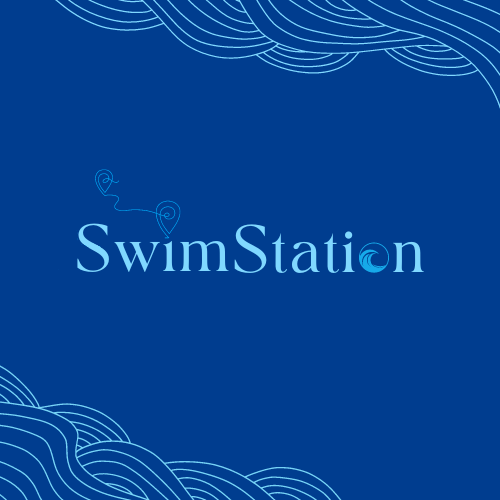

Yes
5 months ago by Bilal - Reply