erin
Posts
21
Likes
24
Liked Posts
22
Given Feedback
21
Feedback
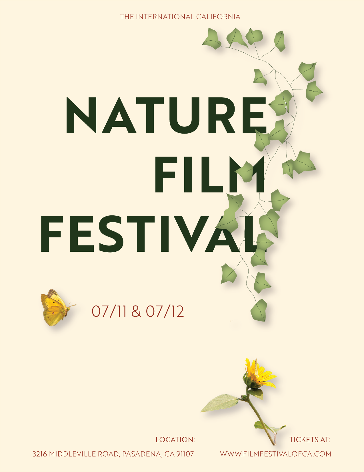
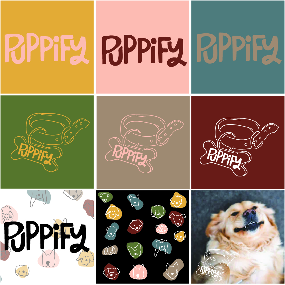
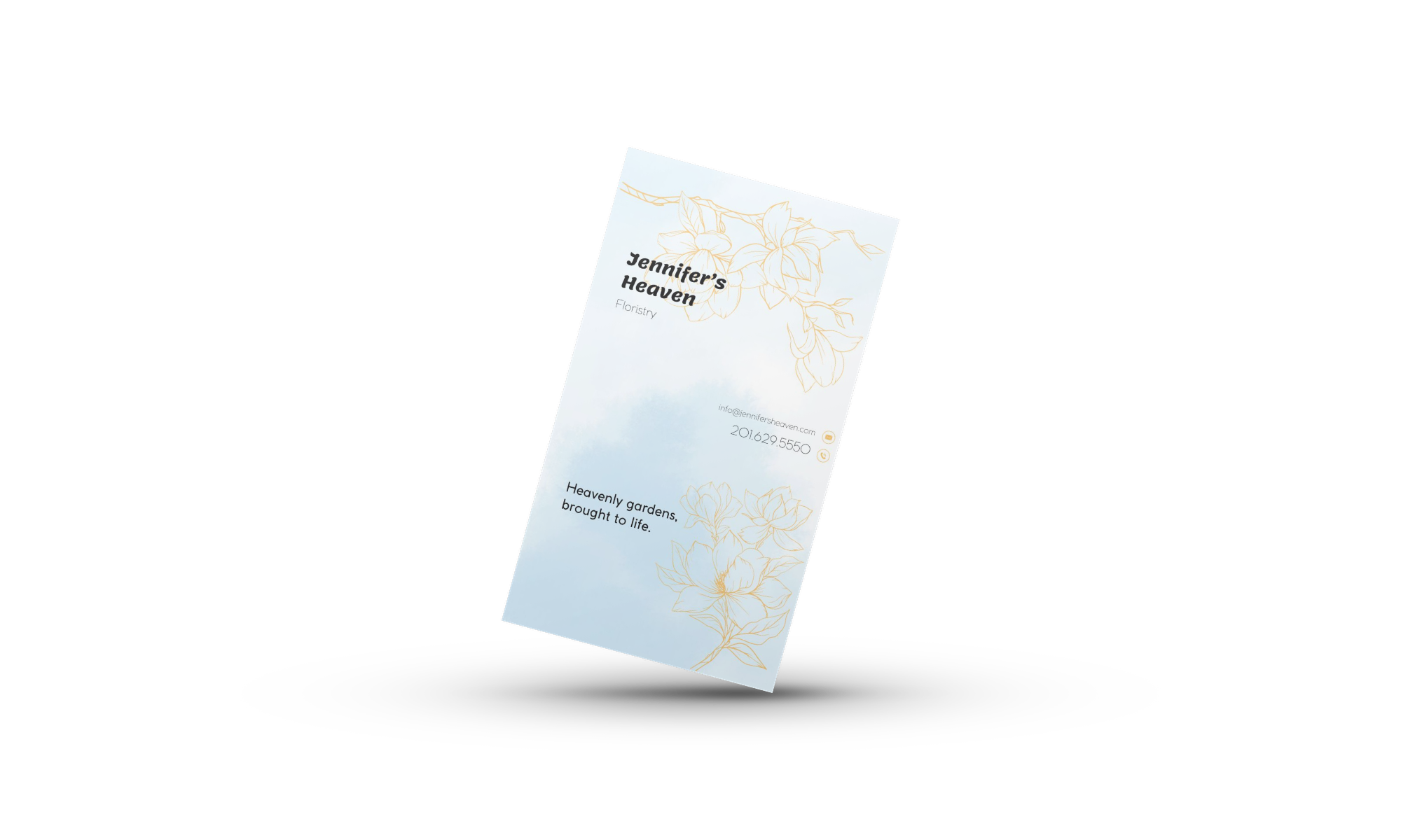
love the color scheme and line work on this design.
5 months ago by erin
I like the ones in the left column
11 months ago by erin
nice colors
11 months ago by erin
nice color variation
11 months ago by erin
Thanks!
11 months ago by erin
Adobe XD
11 months ago by erin
proportions are spot on
11 months ago by erin
bomb
11 months ago by erin
Thanks. This is really helpful
11 months ago by erin
like the font choice

11 months ago by erin
Great colors
11 months ago by erin
Maybe try going for a softer yellow
11 months ago by erin
Thank you!
11 months ago by erin
Feedback helps!
11 months ago by erin
Feedback helps!
11 months ago by erin
Feedback helps!
11 months ago by erin
Feedback much appreciated
11 months ago by erin
somewhat overwhelming

11 months ago by erin
I like the yellow part behind 'pancake house.'
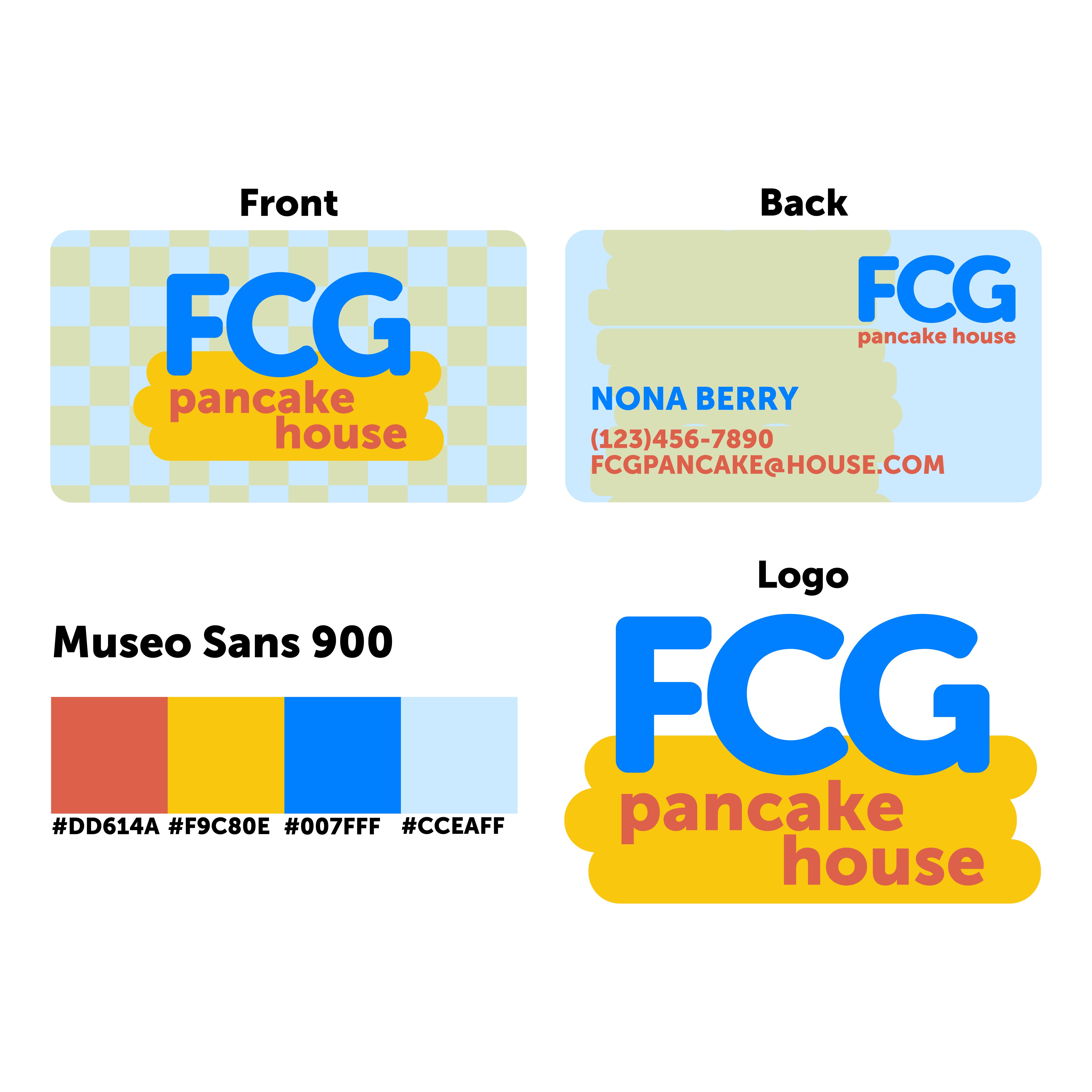
11 months ago by erin
adding a lighter color might help it stand out
11 months ago by erin
not too sure on this font
11 months ago by erin
Posts
DentiCo
- Report
erin • 5 months ago


This is veeerryy nice!
5 months ago by Raphael Etim - Reply
I love the simplicity of this design!
5 months ago by Nadine - Reply
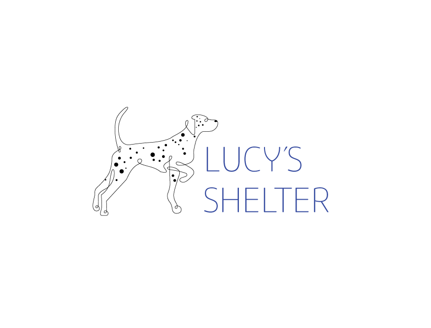
Lucy’s Shelter
- Report
erin • 5 months ago
This is what came from the feedback of the last rendering.

Great design. Consider the places this logo will be used, billboards, signs, flyers, social media, etc. A logo must be legible in all formats, so the thin lines used for the illustration of the pup risk being visually illegible. Especially with your bold typeface, I would recommend simplifying the illustration and making it more visually legible!
4 months ago by Caden - Reply
Nice design, although not sure on the colour of the font....
5 months ago by Matt - Reply
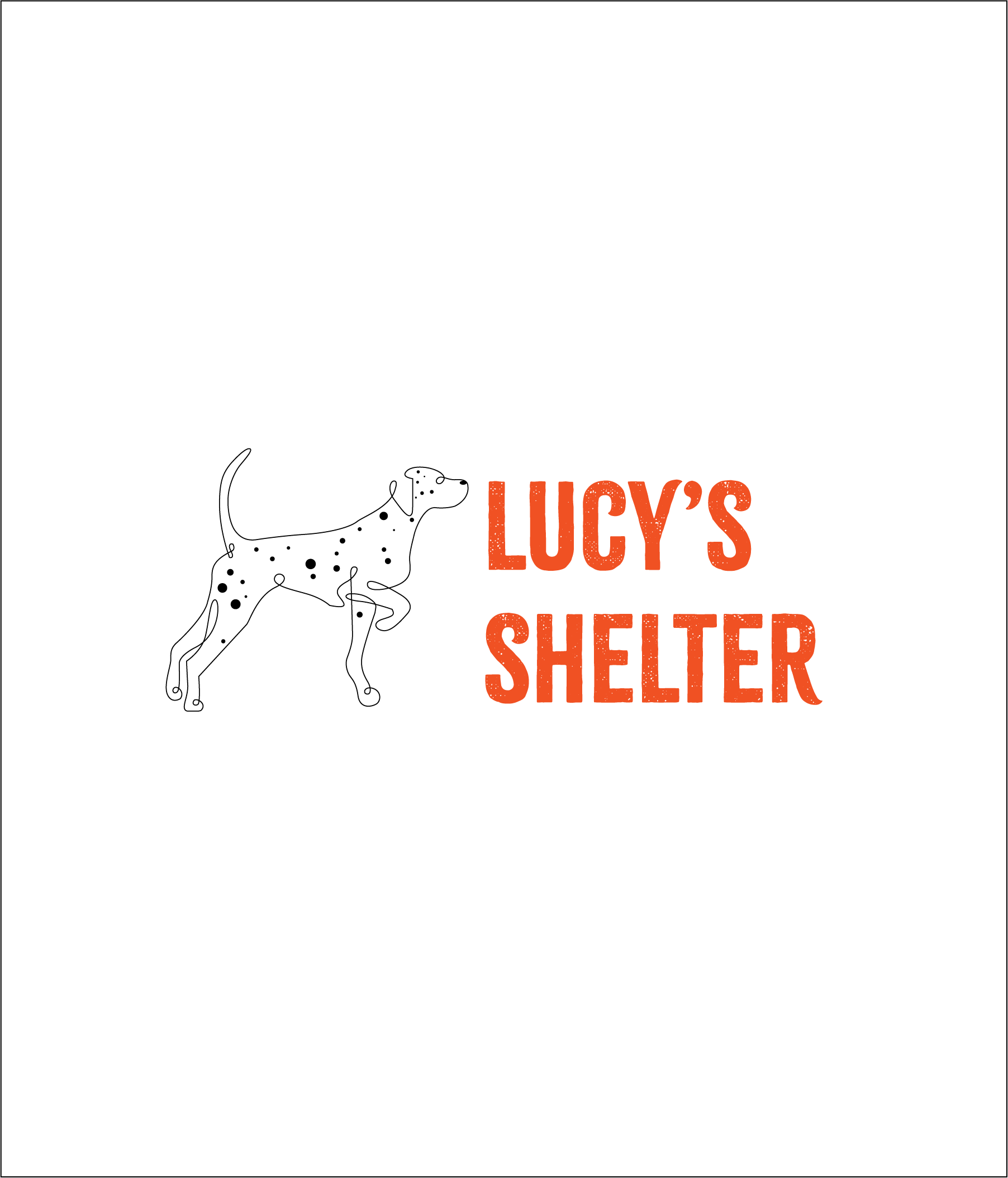
Lucy's Shelter
- Report
erin • 6 months ago

the dog is super cool, i like the one line design! I like that it's looking towards something gives the idea of going somewhere and also draws the eye to the name. I think it might be good to have the name bigger to be more balanced against the dog's size, and also maybe a bolder font with a color less close to the black?
6 months ago by Sir - Reply
Mi Casa
- Report
erin • 6 months ago
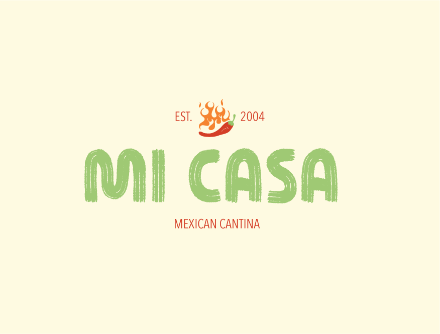

I think this design is perfect for a Mexican cantina but the back around looks a bit to soft I love the green bold writing as well as I love the little chilly . So I would say overall it looks great .
6 months ago by Isley Wallace - Reply