Caden
Posts
1
Likes
2
Liked Posts
0
Given Feedback
4
Feedback
Great design. Consider the places this logo will be used, billboards, signs, flyers, social media, etc. A logo must be legible in all formats, so the thin lines used for the illustration of the pup risk being visually illegible. Especially with your bold typeface, I would recommend simplifying the illustration and making it more visually legible!

2 months ago by Caden
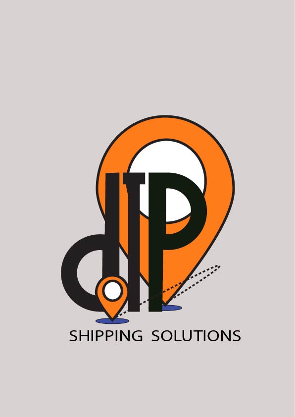
The black outline of the circle and the I are conflicting here. Be conscious of where your lines intersect and cross! Repeating that logo element twice is also a bold choice to make, finding a good visual balance in the logo using those symbols is another thing to look at! Otherwise, great work.
2 months ago by Caden
Try using the drop shadow effect in photoshop to create a more realistic shadow!
2 months ago by Caden
Looks great! I'd look for some more balance though. The bubble has a lot of visual weight that balancing out could benefit the logo in a big way!

2 months ago by Caden
Posts
Dak Logo Design
- Report
2 months ago by Caden
Hello,
I am James, owner of Dak. I'm looking for someone that can create a simple logo for my business. I think a wordmark would look cool. Can you do that?
I am James, owner of Dak. I'm looking for someone that can create a simple logo for my business. I think a wordmark would look cool. Can you do that?

 2 Likes
 4
4
nice i like this .
2 months ago by Nikita Supyal - Reply
so cool!! super efficient and eye-catching logo
2 months ago by Sir - Reply
nice :)
2 months ago by Pizza - Reply