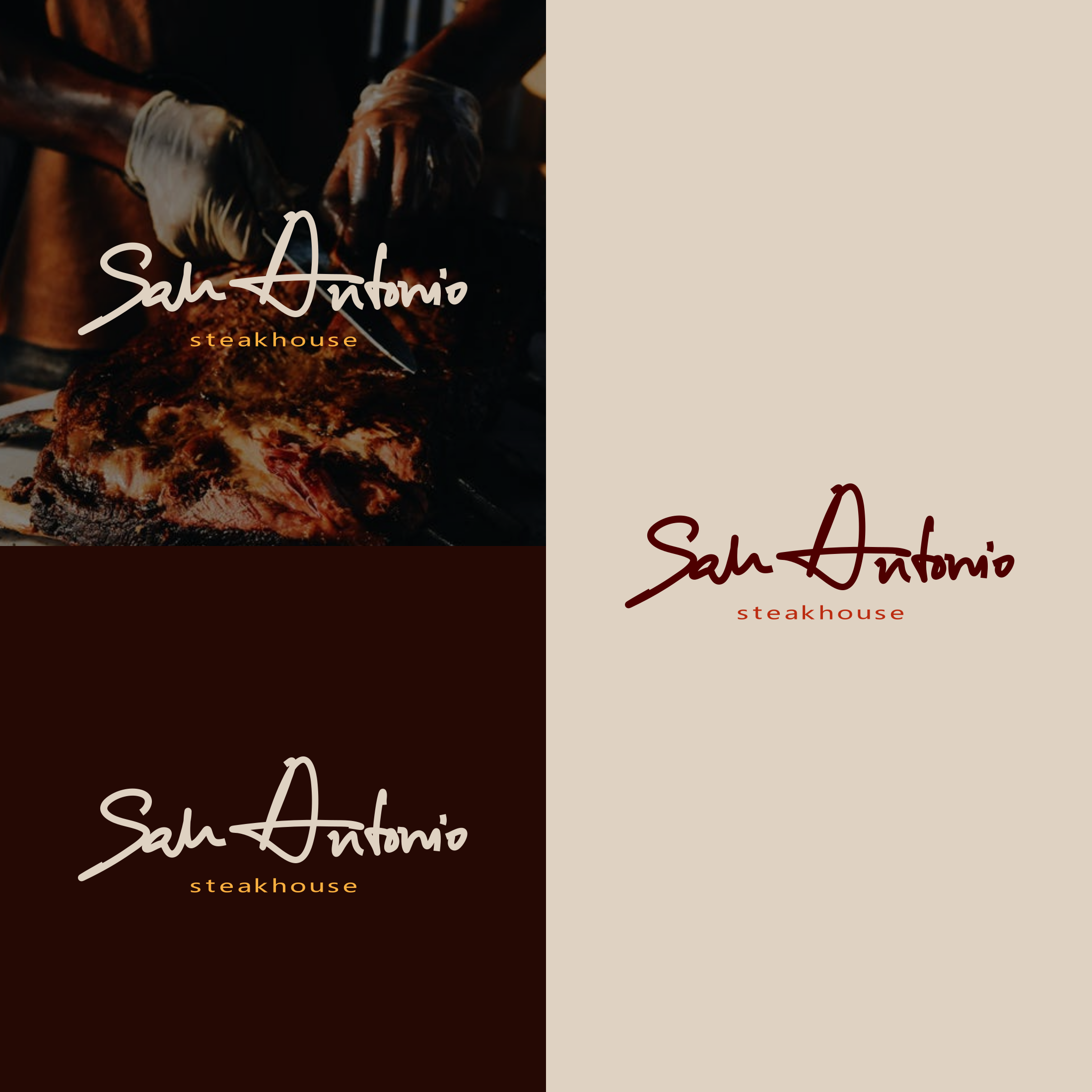
What is a wordmark logo
In logo design a wordmark is quite similar to a lettermark. Both of these logo types use just the letters of the name of a brand to create a unique and recognizable icon. In recent years, however, many brands have switched to wordmarks to modernize their image while dropping their more detailed historic logos. Burberry is one of the most famous examples of this as they went with a simple sans-serif wordmark in 2018. After much criticism that their simplicity went too far, they reverted back to using a serif font much like their original logo. While it's hard to make a wordmark unique and reflective of a brand's image, you can do a lot by working with different color combinations and whitespace. A good example of this is the FedEx logo that looks simple but uses its whitespace to create an arrow, reflective of the delivery industry that FedEx is a part of.
Some famous examples of wordmark logos are the logos of:
- Coca-Cola
- FedEx
- Sony
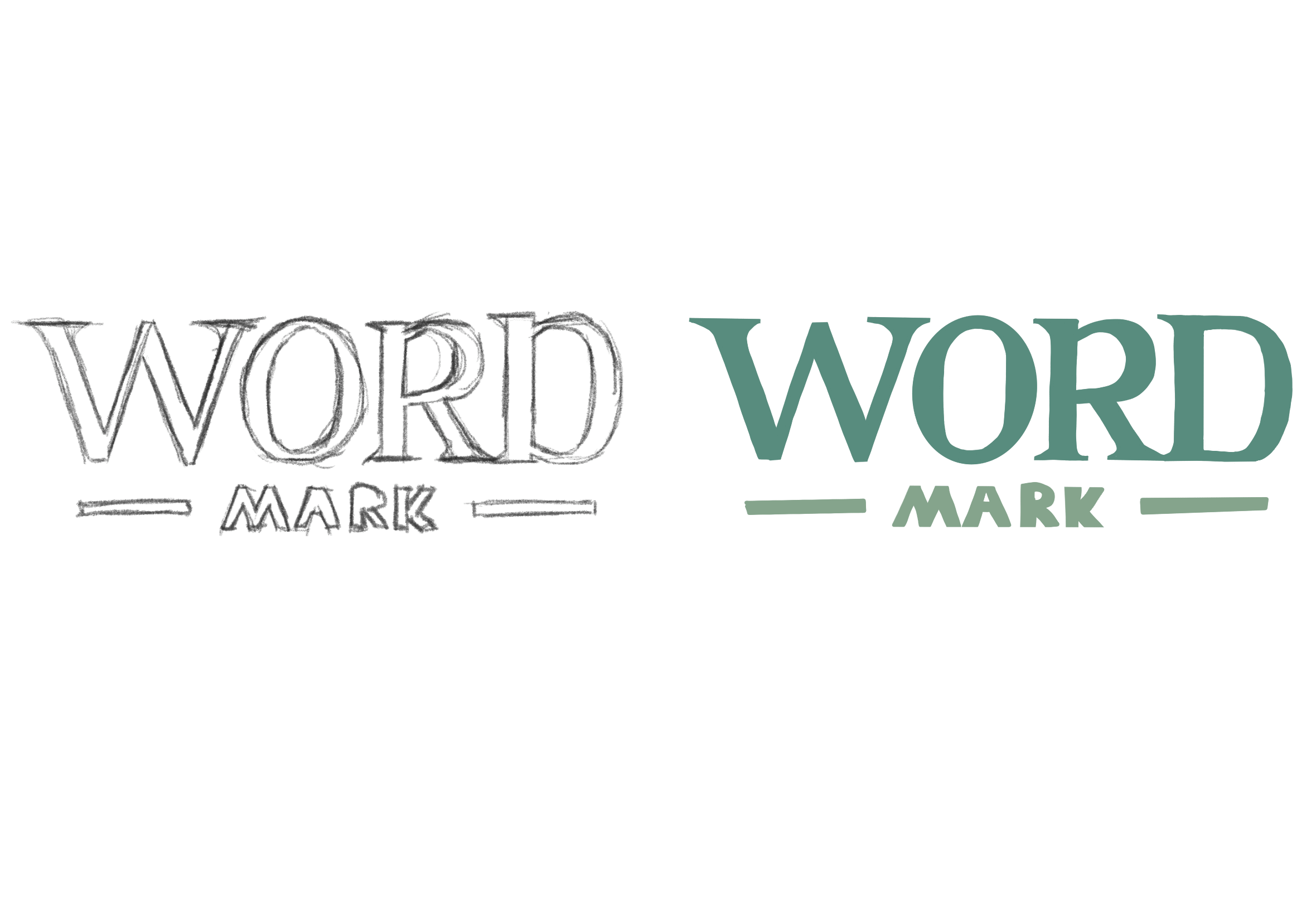
How to design a wordmark logo
Conceptualization and brainstorming
Begin by brainstorming ideas for your wordmark logo. Consider the values, personality, and identity of the brand and write everything down that comes to mind. Think about the message you want to convey and the emotions you want to evoke.
Typography selection
Choose a font or customize lettering that reflects the brand. Experiment with different typefaces to find one that aligns with your brand's tone or start by sketching the lettering yourself.
Letter arrangement and design
Pay attention to the spacing between letters and the arrangement of the words. Adjusting letter spacing (kerning) can enhance readability and visual balance. Experiment with different arrangements to find the most visually appealing composition and maybe do some modifications to the letters to make the logo interesting and unique. Aim for simplicity and clarity in your design. Avoid overly elaborate decorations or fine details that may detract from the readability of your wordmark. Focus on creating a clean and memorable design that resonates with your target audience.
Color palette
Select colors that resonate with the brand identity. Consider the psychology of color and how different they can evoke different emotions or associations. Keep in mind that the colors you choose should be versatile and work well across various applications.
Feedback and Iteration
Gather feedback from peers, colleagues, or the target audience of your wordmark design. Take their input into consideration and make necessary adjustments to refine your logo. Iteration is key to achieving a final design that perfectly fits with the brand. Ensure that your wordmark logo is versatile and scalable. Test its visibility and legibility across different sizes and platforms - from small screens to large prints.
Finalization
Once you're satisfied with your wordmark logo design, finalize it by saving high-resolution versions in various file formats (e.g., PNG, SVG, EPS). Make sure to keep a master file for future edits or resizing needs.