August van de Ven
Designer and creator of FakeClients.com
Posts
1
Likes
4
Liked Posts
669
Given Feedback
8
Feedback
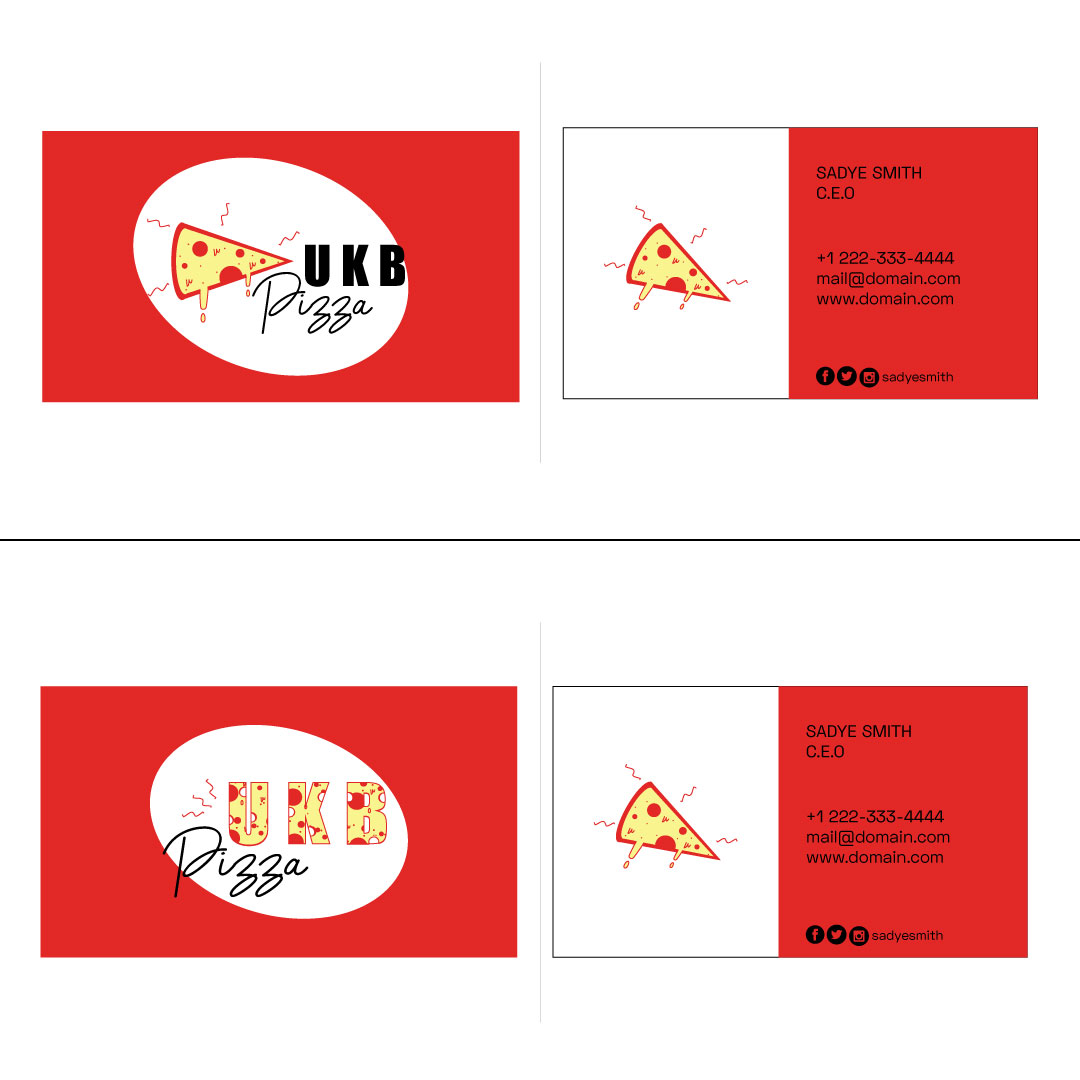
Great work Joanne! I like the first one, the second may be a little hard to read with the pizza pattern and the bold text.
Maybe the first one would look better if you use a lighter font for "UKB" so it looks a bit more balanced. Keep it up :)
5 years ago by August van de Ven
Beautiful! I only think the "Time & Date" & "Events Place" could use a bit more whitespace at the top

5 years ago by August van de Ven
Love the simplicity but the subtitle is a little hard to read right now

5 years ago by August van de Ven
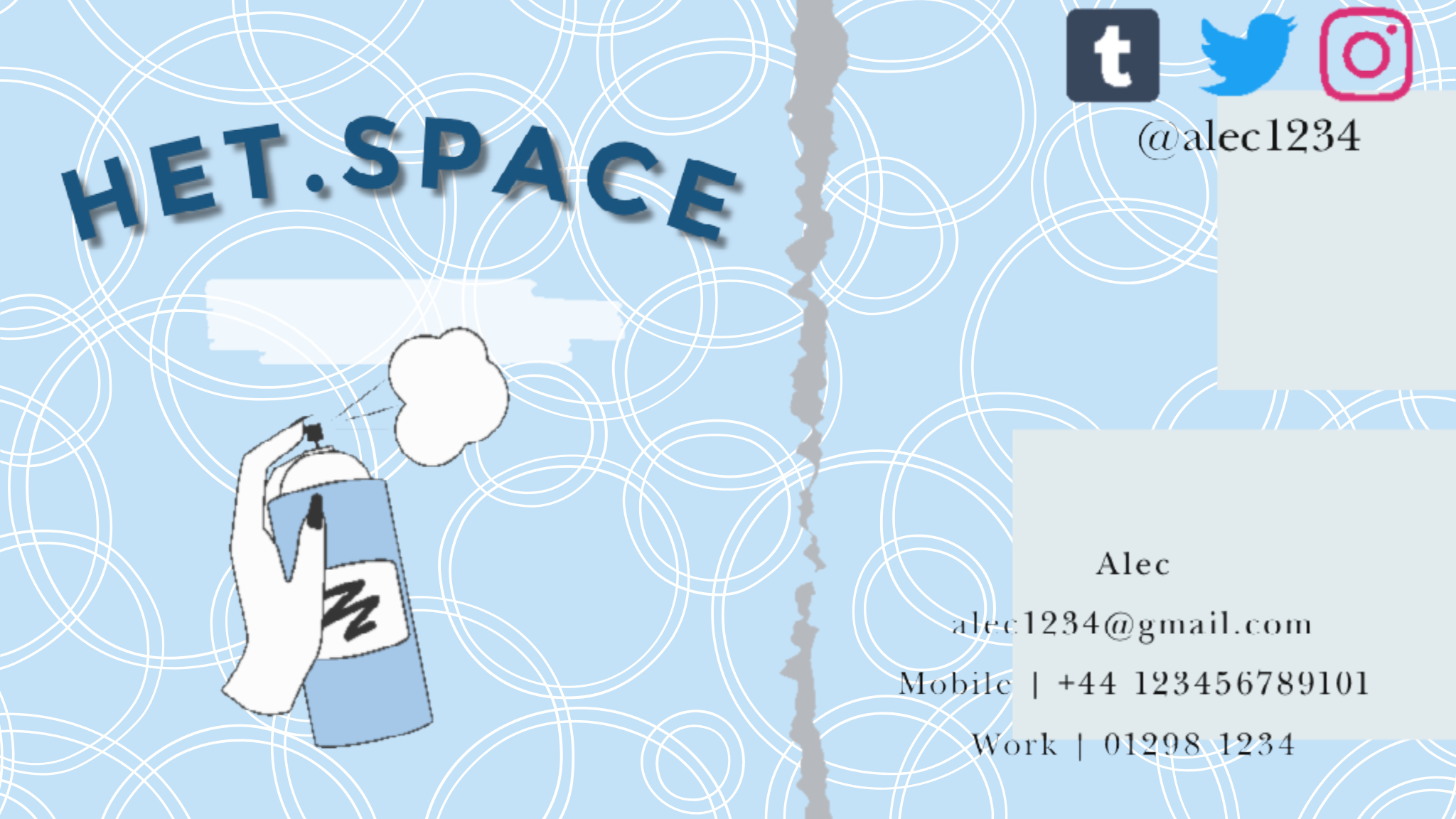
Great job Chloe! Maybe it will look better if you change the font of the contact information to be the same as the "het.space" font. It's a little hard to read right now
5 years ago by August van de Ven
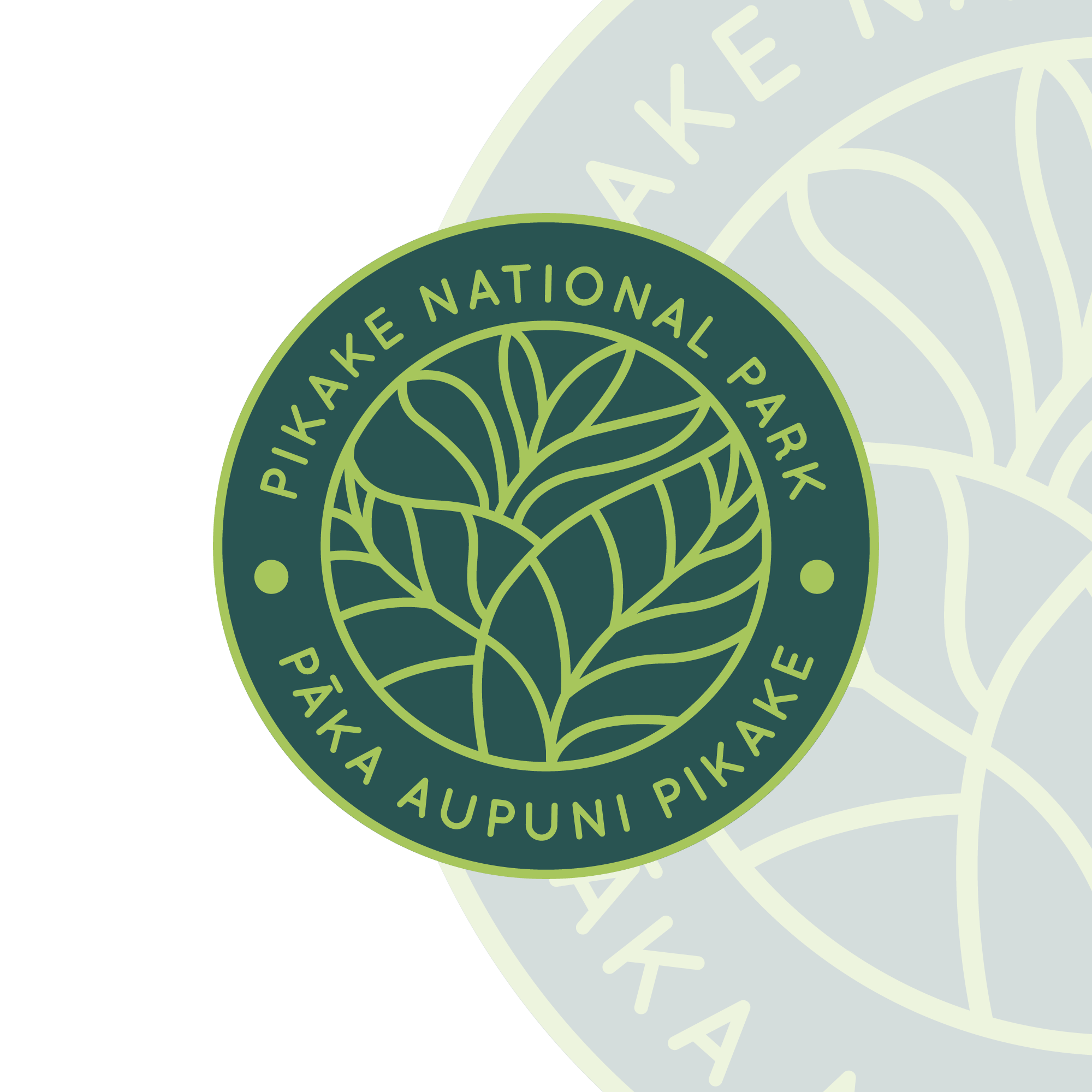
Love these colors! The only thing is that the text seems a bit off-center or the curve the text is on is different than the other circles
5 years ago by August van de Ven
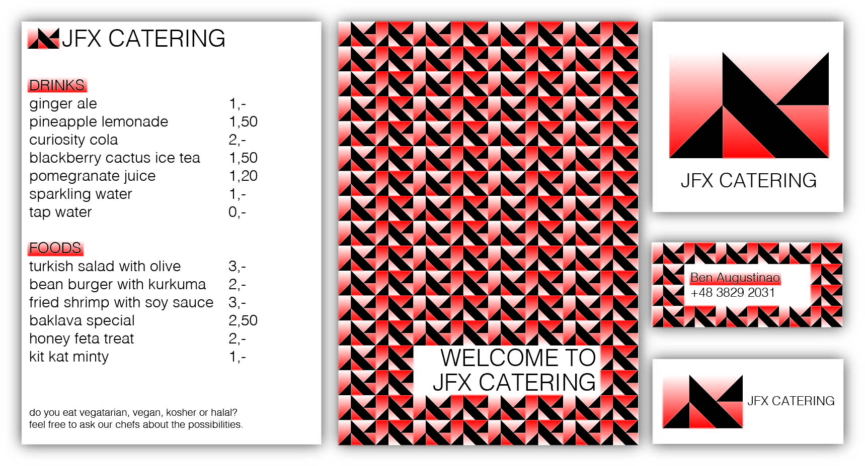
Really like how you used the logo to make a pattern! I think that the text with the gradient background can be a little hard to read however because of how dark the red is. Maybe white text works better?
5 years ago by August van de Ven
Like the logos but I couldn't see the lighter colors at first
5 years ago by August van de Ven
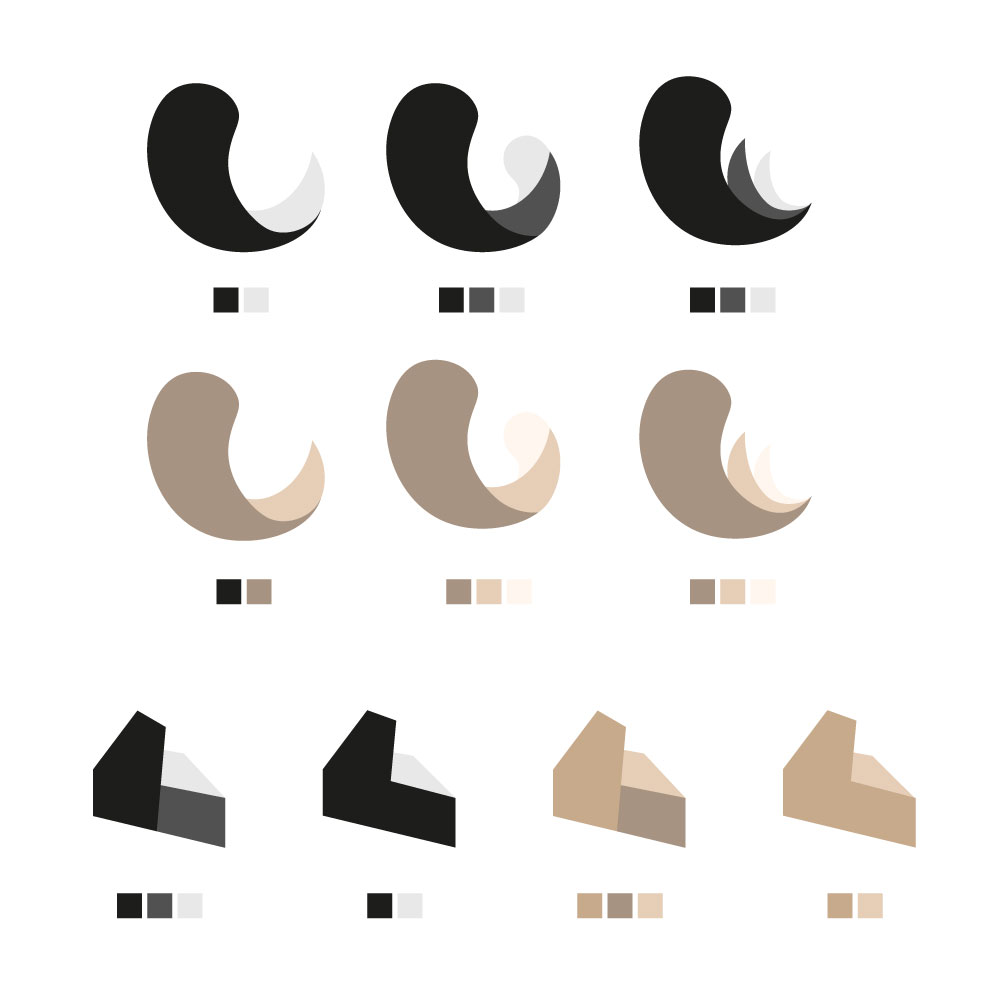
I used the golden ratio to make these curves more pleasing to look at. Most curves in the logo are actually based on the golden ratio.

5 years ago by August van de Ven
Posts
Logo for Reworn.co
- Report
August van de Ven • 5 years ago
Reworn.co makes it more easy to browse second hand clothing and also helps you provide the right items for you with various different filters while promoting buying second hand. The logo is currently being used within the website and android app.


when i saw this, i cannot figure out this logo represent what , is it an icon , a name pictogram or what. better if u make it in lettermark, so people will know that it is reworn, than only 'R' which is people gonna think it is nothing.
4 years ago by Sora - Reply
Agree with August van de Ven
5 years ago by joacimnilsson - Reply
When I looked at the logo my mind tried to make something out of it. Is it an "R"? Is it somehow a person? Is the whitespace something?
5 years ago by Rich Corbridge - Reply
I like the Logo! It is simple and people will recognize it. In my Opinion it is not a logo's job to describe anything about the company, a logo is just there to catches people eyes. I am just not a big fan of gradients. It's sometimes a problem to print gradients.
5 years ago by Magdalena - Reply
The lettermark is very interesting. A problem I have with this design is that it doesn't tell me anything about the business and what they do, at first it seemed to be about hair products. Maybe you could insert and apparel item into the negative space.
5 years ago by stancinovici - Reply
I used the golden ratio to make these curves more pleasing to look at. Most curves in the logo are actually based on the golden ratio.
5 years ago by August van de Ven - Reply