joacimnilsson
Posts
1
Likes
1
Liked Posts
3
Given Feedback
7
Feedback
Give the button more room to breathe
5 years ago by joacimnilsson
Thanks Liz and Clare! Okey will try to use the same color for the background and the form.
Will aswell test the colors for red on the dark grey.
5 years ago by joacimnilsson
5 years ago by joacimnilsson
Agree with August van de Ven

5 years ago by joacimnilsson
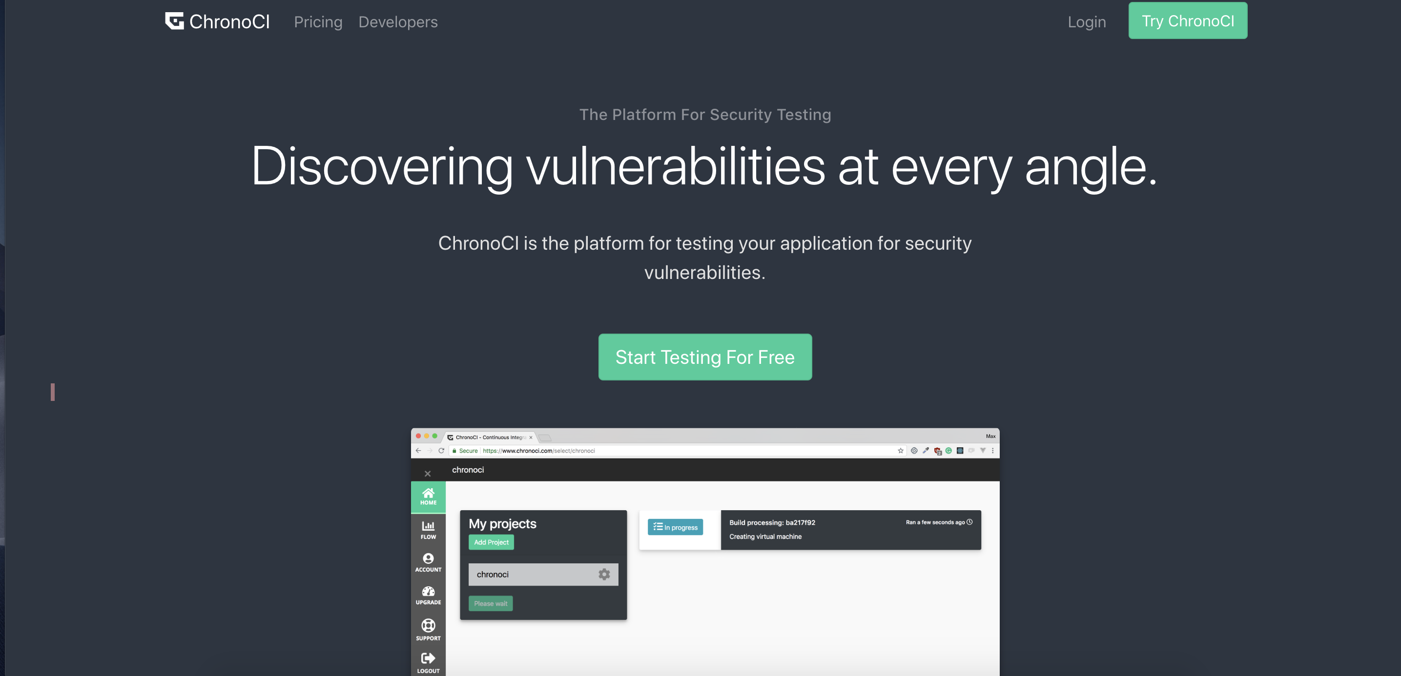
Illustration that shows what the site can do would be awesome! :D
5 years ago by joacimnilsson
Posts
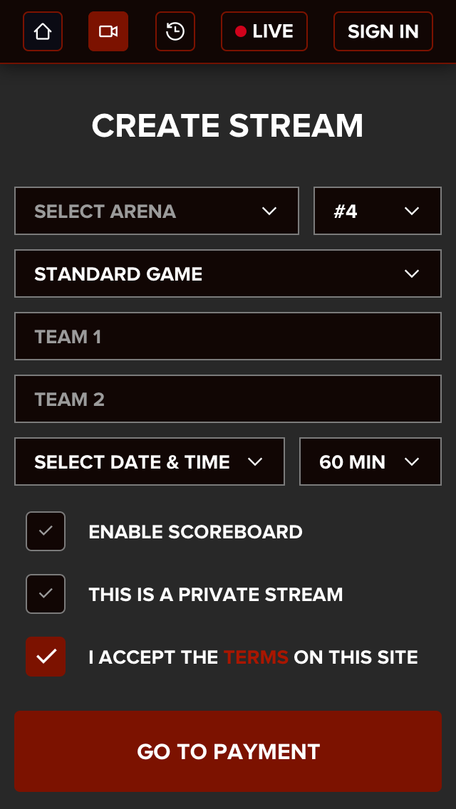
Create a new stream page for a streaming website
- Report
5 years ago by joacimnilsson
This is the page that lets you create a stream on a streaming website. Is it to dark?
 1 Like
 6
6
Sorry to jump in. New version looks great, is that live indicator supposed to be a button or just a way to let you know it's going to be live? If it's not tapable, maybe just have the element without the border and see how that feels.
5 years ago by Nathan - Reply
Is this better?
http://joacimnilsson.se/v2.jpg
5 years ago by joacimnilsson - Reply
Thanks Liz and Clare! Okey will try to use the same color for the background and the form.
Will aswell test the colors for red on the dark grey.
5 years ago by joacimnilsson - Reply
The red on the dark grey probably won't pass the web contrast test (as a guess) test your colours here: https://webaim.org/resources/contrastchecker/
5 years ago by Clare - Reply
Not to say dark, but heavy. Maybe try to use fewer outlines? Similar to this example: https://dribbble.com/shots/4816828-Deposit Or maybe you can make the background color the same color as the background color in the form. Similar to this: https://dribbble.com/shots/4925155-Crowdrise-by-GoFundMe-Sign-Up-Page
5 years ago by Liz Zvereva - Reply
5 years ago by joacimnilsson - Reply