stancinovici
Posts
1
Likes
2
Liked Posts
2
Given Feedback
2
Feedback
The lettermark is very interesting. A problem I have with this design is that it doesn't tell me anything about the business and what they do, at first it seemed to be about hair products. Maybe you could insert and apparel item into the negative space.

5 years ago by stancinovici
You have a non-textured version as well, right? I don't know if this is intended but i love the serifs on this font. It looks like a fish tail.

5 years ago by stancinovici
Posts
Logo for a delivery service
- Report
5 years ago by stancinovici
"Hi!
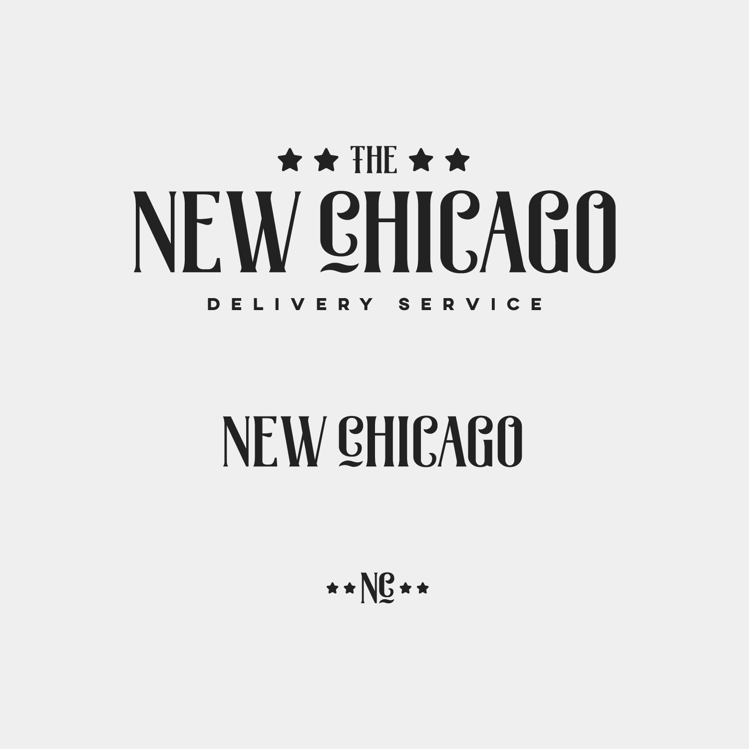
I am Melisa, creator of The New Chicago Delivery Service. For a while now, we've been looking for a good logo for our Delivery Service. I think a wordmark would look cool. Can you help us out?"
At first, I tried designing this logo with ultra-modern fonts and typography but it didn't feel right. So I had it turned around to a typography that resembles the ones of the old factories of Chicago. The "THE" on top of the wordmark looked a little lonely so I added the 4 stars that are present on the Chicago's Flag.
I was looking at the Chicago stars, you could use the originals. They have a retro style and the shape it's kind a weird, I think they are cool. Smaller maybe, they are too heavy. And the underlined c I don't think it's necessary. On the monogram (nc) below looks good but in the wordmark I think there is too many flourish, besides it's a capital letter.

5 years ago by Adri�n Rodr�guez - Reply
The typography is nice and definitely represents Chicago well, however the logo overall doesn't say 'delivery company' to me, maybe work in some delivery symbolism somehow
5 years ago by Clare - Reply