Logo for a delivery service
- Report
5 years ago by stancinovici
"Hi!
I am Melisa, creator of The New Chicago Delivery Service. For a while now, we've been looking for a good logo for our Delivery Service. I think a wordmark would look cool. Can you help us out?"
At first, I tried designing this logo with ultra-modern fonts and typography but it didn't feel right. So I had it turned around to a typography that resembles the ones of the old factories of Chicago. The "THE" on top of the wordmark looked a little lonely so I added the 4 stars that are present on the Chicago's Flag.
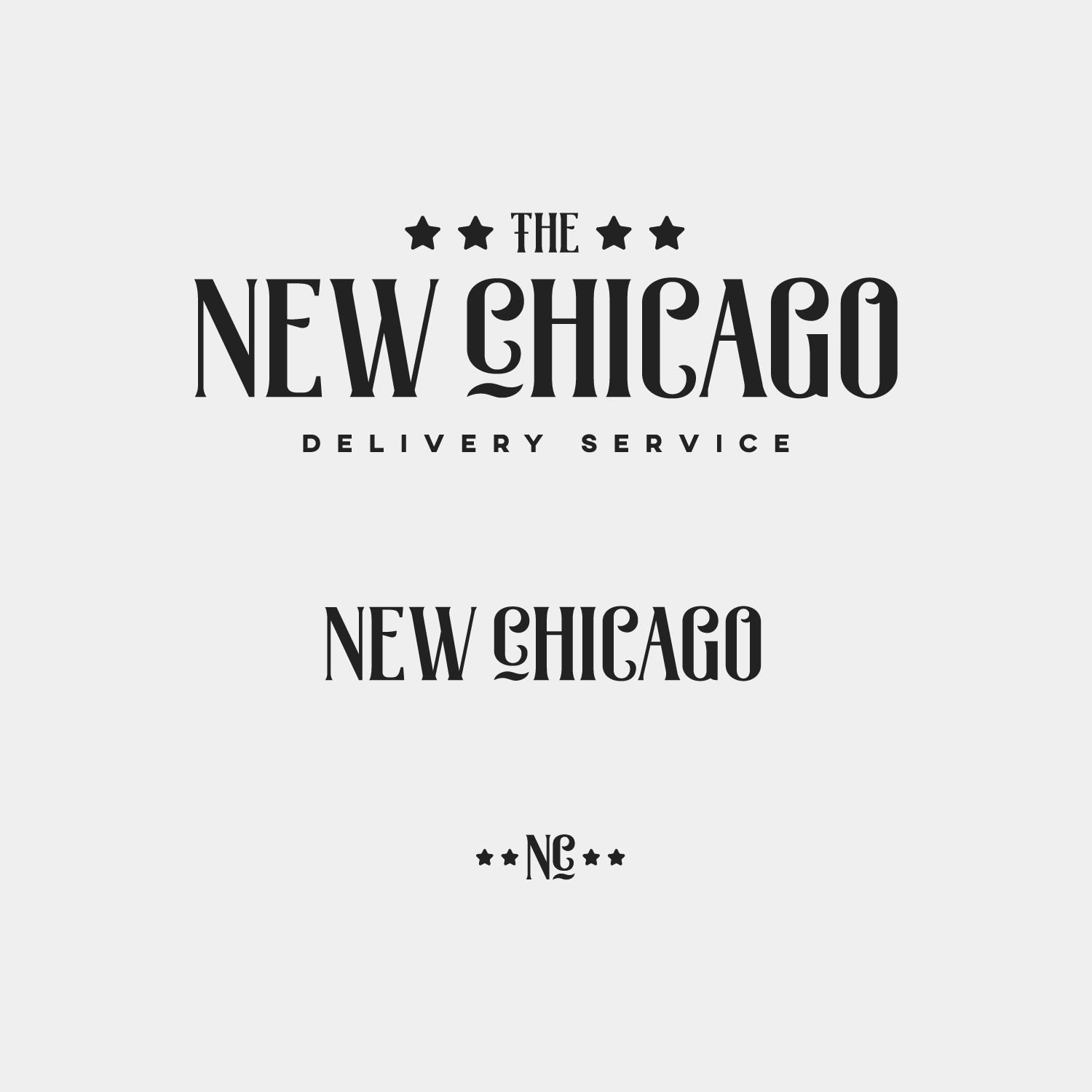
 2 Likes
 2
2
I was looking at the Chicago stars, you could use the originals. They have a retro style and the shape it's kind a weird, I think they are cool. Smaller maybe, they are too heavy. And the underlined c I don't think it's necessary. On the monogram (nc) below looks good but in the wordmark I think there is too many flourish, besides it's a capital letter.
5 years ago by Adri�n Rodr�guez - Reply
The typography is nice and definitely represents Chicago well, however the logo overall doesn't say 'delivery company' to me, maybe work in some delivery symbolism somehow
5 years ago by Clare - Reply


