Clare
Posts
0
Likes
0
Liked Posts
0
Given Feedback
2
Feedback
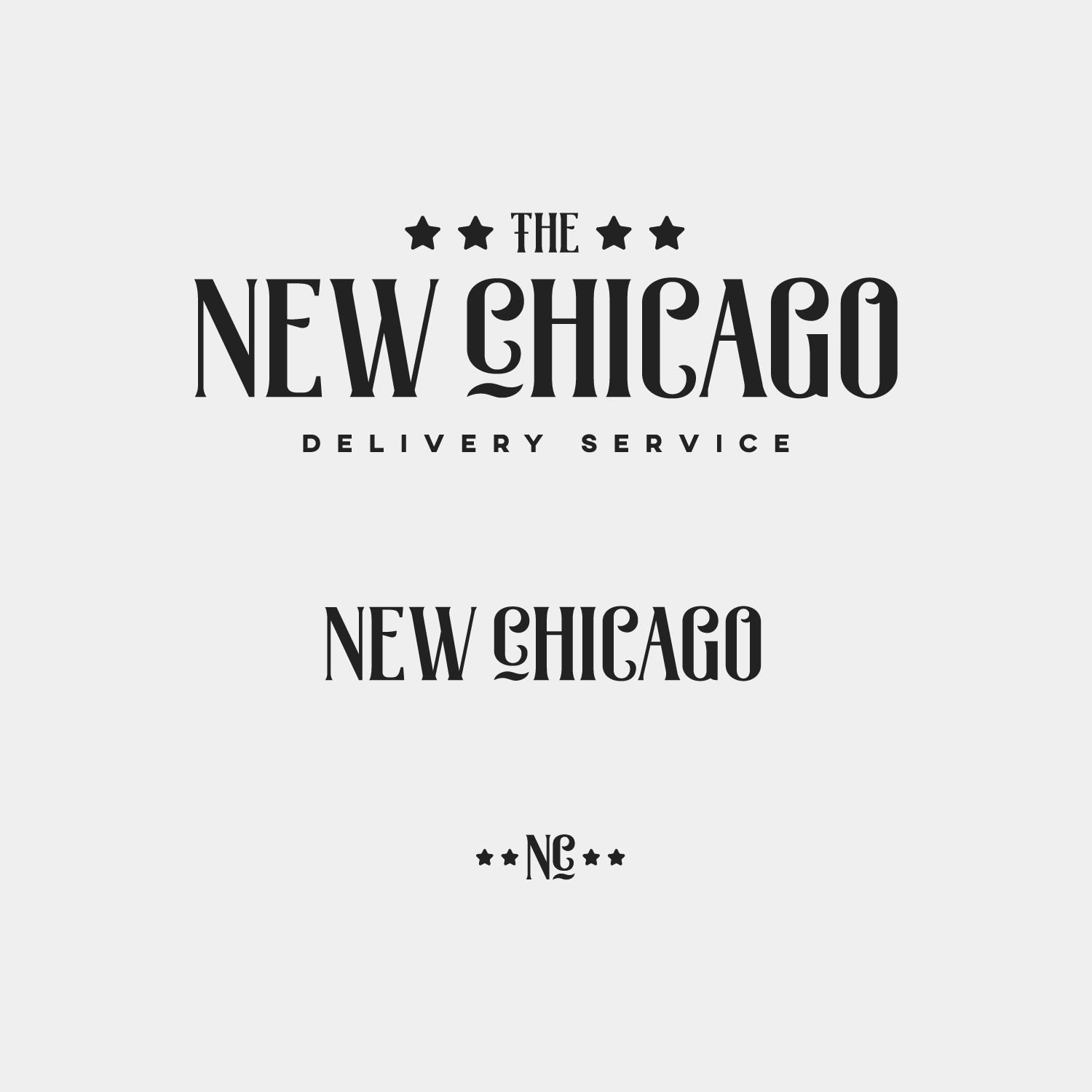
The typography is nice and definitely represents Chicago well, however the logo overall doesn't say 'delivery company' to me, maybe work in some delivery symbolism somehow
5 years ago by Clare
The red on the dark grey probably won't pass the web contrast test (as a guess) test your colours here: https://webaim.org/resources/contrastchecker/
5 years ago by Clare