Tatenda Chirima
Visual Identity Designer
Posts
27
Likes
13
Liked Posts
13
Given Feedback
11
Feedback
I like the colour palette, it's vibrant and refreshing but could've added some depth to the design to make it stand out more and maybe remove the smaller diamonds since they won't be visible when scaled down

3 years ago by Tatenda Chirima
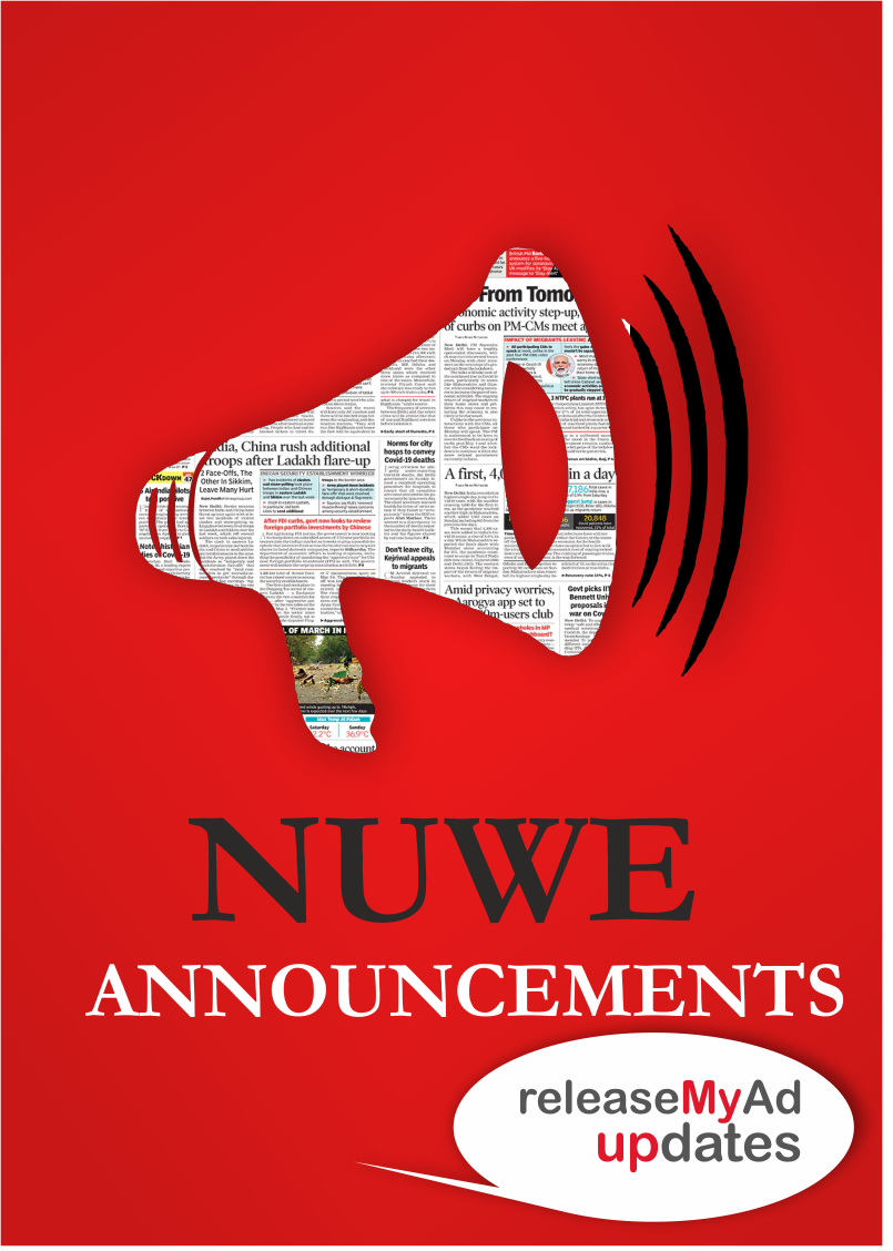
Really the like the contemporary feel the design has I'd've probably added the newspaper mask to the echoes as well
3 years ago by Tatenda Chirima
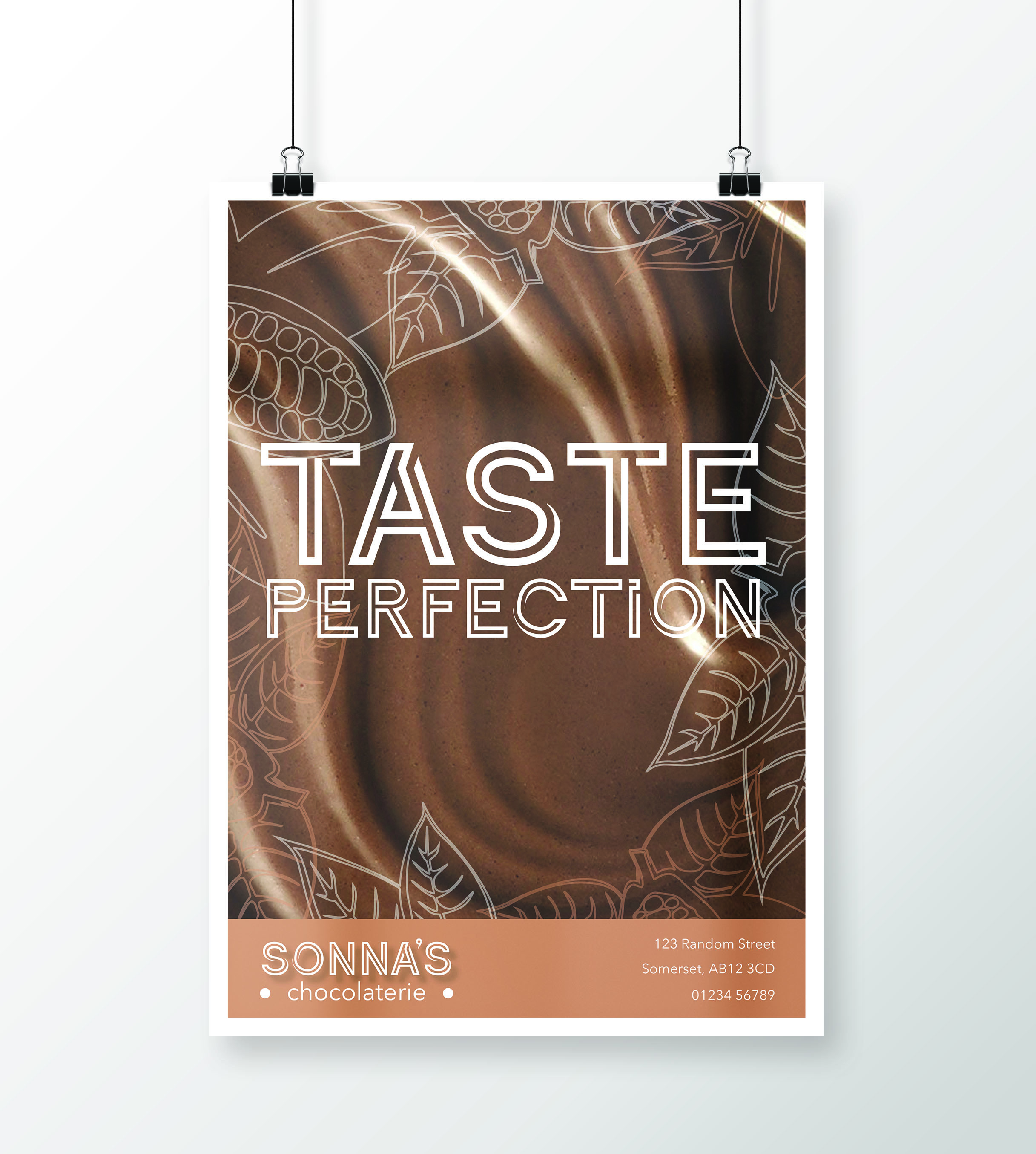
Like the use of the chocolate background to trigger the expectation, nevertheless, the leaf art/icons don't play a part in chocolate, therefore, don't serve a significant purpose but otherwise is a clean straightforward design
3 years ago by Tatenda Chirima
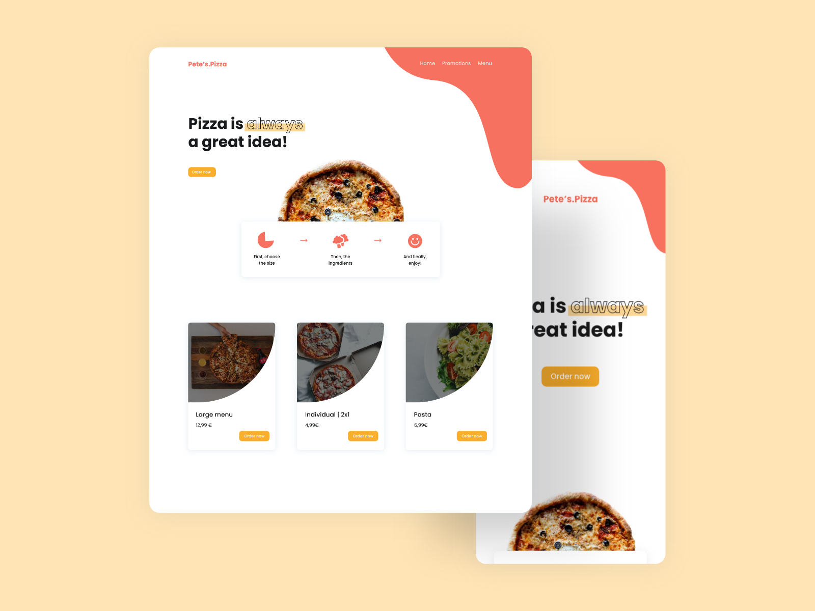
Like the layout and image outlines to resemble pizza slices. I feel the images could've been enlarged even more to balance out the negative space because you used a few elements
3 years ago by Tatenda Chirima
Like the simplicity of it but I feel the width of both elements could've been made the same to create a balance to the eye and also a more modern and contemporary font could be used to carry on the cleanness of the abstract logo
3 years ago by Tatenda Chirima
Clean and ergonomic design and good use of colour, however, the different shades of red and yellow won't be distinguishable when it's minimised
3 years ago by Tatenda Chirima
Like the font combination, however, more lively colours could be added to communicate some form of emotion and expectation
3 years ago by Tatenda Chirima
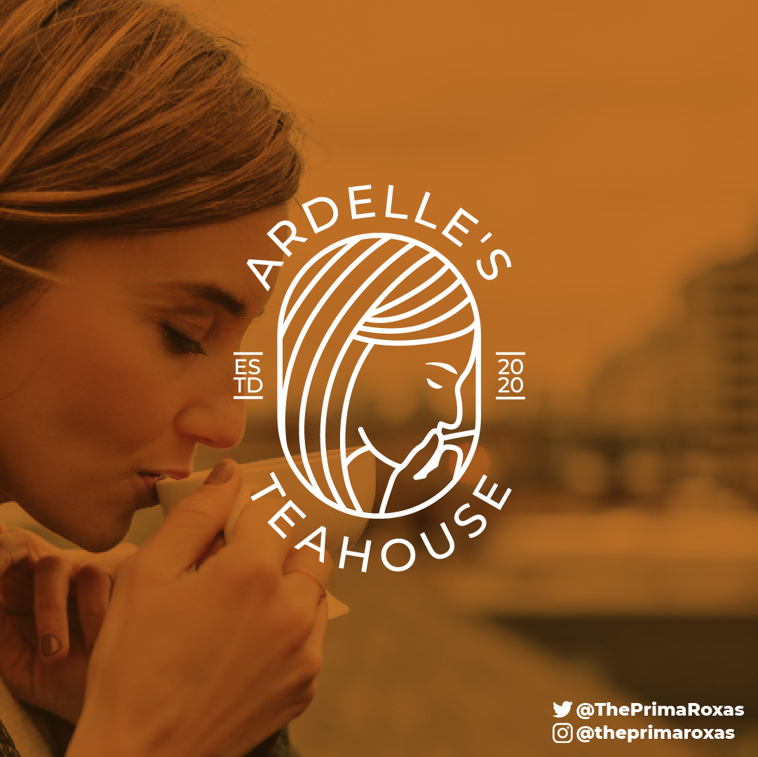
Love this! But the part of the illustration where the lady is holding the cup is not too visible and may be misinterpreted.
3 years ago by Tatenda Chirima
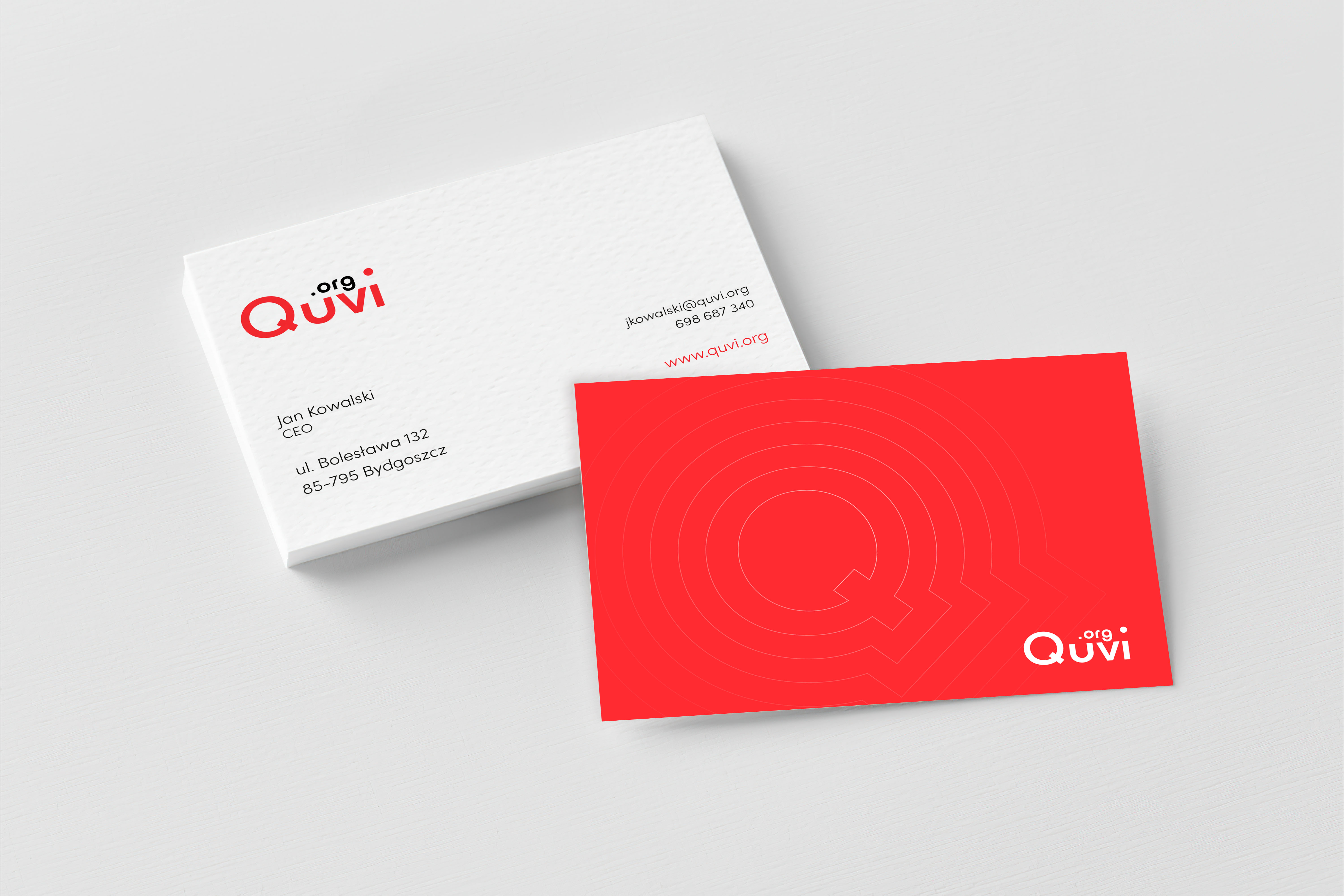
I like the striking colour palette but the positioning of ".org" is awkward and makes the wordmark look like something else from afar. The font could also be a bit more unique but otherwise, the simplicity is also appealing.
3 years ago by Tatenda Chirima
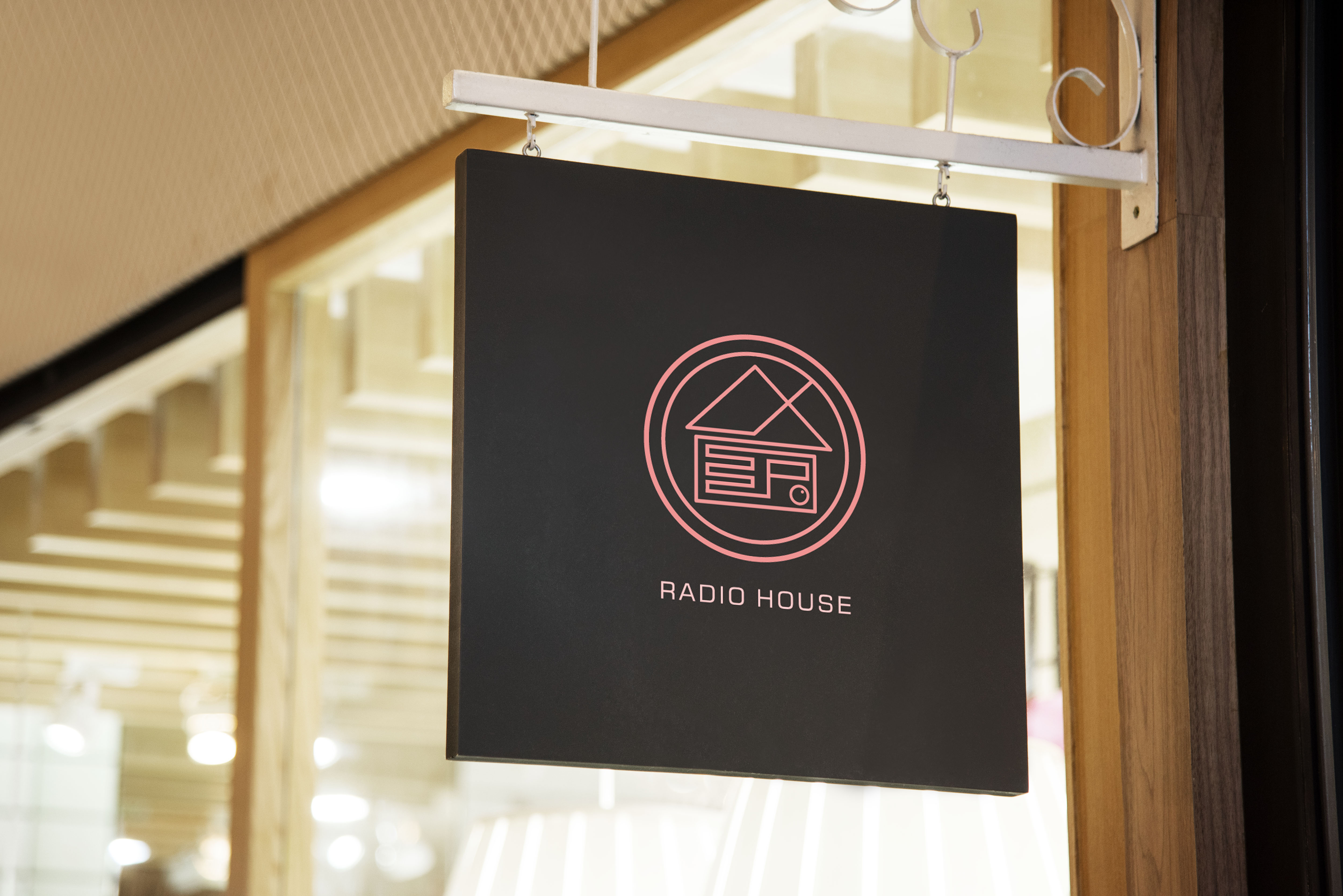
I like the simplicity of the logo and the directness of it but maybe you could've put the antenna on the roof of the house and not crossing over though you're trying to convey the message of a radio.
4 years ago by Tatenda Chirima
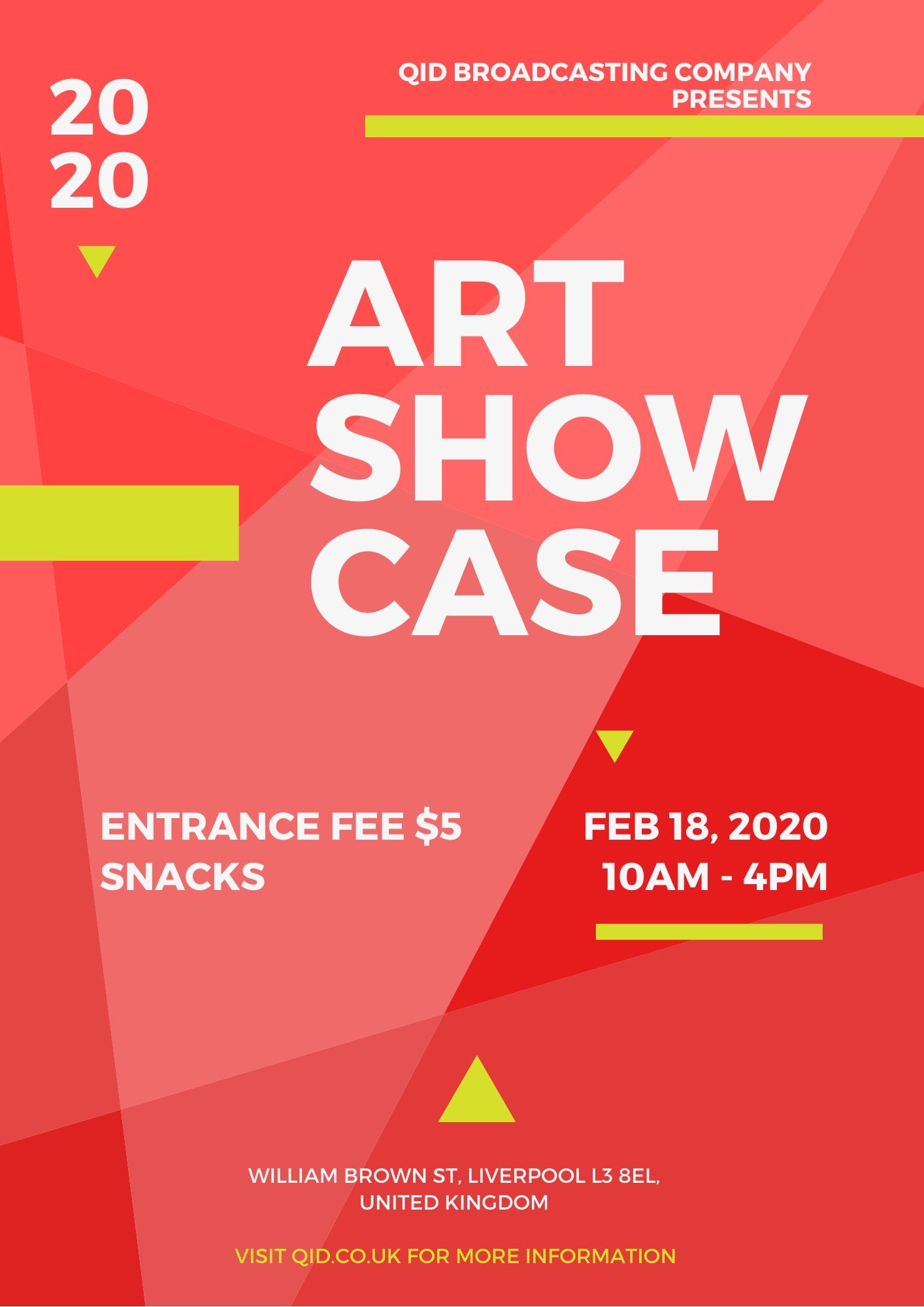
I like the disorderly concept of the layout as well as the colours, however, maybe you could've made some of the text yellow as well just and some of the shapes white to create that hierachy and emphasis of the disorderly theme you went with. But overly great design
4 years ago by Tatenda Chirima
Posts
BookField Business Card
- Report
3 years ago by Tatenda Chirima
Hi!
I'm Antonia, owner of BookField. For a while now, I've been looking for a good designer for my business. I want to have a business card for myself. Can you do that?
I'm Antonia, owner of BookField. For a while now, I've been looking for a good designer for my business. I want to have a business card for myself. Can you do that?
 2 Likes
 1
1
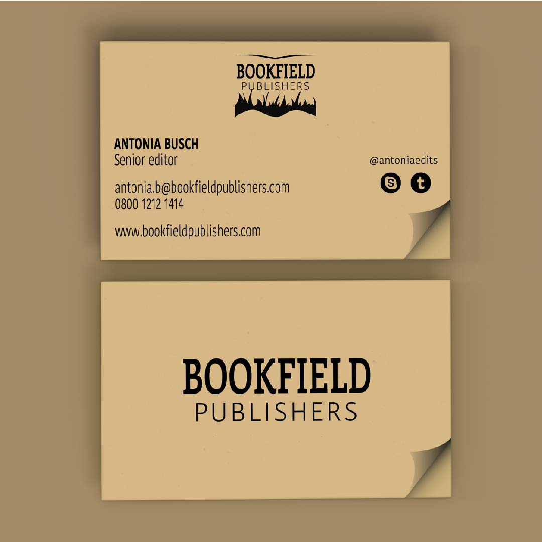
It will be helpful the person if u make... Publichers word to bold to make authentic.
3 years ago by KRISHNA TEJA DUDE - Reply
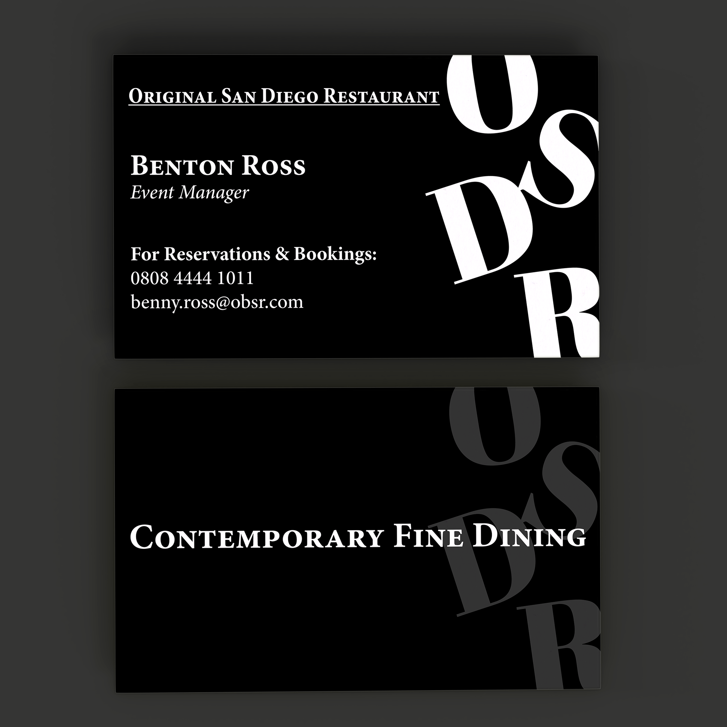
OSDR Business Card
- Report
3 years ago by Tatenda Chirima
Hello,
I am Benton, I recently started a new business called Original San Diego Restaurant. For a while now, I've been looking for a good designer for my Restaurant. I want to have a business card for myself. Can you help me out?
I am Benton, I recently started a new business called Original San Diego Restaurant. For a while now, I've been looking for a good designer for my Restaurant. I want to have a business card for myself. Can you help me out?
 3 Likes
1
3 Likes
1
Looks great I would definitely go fine dining here!
3 years ago by Emma - Reply
MusicPart Abstract Logo
- Report
3 years ago by Tatenda Chirima
Hey!
I am Sam, creator of MusicPart. We're looking for someone that can make a good logo for our business. I would like the logo to be an abstract mark. Would you be interested?
I am Sam, creator of MusicPart. We're looking for someone that can make a good logo for our business. I would like the logo to be an abstract mark. Would you be interested?
 2 Likes
1
2 Likes
1
simple and shiny
1 month ago by nouhaila - Reply
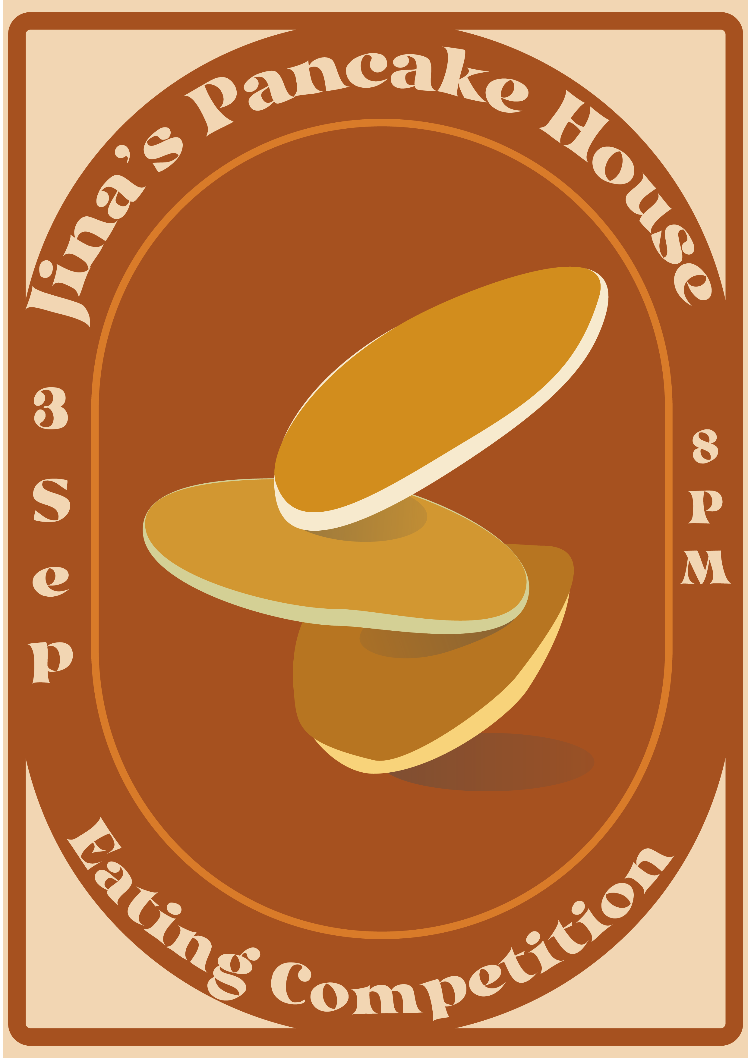
Jina's Pancake House
- Report
3 years ago by Tatenda Chirima
Hi!
I'm Jina, creator of Jina's Pancake house. For a while now, I've been looking for a good designer for my business. I would like a simple flyer for an event. Would you be interested?
I'm Jina, creator of Jina's Pancake house. For a while now, I've been looking for a good designer for my business. I would like a simple flyer for an event. Would you be interested?
 2 Likes
1
2 Likes
1
Love the colour and design it's making me so hungry!
3 years ago by Emma - Reply
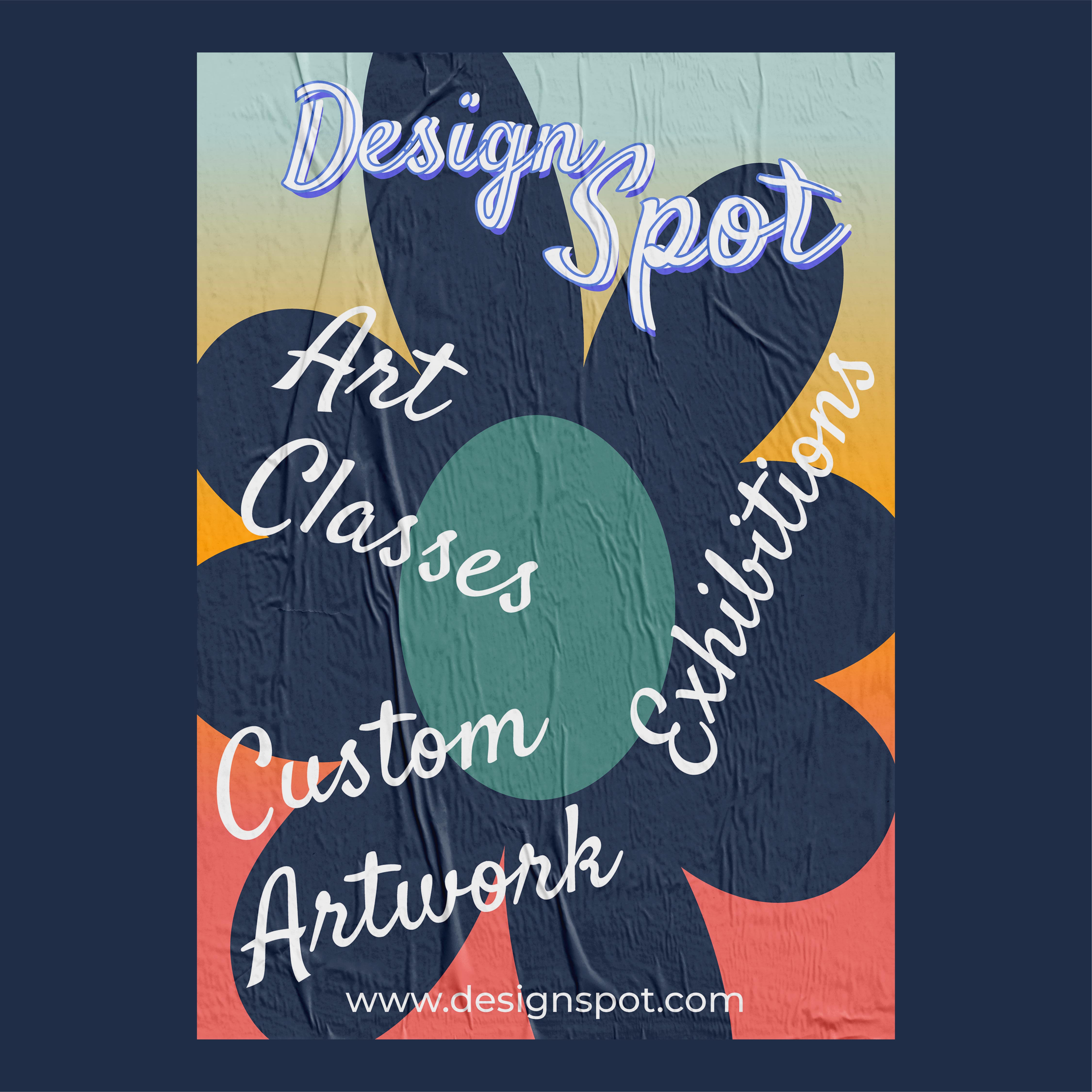
DesignSpot Poster
- Report
3 years ago by Tatenda Chirima
Hi!
I am Everette, founder of DesignSpot. I'm looking for someone that can design something for my business. We will need a poster to advertise our business. Can you help me out?
I am Everette, founder of DesignSpot. I'm looking for someone that can design something for my business. We will need a poster to advertise our business. Can you help me out?
 1 Like
1
1 Like
1
maybe aligning the text in a proper manner would make it better!
1 month ago by lilac - Reply