William Brewster
Posts
155
Likes
13
Liked Posts
0
Given Feedback
2
Feedback
I'll create an abstract logo in another time
2 years ago by William Brewster
It is too plain, still need work to do
2 years ago by William Brewster
Posts
San Diego Diner Logo
- Report
William Brewster • 2 months ago
This pictorial mark is inspired by neon signs at diners. The sign colors are cyan blue and red to support the theme. The neon palm tree is a symbol for San Diego and added a neon circle around the palm tree.
Hi,
I am Marcelene, creator of San Diego Diner. We're looking for someone that can create a simple logo for our Diner. I like pictorial marks. Would you be interested?
I am Marcelene, creator of San Diego Diner. We're looking for someone that can create a simple logo for our Diner. I like pictorial marks. Would you be interested?

 Like
Like


I like what you are going for but I think the palm tree could be filled in with color. Also, perhaps you might consider widening the stroke for the outside.
2 months ago by Bridget Nash - Reply
nice
2 months ago by Vartika Agarwal - Reply
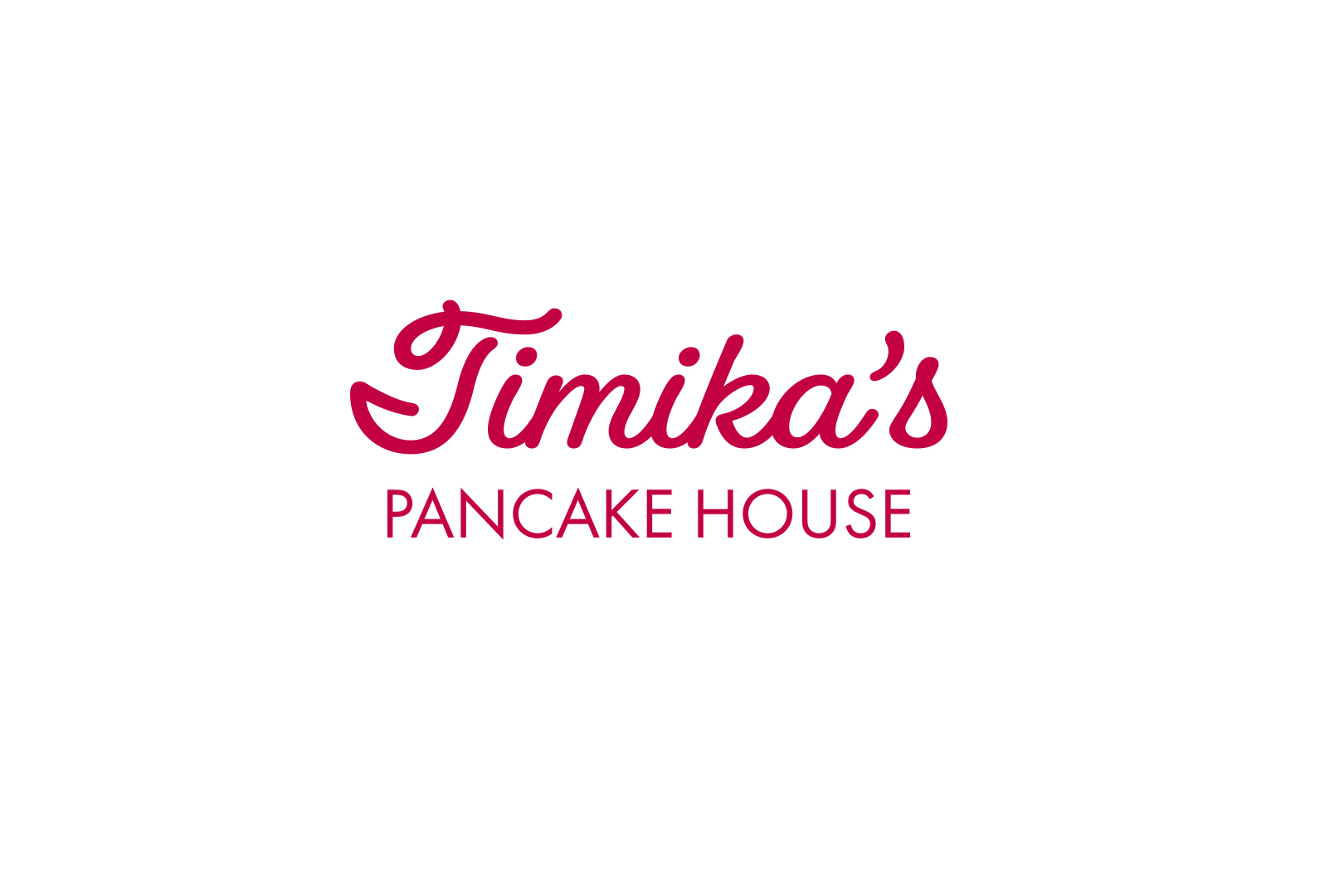
Timika's Pancake House Logo
- Report
William Brewster • 5 months ago
This is a wordmark based on vintage vibes of a pancake house and diners for the color red, and the cursive and sans serif typefaces. Timika's typeface is Fairwater Script, and Pancake House typeface is Futura PT.
Hello,
I am Timika, owner of Timika's Pancake house. I'm looking for someone that can create a simple logo for my business. I think a wordmark would look cool. We would love to work with you!
I am Timika, owner of Timika's Pancake house. I'm looking for someone that can create a simple logo for my business. I think a wordmark would look cool. We would love to work with you!

keep doing great work
5 months ago by li dow - Reply
Nice but color combination you should work on
5 months ago by Bikram Basnet - Reply
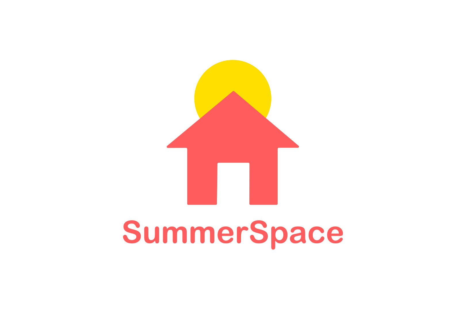
SummerSpace Logo
- Report
William Brewster • 8 months ago
This combination mark logo is a house with a sun to represent "SummerSpace." This logo would work for vacation and travel business. I adjust the edges of the house to fit the circle of the sun and the rounded typeface.
Hey!
I'm Sadye, owner of SummerSpace. I am looking for someone that can design a professional logo for my business. I think a combination mark will fit best with the business. Can you help me out?
I'm Sadye, owner of SummerSpace. I am looking for someone that can design a professional logo for my business. I think a combination mark will fit best with the business. Can you help me out?

I like this design. Very simple and aesthetic design https://fakeclients.com/uploads/cb12ad740dd9794bf0ae39ac514e61f8.jpg
8 months ago by Naufal Rafif - Reply
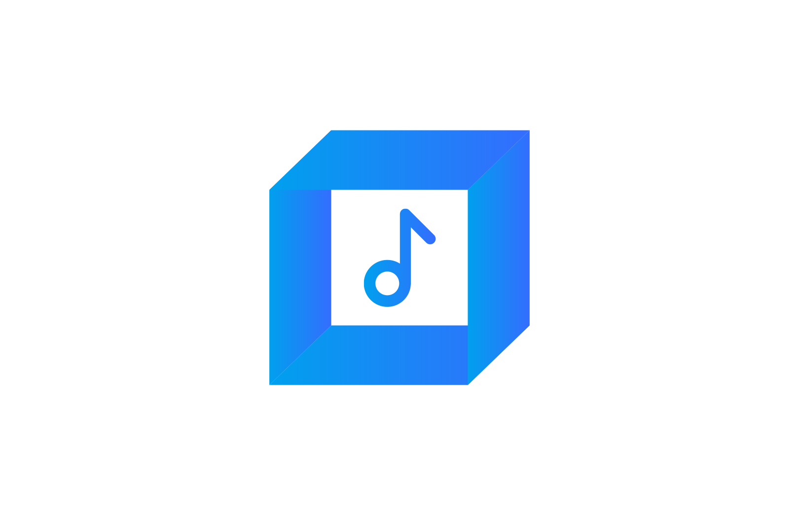
SongWatcher Logo
- Report
William Brewster • 9 months ago
The SongWatcher logo is a cube with a musical note on it. The semi 3D logo gives more depth to the music logo. The cube represents any kind of screen with music embedded into it.
Hey There,
I am Jene, creator of SongWatcher. For a while now, I've been looking for a good logo for my business. I would like the logo to be an abstract mark. Can you help us out?
I am Jene, creator of SongWatcher. For a while now, I've been looking for a good logo for my business. I would like the logo to be an abstract mark. Can you help us out?

Nice, I love the simplicity and the colour match💕
9 months ago by Temidun - Reply
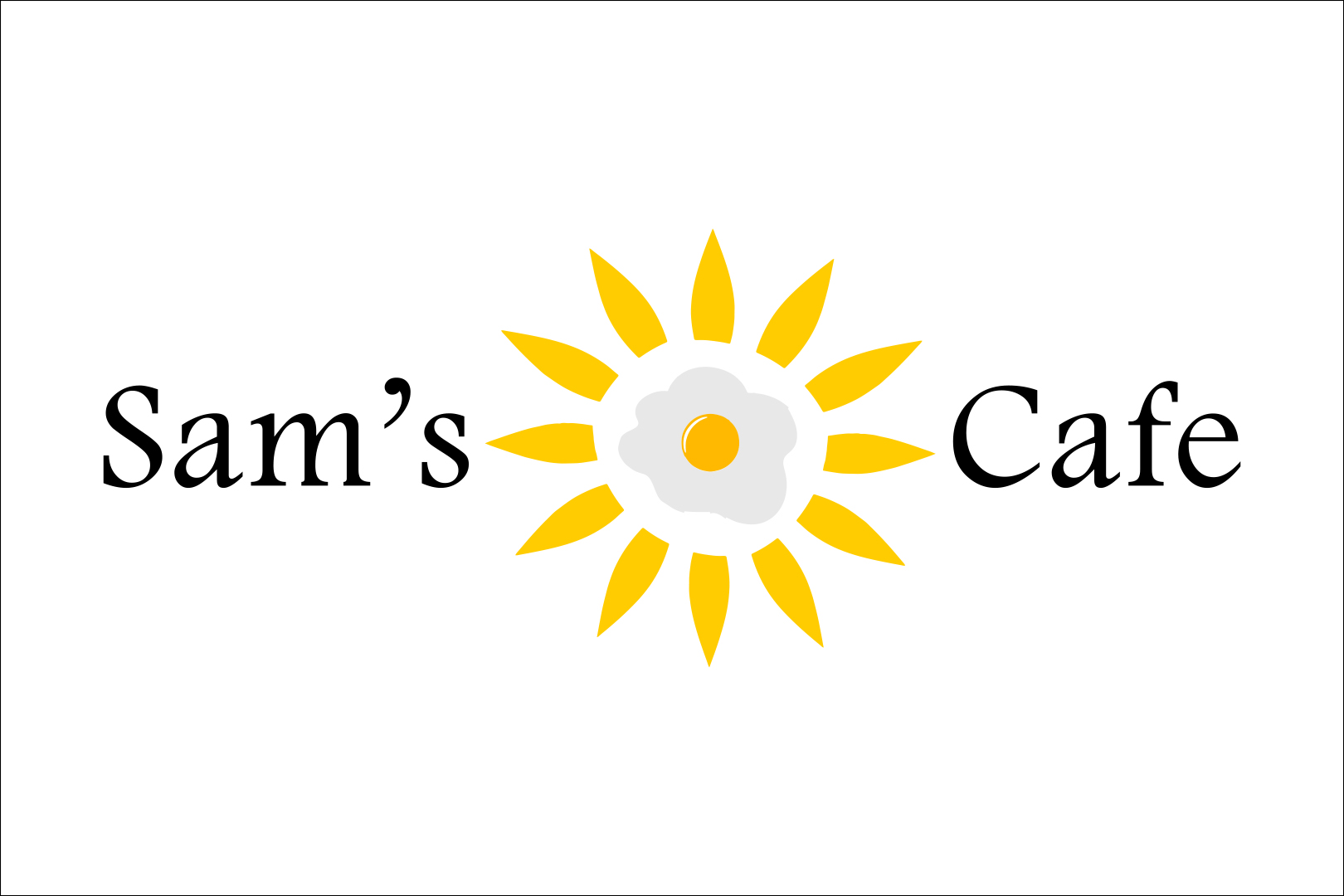
Sam's Cafe Logo
- Report
William Brewster • 10 months ago
Sam's Cafe combination mark is a egg yolk as a sun with streaks. I want it to be different and unique.
Hi!
I'm Sam, founder of Sam's Cafe. For a while now, we've been looking for a good logo for our business. I think a combination mark will fit best with the business. We would love to work with you!
I'm Sam, founder of Sam's Cafe. For a while now, we've been looking for a good logo for our business. I think a combination mark will fit best with the business. We would love to work with you!

amazing
10 months ago by Nabila Wahdatul - Reply