Alex Strøm
Posts
7
Likes
60
Liked Posts
7
Given Feedback
17
Feedback
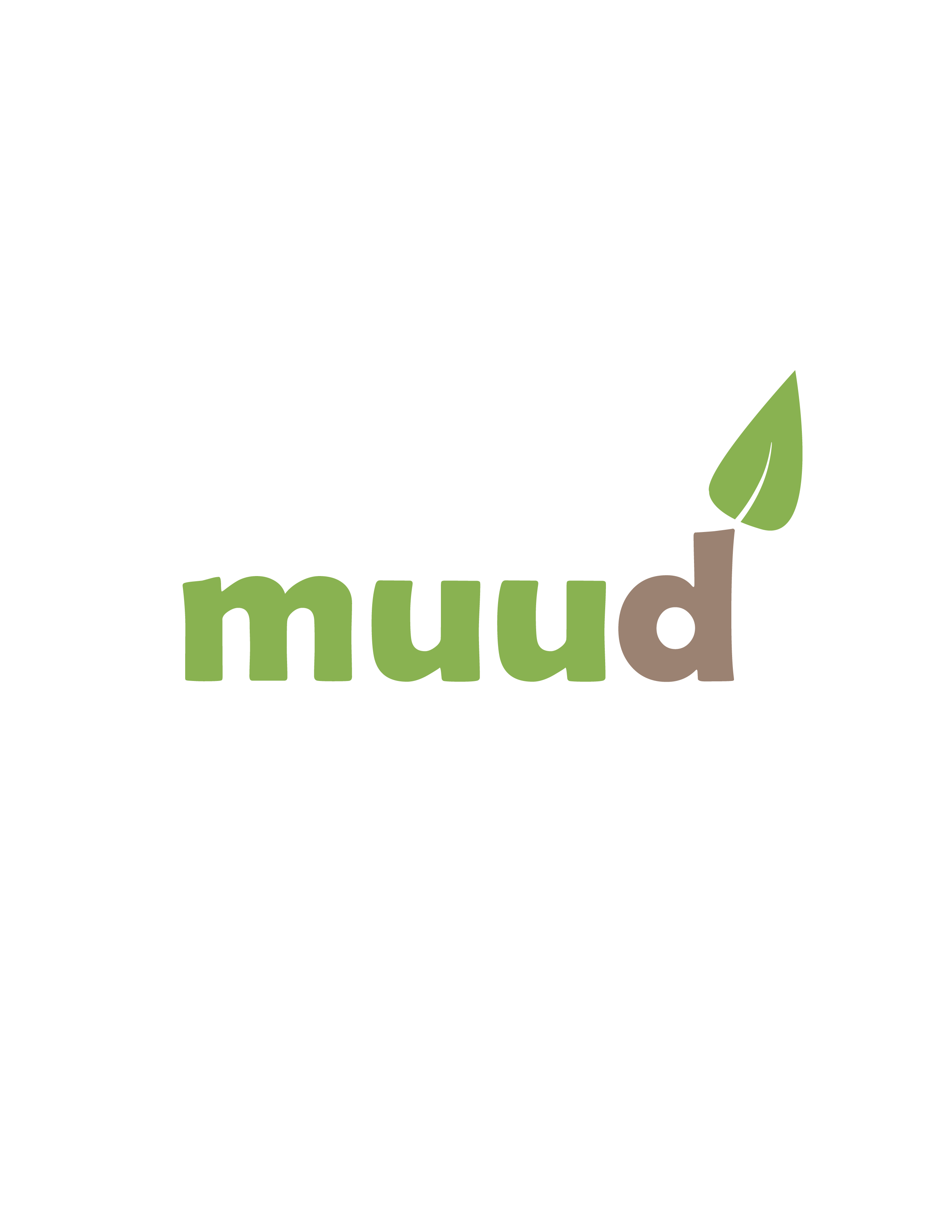
I really like this logo concept! Nice color combination. You immediately get a feel for the company. The only thing worth pointing out to me is that the leaf feels... off? I think it would match the font more if the leaf was more rounded. As it is now, it feels very triangular. Other than that, great logo!
5 years ago by Alex Strøm
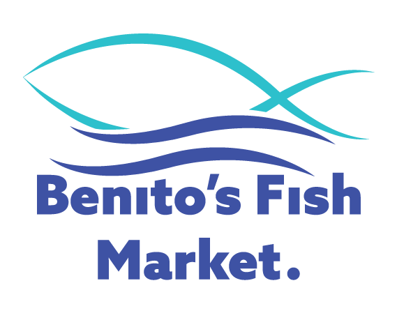
Hi Jessica. I like this concept and color combination. I really like how the fish blends in with the waves, and how the strokes have go from a light weight to a heavy weight. If I were to give you any advice on how to make it even better, I would probably make "Benito's" on one line and "Fish Market" on the second line. Think of the way you'd say the company name. Most people would say "Benito's (pause) fish market." not "Benito's fish (pause) market". Do you see what I mean? I'd also move the top text line a little down, to give the logomark some space and to bring the text lines closer so they don't feel as separated. Overall, great job.
5 years ago by Alex Strøm
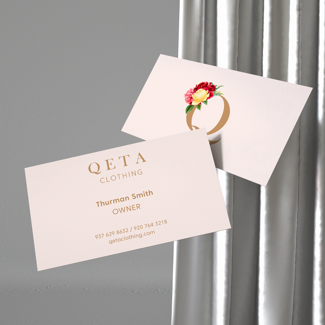
Hi Erick! I really like the concept and execution of this design. It feels high-end and feminine. If I were to suggest any changes, I'd probably not make the word "OWNER" in all caps. It seems out of place when all text (except for logo) is in lowercase. I would also make "OWNER" a little smaller, so it doesn't steal attention from the name. In terms of presentation, I am not a fan of the background. It feels busy and I am not quite sure what it is. I think the design would benefit from a white/lighter background. Overall, really great design.
5 years ago by Alex Strøm
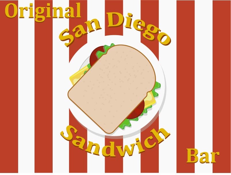
Hi Gia. Solid concept. I like that the text wraps around the plate. This will also make it easy to adapt to social media. The text looks a little "squished"... Did you use "type on path" or did you use the warp effect? Sometimes when you use the effect it kind of squishes the letters. I'd try using type on path instead.
I agree with Isa that it is a little too detailed for a logo. When it's very far away or scaled down to a few cm, it might be too busy. Try simplifying the sandwich.
Additionally, I'd prefer to see it on a white or solid colored background. The stripes makes it seem even more busy.
Keep up the good work. Would love to see the results, if you decide to do a revision of the logo.
5 years ago by Alex Strøm
(A little more info about the brief) The back side was supposed to be able to be filled out by a bartender at either location :)
5 years ago by Alex Strøm
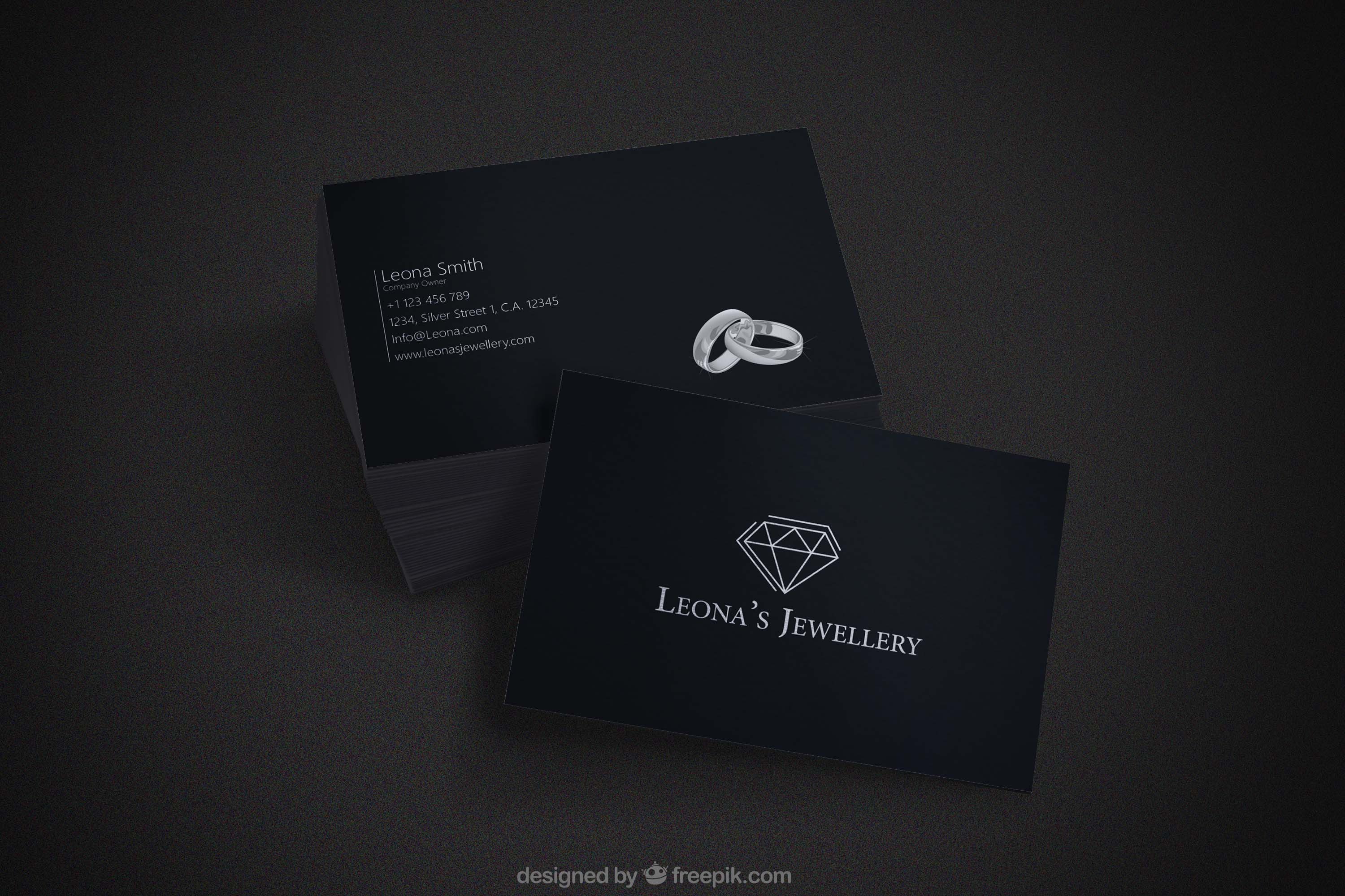
I like this design! It feels very sleek and elegant.
I think it would look even better without the rings on the information side. In my opinion they don't fit in with the exclusive feel of the rest.
Really good job!
5 years ago by Alex Strøm
Hi Khizar!
I like this logo. I think you've improved since the first logo i saw by you, which is awesome!
I like that it can work in both grayscale, as negative/positive and in color! :)
I would say though, that it feels a bit unbalanced. Maybe making the font larger and making a little space between the mark and typeface would also improve it!
Overall good job, nice to see you working hard :)
5 years ago by Alex Strøm
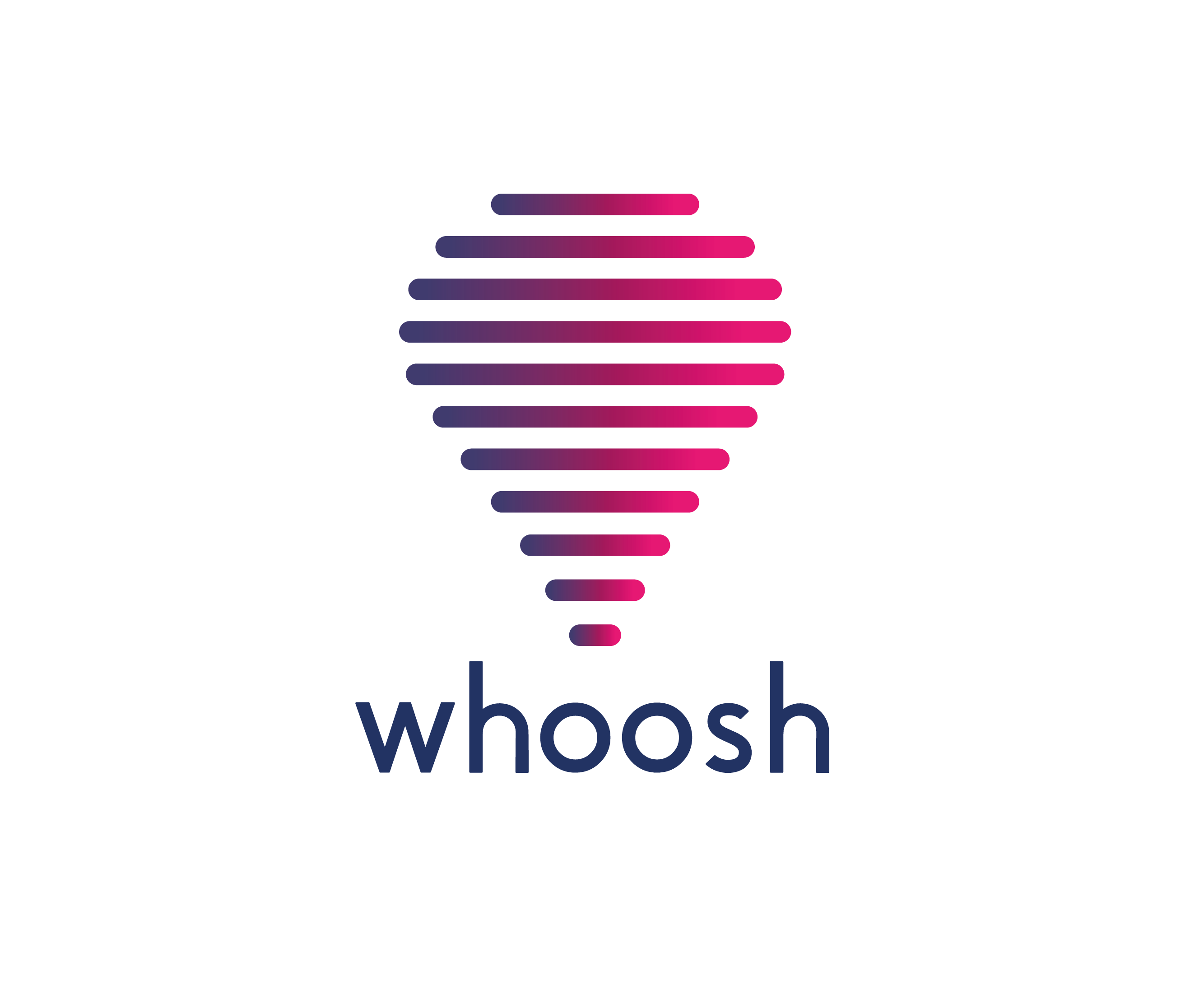
Hi Eugene. This design is really nice! The lines reminds me of soundbars, I don't know if that was intentional, but i like it. I also really like the gradient.
If I were to change anything, I would round the corners of the font, so they match the hot air balloon. It would also make the typeface look more custom.
Really good job! Keep up the good work!
5 years ago by Alex Strøm
Hi! Awesome to hear that you're getting into designing. I get the concept, but there's a few things you could change to make it even better.
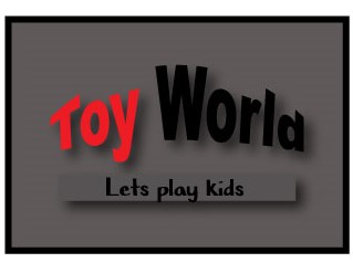
It doesn't feel like it's for kids (tbh it's giving me slightly pedophilia vibes - i think it's the tag line combined with the dark colors), so changing the colors to brighter, 'happy' colors could work. You could even make the letters in "TOY WORLD" all different colors, and keep the tagline dark.
Because of the curved effect on the "TOY WORLD", I would make the letters all caps to create a nice even line (the Y breaks the line). Then I would remove the box around "let's play kids" and move that text up, closer to the title.
Lastly, when displaying the logo, I would disply it on a lighter background (preferably white), since the letters are dark.
I am looking forward to seeing what you'll create in the future. Good luck on your graphic design journey.
5 years ago by Alex Strøm
Hi! Thank you for feedback on my design. I'm glad to hear that you're getting into graphic design.
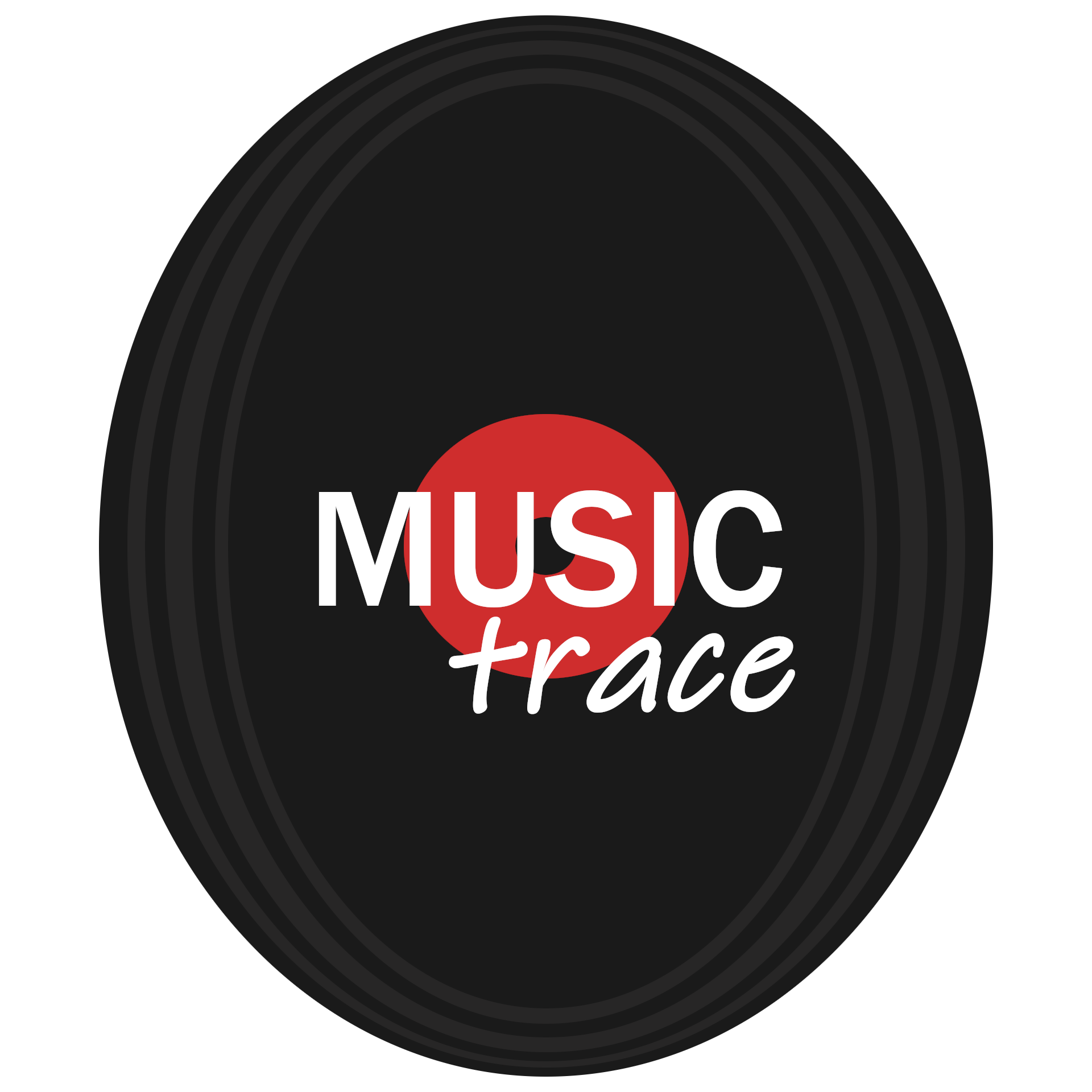
I like the concept. I think it would work a little better if the record was a circle, not an oval. I also like the combination of a sans-serif font with a script font. If I were to change anything about the typography, I would maybe choose a font that looks hand-lettered and curve that a little to make it look more custom. I would also make the text a little bigger, so there's more focus on the company's name. Looking forward to seeing what you'll do in the future. Keep designing ;)
5 years ago by Alex Strøm
This looks absolutely perfect! The texture is really nice (Would love to know what brushes you used), and the idea of the steak in the shape of Texas is amazing. Would love to see variations such as a more horizontal look and how it will look on SoMe (In a circle for example). Really good job, Chollene!

5 years ago by Alex Strøm
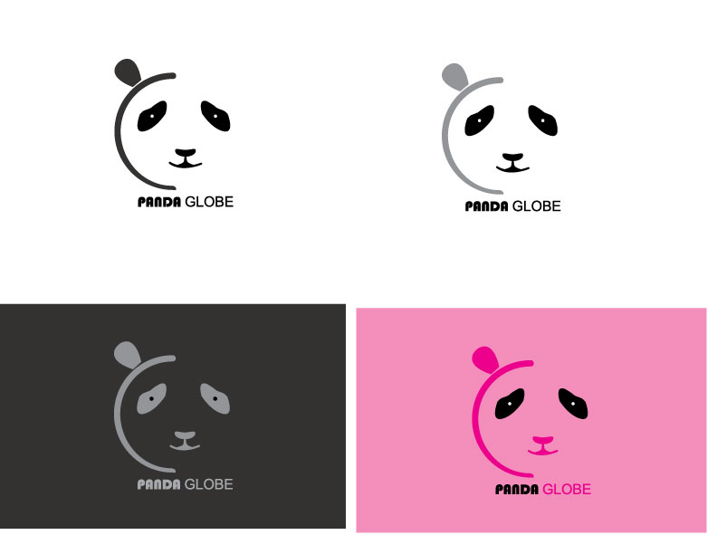
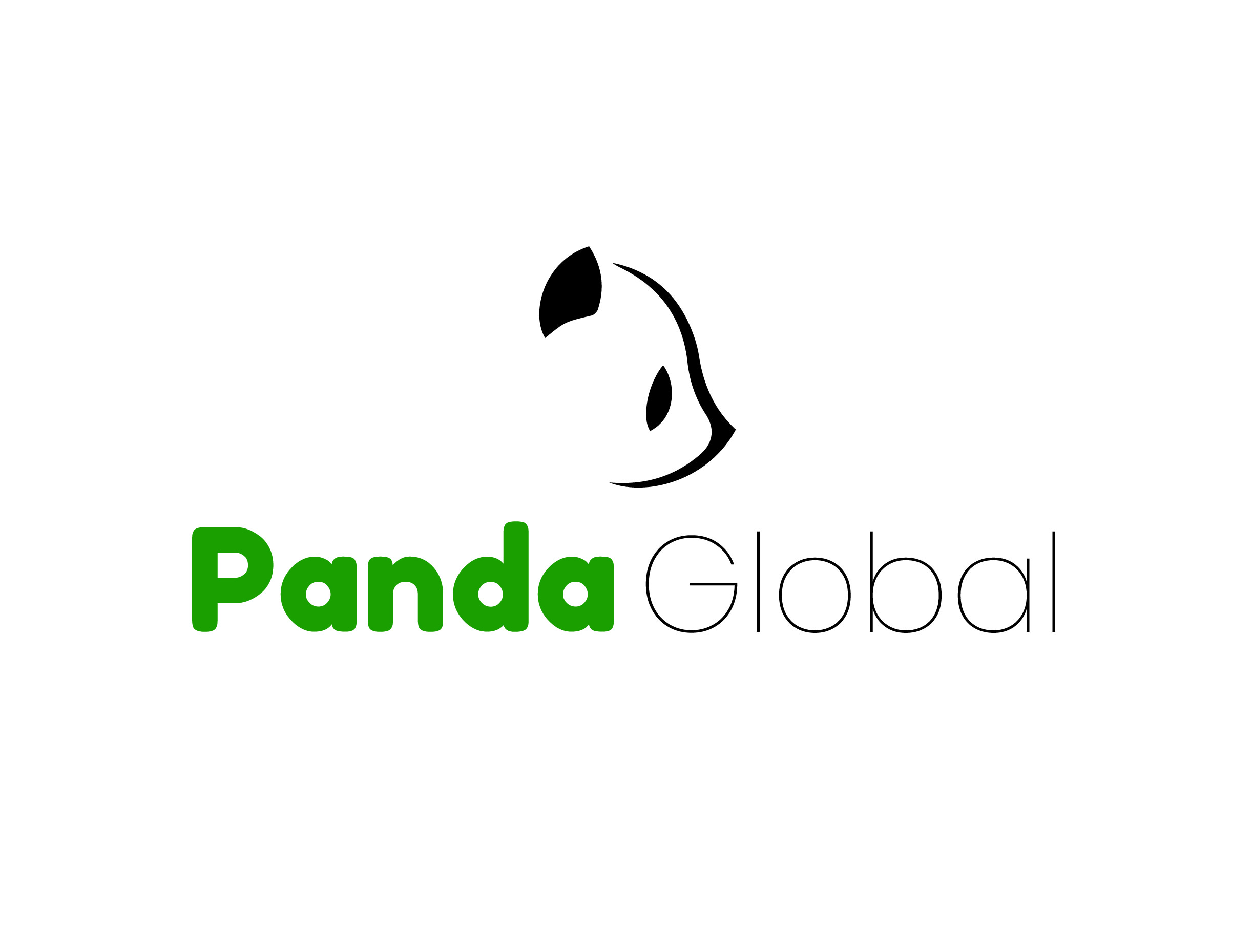
Cute logo. If I were to improve it, I'd round the edges on the panda a little to match the font. Also, consider making the word "Global" slightly bolder, so it doesn't disappear, when you shrink the logo down to a few cm. Really good job!
5 years ago by Alex Strøm
This is a nice dynamic logo :) I think the outline of the circle could be improved by making it a little bit bolder, so they are noticeable even when the logo is very small. Maybe even using a calligraphy brush that'd making them look hand drawn. Super nice logo overall.
5 years ago by Alex Strøm
I really love this lettermark :) It looks like a wave and feels very dynamic. I think it can also work as just negative or positive, but I would like to see how that'd turn out. Really good job!

5 years ago by Alex Strøm
I like the concept of the interlacing of the ice cream, however, it comes off a bit messy. I think it would help a little bit if the ice-cream scoops were completely round.
In terms of color I think the colors can work, but maybe de-saturate them a little and make them lighter as well. I think the cone would be more appealing if it was white with black markings (instead of black with green marking). I hope you continue working on this design, and I would love to see it after a few revisions
5 years ago by Alex Strøm
I like the minimalism of the logo, it makes it feel fashionable. However, I feel like the K might get lost. For me it reads more like a graphic element than a letter. Maybe if you made it black, like the rest of the letters it'd read more as a letter?
Really good job.
5 years ago by Alex Strøm
I really like that the mark as well as the type is multi-colored and matched. Unfortunately with the orange it reminds me a lot of the Sound Cloud logo. Since both company names start with the word Sound and both logos are orange, it'd be easy to mix them up.
I think a different color might be better, since it will separate the company from Sound Cloud, which is the more well-known out of the two.
Really good job with the flow of the logo. I also like the pattern in the back of the presentation.

5 years ago by Alex Strøm
Posts
Toucan Logo Mark
- Report
Alex Strøm • 4 years ago
Hi, everyone!
I did this geometric logomark of a toucan, and I'd love some feedback.
See more on my IG @stroem_graphics
I did this geometric logomark of a toucan, and I'd love some feedback.
See more on my IG @stroem_graphics


Cool
11 months ago by Zahrrakh - Reply
I love the design. It's absolutely beautiful and well thought out. I'd love to know if you used the golden ratio at all. If not, I think it would really heighten the design overall. I'm also wondering what the green is meant to be. Is there some sort of connection to the brand? Is it meant to represent something specific?
1 year ago by P - Reply
My goodness this is art! Gorgeous logo
1 year ago by Luke - Reply
The black and white is very modern
1 year ago by Alisha - Reply
Great work!
4 years ago by Abhilash Thekkel - Reply
awesome design
4 years ago by ANJALI SHAW - Reply
I personally would prefer flat colors here (and honestly on any logo). Granted I have no idea what it would look like without the gradients, and neither am I one, whoom's opinion you should take as fact. Regardless, geometrically it's damn genious :) .
4 years ago by Lan Gradi�ek - Reply
I agree that the gradients are a bit offputting
1 year ago by Alisha - Reply
I like how there's a subtle pie chart there.
4 years ago by Enzo - Reply
I love this! The colors are great and the black and white is just soooo good! Great job
4 years ago by Elena - Reply
Houston Fish Market - Poster
- Report
Alex Strøm • 5 years ago
FakeClients brief:
"Hey!
I am Yan, founder of Houston Fish market. For a while now, I've been looking for a good designer for my Fish market. We will need a poster to advertise our business. Can you help us out?"
I haven't done a poster in a while, so I'm a little out of practice. Would love some feedback on this vintage-inspired poster :)

Marty's Repairs Logo
- Report
Alex Strøm • 5 years ago
Fake Clients Brief:
"Hey There, I'm Marty, I just founded a new business called "Marty's Repairs. I'm looking for someone that can create a simple logo for my business. I think a wordmark would look cool. Can you do that?"
"Hey There, I'm Marty, I just founded a new business called "Marty's Repairs. I'm looking for someone that can create a simple logo for my business. I think a wordmark would look cool. Can you do that?"

I love this
4 years ago by Ghalib Putra - Reply
Hey Alex, I'm really liking this logo. The different typefaces give off an interesting and unique vibe. The added texture has made your logo give off a worn/ in need of repair feel. This brings the logo together and links it to the brief.
5 years ago by jessica morton - Reply
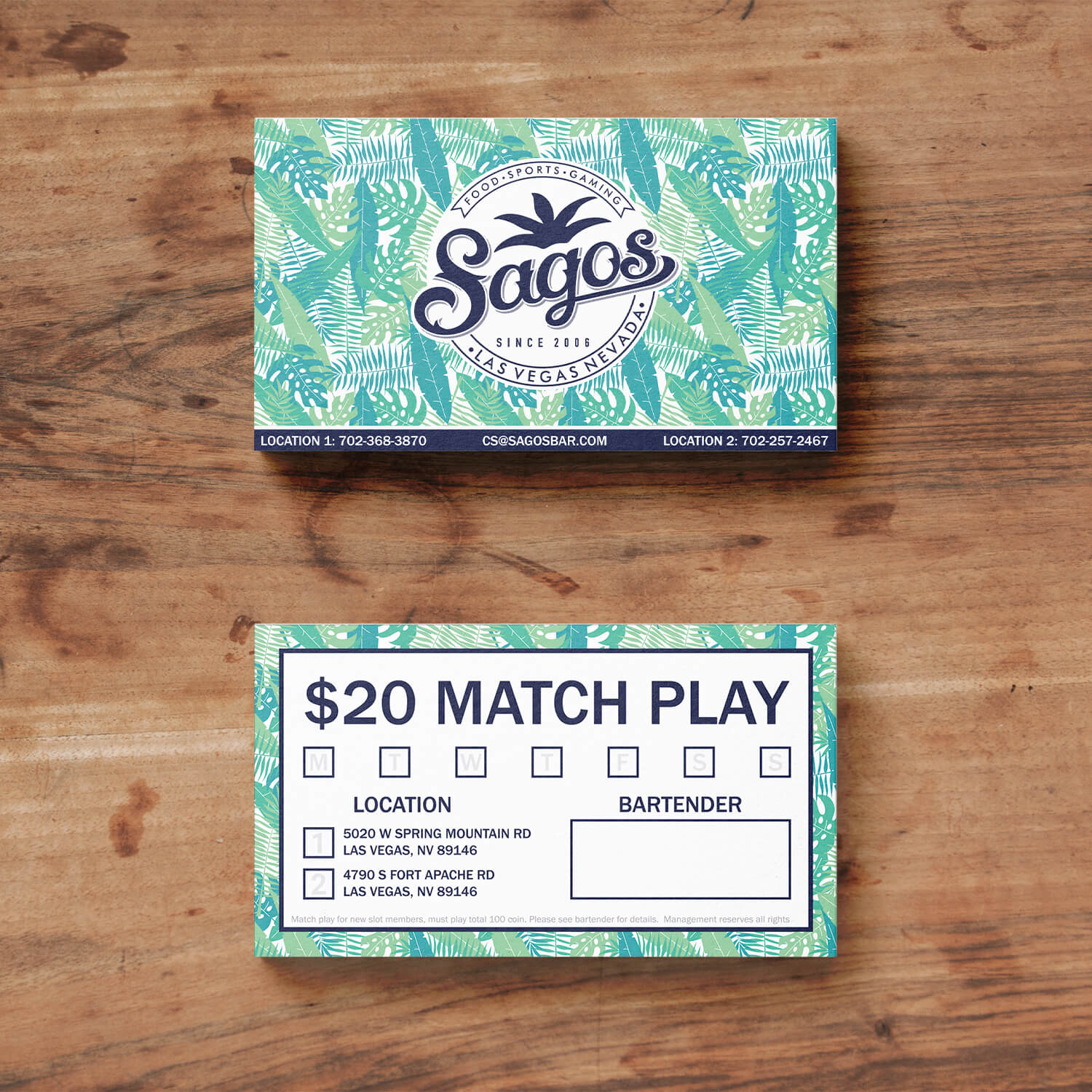
Rejected Business Card Design for Lagos Beach Bar
- Report
Alex Strøm • 5 years ago
Hi everyone!
A while back I did this business card design as part of a design competition. I unfortunately didn't win the competition, but I'd like some feedback on the design. Thank you.
A while back I did this business card design as part of a design competition. I unfortunately didn't win the competition, but I'd like some feedback on the design. Thank you.

please watch my first work also and please give me some feedback, thank you
5 years ago by kunal das - Reply
(A little more info about the brief) The back side was supposed to be able to be filled out by a bartender at either location :)
5 years ago by Alex Strøm - Reply
I think the informations about the business is too small for a business card. The back give me a feeling of more a ticket than a business card. But like the idea of the texture
5 years ago by Isa - Reply
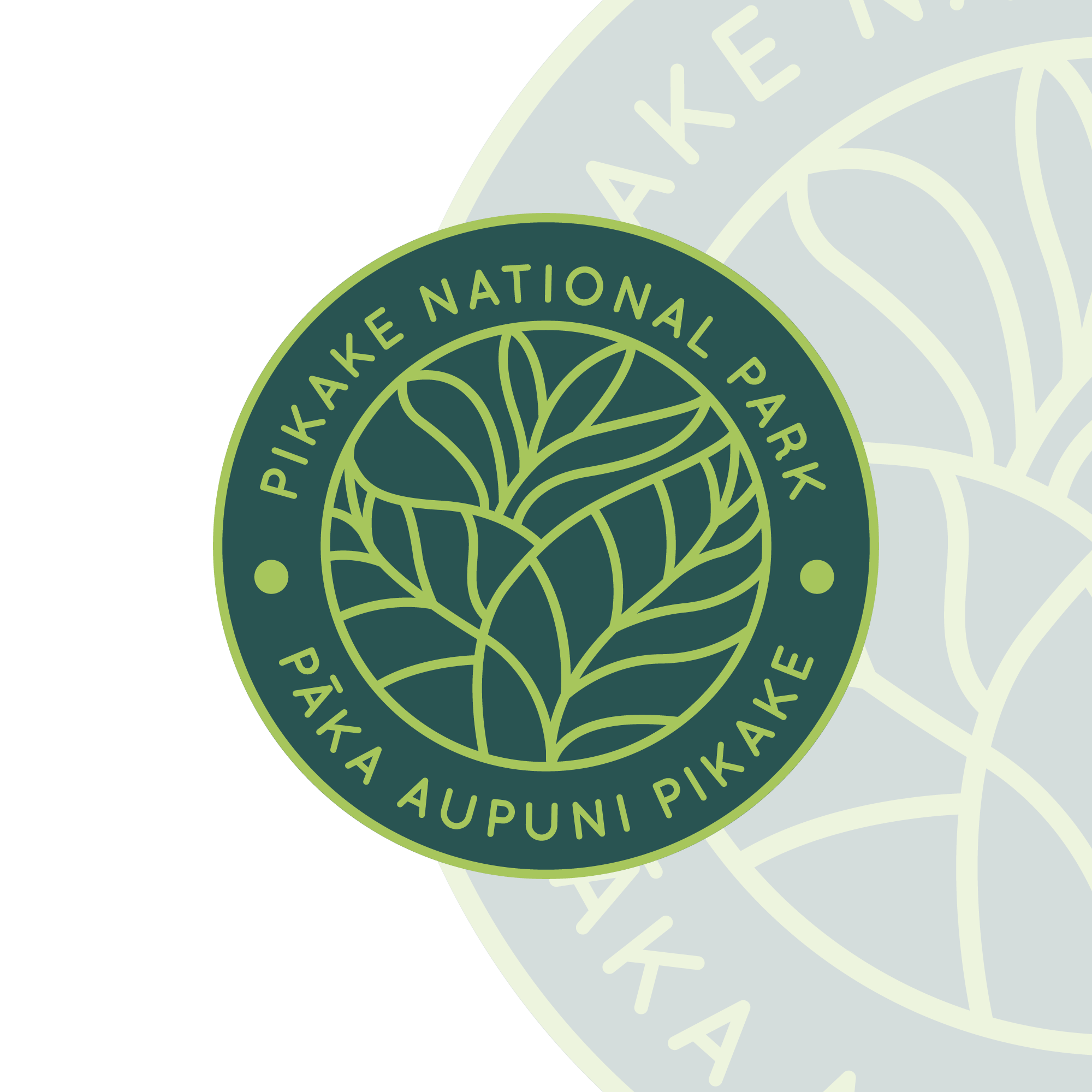
National Park Logo (Daily Logo Challenge - Day 20)
- Report
Alex Strøm • 5 years ago
Hi everyone!
So I recently finished the 50 days daily logo challenge, and while I could see myself improving from the beginning to the end, I would like feedback on a few select logos from the challenge. Thank you for anything you might have to say.
So I recently finished the 50 days daily logo challenge, and while I could see myself improving from the beginning to the end, I would like feedback on a few select logos from the challenge. Thank you for anything you might have to say.
)
Like it! I just wonder when print in small if the type is bold enough and if the lines of the leaves will disappear. Maybe the upper lines ain't necessary to avoid it.
5 years ago by Isa - Reply
Love these colors! The only thing is that the text seems a bit off-center or the curve the text is on is different than the other circles
5 years ago by August van de Ven - Reply