jessica morton
Posts
1
Likes
4
Liked Posts
2
Given Feedback
1
Feedback
Hey Alex, I'm really liking this logo. The different typefaces give off an interesting and unique vibe. The added texture has made your logo give off a worn/ in need of repair feel. This brings the logo together and links it to the brief.
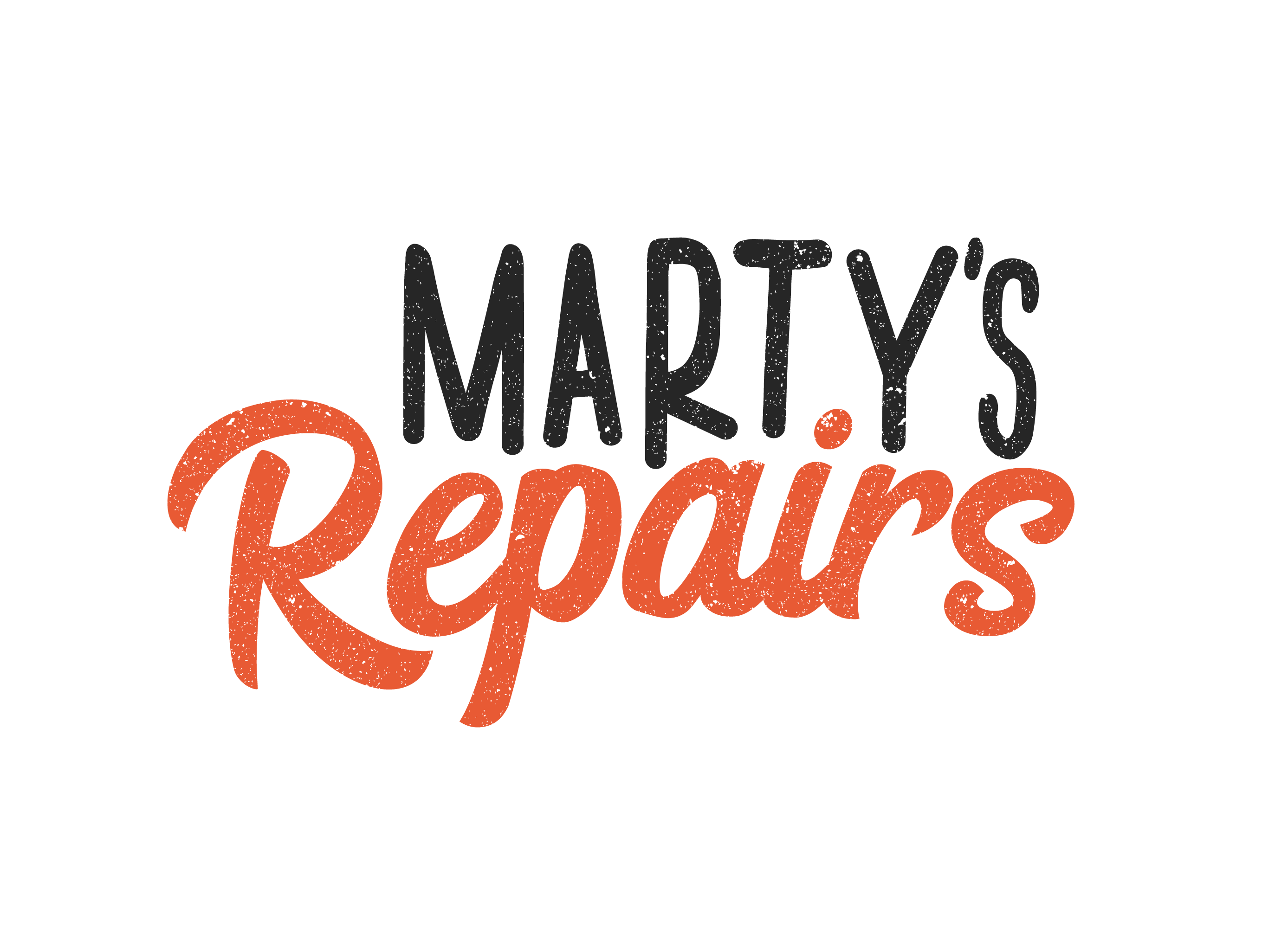
5 years ago by jessica morton
Posts
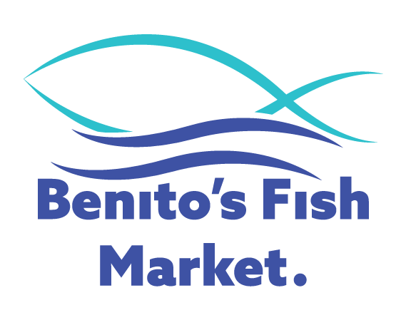
Benito's Fish Market.
- Report
jessica morton • 5 years ago
Here's my logo for Benito's Fish Market. Let me know what you think.


Hi Jessica. I like this concept and color combination. I really like how the fish blends in with the waves, and how the strokes have go from a light weight to a heavy weight. If I were to give you any advice on how to make it even better, I would probably make "Benito's" on one line and "Fish Market" on the second line. Think of the way you'd say the company name. Most people would say "Benito's (pause) fish market." not "Benito's fish (pause) market". Do you see what I mean? I'd also move the top text line a little down, to give the logomark some space and to bring the text lines closer so they don't feel as separated. Overall, great job.
5 years ago by Alex Strøm - Reply