Elena
Posts
6
Likes
63
Liked Posts
46
Given Feedback
23
Feedback
It is a really great design! It works very well for the client, is simple yet very proffesional. Keep up the great work :)
4 years ago by Elena
I really like the logo, the colors are great and it can work for many kind of business. Good job!

4 years ago by Elena
The detail of the logo is really great! The black-white option is great, for the color version i could prefer not to use a gradient for the letters and keep the color solid as the black-white option. The red color on the XX is on point! Great work!
4 years ago by Elena
Im in love with the colors! Cool logo!

4 years ago by Elena
I love the logo! Looks very clean and modern, the color red is fantastic for this one

4 years ago by Elena
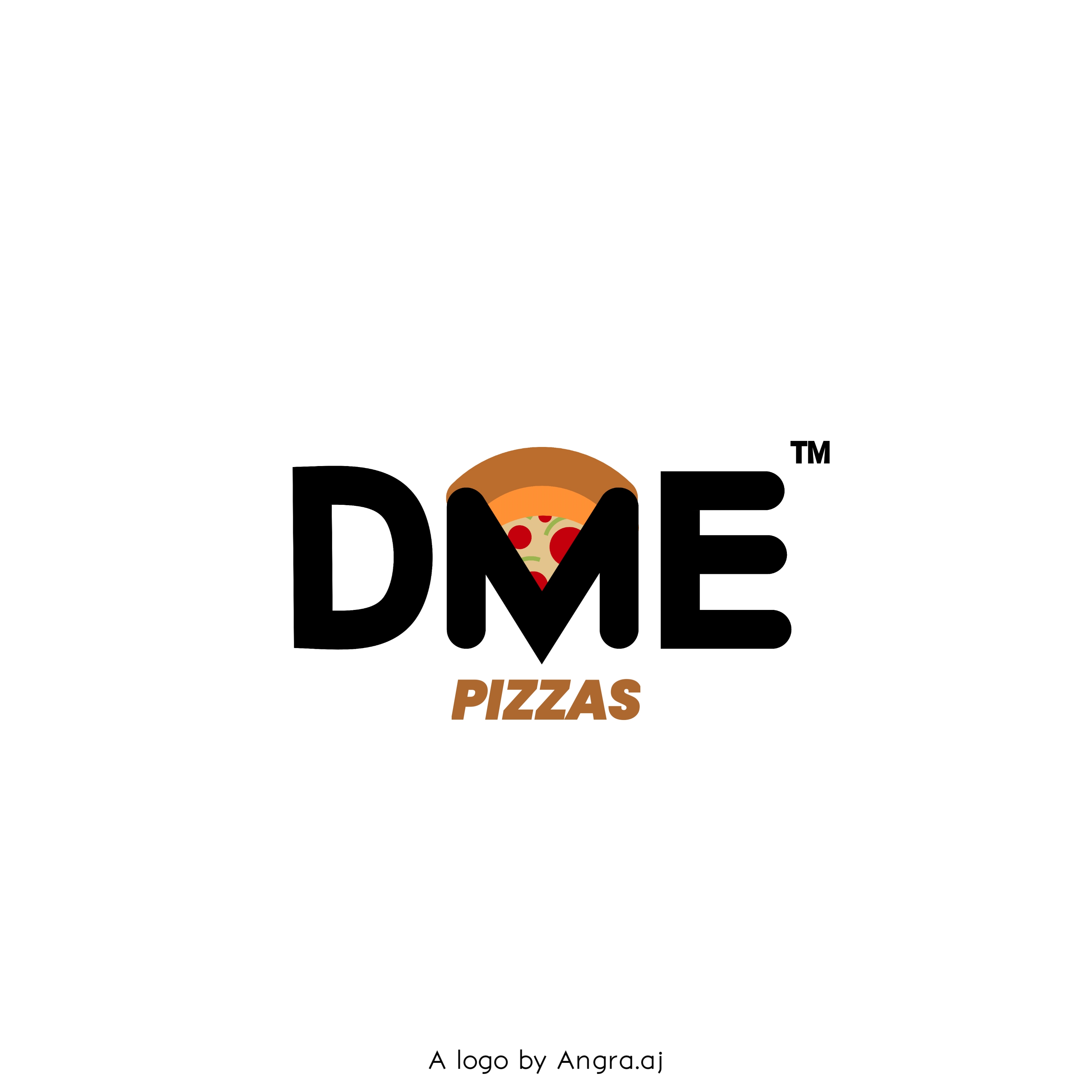
Very clever idea to have the pizza in the middle of the M! Looks cool! Maybe the black color is too strong for the design, try to tone it down a bit.
4 years ago by Elena
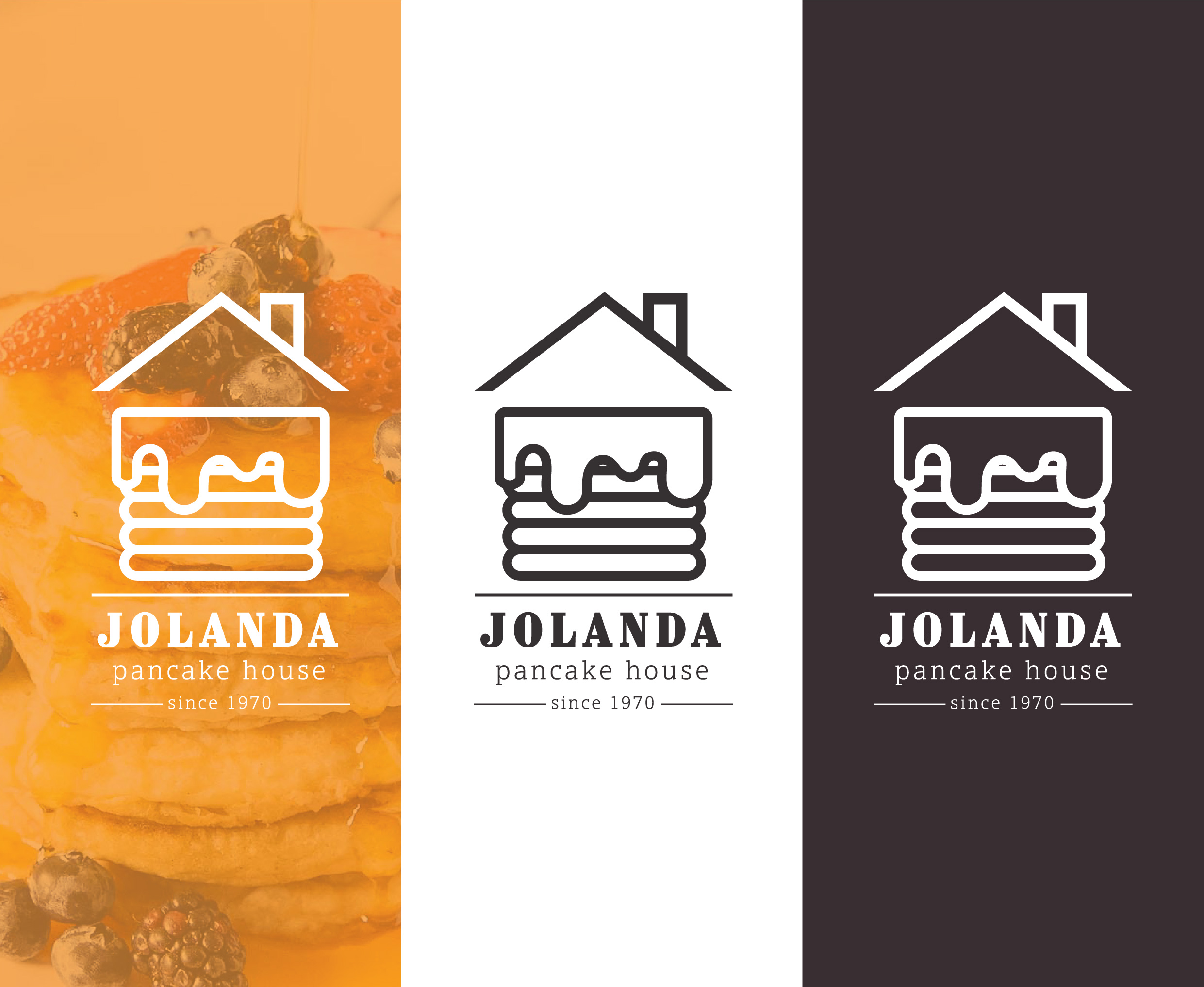
I love the design, it looks like a comfy cabin in the woods where i could be eating pancakes :)
4 years ago by Elena
The colors are fantastic on this one, the design is simple yet so on point! I'm between option 1 and 3, great work!

4 years ago by Elena
I really like N� 1 and 2. As you said, the typeface works great for the vintage style and the whole design looks very classy. For the color version, i think the colors are too similar, a little more contrast could help. Great Work! Keep it coming!
4 years ago by Elena
Great design! I dont know what the company is about, because the brief is very vague, but i definitely can see this logo printed on a surf table! Cool!

4 years ago by Elena
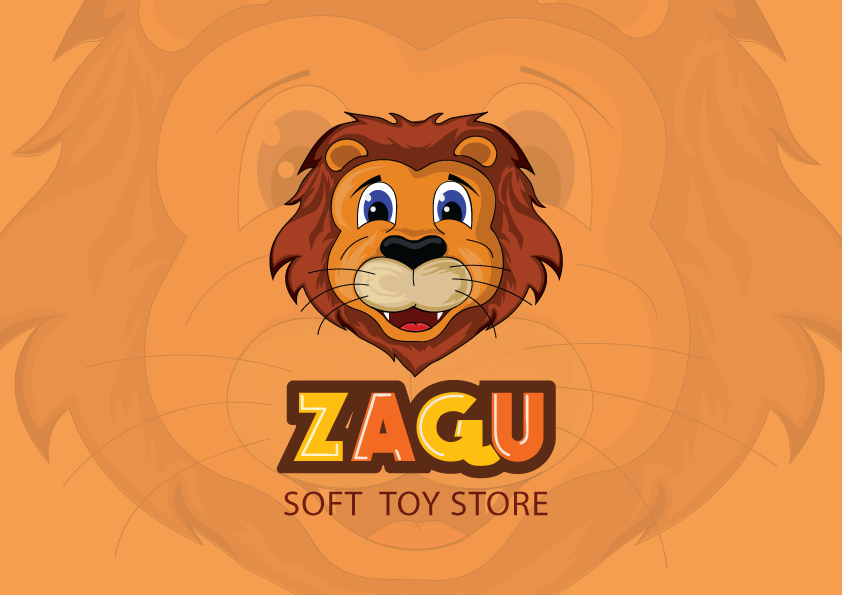
I love the look of ZAGU! The colors are really great and the letters look gloosy and bright, perfect for the Toy Store! The lion mascot is super cute, although i think the colors are a bit dark when compared with the wordmark color, maybe try to use colors on the same scheme for a more cohesive look. Great work!
4 years ago by Elena
I like the color scheme very much, it looks very clean and modern. I could like to see a little more contrast for the type, try to combinete at least two typefaces for a more angaging look. Good work, keep it coming :)
4 years ago by Elena
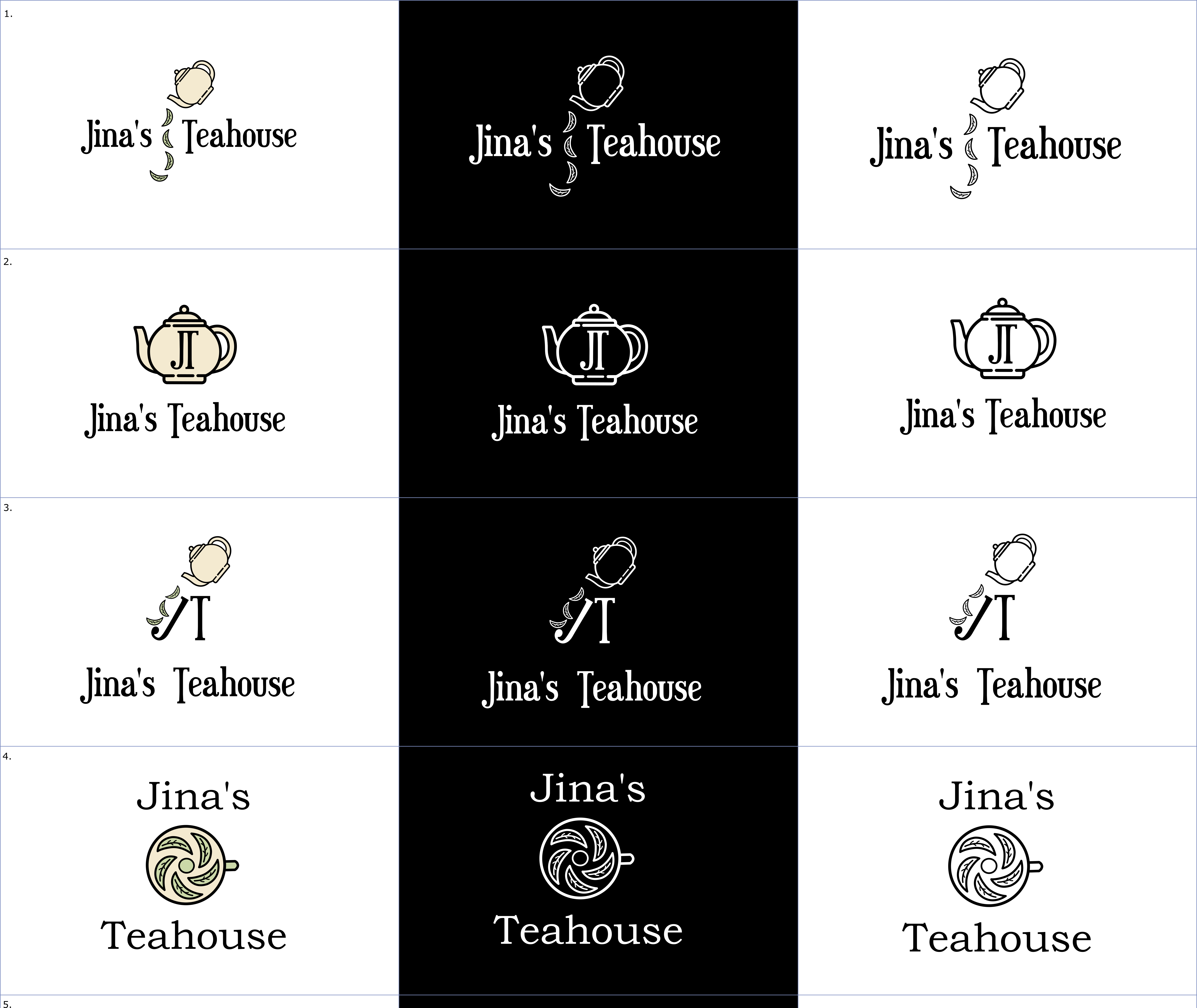
This looks soooo good! the design is so simple yet so clever! Some details inside the pot get lost on smaller scales, but it doesnt affect the overall design. Good job!

4 years ago by Elena
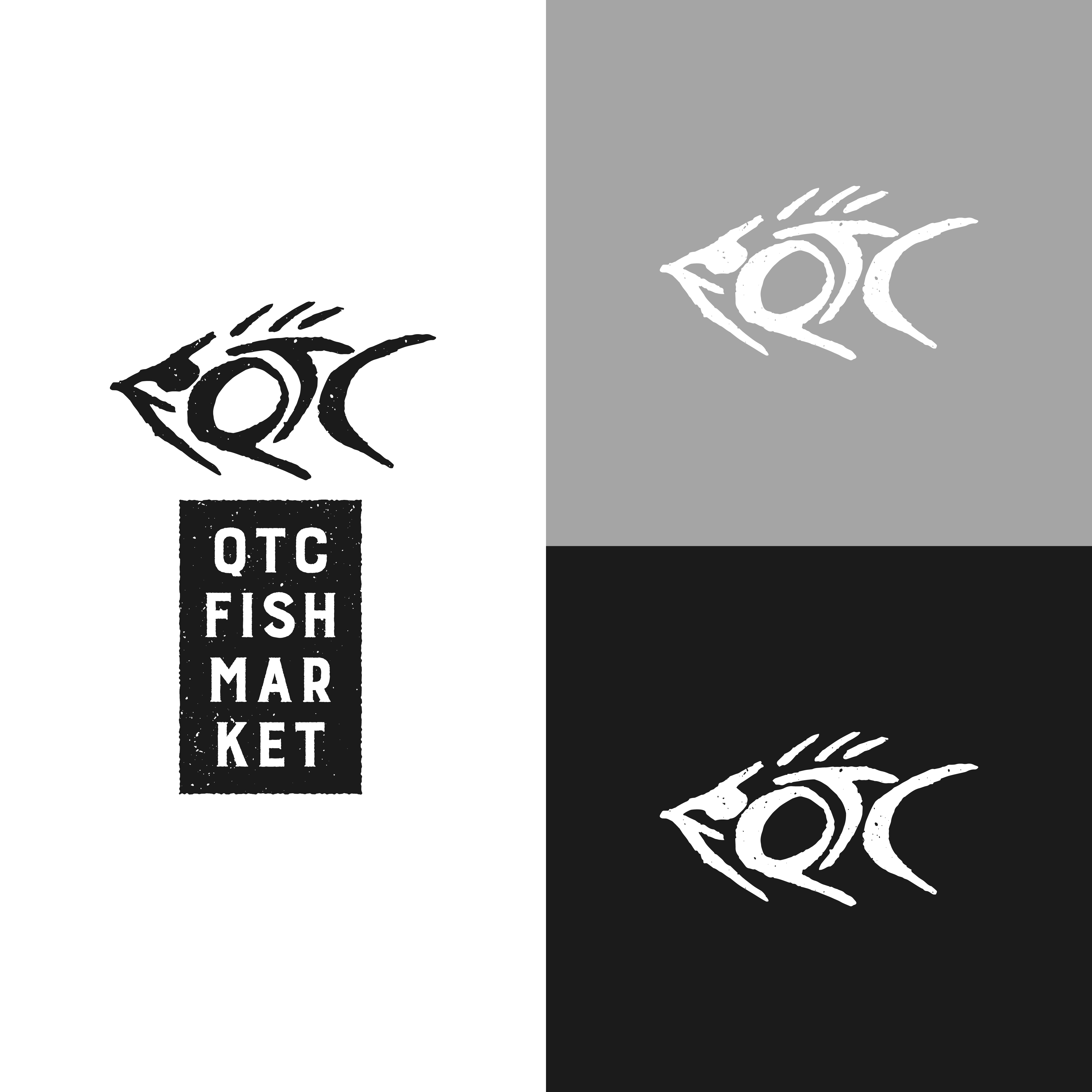
I love this! It works for the fishmarket and also as a clothing line! Really great design!
4 years ago by Elena
I love the design, the font is really neat. I think it works great as an electronic business card!

4 years ago by Elena
This lettermark works really great! It looks like a good and functional logo for a home appliances or electronics company! Great job!

4 years ago by Elena
I love the simple approach, I can see this on a billboard! Really cool!

4 years ago by Elena
This looks so cool!
4 years ago by Elena
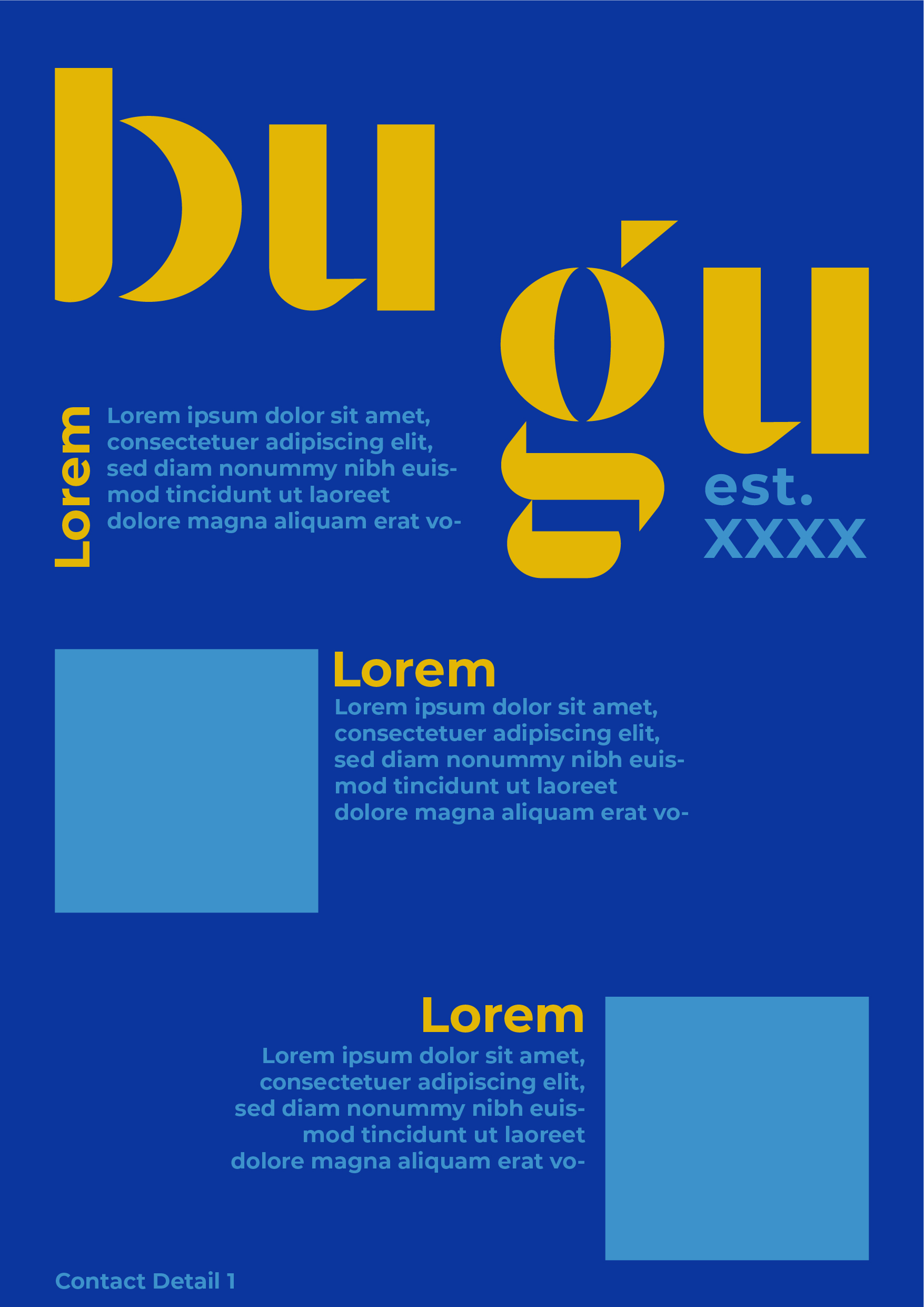
Love the typography for "bugu"!
4 years ago by Elena
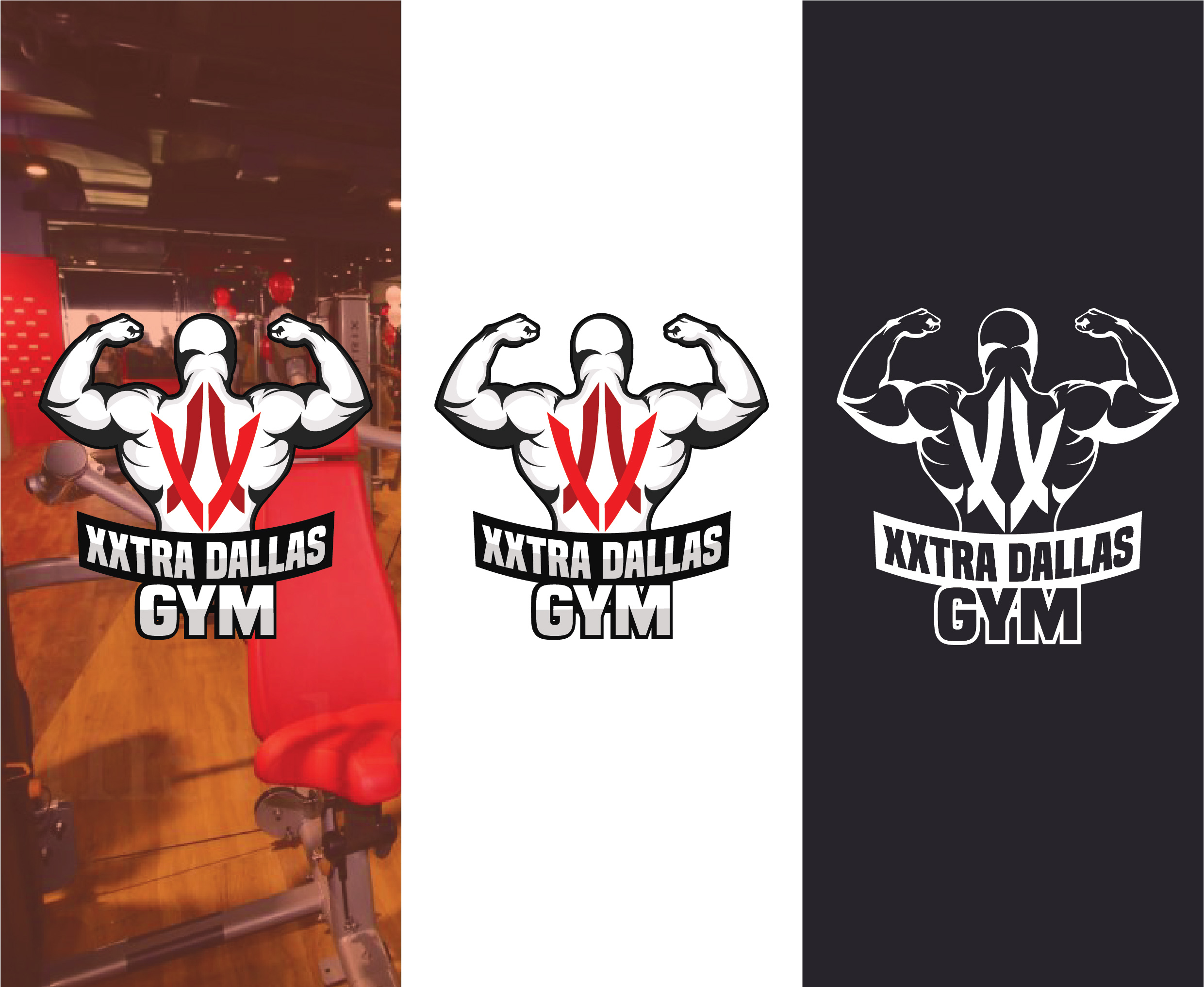
I like the color pallete, it looks really well together! I think the DALLAS scaling is a bit too big, a little space around it could give the design some air. Great job, keep it going!
4 years ago by Elena
I love the color pallete, it has a modern feel and looks very smooth. Great work!
4 years ago by Elena
I love this! The colors are great and the black and white is just soooo good! Great job

4 years ago by Elena
I like that the logo works on the negative space and it is very simple, also it works great on blank/white. Great work!
4 years ago by Elena
Posts
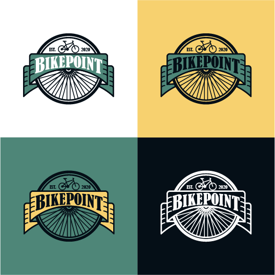
BIKEPOINT logo design
- Report
Elena • 4 years ago
Client requested a logo for "Bikepoint". I wanted a batch-style logo, something that can be easily recognize on a park.
I'd love your feedback :)
I'd love your feedback :)


Very well done. You did the logo in different backgr how it should be done. Is easily recognisible and very related to what client requested. The black color is loosing in that green-ish backgr a bit. But overall looking ok.
2 years ago by Aurel - Reply
wow! this is really nice. i love the colors as well, really makes the work pop and easy to read. perhaps my only nitpick is making sure the bike is in contact with the border/line of the banner, it seems like in the other variants it's not touching. Otherwise, great work!
4 years ago by pndmx - Reply
great work keep it up.*would you like to give me feedback, check my recent works
4 years ago by kunal das - Reply
DTP Shipping Solutions - Logo Design
- Report
Elena • 4 years ago
On this brief, DTP Shipping Solutions is a shipping company located in Texas. They requested a recognizable logo, that could be print out on all their fleet of trucks, containers, and vans.
For this logo i wanted to convey the efficiency of their deliveries, keep in it simple so it can work across all their platforms. I wanted to incorporate the Texas feeling, to honor their roots, so i went through with a simple red, blue and white color scheme.
I'd love your feedback :)
For this logo i wanted to convey the efficiency of their deliveries, keep in it simple so it can work across all their platforms. I wanted to incorporate the Texas feeling, to honor their roots, so i went through with a simple red, blue and white color scheme.
I'd love your feedback :)

this logo really works on me, i realy like it!
I would only choose a different font at 'dtp'
4 years ago by Helena H - Reply
verry good and clean work.
4 years ago by kunal das - Reply
I love this! I can definitely see this on a truck..the color choice was a good one too. It makes me automatically think of mail, not to mention texas lol. Great work! Maybe change the font choice for "DTP" to something more bold and/or boxy...Perhaps even increase the size of the "DTP" smidge.
4 years ago by Jasmine - Reply
This looks great!! I think DTP. can be of a different font family. Preferably Sans Serif.

4 years ago by Abhilash Thekkel - Reply
This is great!
4 years ago by Leye Abiola - Reply
MUJO Brief Logo design
- Report
Elena • 4 years ago
For this Brief, it was only provided the company's name MUJO. I loved the name and pictured a fancy new bar in town. For this logo I wanted to be modern and simple,
easy to recognize, to be hung outside the bar.
I'd love your feedback!
easy to recognize, to be hung outside the bar.
I'd love your feedback!


Kudos to you for extending the brief so creatively and bringing out such an excellent design piece! I was so confused and disappointed after receiving a similar brief mentioning only the name of the business - "Qal", but your design gives me so much hope and inspiration! :)
2 years ago by Priyanka Salelkar - Reply
Smooth choice. Wine color on cozy backgr.)
2 years ago by Aurel - Reply
Very professional work.
4 years ago by Abhilash Thekkel - Reply
Very simple and love the colors. Great work
4 years ago by Maria Garcia - Reply
Super hip! I love it!
4 years ago by Kristina Farrow - Reply
Nice
4 years ago by Kevin - Reply
Flower Bouquet Illustration
- Report
Elena • 4 years ago
For this brief the client requested a flower bouquet illustration on watercolor style. I wanted to experiment with this style and step out of my comfort zone. It was a great exercise. I'd love your feedback!
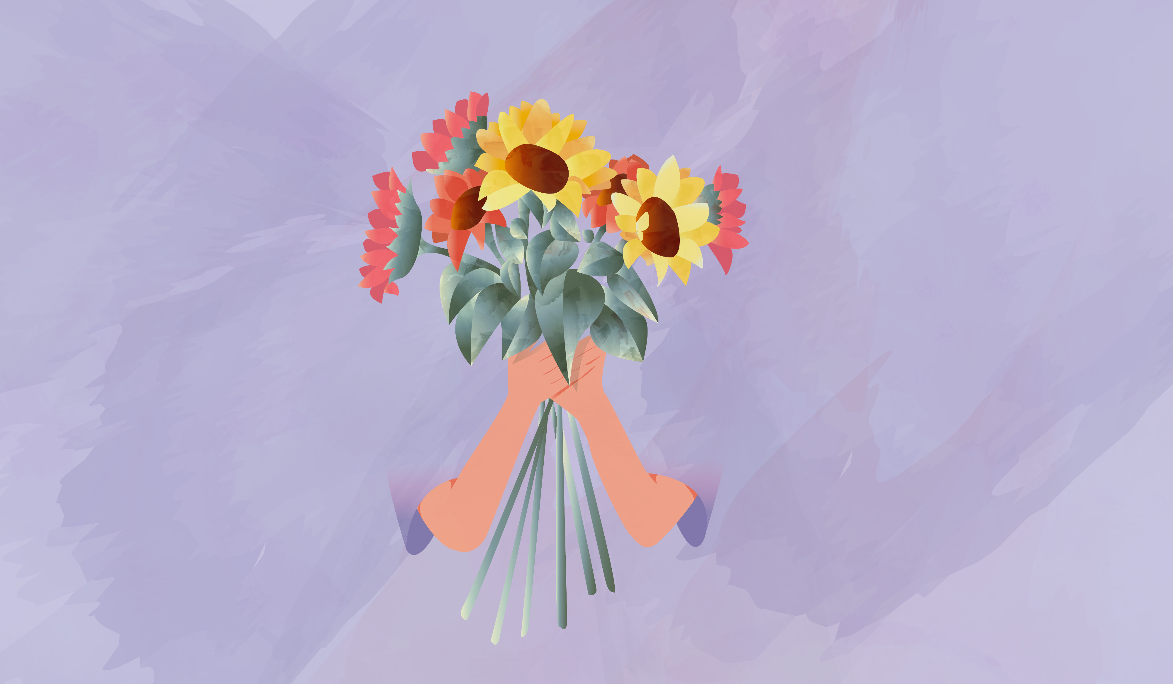

the color combination is awesome. Good job.
4 years ago by Nabila Tasfiha Rahman - Reply
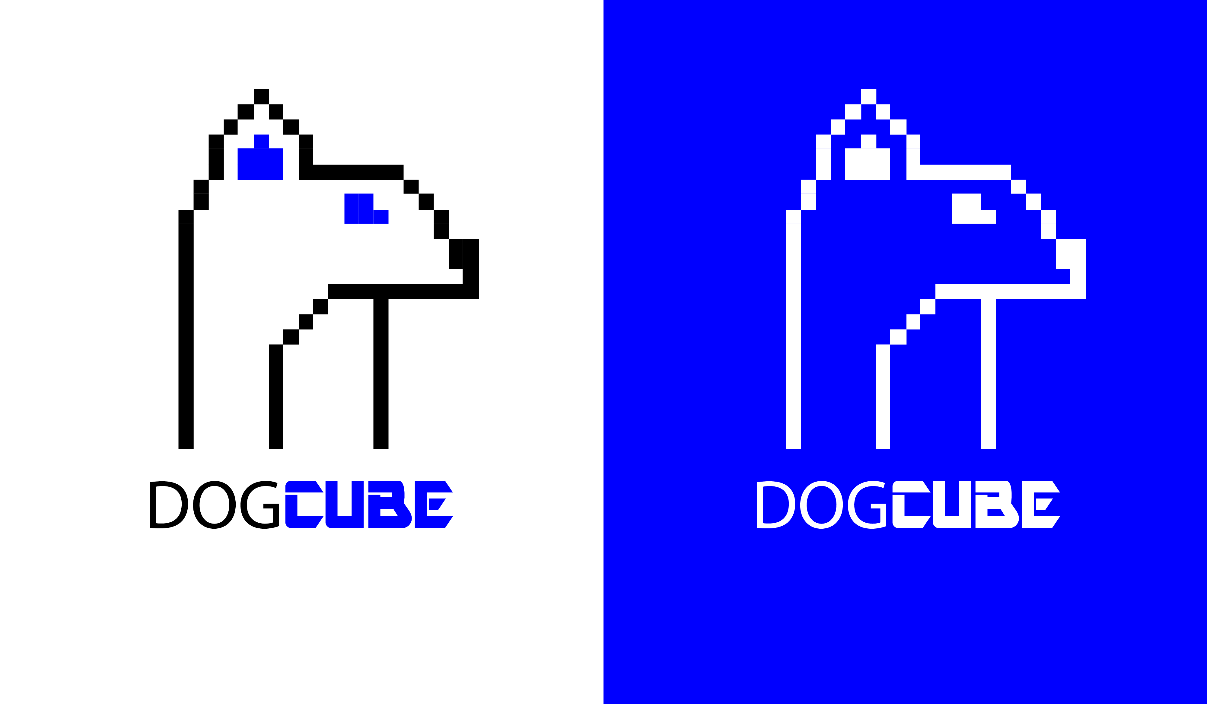
DOGCUBE Logo design
- Report
Elena • 4 years ago
For DOGCUBE i pictured a Video Game company, so i wanted the logo to be like the early pixel-styled video games.

Interesting.
Not sure about this toxic blue. And dogs don't have that long neck.)I see just one ear by the way.) I don't know why this bothers me.))
2 years ago by Aurel - Reply
This is cute! Though at first glance I saw a mouse and not a dog. It would also help to tie the entire thing together if "dog" was the same font as "cube". But good work nonetheless
4 years ago by pndmx - Reply
I don't know if I agree with your interpretation of the name, but I would have known this was a video game company immediately after seeing the logo, so good representation ;) .
4 years ago by Lan Gradi�ek - Reply