Jasmine
Posts
3
Likes
7
Liked Posts
7
Given Feedback
4
Feedback
I really like the second one. Very chic and modern. However, I think both are great. I guess it really depends on what vibe you want to go with. I love the simplicity of both.
4 years ago by Jasmine
I love this! I can definitely see this on a truck..the color choice was a good one too. It makes me automatically think of mail, not to mention texas lol. Great work! Maybe change the font choice for "DTP" to something more bold and/or boxy...Perhaps even increase the size of the "DTP" smidge.

4 years ago by Jasmine
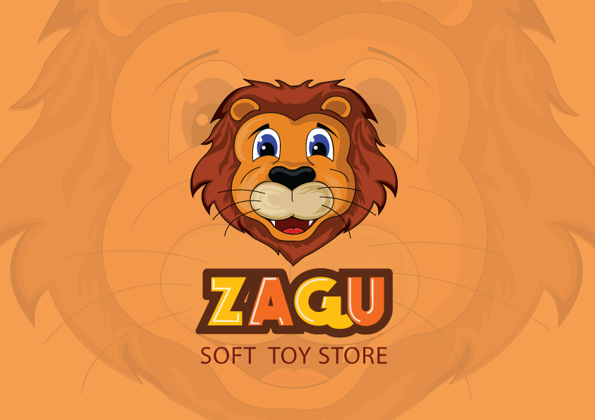
aww your lion is so cute! lol
4 years ago by Jasmine
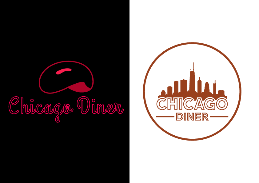
Hi. Overall it is a very nice flyer. The only thing I would say is that it's a lot of negative space. Maybe you could enlarge some of the text in certain places.
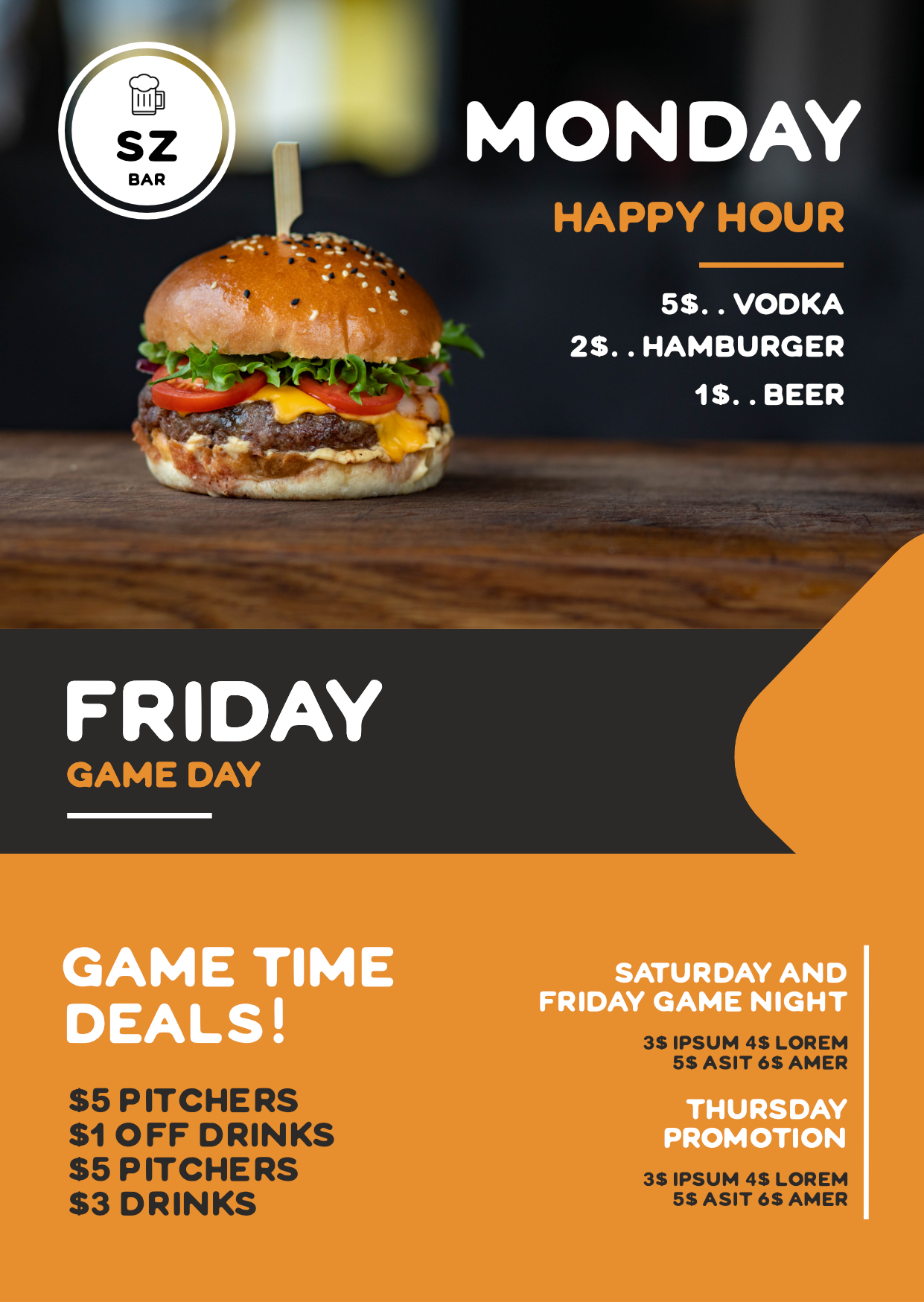
4 years ago by Jasmine
Posts
Patterson Fletcher Logo
- Report
Jasmine • 4 years ago
This a logo for a tailor that caters to luxury and expensive suits. They wanted the new logo to reflect the luxurious and expensive vibe, while keeping the same feel of the original design.
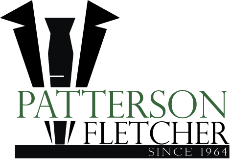


good attempt but the luxurious & expensive vibes are missing. i would suggest use one solid colour and make it smooth.
**would you like to like to give me feedback ? check my works.
4 years ago by kunal das - Reply
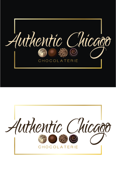
Authentic Chicago Chocolaterie
- Report
Jasmine • 4 years ago
This design is a logo for a luxury chocolate shop. Their main colors are brown and white with gold accents.

WaveTrace Logo
- Report
Jasmine • 4 years ago
wordmark logo with a vector wave merged as the top of the "T" in WaveTrace
Hello!
I'm Benton, creator of WaveTrace. For a while now, I've been looking for a good logo for my business. I think a wordmark would look cool. Would you be interested?
I'm Benton, creator of WaveTrace. For a while now, I've been looking for a good logo for my business. I think a wordmark would look cool. Would you be interested?


Great design! I dont know what the company is about, because the brief is very vague, but i definitely can see this logo printed on a surf table! Cool!
4 years ago by Elena - Reply
WOW good job , but look at ''T" maybe..... it could better.
would you like to give me feed back ? go check my works and give a honest review.
4 years ago by kunal das - Reply