kunal das
Posts
40
Likes
25
Liked Posts
35
Given Feedback
39
Feedback
very good. simple and elegant

4 years ago by kunal das
very decent and clean.good work.*would you like to give me feedback, check my recent works

4 years ago by kunal das
loved the simplicity
4 years ago by kunal das
very good buddy
4 years ago by kunal das
great work keep it up.*would you like to give me feedback, check my recent works
4 years ago by kunal das
i like the first one. looking nice to me.*would you like to give me feedback, check my recent works
4 years ago by kunal das
i liked the fourth one. going perfect with name. *would you like to give me feedback, check my recent works
4 years ago by kunal das
very nice and clean. *would you like to give me feedback, check my recent works

4 years ago by kunal das
very clean looking good and nice use of fonts. *would you like to give me feedback, check my recent works
4 years ago by kunal das
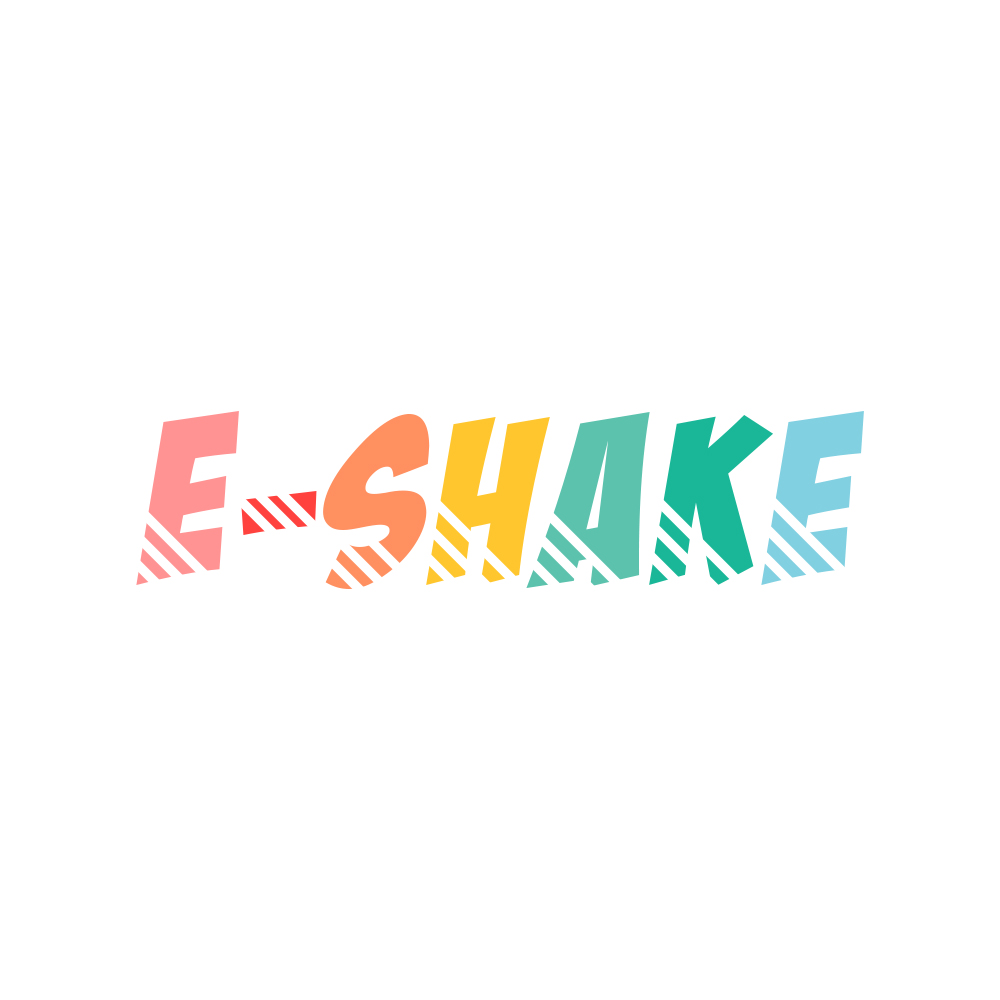
very vibrant colors looks good . good for the shakes . *would you like to give me feedback, check my recent works
4 years ago by kunal das
very good concept,also very clean. good work.
*would you like to give me feedback , check my recent works
4 years ago by kunal das
good work but the fonts..... i would suggest you to use some gothic fonts.

4 years ago by kunal das
very good and clean work, I would just suggest you that make the out lines a little bit thicker and the cup handle make it smaller these 2 small changes will make it better.thank you
4 years ago by kunal das
verru clean in look , love the simplicity.
*would you like to like to give me feedback ? check my recent works.

4 years ago by kunal das
verry nice and unique colours are looking good too, good job.
*would you like to like to give me feedback ? check my recent works.
4 years ago by kunal das
i love the work , i have seen so many logos on this brief but this one is really eyecatching to me good work.
*would you like to like to give me feedback ? check my recent works.
4 years ago by kunal das
it is good my friend and very detailed ,
*would you like to like to give me feedback ? check my recent works.
4 years ago by kunal das
wow very clean work i can feel that old school vibes you put in , looks good , *would you like to like to give me feedback ? check my recent works.
4 years ago by kunal das
top level thinking. good job , i would sugest to use dark background colour .
4 years ago by kunal das
good job , the colours you put behind the font thats a very good idea. *would you like to like to give me feedback ? check my works.
4 years ago by kunal das
good attempt but the luxurious & expensive vibes are missing. i would suggest use one solid colour and make it smooth.
**would you like to like to give me feedback ? check my works.
4 years ago by kunal das
good job , the solid colours are looking better . *would you like to like to give me feedback ? check my works.

4 years ago by kunal das
verry good and clean work.

4 years ago by kunal das
WOW good job , but look at ''T" maybe..... it could better.
would you like to give me feed back ? go check my works and give a honest review.

4 years ago by kunal das
good work , would you like to give some feedback, check my works

4 years ago by kunal das
so good man , nice one , would you like to give me feedback , please check my works
4 years ago by kunal das
good concept liked it
you can check my works too

5 years ago by kunal das
very decent and clean ,liked the design
you can check my works too
5 years ago by kunal das
thanks for the suggestions .

5 years ago by kunal das
wow man very good. 2nd one is perfect
*would you like to give me feedback too, please go check my works and give a honest review.
5 years ago by kunal das
think again creatively , you can do it better
5 years ago by kunal das
look at the gaps between B&P.
5 years ago by kunal das
you can try the darker shade of blue colour.
*would you like to give me feedback too, please go check my works and give a honest review.

5 years ago by kunal das
first one is best very clean and simple.
*would you like to give me feedback too, please go check my works and give a honest review.

5 years ago by kunal das
looking very dull you should work on brightness.
*would you like to give me feedback too, please go check my works and give a honest review.
5 years ago by kunal das
so clean wow.
would you like to give me feedback too, please go check my works and give a honest review.
5 years ago by kunal das
very clean but the font can be better.
please give me feedback too , i am new here
5 years ago by kunal das
please check my first ever post and please give me feedback, thank you.
5 years ago by kunal das
please watch my first work also and please give me some feedback, thank you
5 years ago by kunal das
Posts
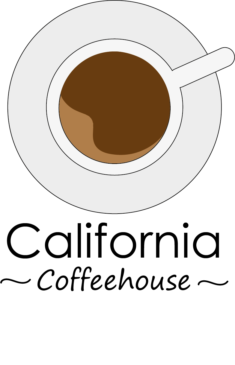
Logo design
- Report
kunal das • 4 years ago
Clients brief - Hey!
I am Sadye, creator of Xaco. We are looking for someone that can design a professional logo for our business. I would like the logo to be an abstract mark. Can you help me out?
I am Sadye, creator of Xaco. We are looking for someone that can design a professional logo for our business. I would like the logo to be an abstract mark. Can you help me out?


The abstract mark effectively conveys a sense of uniqueness and intrigue.
2 months ago by Akash Kumar - Reply
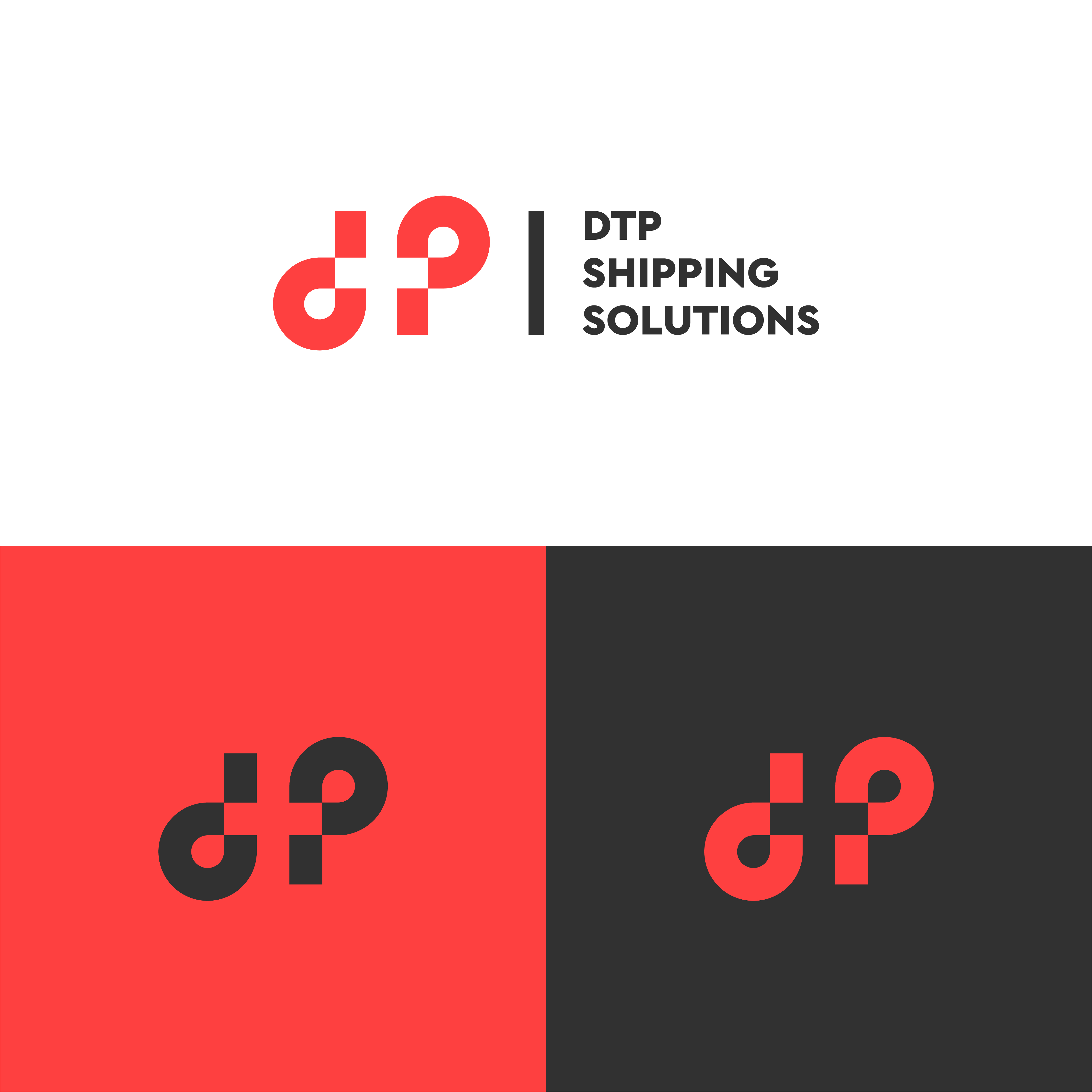
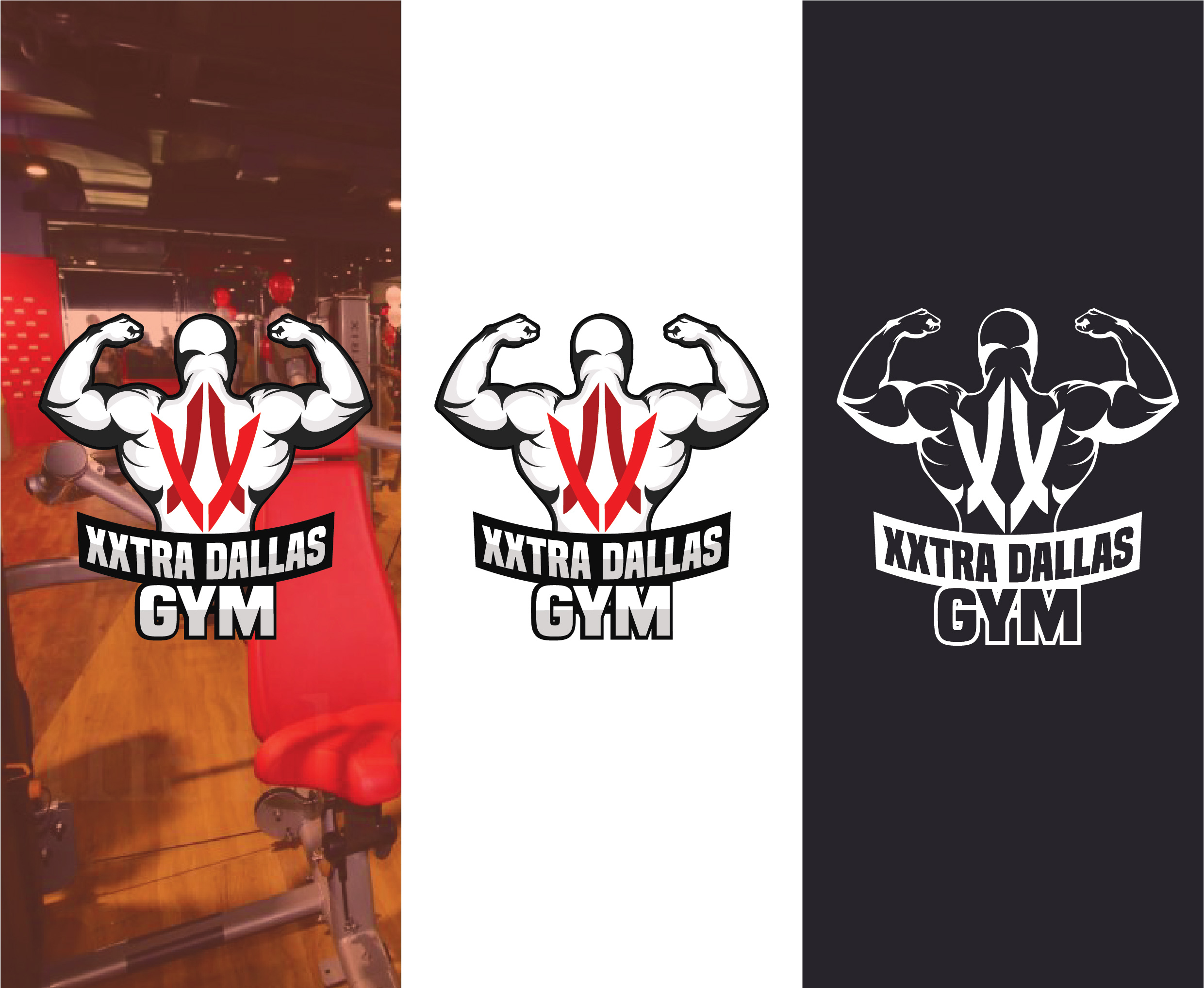
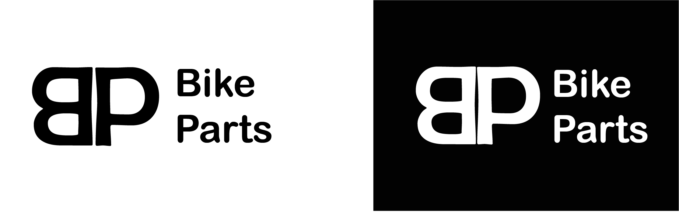
Logo Design
- Report
kunal das • 4 years ago
Clients brief - Hi,
I am Anthony, owner of Anthony's Gym. I'm looking for someone that can create a simple logo for my business. I would like the logo to be an abstract mark. Would you be interested?
I am Anthony, owner of Anthony's Gym. I'm looking for someone that can create a simple logo for my business. I would like the logo to be an abstract mark. Would you be interested?

looking too impressive. I can just say for it wow!!
4 years ago by Fardeen Idrishi - Reply
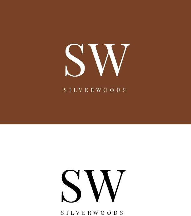
Logo design
- Report
kunal das • 4 years ago
Clients brief - Hi!
I am Tony, founder of SummerWatcher. We're looking for someone that can create a simple logo for our business. I think a lettermark will fit best. We would love to work with you!
I am Tony, founder of SummerWatcher. We're looking for someone that can create a simple logo for our business. I think a lettermark will fit best. We would love to work with you!
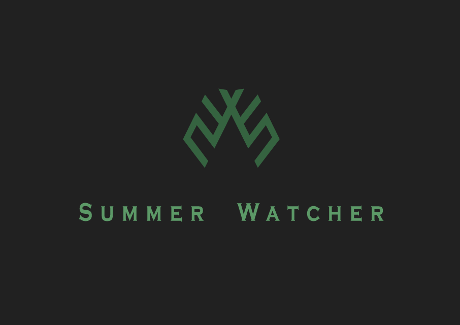

Good font choice as well!
4 years ago by William S - Reply
i like the color combination.
4 years ago by Fardeen Idrishi - Reply
I like the shape, and the color combination of dark green and black is perfect!
4 years ago by Leangheng Ou - Reply
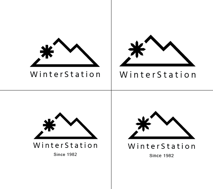
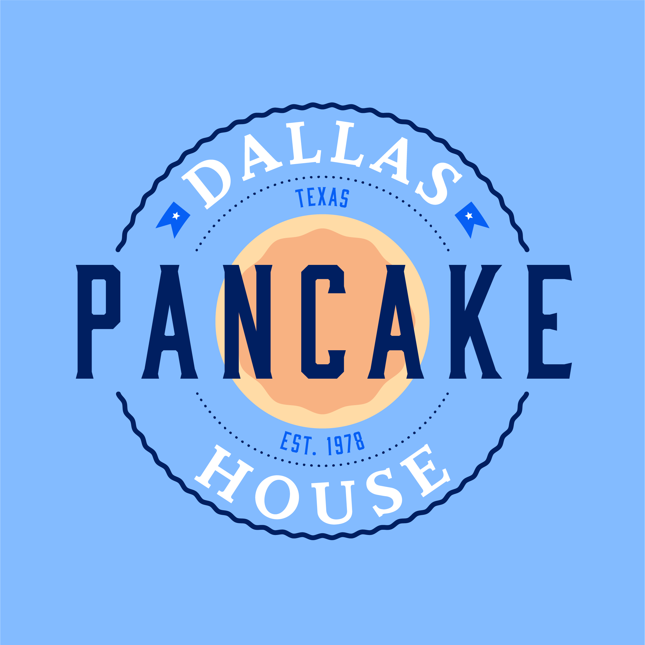
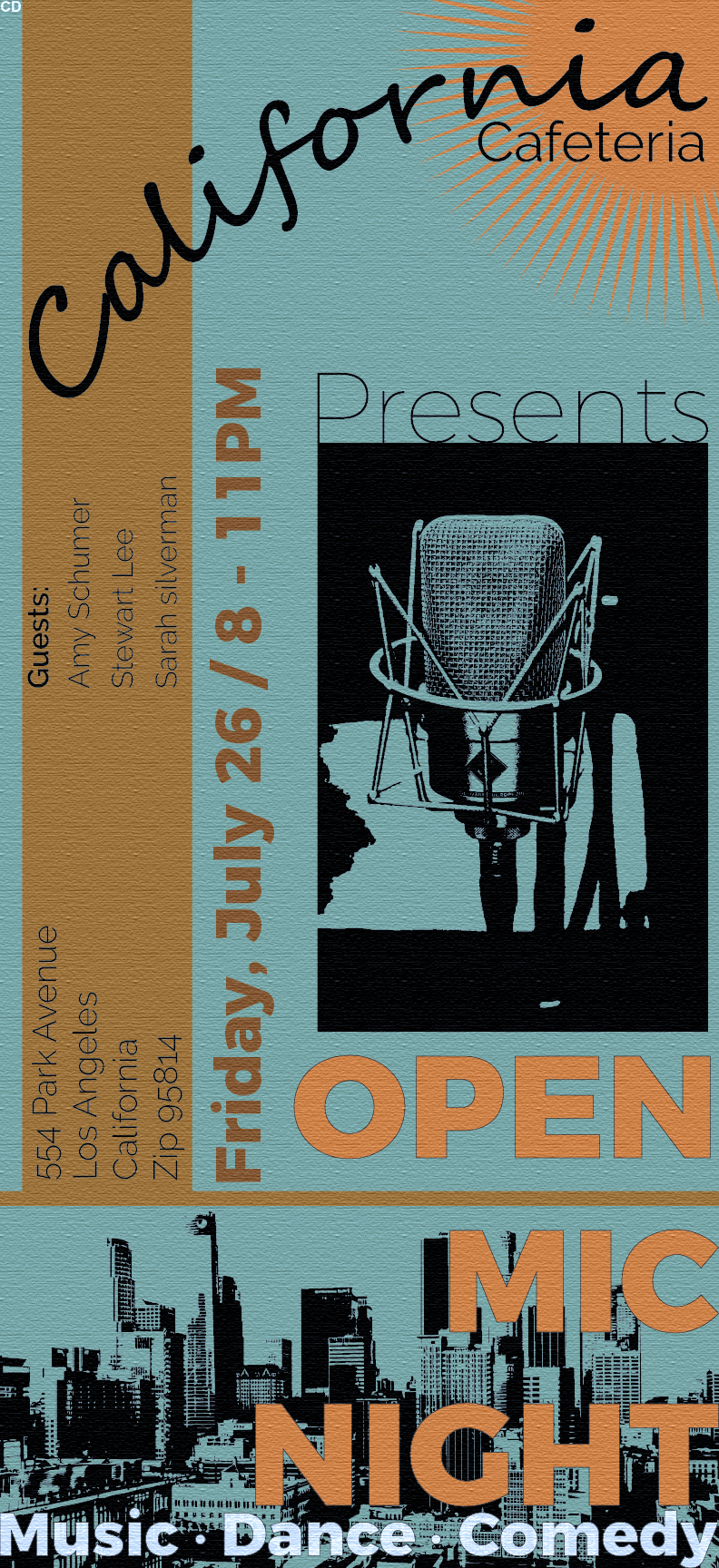
Logo design
- Report
kunal das • 4 years ago
Clients brief - Hello!
I am Johnathon, I recently started a new business called Authentic Dallas Pancake house. For a while now, I've been looking for a good logo for my Pancake house. I would like the logo to be an abstract mark. Can you help us out?
I am Johnathon, I recently started a new business called Authentic Dallas Pancake house. For a while now, I've been looking for a good logo for my Pancake house. I would like the logo to be an abstract mark. Can you help us out?


change the font
2 months ago by kabul - Reply
Logo design
- Report
kunal das • 4 years ago
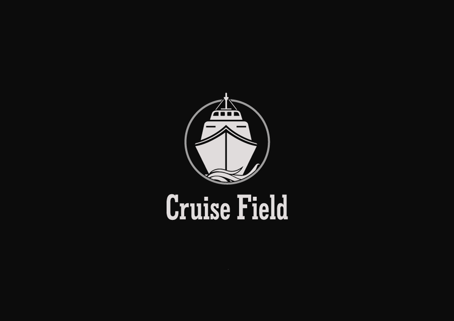
Clients brief - Hi,
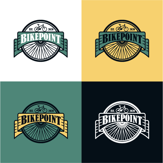
I'm Mallory, owner of Cruise Field. I'm looking for someone that can make a good logo for my business. I think a combination mark will fit best with the business. Can you help us out?
I'm Mallory, owner of Cruise Field. I'm looking for someone that can make a good logo for my business. I think a combination mark will fit best with the business. Can you help us out?

this is pretty nice. it's very easily read as a logo, but i fear the smaller details are sort of hard to read at such a small scale. perhaps simplifying it more to basic shapes would be better. good job overall!
4 years ago by pndmx - Reply