pndmx
Posts
2
Likes
11
Liked Posts
16
Given Feedback
16
Feedback
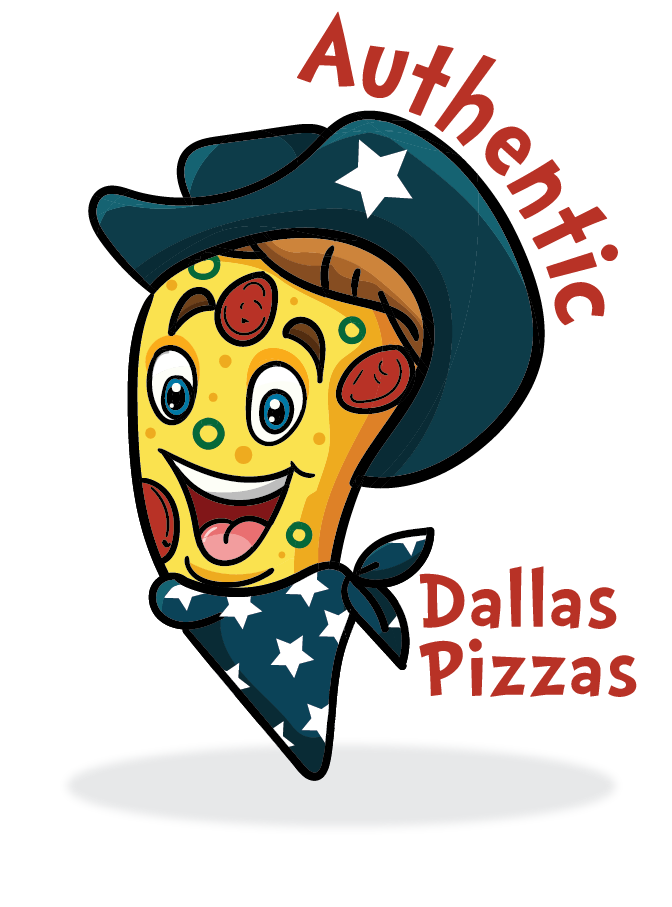
This is a really good mascot! I'm not quite sure about the font choice, but that mascot is really well-executed. Good job!
4 years ago by pndmx
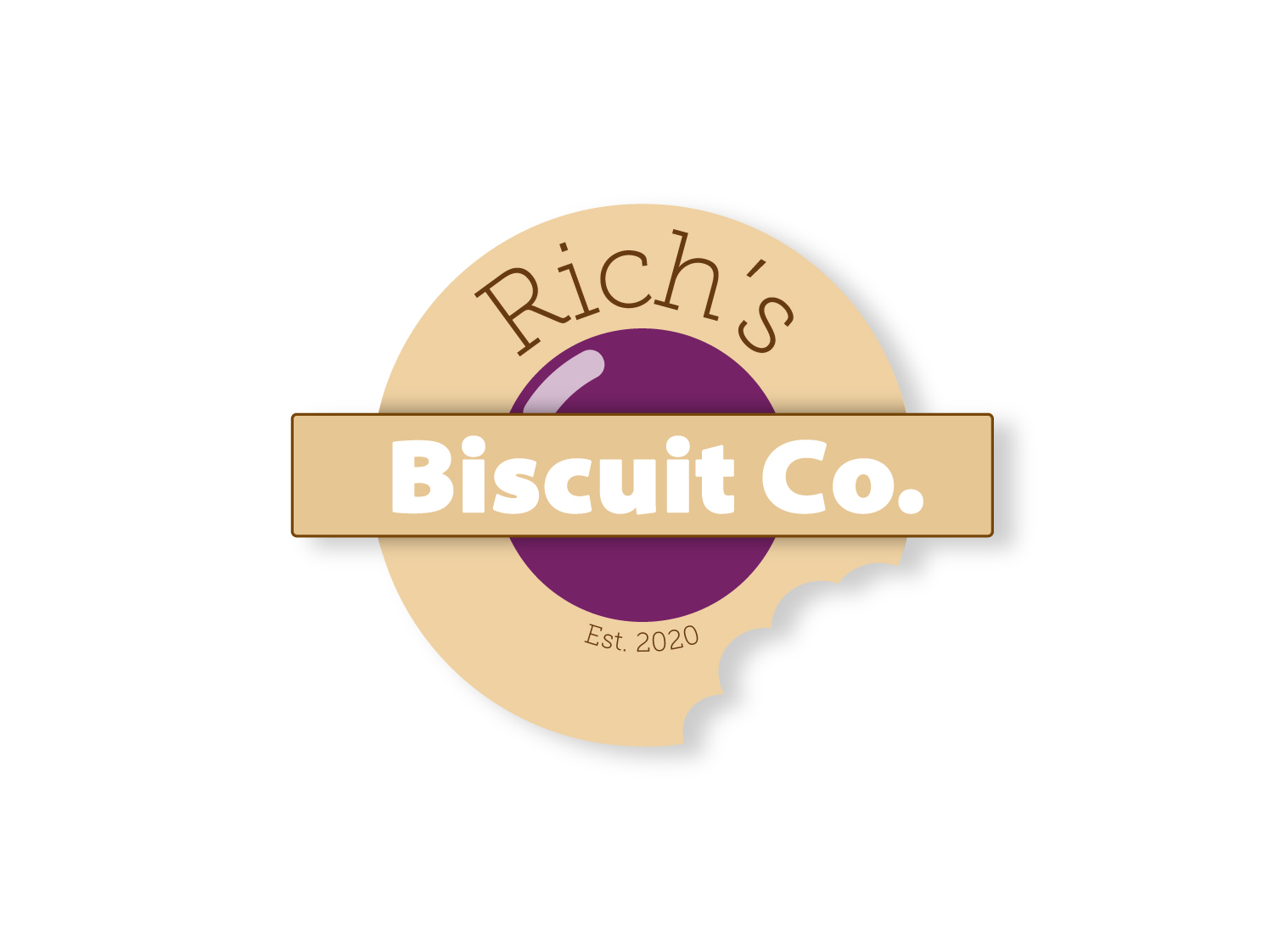
The fonts are too different, and "biscuit co" is a bit hard to read because it's in front of a light color as well. That being said, you probably could have put all the text in a single shape instead. Good work!
4 years ago by pndmx
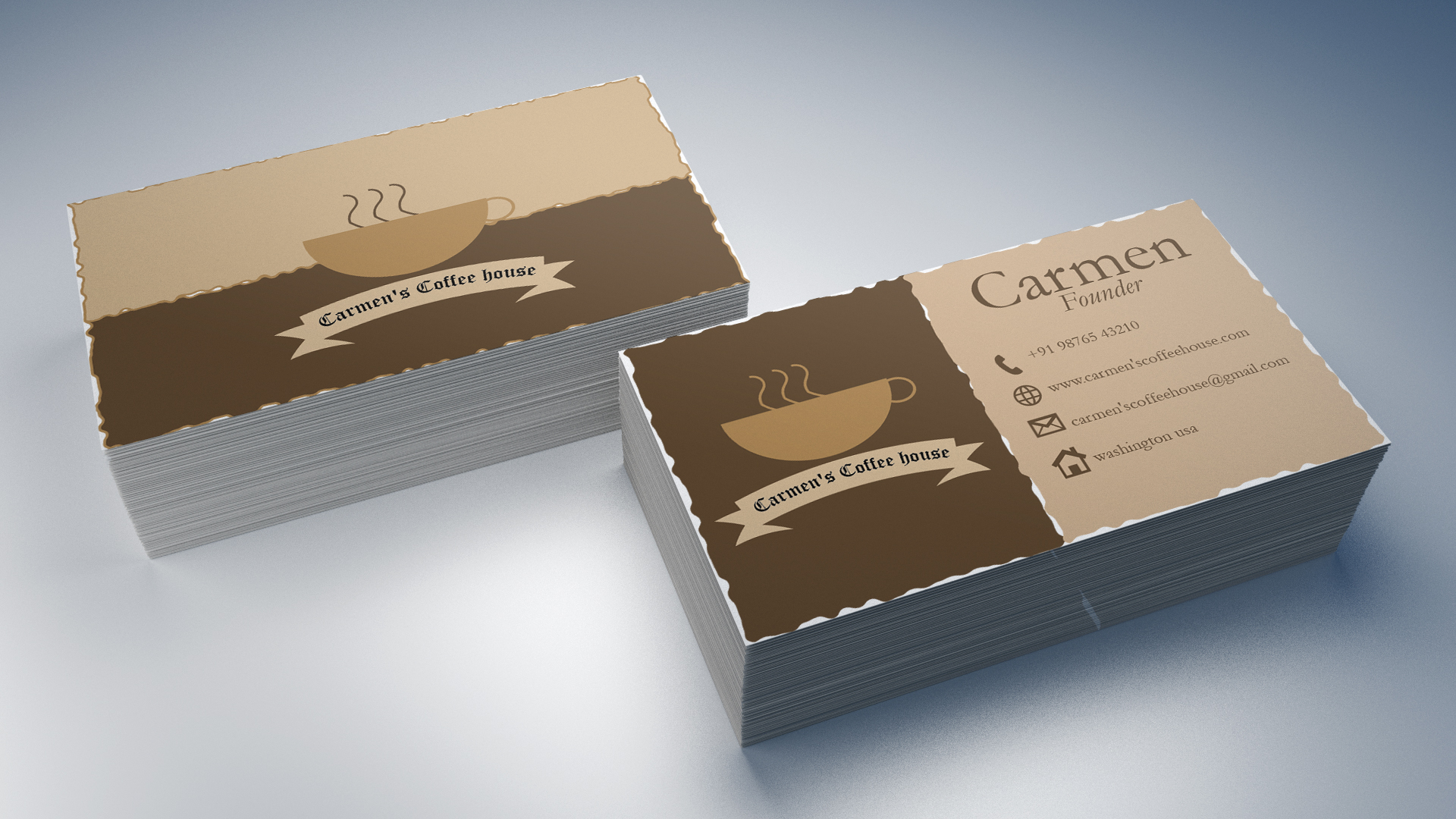
This is a nice, clean design. For the information at the back, you could have split it into thirds, so there's more space for the text, but still a good design.
4 years ago by pndmx
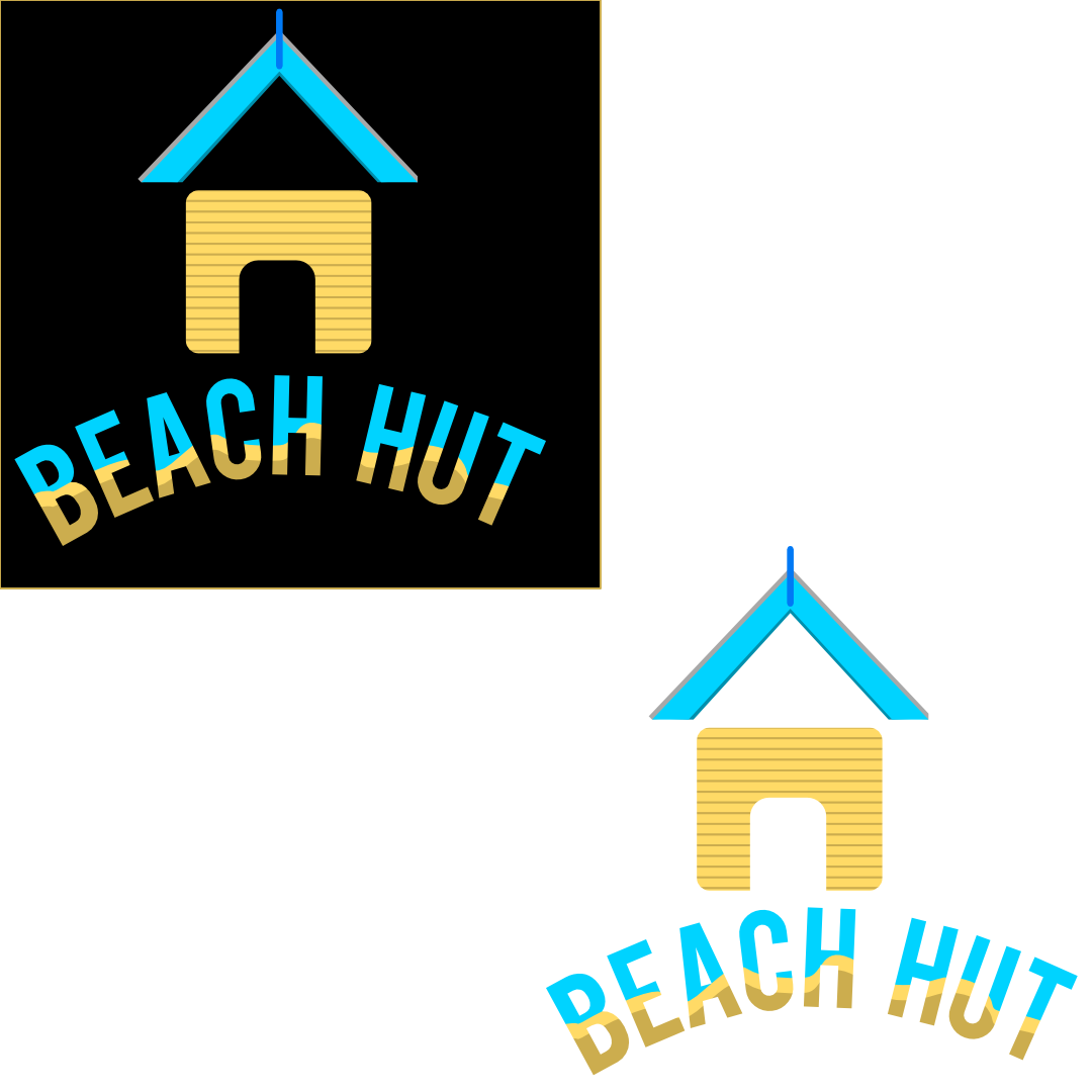
This blue line at the top feels out of place. Your corners also don't match, as some are rounded and some are kept sharp. The empty space below the roof could be eliminated if you push the two objects together and cut the main building shape instead. But overall, this is a good design, very clean, and could work well in solid black or white. Good job!
4 years ago by pndmx
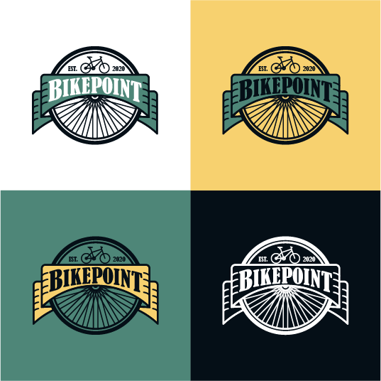
wow! this is really nice. i love the colors as well, really makes the work pop and easy to read. perhaps my only nitpick is making sure the bike is in contact with the border/line of the banner, it seems like in the other variants it's not touching. Otherwise, great work!
4 years ago by pndmx
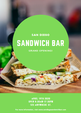
This is a good foundation! For flyers, we should consider the user experience, how the user will interact with our material. That being said, the details are too small and quite difficult to read, especially when paired with a bright green background color. It's also a shame that the sandwich was covered, unless that's what you were going for, in which case, you may want to center the sandwich so our eyes dart directly onto it. Can't wait to see more of your work!
4 years ago by pndmx
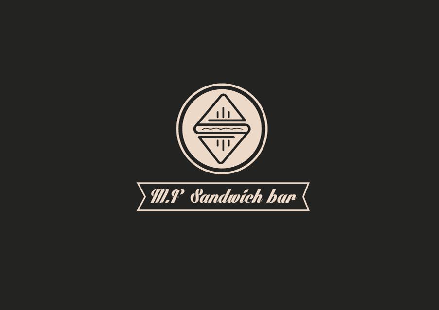
The line width should be consistent to give a much more tied appearance. The middle squiggle you have (condiment on the hotdog, i presume) is just too thin, especially when viewed on mobile platforms. Good work, however!
4 years ago by pndmx
I feel like there is too much going on with this logo, it's difficult to take in. There is also little consistency with your type; the spacing is all over the place and there are two gradients per letter. However, I look forward to seeing you improve and post more. Cheers!

4 years ago by pndmx
This is very nice! I like the bottle in place for the "I"

4 years ago by pndmx
This is a nice, bold logo! My only concern is that the font used for "pizza" doesn't quite fit. It feels a bit too techy for me. Still, amazing work!

4 years ago by pndmx
this is pretty nice. it's very easily read as a logo, but i fear the smaller details are sort of hard to read at such a small scale. perhaps simplifying it more to basic shapes would be better. good job overall!
4 years ago by pndmx
I like the striking design you did with the letters, but I feel like it could be better without the irregular box surrounding the text. Still a wonderful job!

4 years ago by pndmx
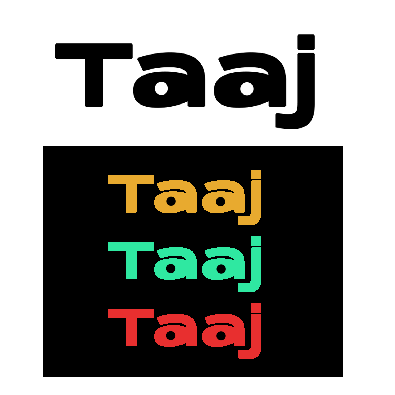
I appreciate the minimalist and modern approach you took on this one! I feel like the kerning could be adjusted a bit, as the "T" and "a" are a bit too close together, compared to the rest of the letters. I also see what you did with the "a", sort of like eyes looking off to the sides. Overall, good job with this design!
4 years ago by pndmx
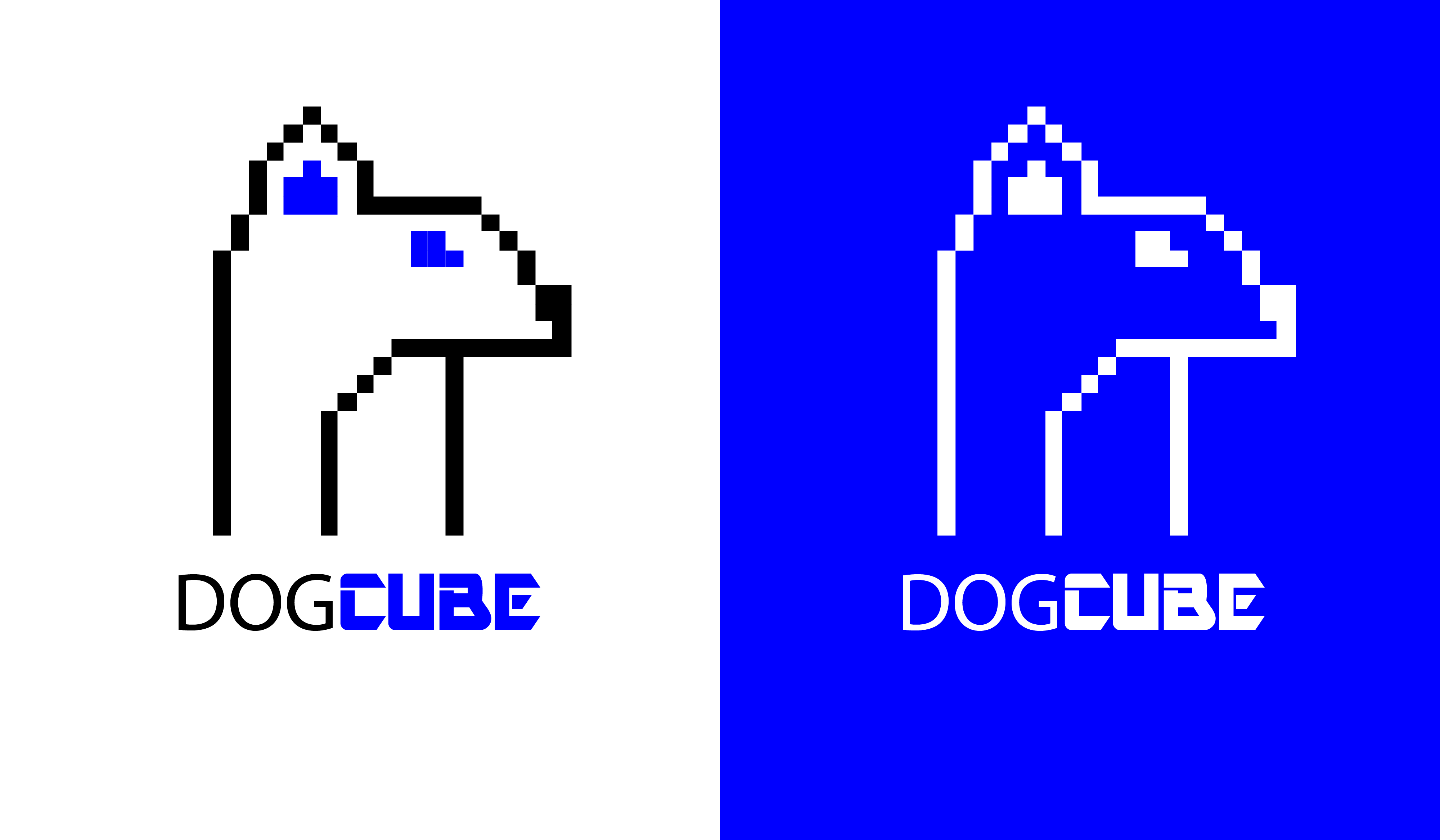
This is cute! Though at first glance I saw a mouse and not a dog. It would also help to tie the entire thing together if "dog" was the same font as "cube". But good work nonetheless
4 years ago by pndmx
I feel that 3 would work well, but that the signal marks on each side of the mouse is too much, perhaps putting it on top of the mouse instead, where the small antenna is? Other than that, it's a pretty solid logo :)

4 years ago by pndmx
Hello! I feel like for an illustration, it lacks story or definite meaning as to what it is. If I were to see this illustration by itself without the prompt, I probably would have not understood it.
That being said, there are too many elements present, and presents a sensory overload to the viewer.

4 years ago by pndmx
Posts
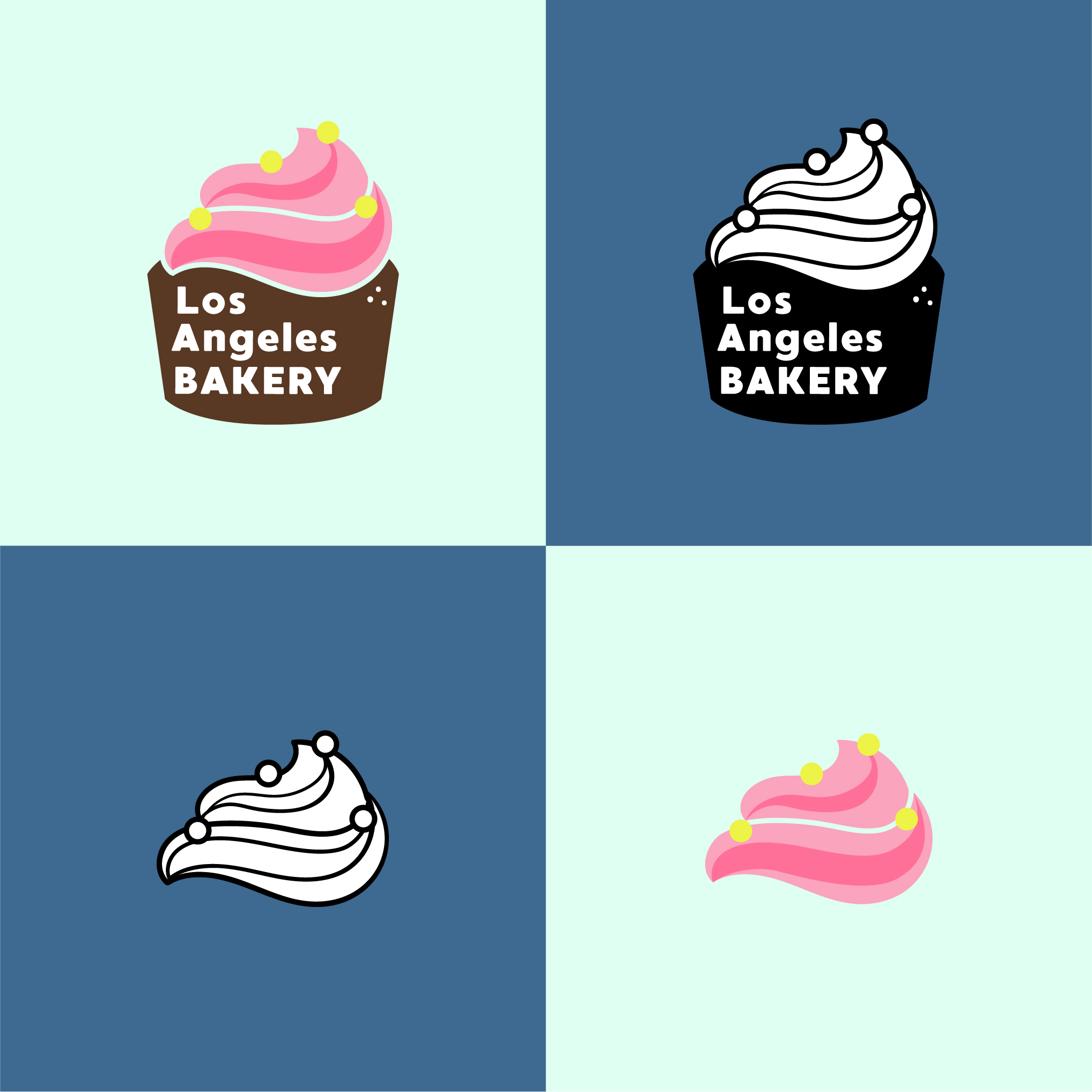
Los Angeles Bakery
- Report
pndmx • 4 years ago
As per the client request:
"Hi!
I'm Carmen, I just founded a new business called Los Angeles Bakery.
For a while now, I've been looking for a good logo for my Bakery.
I would like the logo to be an abstract mark. Can you help us out?"
A staple in bakeries, I went with a cupcake as it has more playful options than bread.
I decided to do two logos, one that has a more urban style, and one that's more colorful and playful.
I opted to keep the text in, but the I feel like the swirl could also be used for shirts, cups, plates, etc.
Let me know what you think!


bugu - Poster
- Report
pndmx • 4 years ago
I actually made three designs, but I felt this one is the most cohesive. My thought process was that a blue/gold combo will stand out best, and a minimal layout will give way for the designs that can be shown in the boxes. Short descriptions accompany the designs, as well as a company background in the upper right region, below the logo.
Showing the year the company started can give off either a willingness to try something new (if the company is starting out) or breathe a sense of seniority (if the company is established already).
I must admit, in retrospect, the background could use more detail. Let me know what I can improve upon!
Hello!
I am Joan, founder of bugu.com. For a while now, I've been looking for a good designer for my graphic design firm. We will need a poster to advertise our business. We primarily use the color blue. Can you do that?
I am Joan, founder of bugu.com. For a while now, I've been looking for a good designer for my graphic design firm. We will need a poster to advertise our business. We primarily use the color blue. Can you do that?
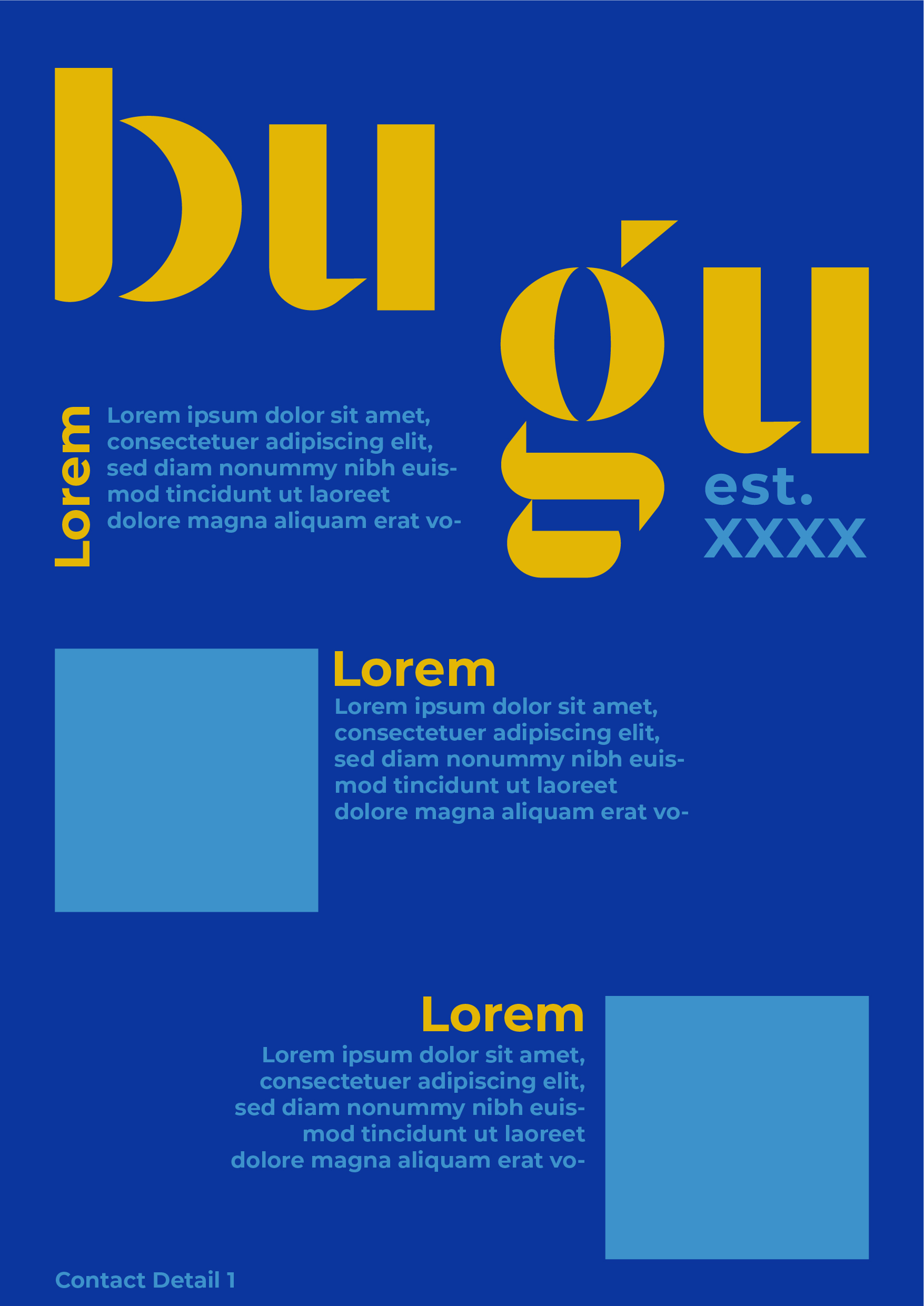

The font for the company name is bringing life into this piece. Although the light blue color for text could have been more lighter so as to improve contrast.
I am new here, will appreciate if you can give feedback on my work, thanks
2 years ago by Deepanshi Chaudhary - Reply
Love the typography for "bugu"!
4 years ago by Elena - Reply