Deepanshi Chaudhary
Posts
1
Likes
1
Liked Posts
3
Given Feedback
5
Feedback
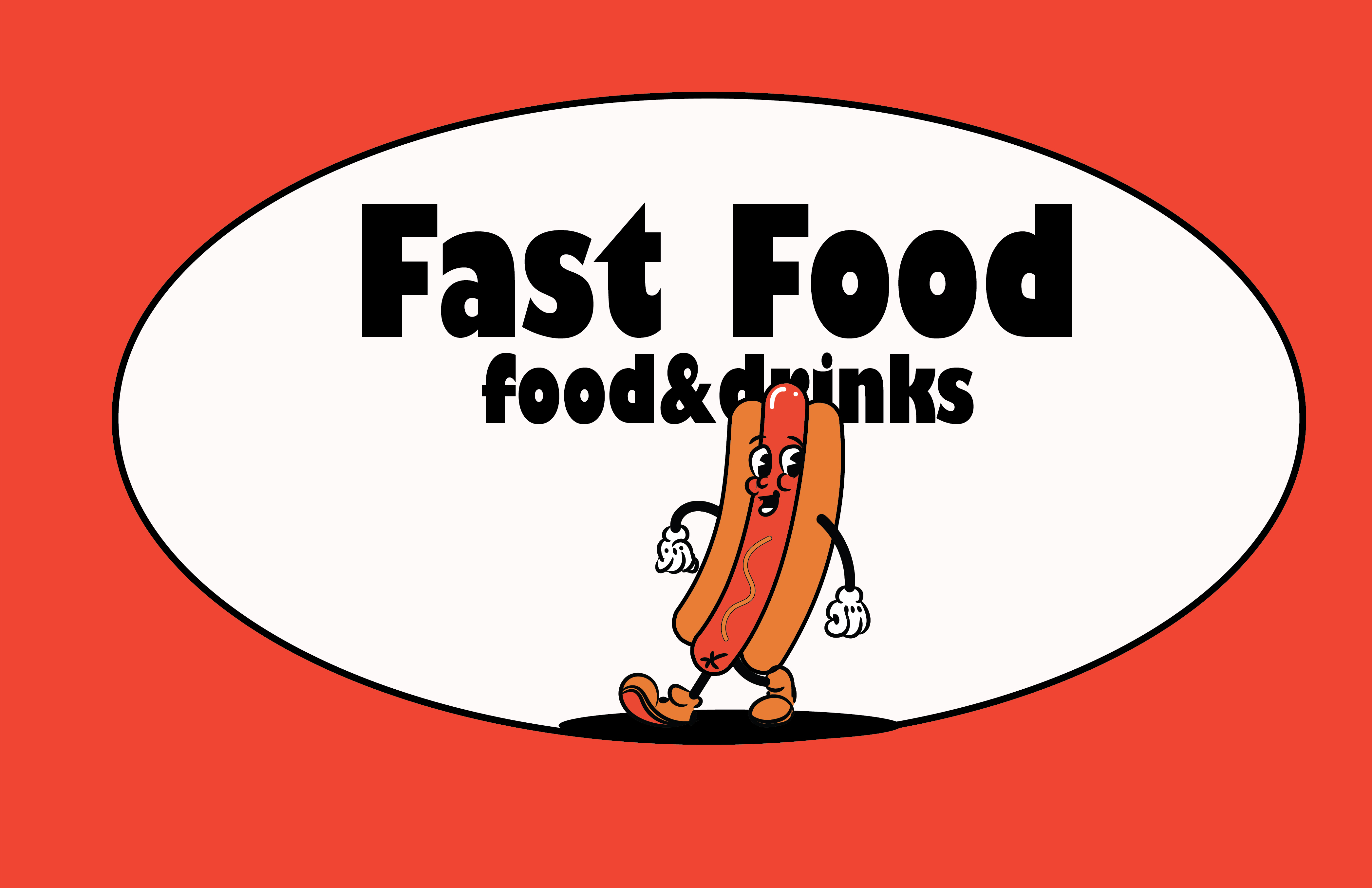
Amazing display! Can you tell me which tools you used to create this design. I am a young designer, it would be really helpful
2 years ago by Deepanshi Chaudhary
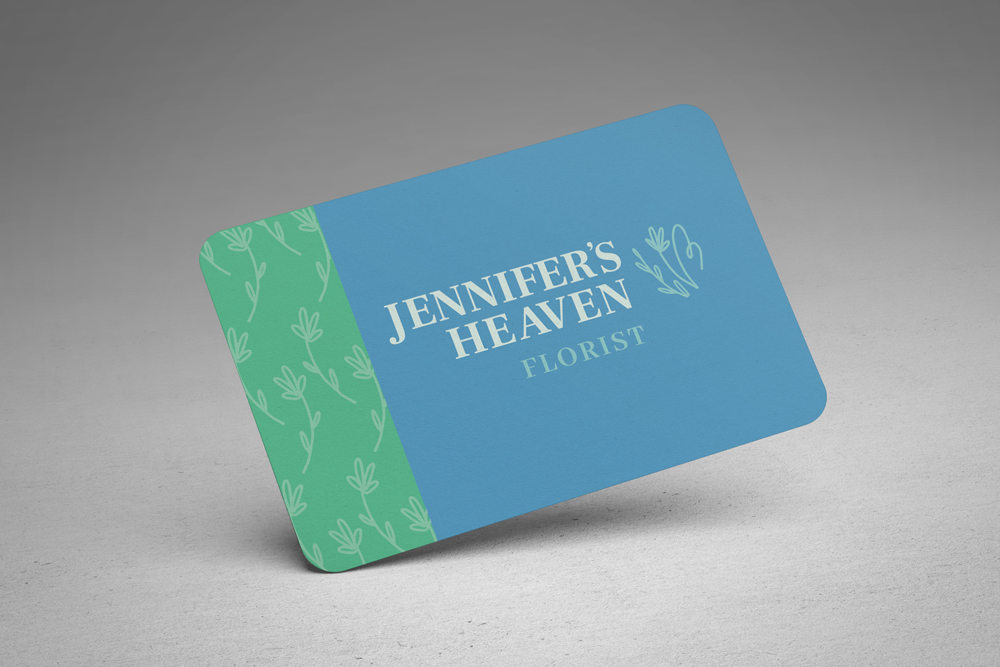
The font for the company name is bringing life into this piece. Although the light blue color for text could have been more lighter so as to improve contrast.
I am new here, will appreciate if you can give feedback on my work, thanks
2 years ago by Deepanshi Chaudhary
Lovely colors!
2 years ago by Deepanshi Chaudhary
Interesting font. Looks perfect with the theme and logo
May I know the tool you used to create the logo and name of the font?
Would be really helpful for me, thanks!

2 years ago by Deepanshi Chaudhary
Hey, I am a young learning designer. I like the use of color red which is usually associated with fast food businesses.
2 years ago by Deepanshi Chaudhary
Posts
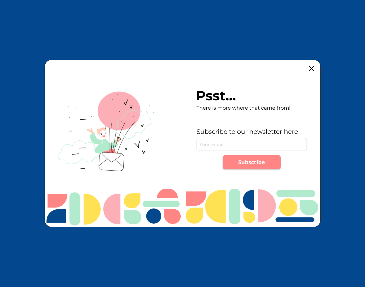
Subscribe
- Report
2 years ago by Deepanshi Chaudhary
Here I created a subscribe page for a blog website. I took inspiration from https://dribbble.com/shots/14933967-Daily-UI-26-Subscribe and tried to keep it simple yet fresh.
I am new here so I would appreciate everyone's feedback and let me know if it can be improved
I am new here so I would appreciate everyone's feedback and let me know if it can be improved
Hi,
My name's Fredricka. I am looking for a UI designer. I need an interface design of a subscribe. We would love to work with you!
My name's Fredricka. I am looking for a UI designer. I need an interface design of a subscribe. We would love to work with you!
 1 Like
 1
1
I think the Typography on the right can be done better, they lack of hierarchy, and just a little improve they will look good
7 months ago by nostructure - Reply