Leangheng Ou
Posts
8
Likes
7
Liked Posts
20
Given Feedback
6
Feedback
I like the shape, and the color combination of dark green and black is perfect!

4 years ago by Leangheng Ou
Nice i love the shape, and the color!

4 years ago by Leangheng Ou
@pndmx ahh yeahh true, you are right, I will try to fix the font. Thank for the feedback!

4 years ago by Leangheng Ou
That cool I like that!
4 years ago by Leangheng Ou
wow

4 years ago by Leangheng Ou
I like the font choice and its great that you use the suggested color. And it will even more amazing if you apply more type of shapes or line on the front card.

4 years ago by Leangheng Ou
Posts
Loftry, The Real Estate Company
- Report
Leangheng Ou • 4 years ago
Hello, this is my opinion on Loftry as they wish to have a modern look, put brown shade in logo, and include the shape of the house. I am thinking that my opinion is not match with the requirement of the customers. I am open and happy to hear feedback from everyone.

 Like
Like


this font look bad
2 months ago by kabul - Reply
SilverWoods, Cosmetic Company
- Report
Leangheng Ou • 4 years ago
Hello, this is my opinion on SilverWoods logo, the cosmetic company that wishes to have fgant and elegant looking logo.
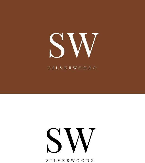

It is giving the feel of a luxury brand which is great, serif font good choice. Nice work keep it up
4 years ago by Fardeen Idrishi - Reply
loved the simplicity
4 years ago by kunal das - Reply
Netaid, Computer Service
- Report
Leangheng Ou • 4 years ago
This is my opinion on the Netaid Company. The company focusing on internet connection and computer repair service. They target their loyal elders customers.


so far so good
2 months ago by kabul - Reply
Piccio's Pizza
- Report
Leangheng Ou • 4 years ago

@pndmx ahh yeahh true, you are right, I will try to fix the font. Thank for the feedback!
4 years ago by Leangheng Ou - Reply
This is a nice, bold logo! My only concern is that the font used for "pizza" doesn't quite fit. It feels a bit too techy for me. Still, amazing work!
4 years ago by pndmx - Reply
LogoSpotter
- Report
Leangheng Ou • 4 years ago
Hello, this is my opinion about the logo of LogoSpotter, an Instagram page's logo.


.
2 months ago by Gustav - Reply