Aurel
Posts
1
Likes
2
Liked Posts
20
Given Feedback
29
Feedback
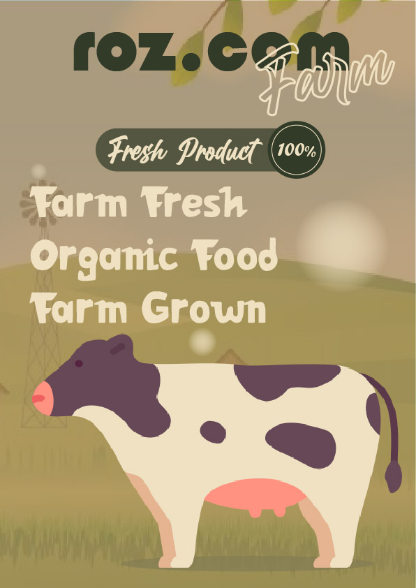
Almost a good poster. The brightness is a bit too low for a farm advertise. And according to the brief, the predominant color is blue, witch there isn't any.
2 years ago by Aurel
Smooth choice. Wine color on cozy backgr.)

2 years ago by Aurel
Interesting.
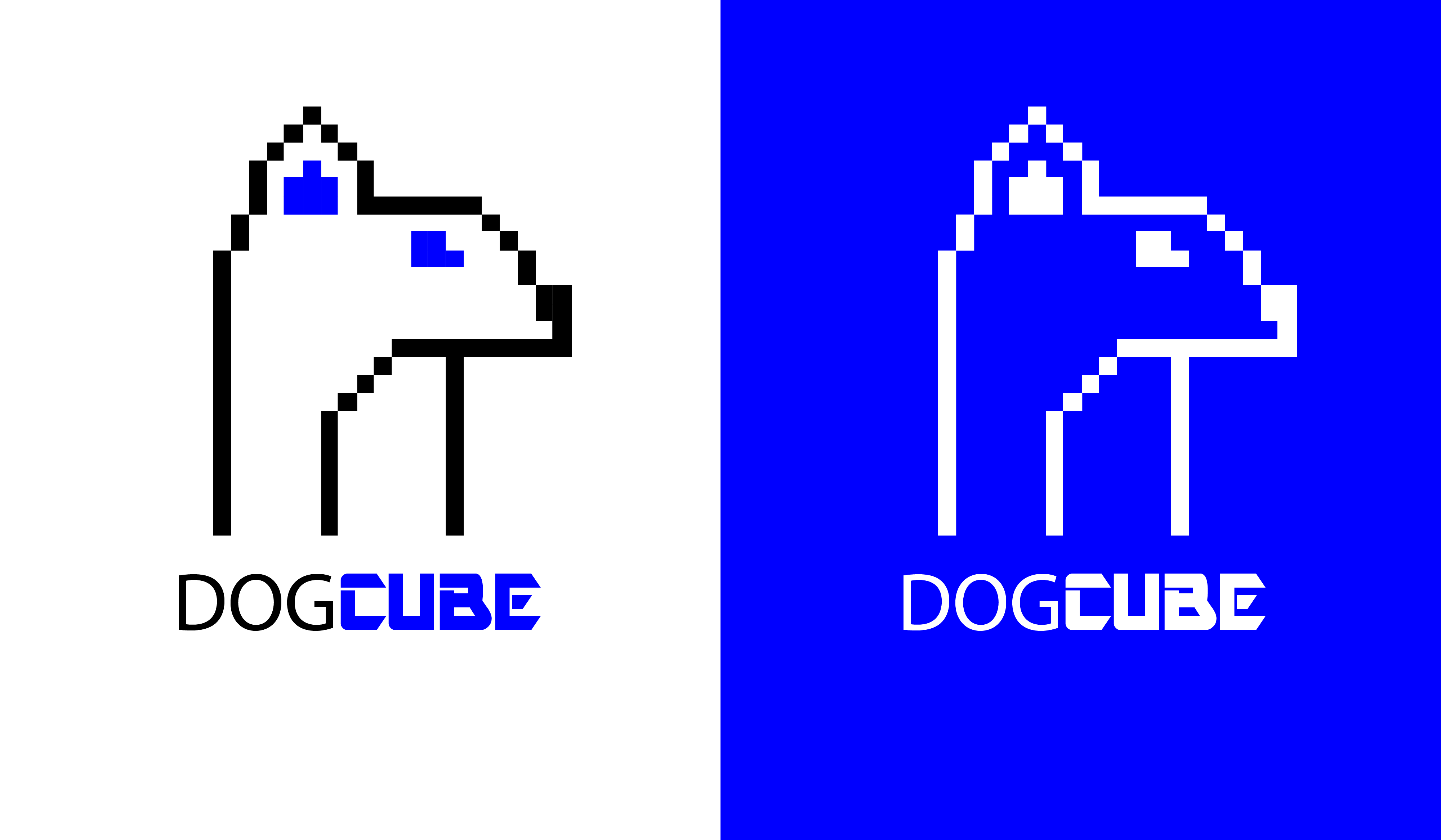
Not sure about this toxic blue. And dogs don't have that long neck.)I see just one ear by the way.) I don't know why this bothers me.))
2 years ago by Aurel
Well is looking very good as a design work. But is not quite related to the comfort feeling, and the mattresses. Maybe you took a element of them and transform it in a mark for logo. But this is not what people see when go for mattress). Besides, the non-colors as black and grey, are not related to the comfort and warm zone. Great work, but not according to the brief.

2 years ago by Aurel
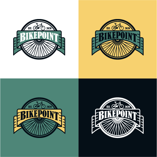
Very well done. You did the logo in different backgr how it should be done. Is easily recognisible and very related to what client requested. The black color is loosing in that green-ish backgr a bit. But overall looking ok.
2 years ago by Aurel
This is not related to fruits or importing business. You need to reconsider your design.

2 years ago by Aurel
Good design. Nothing more to say about it.
2 years ago by Aurel
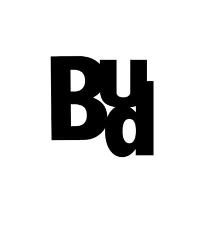
These fonts are not good for placing one on each other, especially "d" is out of place. Try other font families. Maybe more square-ish, or that looks more like each other. Play with it.
2 years ago by Aurel
The spacing between Headline Naming need to be a bit reduced. In general looks good.
2 years ago by Aurel
Looking interesting so far.
2 years ago by Aurel
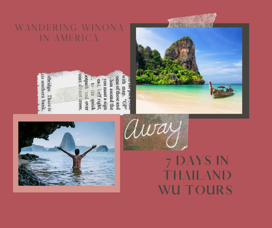
The Brown text is loosing in the background, and not really readable. Also the red color is not necessarily appropriate for a trip event, especially with beach and sea. It can be blue, yellow, orange, ultramarine (the colors need to be light and soft), they need to bring the feel of happiness and relaxation. Then you adjust the text and give it a withe color preferably, maybe a very light grey.
2 years ago by Aurel
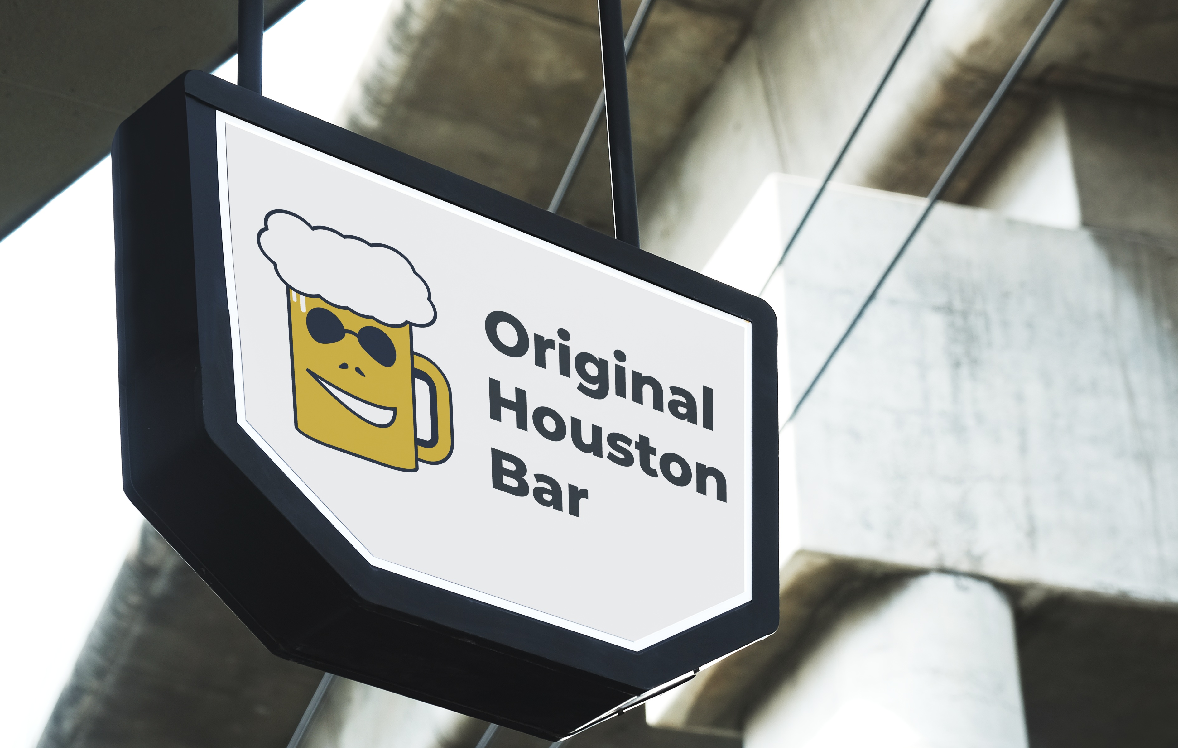
I know that the beer is leeking, but if the mascot would have a mood it must be feeling "awkward" :) Is a bit too simplistic illustration, and no - the glasses don't make mascot "cooler" (in this case)) If you can't draw eyes, just look at the references of cartoon characters when they are laughing of just feeling happy and smile. The text was not necesary (according to brief) but loking okay on the signboard.
2 years ago by Aurel
Is a bit long for a "lettermark". Overall feels fresh.

2 years ago by Aurel
Looking nice. Not sure about the font tho. Also you need to understand that your logo will look good on a filled shape if you want to place in website, on top of an image, or printed on something (especially black & white on some surfaces).
2 years ago by Aurel
Good choice of elements. The bold type is also well balanced. Don't remember where i've seen a similar design. But overall well done.
2 years ago by Aurel
Interesting choice. Not sure if you need anything to change here. Maybe the "A" is a bit too big and thick, but not neceserally. After all the word below is less important than that at the top of it. Well done for first experience.
2 years ago by Aurel
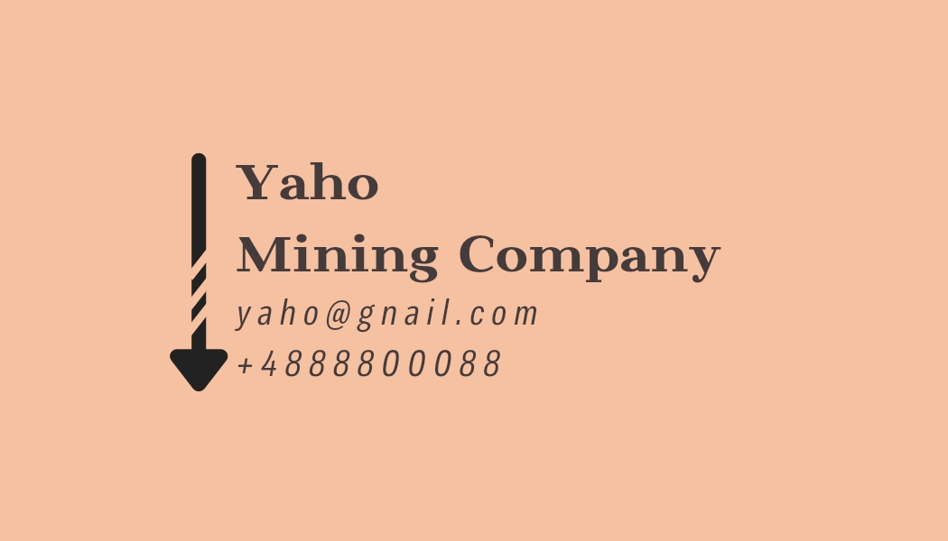
Don't make the text double (exception if is decorative and no need to read it). The bottom text is too thin, and not readable (i see it clear just with zoom). And maybe the icons for social media you would likely change the overall color to some gold or soft grey like in the image in the center.
2 years ago by Aurel
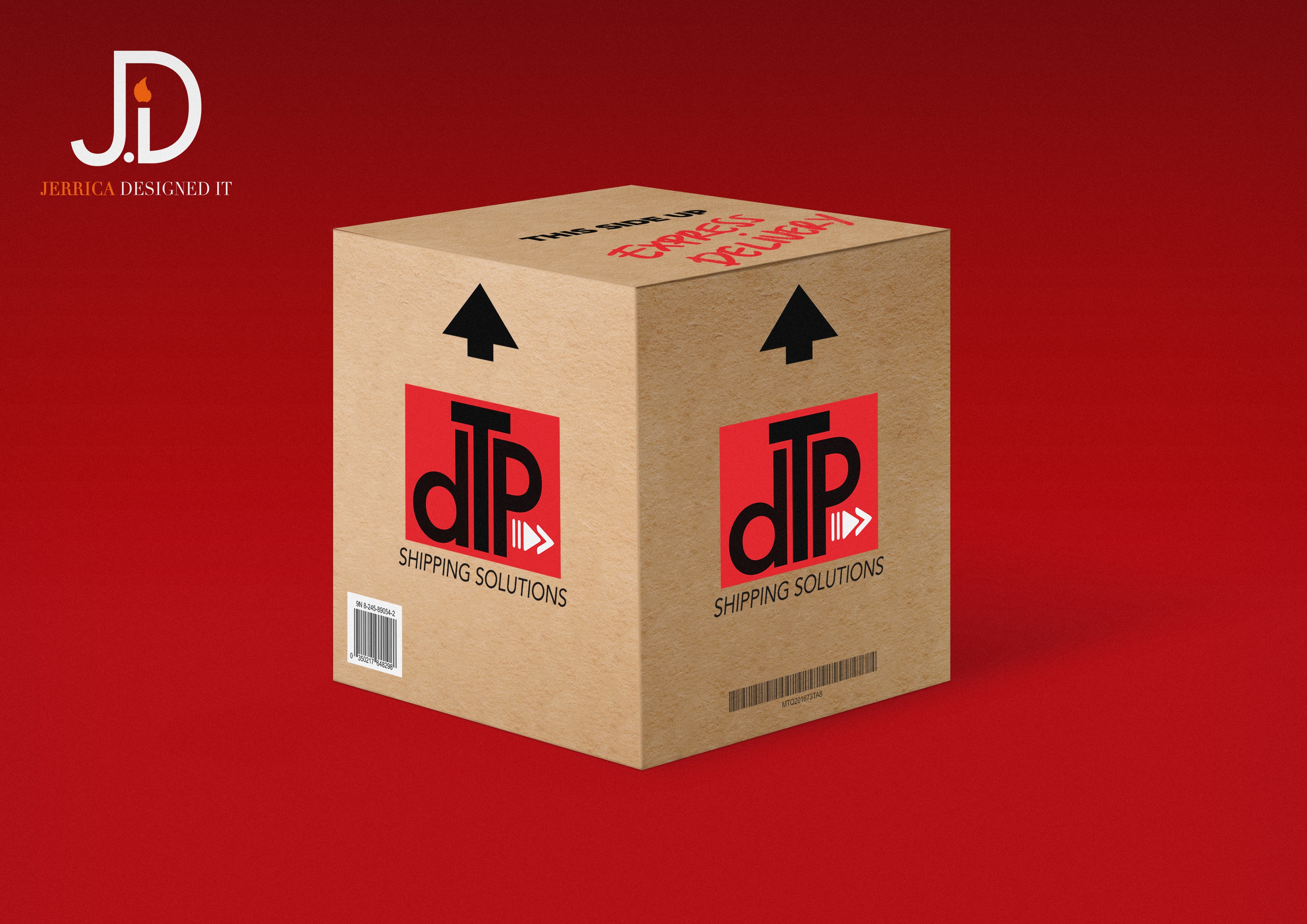
The logo is recognizable, but the text... i don't know. I see "T", i see "D", but "P" is not there or is not readable at all. Also the text is to different from the logo style, and a bit not well alligned with it. The Idea is good, but is not finished. Keep it up!
2 years ago by Aurel
Kinda cool. I don't know why you would draw the perspective lines. I know you wanted to fill them with something but, it looks a bit odd. You should reconsider what to put in the text, or maybe do not put anything.
2 years ago by Aurel
The word "presents" may be aligned to the right alog with the headline. But in the half-bottom of flyer the text is kinda messy. maybe draw an rectagular with rounded corners, or even better a circle/elipse at the top of that blink of boque-light in bottom left of the image (and make it at the same color with a bit of Outer Glow at the edge), and put that description text for the event in shape. This will stabilise the composition and wil give more balance.

2 years ago by Aurel
Ok. Simple choice. I agree about the pail and shovel in comment bellow. And the headline maybe you would want to align to the right to make some balance in the half-top of the flyer.
2 years ago by Aurel
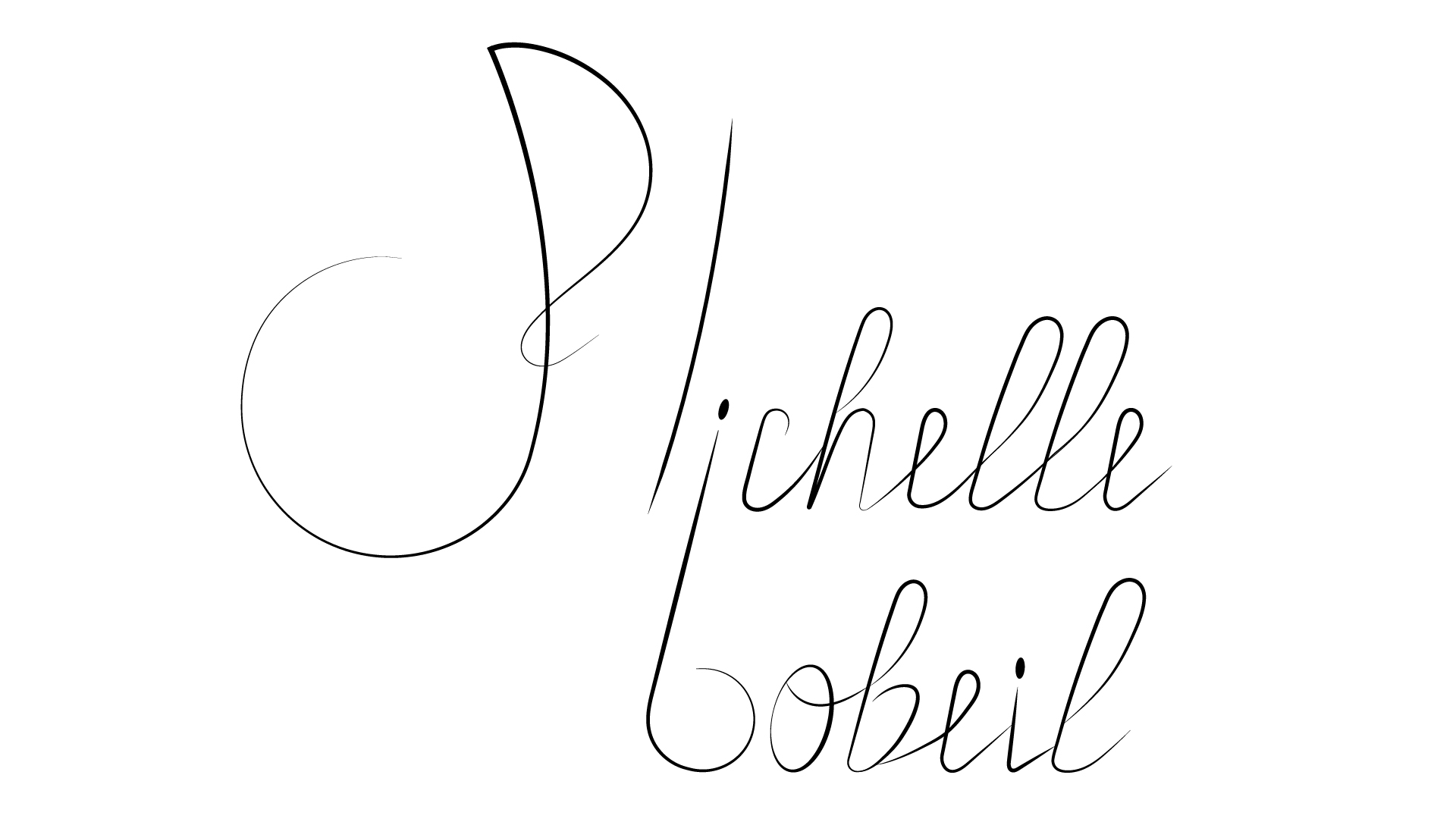
Plichelle bobeil.) Sorry, but that's what i see here. Maybe you need to find some lettering/callygraphy alphabet reference.
2 years ago by Aurel
You concentrated too much on "M", in the end the text you created is not much readable. The bed did not identify much as a bed, and is more related with enlarged "H". You need to reconsider the design, and by doing it you need to feel cozy and that you like it. It's about matress after all (if i understood correctly).
2 years ago by Aurel
You have so much to learn.
2 years ago by Aurel
Nice. The style fits. Not sure about the color tho.
2 years ago by Aurel
Conceptual but not readable, even as an abstract mark. If you want to keep that style, maybe would be better to make shorter lines, or less negative space between. Or both.

2 years ago by Aurel
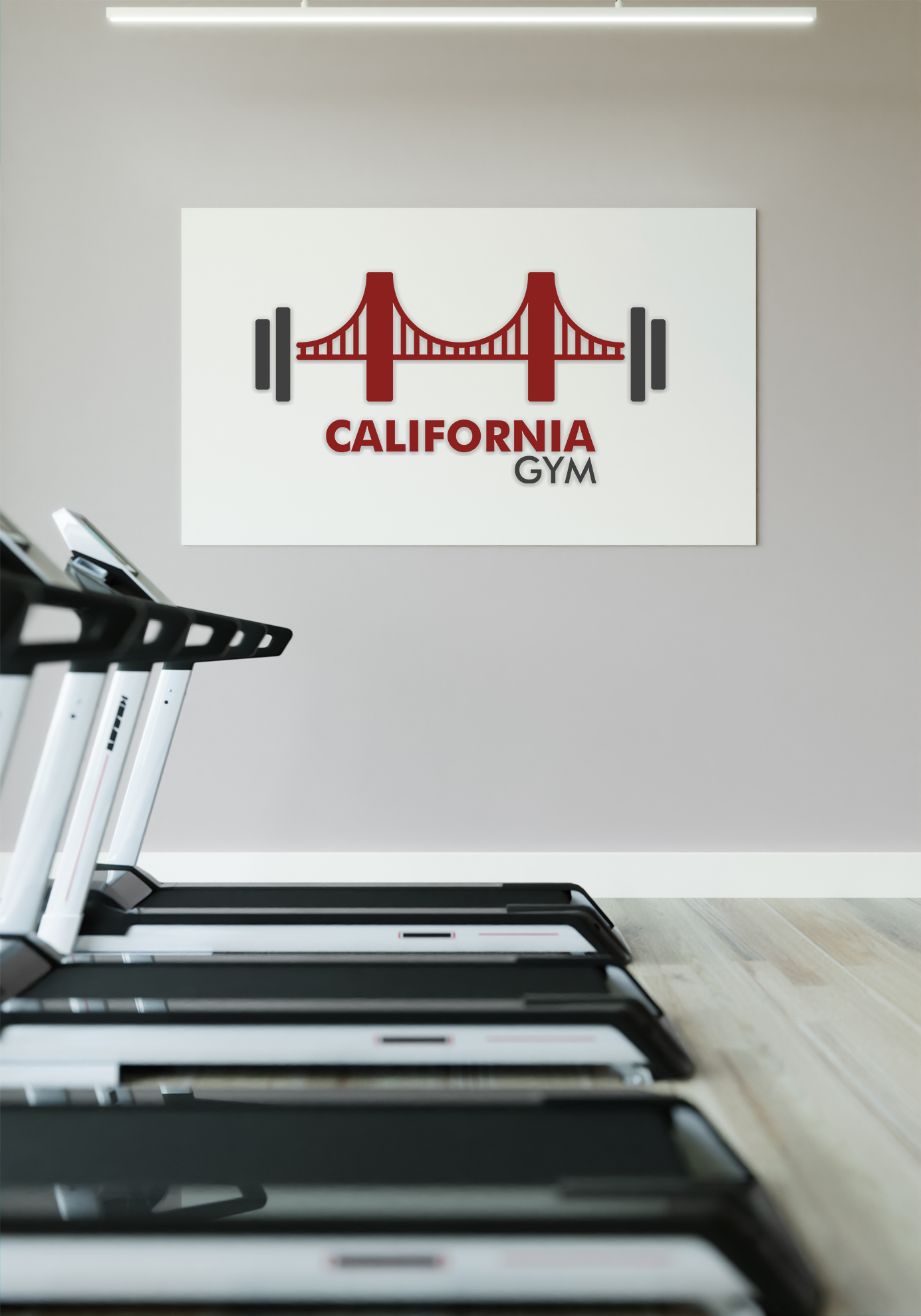
I understand that the bridge is a simbol, but i still see a "bra" there sustaining the weights.))(just joking) I know is kinda odd.) But the weights are still not combining with that bridge. Maybe if you could do opposite focal point: to make weights red and bigger maybe, and bridge smaller and grey. The same thing with the words. Because is about Gym afterall, not about California.
2 years ago by Aurel
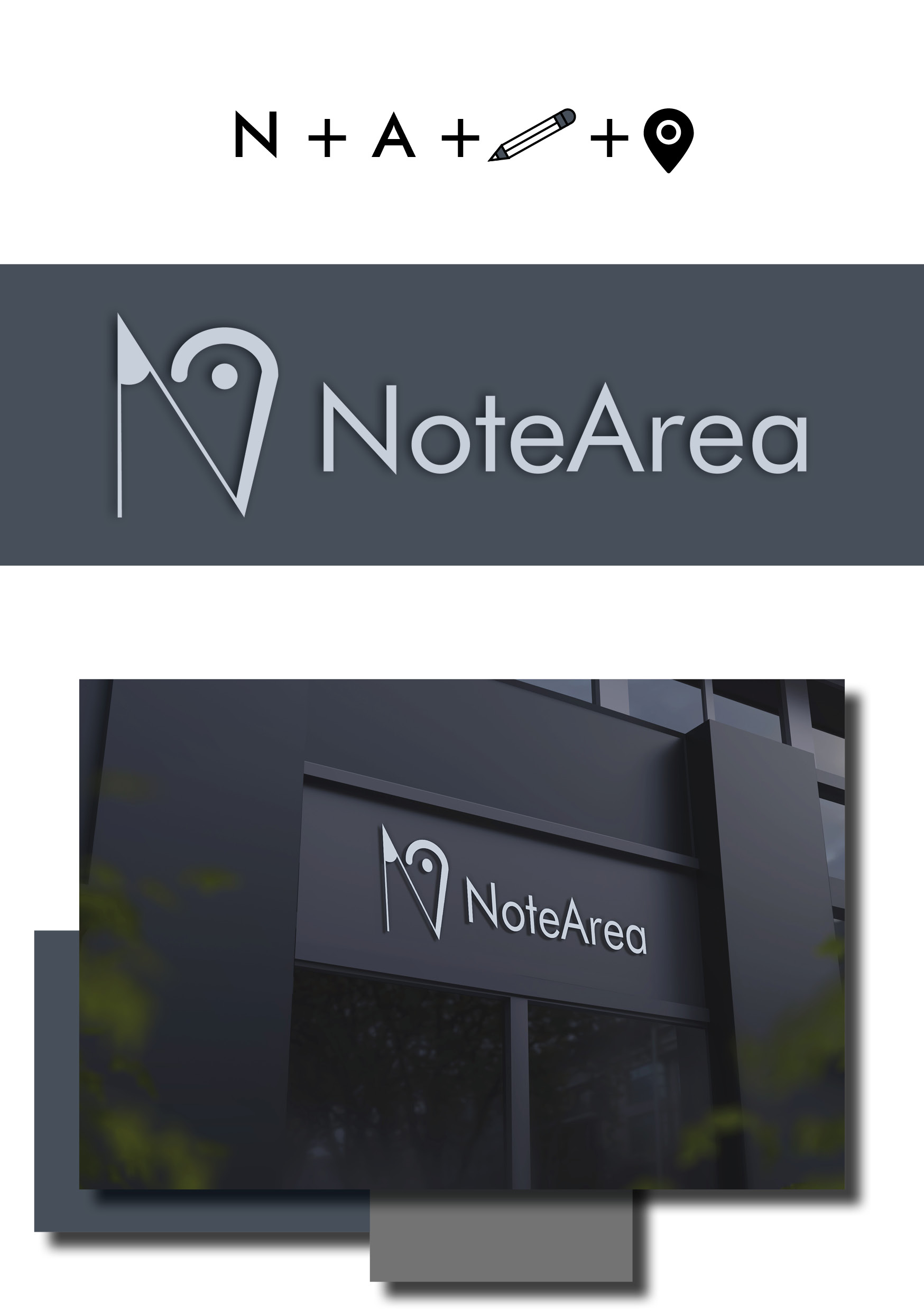
I was not sure what was it at first. When i understood, i didn't find the conection between the "map point" and "the pencil edge". Then i read the brief. It says that is needed to be an "abstract mark"..well is too abstract.) The edges are looking in the oposite sides, wich automaticly devide them as individual elements (if your goal was to combine them). Speaking of abstract.. if that was "the will" of client, then maybe the logo must be a pure symbol, without words. I mean nice try but, it could be better. Keep it up. You got this!
2 years ago by Aurel
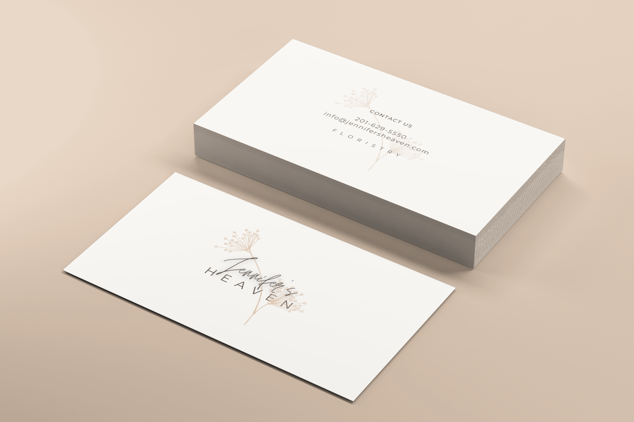
It is good looking with sharp edges. With round edge you need already a bit other font beside Jennifer's name. And maybe just i see it but, ilustration in backgr is to thin for a floristry company. No doubt is beautiful in this composition but, is having a vibe more of a Bio-Cosmetic-Product..-ish). In general - nice touch!
2 years ago by Aurel
Posts
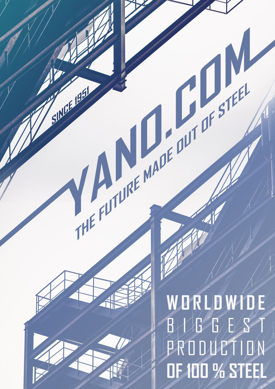
YANO.COM Steel Company Poster
- Report
Aurel • 2 years ago
Hello!
I'm Malcolm, creator of yano.com. I'm looking for someone that can design something for my steel production company. We will need a poster to advertise our business. We primarily use the color blue. Can you do that?
I'm Malcolm, creator of yano.com. I'm looking for someone that can design something for my steel production company. We will need a poster to advertise our business. We primarily use the color blue. Can you do that?


amazing
1 year ago by mostafa abdelhady khalifa omar - Reply