DTP Shipping Solutions - Logo Design
- Report
Elena • 4 years ago
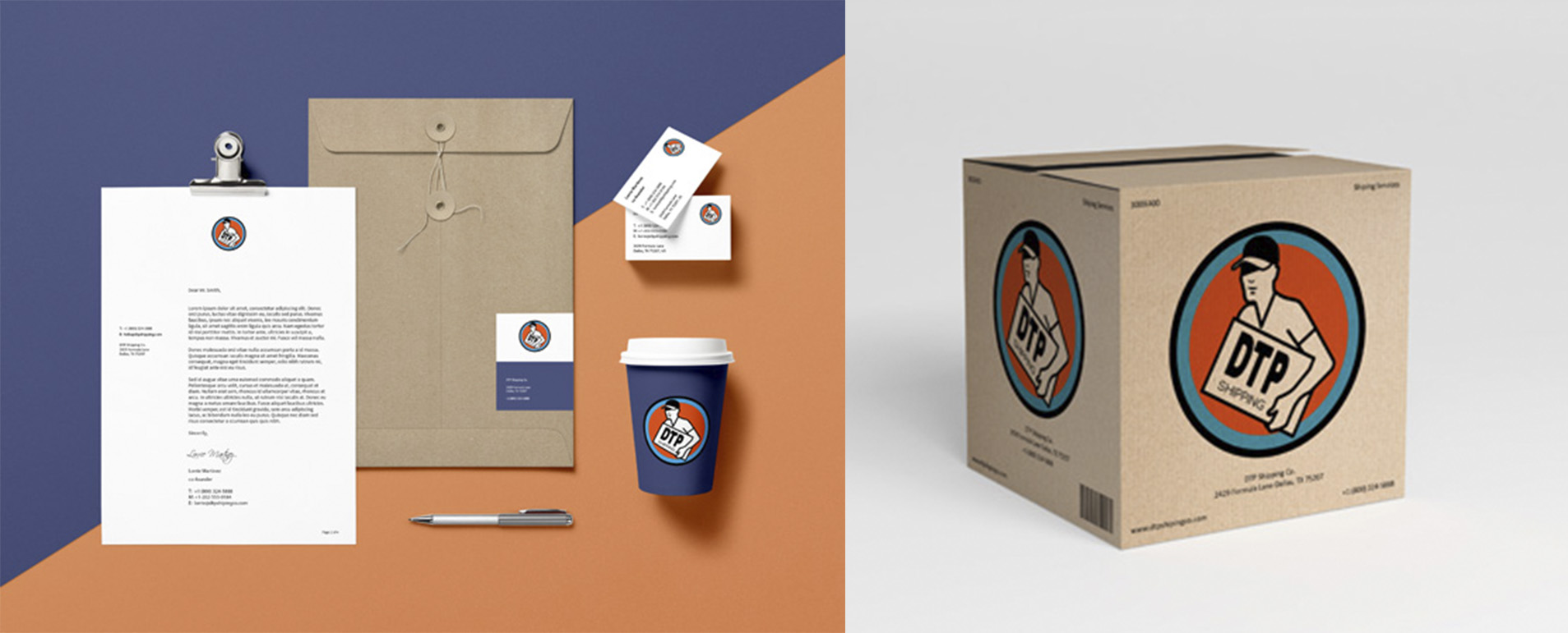
On this brief, DTP Shipping Solutions is a shipping company located in Texas. They requested a recognizable logo, that could be print out on all their fleet of trucks, containers, and vans.
For this logo i wanted to convey the efficiency of their deliveries, keep in it simple so it can work across all their platforms. I wanted to incorporate the Texas feeling, to honor their roots, so i went through with a simple red, blue and white color scheme.
I'd love your feedback :)
For this logo i wanted to convey the efficiency of their deliveries, keep in it simple so it can work across all their platforms. I wanted to incorporate the Texas feeling, to honor their roots, so i went through with a simple red, blue and white color scheme.
I'd love your feedback :)
this logo really works on me, i realy like it!
I would only choose a different font at 'dtp'
4 years ago by Helena H - Reply
verry good and clean work.
4 years ago by kunal das - Reply
I love this! I can definitely see this on a truck..the color choice was a good one too. It makes me automatically think of mail, not to mention texas lol. Great work! Maybe change the font choice for "DTP" to something more bold and/or boxy...Perhaps even increase the size of the "DTP" smidge.
4 years ago by Jasmine - Reply
This looks great!! I think DTP. can be of a different font family. Preferably Sans Serif.

4 years ago by Abhilash Thekkel - Reply
This is great!
4 years ago by Leye Abiola - Reply


