Digital
Posts
6
Likes
84
Liked Posts
1
Given Feedback
0
Posts
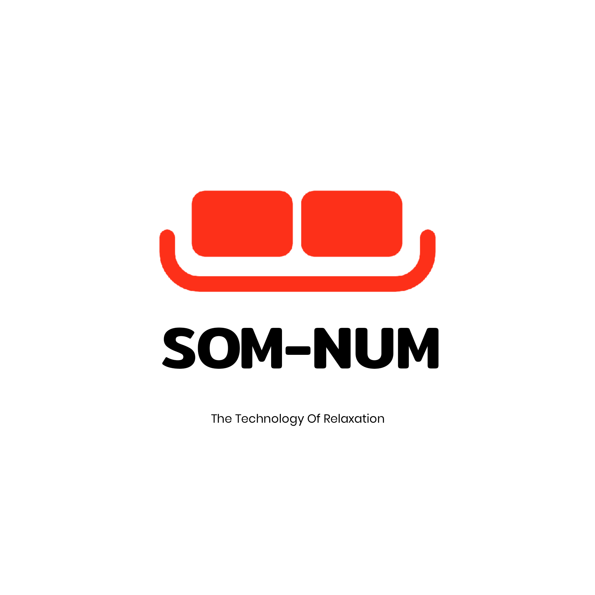
Som-Num Logo
- Report
Digital • 3 years ago
Som-Numlogo


A main point of this logo was to be simple so it can be easily embroidered, I don't think this fits that. Removing the gradient and the extra lines at the bottom would be a good start towards simplifying it
1 year ago by Garett Noll - Reply
This icon is very pleasing to see
I would only recomand adjusting the size of the lower text (THE TECHNOLOGY........) because it's hard to read
Really good work
3 years ago by Boby - Reply
Gorgeous and unique design
3 years ago by ahmad - Reply

DTP Shipping Solutions Logo
- Report
Digital • 3 years ago

I love this icon also i love the way you colored it using gradiant
I would only suggest that you adjust the size of the text and the kerning (space between letters ) to make it more legible when scaled down
This is a really good design
Keep it up
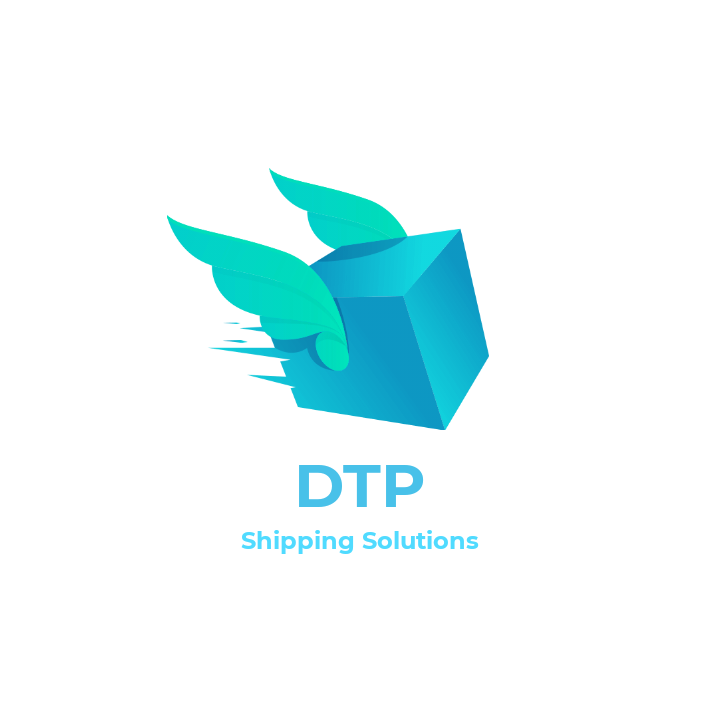
3 years ago by Boby - Reply
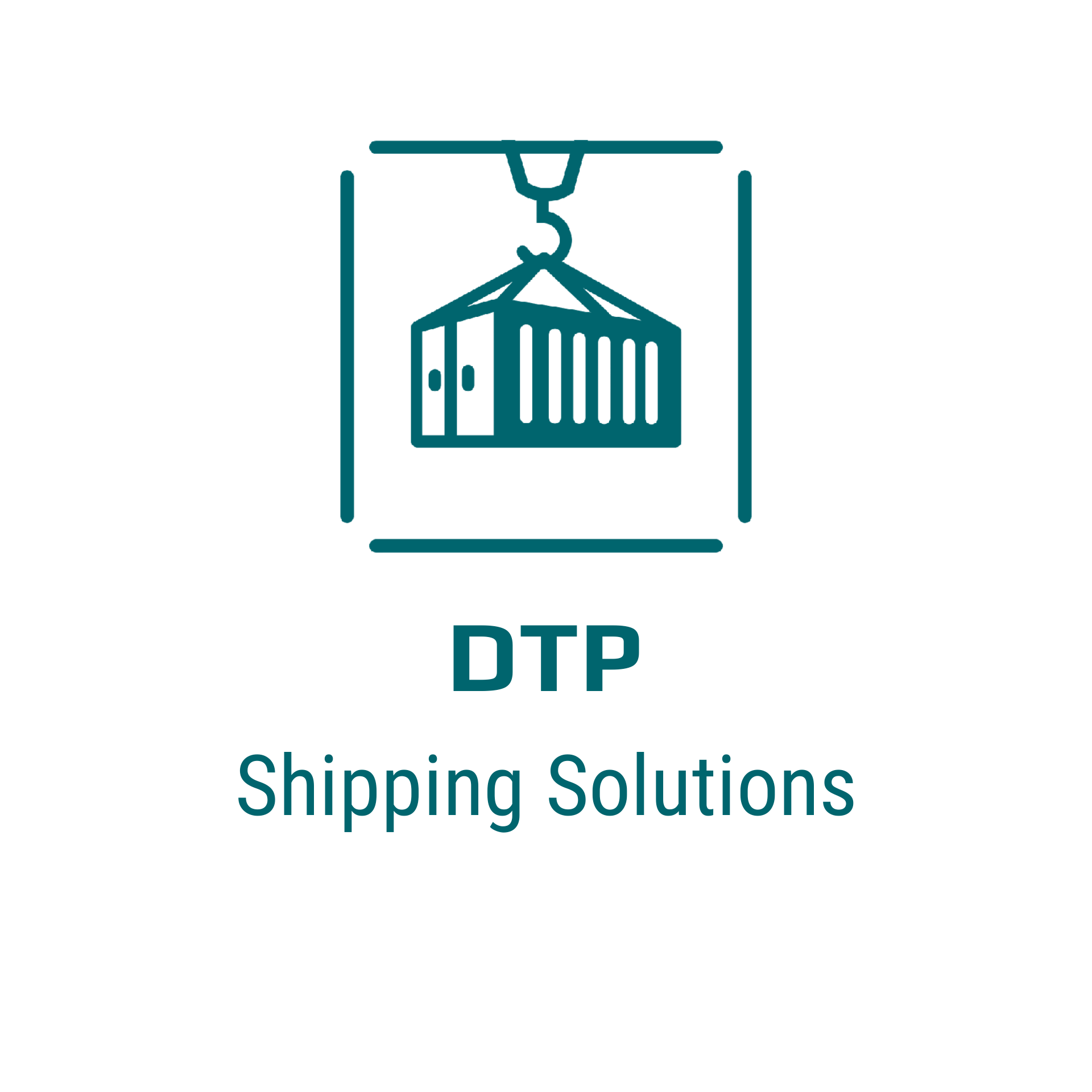
DTP Shipping Solutions
- Report
Digital • 3 years ago

i don't like how the logo and the type have two different shades of black. they might as well be the same. other than that, i like the design.
1 year ago by Garett Noll - Reply
This is a really creative logo! but, if i were you i would try to make the "DTP" equally spaced between the "shipping solutions" and the logo (take this advice with a grain of salt because I'm not good at spotting details lol)
2 years ago by Vincen - Reply
good design
3 years ago by Mhamed Salama - Reply