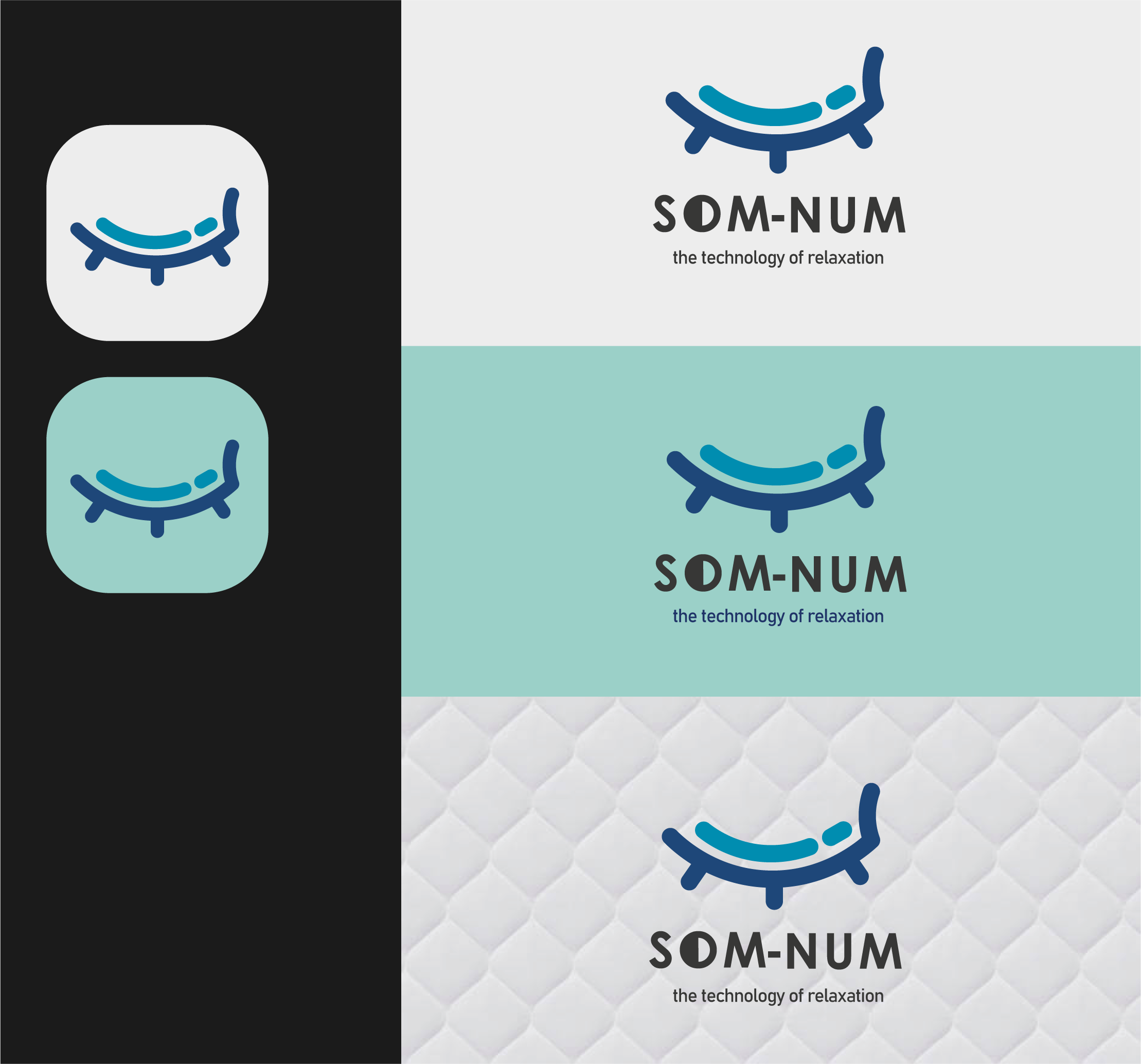
Som-Num Logo
- Report
Digital • 3 years ago
Som-Numlogo


A main point of this logo was to be simple so it can be easily embroidered, I don't think this fits that. Removing the gradient and the extra lines at the bottom would be a good start towards simplifying it
1 year ago by Garett Noll - Reply
This icon is very pleasing to see
I would only recomand adjusting the size of the lower text (THE TECHNOLOGY........) because it's hard to read
Really good work
3 years ago by Boby - Reply
Gorgeous and unique design
3 years ago by ahmad - Reply