Som-Num Logo
- Report
Enzo • 4 years ago
Hi!
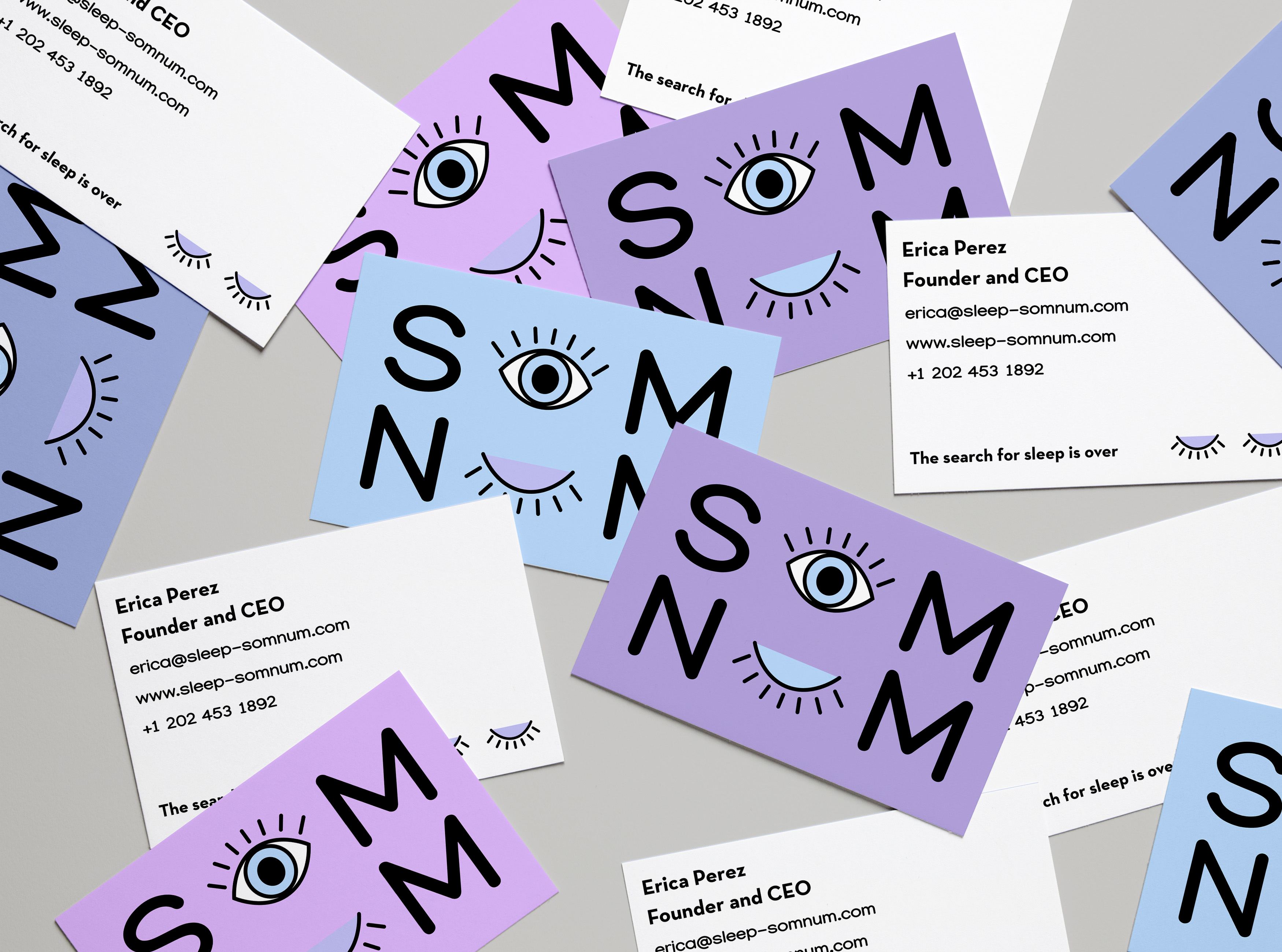
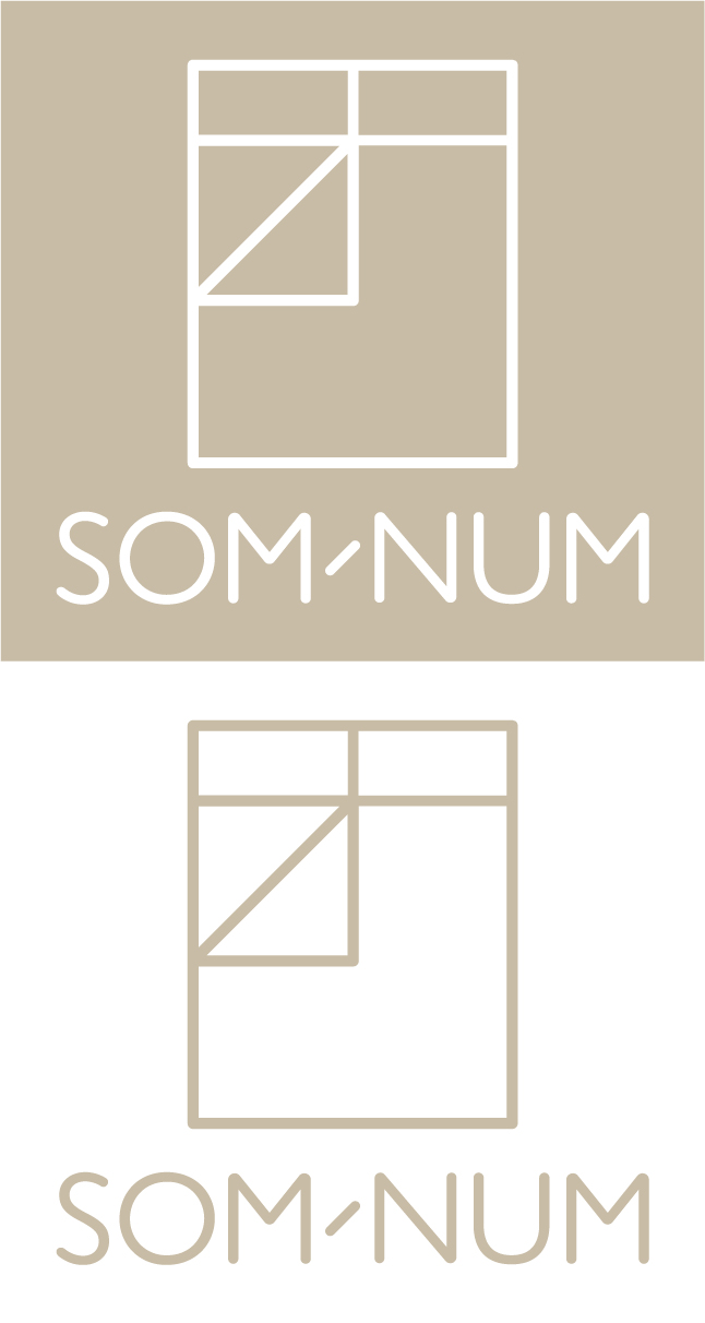
For this brief, I made sure to maintain the simplistic style that the client wanted and I also took inspiration from the sample pegs the brief provided.
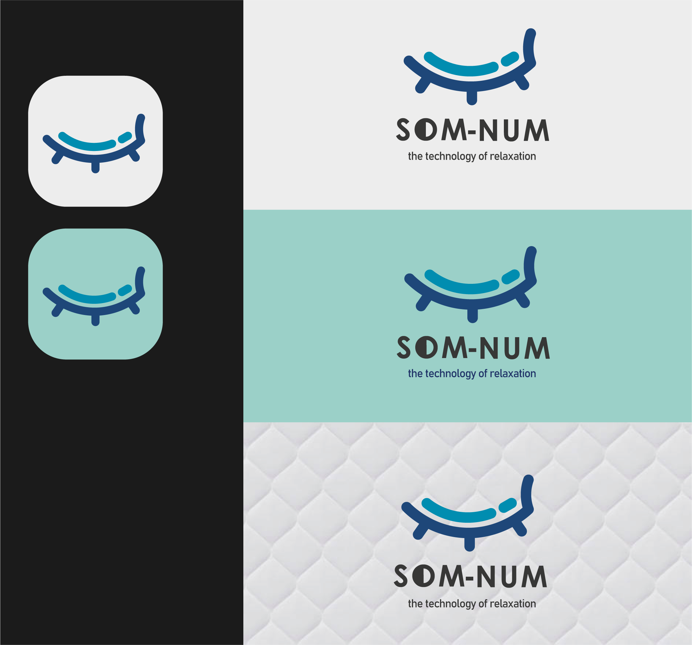
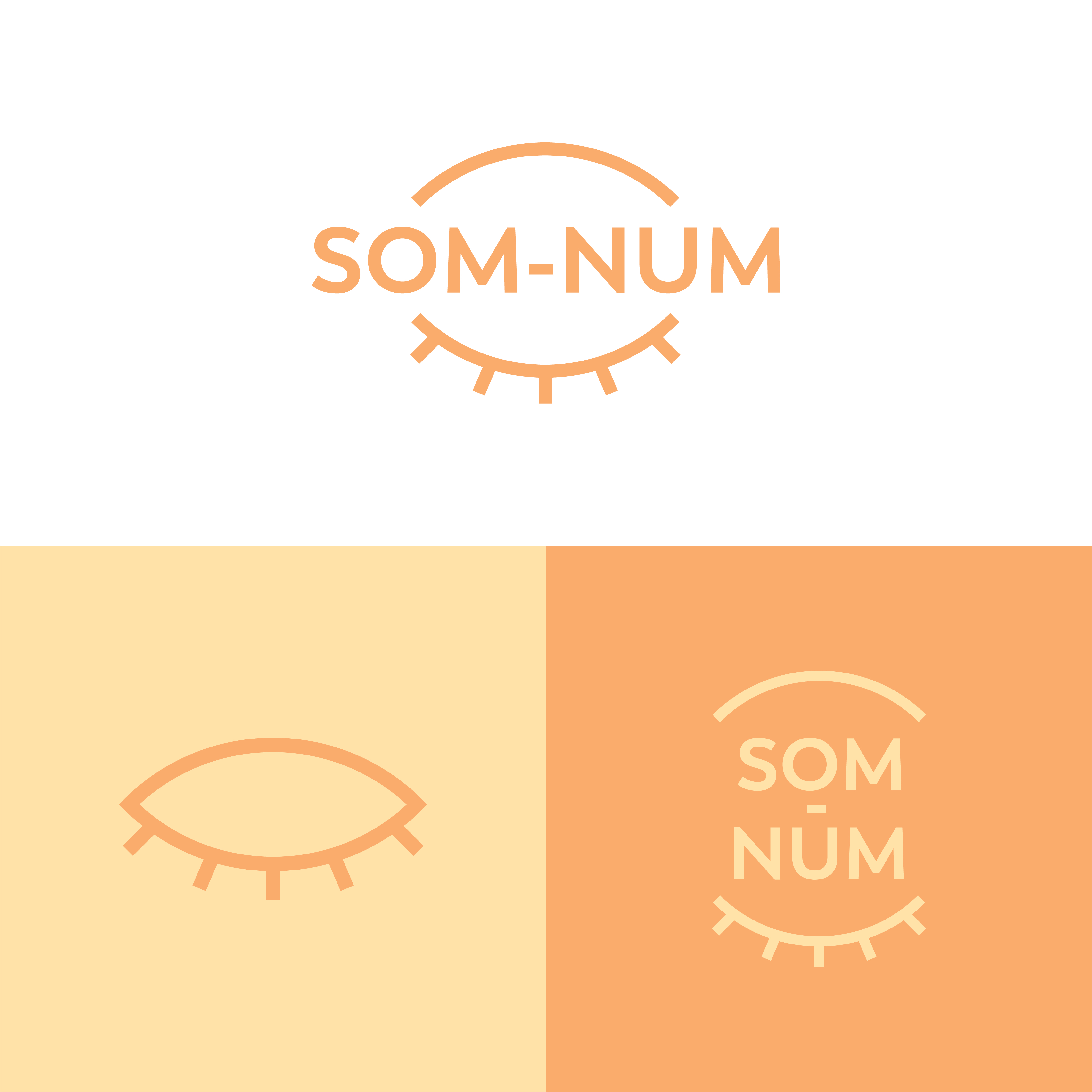
The logomark is a closed eye that implies �sleeping� which is the meaning of the brand name, somnus. The colors were inspired by the night shift mode of the iPhone. It�s a mode that changes your screen to a warmer tone to help induce sleeping so I felt it was an appropriate color choice for the brand.
Overall, I think this design was able to solve the pain points of the client. Let me know what you think.
For this brief, I made sure to maintain the simplistic style that the client wanted and I also took inspiration from the sample pegs the brief provided.
The logomark is a closed eye that implies �sleeping� which is the meaning of the brand name, somnus. The colors were inspired by the night shift mode of the iPhone. It�s a mode that changes your screen to a warmer tone to help induce sleeping so I felt it was an appropriate color choice for the brand.
Overall, I think this design was able to solve the pain points of the client. Let me know what you think.
Som-Numlogo


the colors make me think of day. Second its driving crazy that the letters aren't in line
1 year ago by Garett Noll - Reply
I love the idea behind the color scheme!
1 year ago by May_J - Reply
If those are 3 different concepts, then the first is a suitable concept
4 years ago by Ghalib Putra - Reply
Nice use of colors! I love the sleek and simple design
4 years ago by Helena H - Reply