Rob Sollom
Hi! I'm Rob, a designer with a leaning towards the graphic arts. I love typography, layout design and designing logos, and am keen to get more experience designing for the web.
Posts
2
Likes
41
Liked Posts
4
Given Feedback
1
Feedback
Hi William,
Thanks for your comment. I know what you mean about the repetition of 'Coffeehouse' being a bit redundant – I wanted to balance the logo visually so it seemed better for the overall design.
Cheers,
Rob

4 years ago by Rob Sollom
Posts
New California Coffeehouse
- Report
Rob Sollom • 4 years ago
The client wanted a wordmark logo for their coffeehouse so I came up with this roundel using a slab serif and script font to create a contemporary, friendly and welcoming feel. Feedback welcome, thanks!


Hi William,
Thanks for your comment. I know what you mean about the repetition of 'Coffeehouse' being a bit redundant – I wanted to balance the logo visually so it seemed better for the overall design.
Cheers,
Rob
4 years ago by Rob Sollom - Reply
Why does the logo have the word "Coffeehouse" two times? It seems redundant...
4 years ago by William J Warncke - Reply
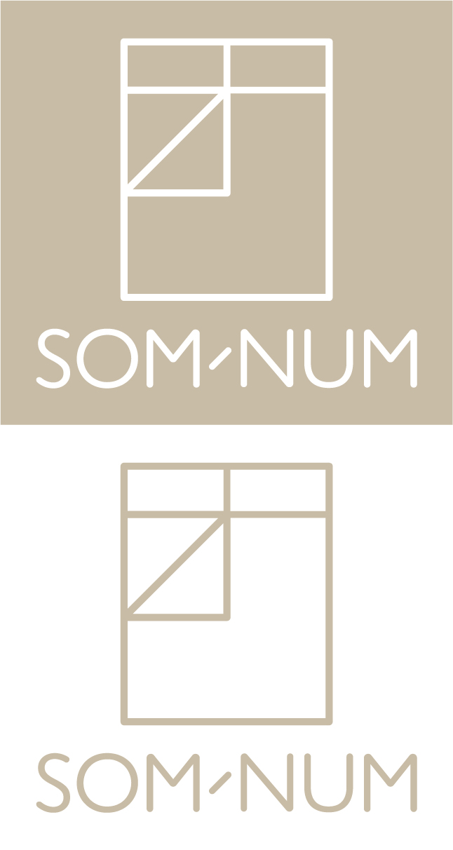
Som-Num
- Report
Rob Sollom • 4 years ago
I created this logo in response to a brief to design a logo for a company that makes smart mattresses. I've used a rounded version of Gill Sans in order to give a soft feel and picked a calming beige colour.
This logo can be applied to business cards, printed stationary, the company website and embroidered onto the mattresses in either the white-out or coloured version. The hyphen echos the 45� angle of the folded back duvet.
This logo can be applied to business cards, printed stationary, the company website and embroidered onto the mattresses in either the white-out or coloured version. The hyphen echos the 45� angle of the folded back duvet.
Som-Numlogo