Moon Logo Inspiration
Generate Unlimited Logo Design Ideas
The moon is a symbol that's used quite a lot in logo design. It's a very easily recognizable symbol, has a lot of hidden meanings, and conveys calmness. The moon is also said to symbolize things like femininity, balance, love, and illumination.
Simple moon logos
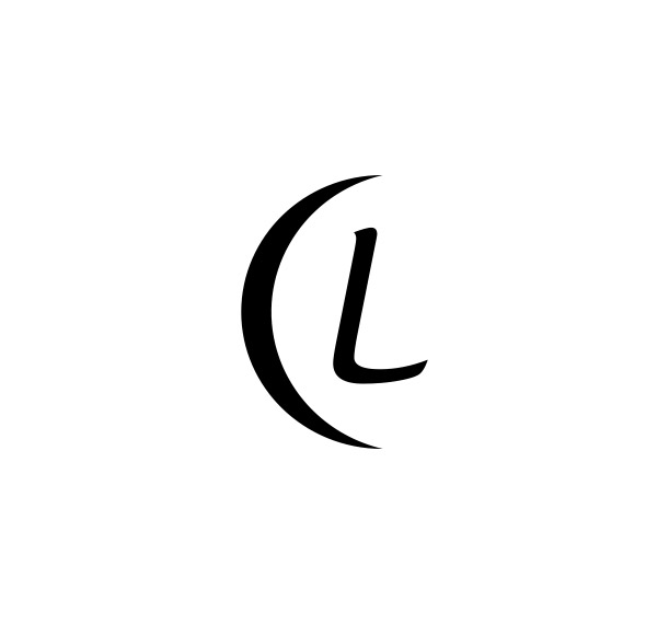
While some logos try to use detailed images of the moon, most use a simple but easily recognizable symbol. Because a symbol of a full moon wouldn't be as recognizable, most logos use the crescent shape of the moon. You can use it as a symbol in a combination mark or try to embed it within another symbol or wordmark. Some logos, for example, replace the "O" or "U" with a moon symbol.
Negative space moon logos
Due to its simple and quite distinct shape, the moon can and is often used in the negative space of a logo. Hiding an icon like to moon in a logo's negative space can help give a logo a deeper meaning while retaining simplicity. Negative space can take many forms in logo design. The first example uses a moon-shaped shadow, for example, to create the illusion of a circle around the lettermark.
