Carza
Posts
2
Likes
2
Liked Posts
0
Given Feedback
1
Feedback
Not the biggest fan of that font, love the colors you used though.

1 year ago by Carza
Posts
DTP Shipping Solutions
- Report
Carza • 1 year ago
I came up with two different logos as the brief stated that the brand should be serious and professional but I felt like some playfulness would be allowed. The first one on the top is a bit friendlier, while the one on the bottom is more professional. The first one uses a custom font, the one on the bottom features Gelasio, although the space between each letter has been slightly altered.


simple & clean, very nice!
1 year ago by Mayah Payne - Reply
Som-Num
- Report
Carza • 1 year ago
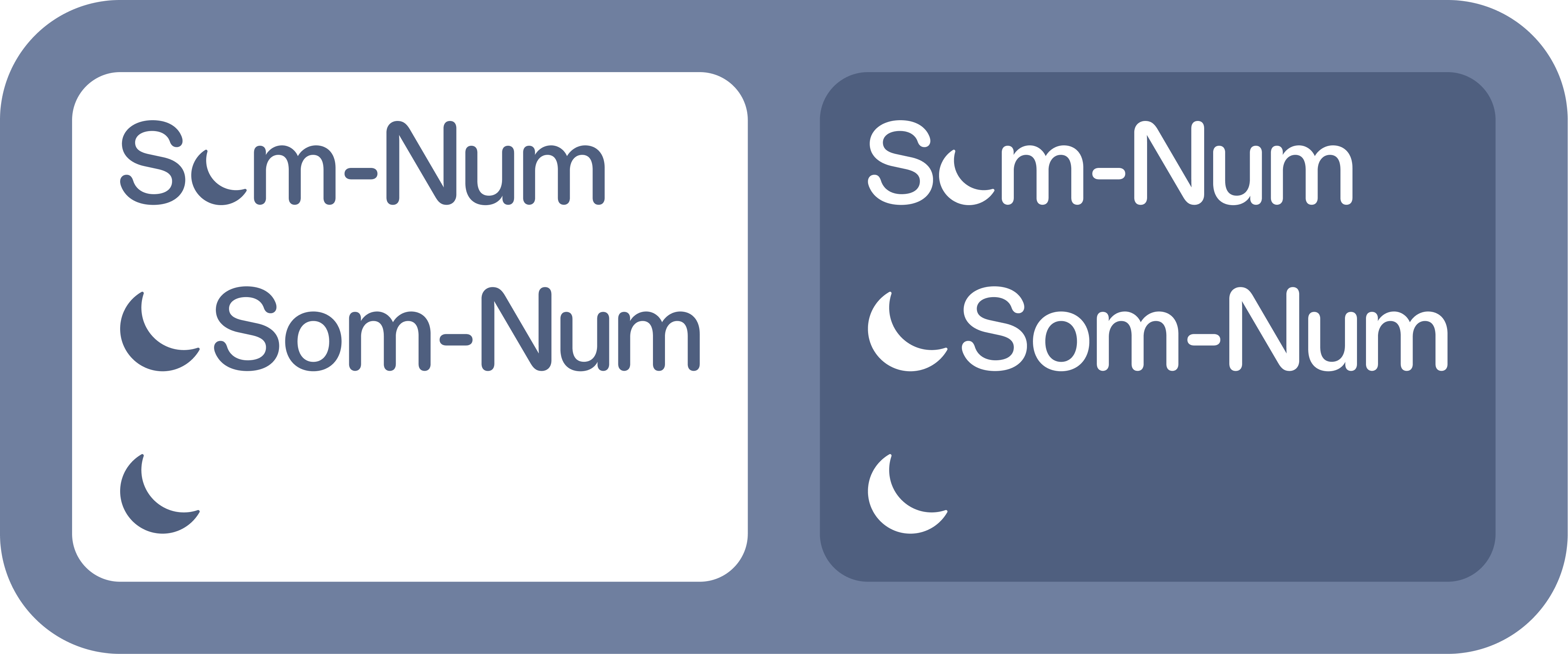
Quick logo I made for Som-Num. The brandmark represents a moon and can be used both with or without the wordmark, making it great for small icons. The full wordmark is supposed to be used only when there's enough available space, for example on billboards. For the design I used Figma and the ABC Diatype Rounded font. I set the font size to 307,6229816 px so each character would be exactly 32 px thick, making it easier to manually adjust the spacing between each letter.
Som-Numlogo

Cute!
1 year ago by Mayah Payne - Reply