Casey Jones
Posts
6
Likes
15
Liked Posts
1
Given Feedback
0
Posts
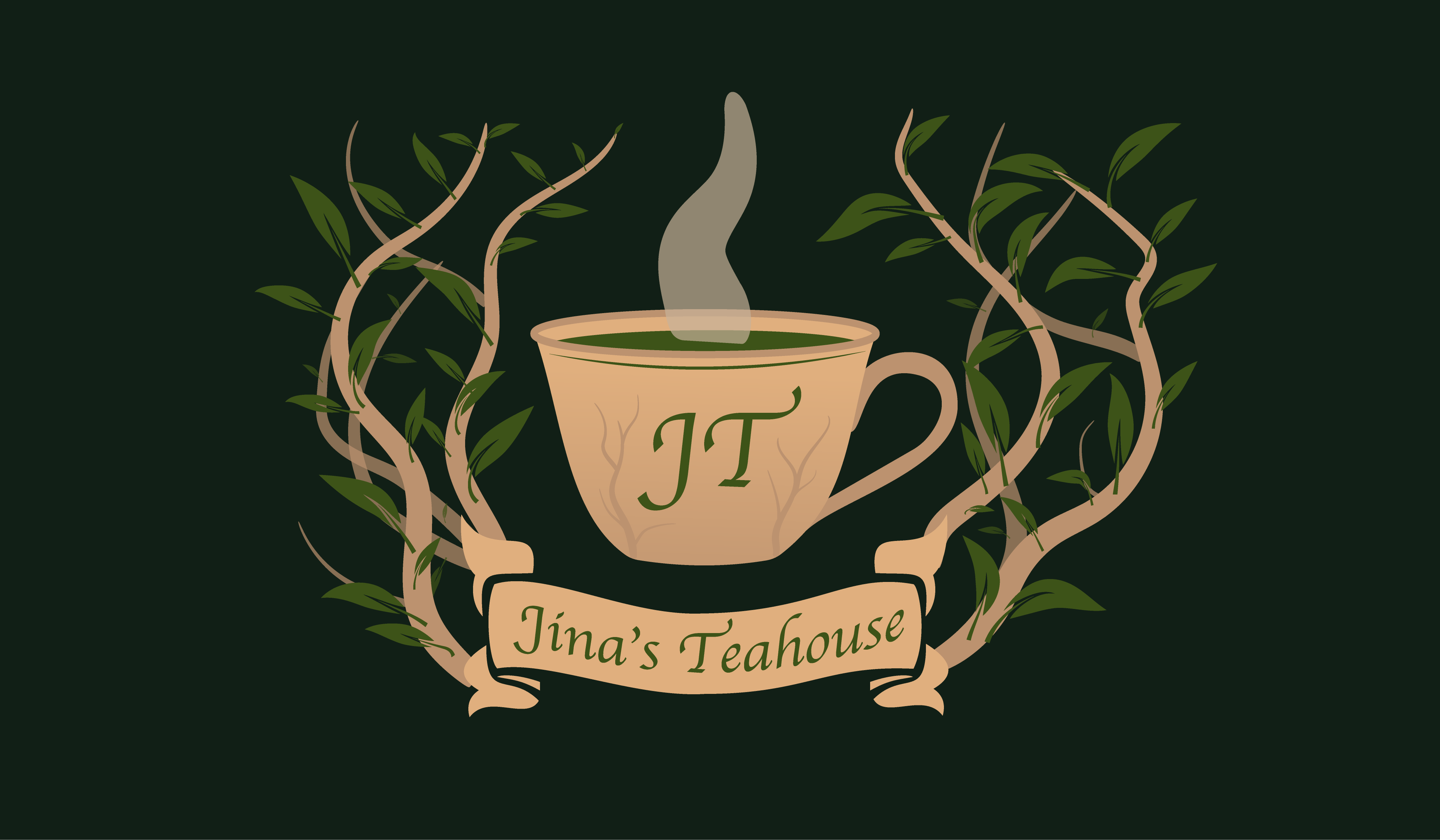
Jina's Teahouse Vintage Logo
- Report
10 months ago by Casey Jones
A vintage look for Jina's Teahouse.
 2 Likes
 1
1
You have done excellent illustration
It's represents the vintage style
10 months ago by Axis designs - Reply
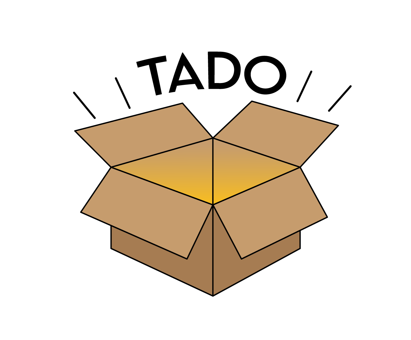
Tado's New Logo
- Report
10 months ago by Casey Jones
 1 Like
1
1 Like
1
looking really professional and great
10 months ago by Ali Haider - Reply
DTP Shipping Solutions logo
- Report
11 months ago by Casey Jones
I wanted to use the lettering for DTP for this logo and make it something unique. I got some inspiration from the FedEx logo on how they used their negative space. Making the DTP logo, I wanted the letters to connect and use the t as tape for a package in the middle.
 6 Likes
2
6 Likes
2
BillboardBuys Simple Ad Design
- Report
11 months ago by Casey Jones
 1 Like
1
1 Like
1
Good placement and heirarchy,
11 months ago by Kevin - Reply
Som-Num Mattress Logo
- Report
11 months ago by Casey Jones
Coming up with this design took some creative thinking. I wanted something simple and pleasing to the eye.
I made the company name Som-Num enclosed in between two thin rectangles, which is supposed to give the idea that it's a mattress for this company. I also made the O in Som-Num have a moon within it to signify sleep.
The icon is just the O from the wordmark logo by itself.
I made the company name Som-Num enclosed in between two thin rectangles, which is supposed to give the idea that it's a mattress for this company. I also made the O in Som-Num have a moon within it to signify sleep.
The icon is just the O from the wordmark logo by itself.
Som-Numlogo
 2 Likes
1
2 Likes
1
Above average you can make more beautifull logos
11 months ago by Muhammad Daniyal - Reply