Sandra
Posts
2
Likes
5
Liked Posts
23
Given Feedback
3
Feedback
Sorry for the very late reply! But thanks for the feedback! I did find it constructive, no worries :D
1 year ago by Sandra
Ty very much for the feedback! :D My mind tends to relate things to each other very quickly so I'm glad my thought process intrigued you! I will definitely be keeping it up! :)
2 years ago by Sandra
I'm no critic so the only thing I'll say is that I love love love the yellow you've used. it reminds me of the golden ticket to get to willy wonka's chocolate factory tbh.
2 years ago by Sandra
Posts
Beachroom
- Report
Sandra • 2 years ago
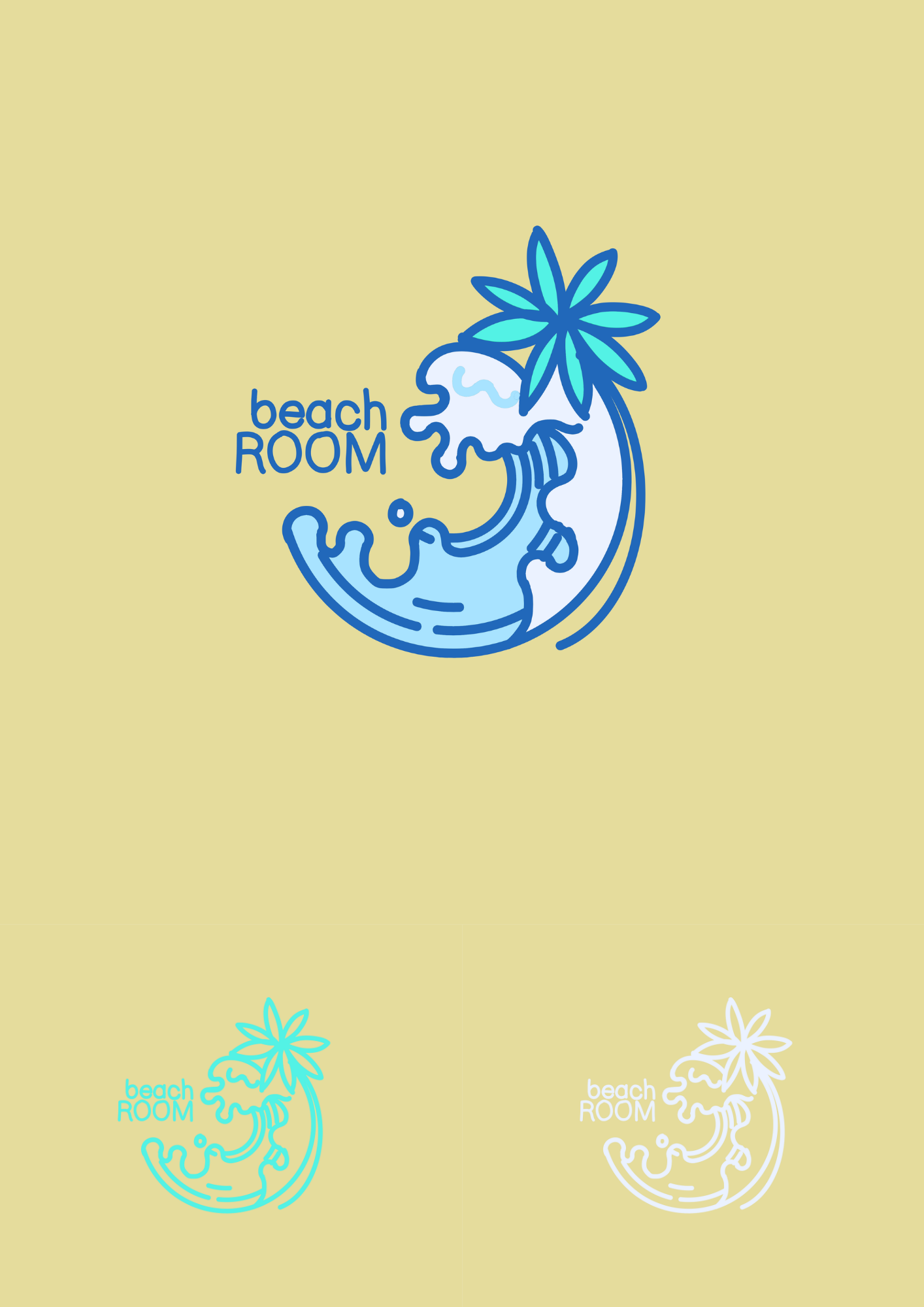
I have three designs for the beach room logo. One features a whole colour scheme of everything that reminds me of the beach: Sand, Palm trees and the sea while the other two feature a more simplistic color palette. Personally, I like the white outline one best but ill leave the judging to you guys :)
Hello,
I'm Leigh, founder of BeachRoom. I am looking for someone that can design a professional logo for my business. I think a combination mark will fit best with the business. Would you be interested?
I'm Leigh, founder of BeachRoom. I am looking for someone that can design a professional logo for my business. I think a combination mark will fit best with the business. Would you be interested?


This absolutely simple and elegant! I love the work you did.
2 years ago by Gillian - Reply
Som-num logo
- Report
Sandra • 2 years ago
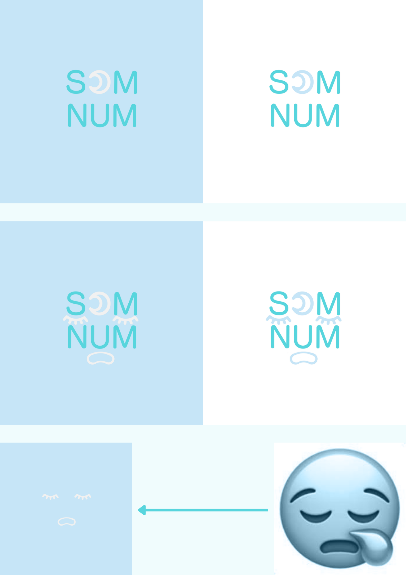
so I recently started doing logos and I find it exciting so far. this is my first post on here so here's the details of the design:
the colour scheme is inclusive of grey-white, teal and baby/sky blue which represent clouds and the sky. This is because when I think of the word 'matress', I think of sleep, and when I think of sleep I think of the sky and the clouds cause clouds are soft and fluffy and the sky represents time (that is sleepy time.)
I also turned the O in Som into a cresent moon because the moon also symbolizes sleep and the night sky.
Lastly, there's the sleepy face emoji I tried to incorporate in the design. I tried using vectors to make the face but it turned out bad so I cheated and hand drew them digitally and for that, I ask for forgiveness. Apart from all this, there's nothing else to say really. Please give me any feedback I could use for any future projects. :)
Som-Numlogo

I think there's nothing use of moon there if you add sleepy face in your logo it looks like it is something on character head hope you find the feedback constructive :)
2 years ago by Yash - Reply
Sorry for the very late reply! But thanks for the feedback! I did find it constructive, no worries :D
1 year ago by Sandra - Reply
This is cute. I liked reading about the thought process. I think the logos with just the crescent moon are already strong enough to go and I like the simplicity. Keep it up!
2 years ago by Joshua - Reply
Ty very much for the feedback! :D My mind tends to relate things to each other very quickly so I'm glad my thought process intrigued you! I will definitely be keeping it up! :)
2 years ago by Sandra - Reply