Joshua
Posts
2
Likes
7
Liked Posts
6
Given Feedback
6
Feedback
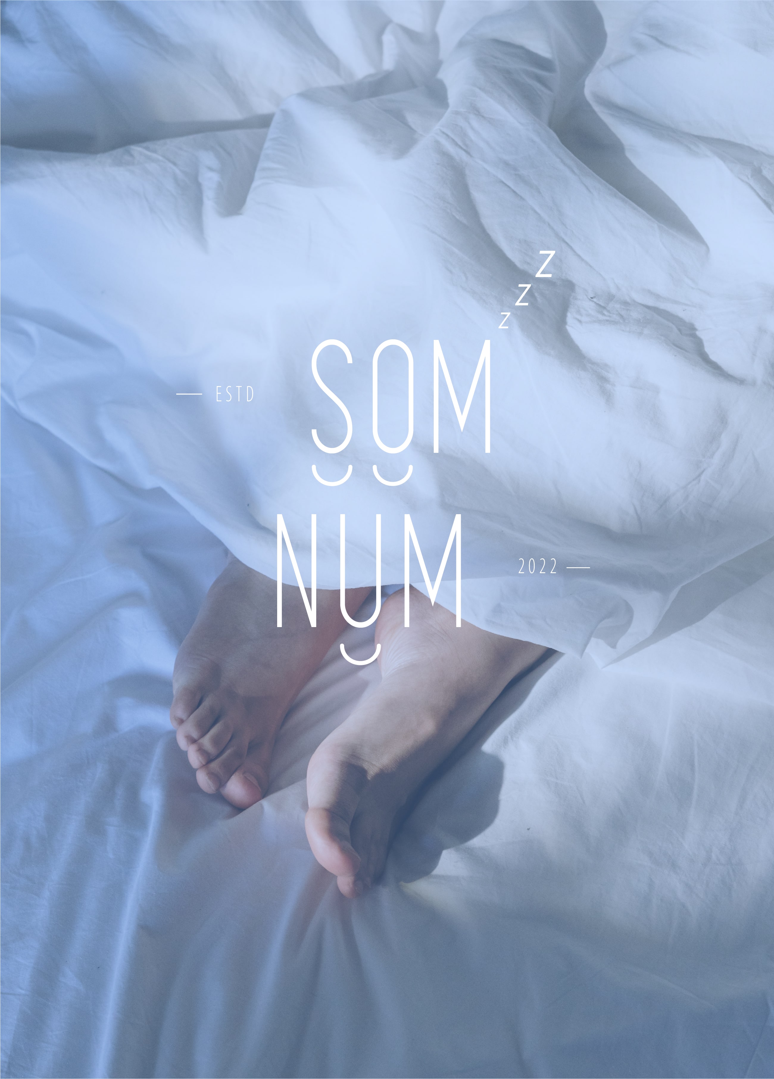
The logo is too busy and will not display well on small screens or an app icon like the brief says. It will also be difficult to embroider the "ESTD" and "2022." Simplifying it and having less small details will help. I recommend testing it as an icon on a phone to check. You can also check the competitor logos listed in the brief for examples. Hope you find this feedback helpful :)
2 years ago by Joshua
Thank you :)

2 years ago by Joshua
Hi thanks for the feedback. I think you misunderstand the brief. Finishing the Kickstarter campaign means the funding is complete and the product is going into production. The product is a bluetooth-enabled mattress that helps you track your sleep. It's a unique feature that separates it from the competition. The key point mentioned was "simple, easily recognizable icon that can be embroidered." Sleepy is the point behind the name, not the logo.
2 years ago by Joshua
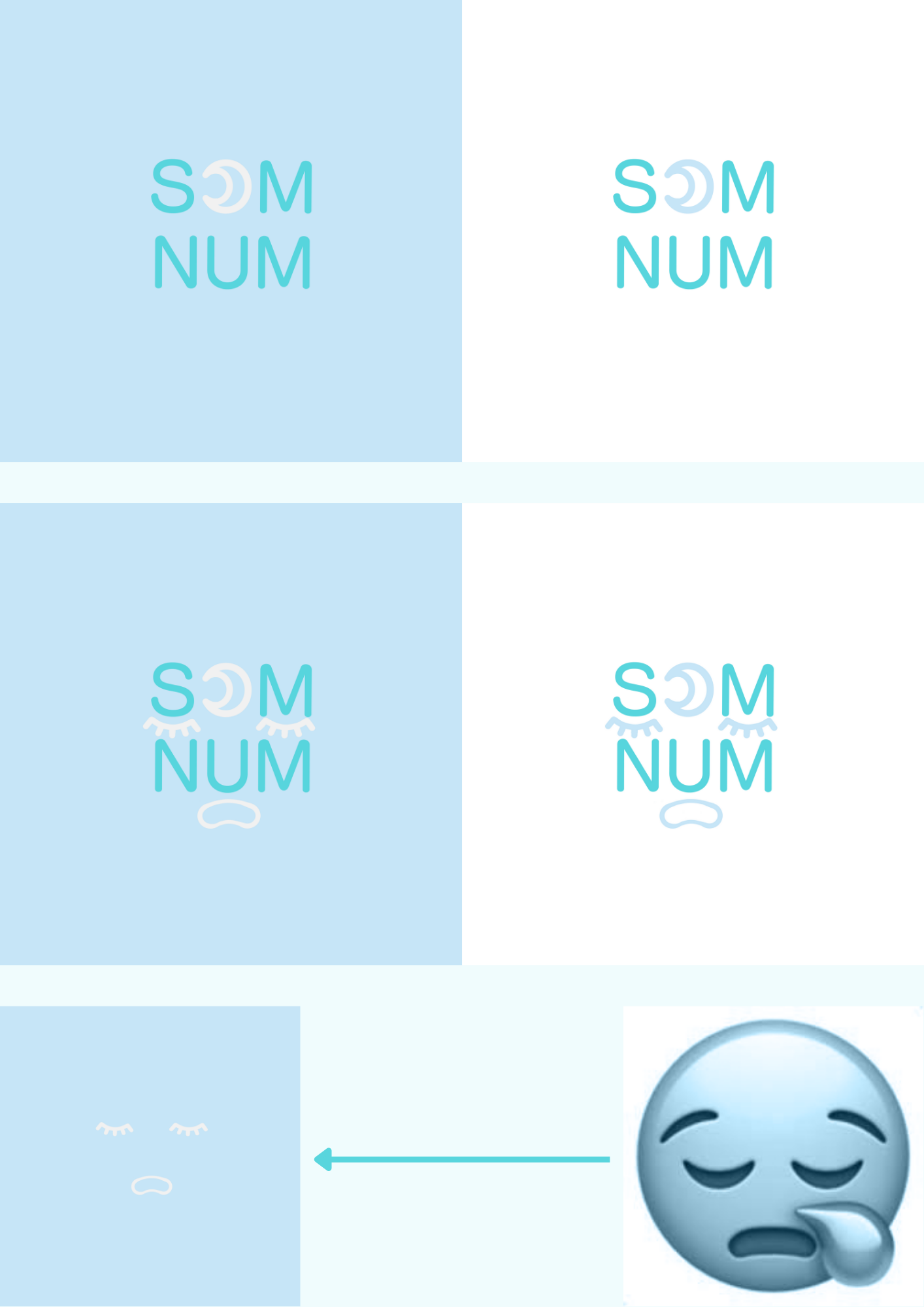
This is cute. I liked reading about the thought process. I think the logos with just the crescent moon are already strong enough to go and I like the simplicity. Keep it up!
2 years ago by Joshua
Thank you! I did use an image of gold (very much like the golden ticket) as an overlay to get the effect.
2 years ago by Joshua
Love the mark!
2 years ago by Joshua
Posts
London Chocolaterie
- Report
Joshua • 2 years ago
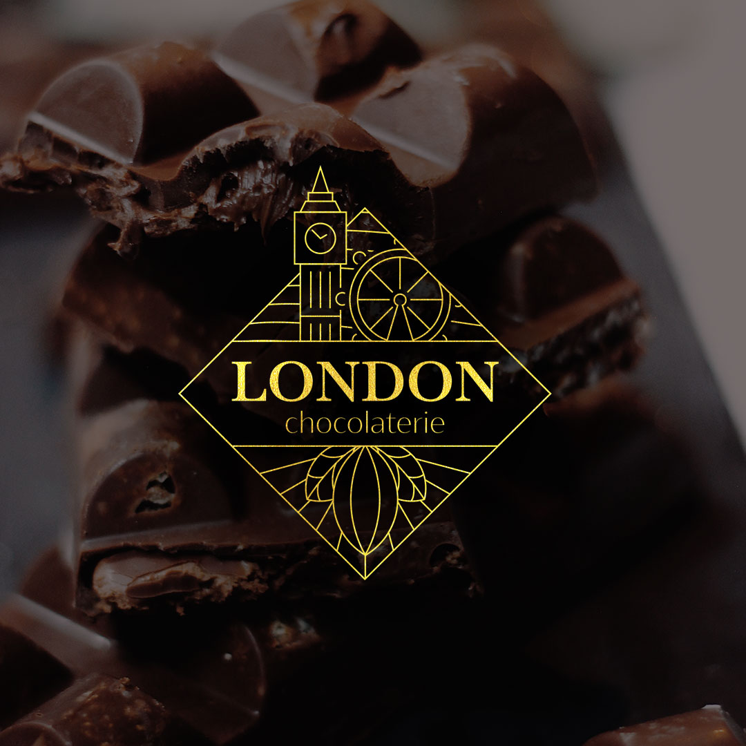
For this combination logo, I used elements representing London in the top half, and a cacao fruit in the bottom half. The full mark is framed in a square/diamond — like a piece of chocolate. It's designed to print nicely on packaging, with the rotated square fitting dynamically on a rectangular block of chocolate.
I picked Baskerville for the main typeface as it's elegant, but the serifs have a "gooey" quality to them to give it a melting chocolate feel.
I picked Baskerville for the main typeface as it's elegant, but the serifs have a "gooey" quality to them to give it a melting chocolate feel.
Hey!
I am Eldridge, owner of London Chocolaterie. For a while now, I've been looking for a good logo for my Chocolaterie. I think a combination mark will fit best with the business. Can you help me out?
I am Eldridge, owner of London Chocolaterie. For a while now, I've been looking for a good logo for my Chocolaterie. I think a combination mark will fit best with the business. Can you help me out?


I'm no critic so the only thing I'll say is that I love love love the yellow you've used. it reminds me of the golden ticket to get to willy wonka's chocolate factory tbh.
2 years ago by Sandra - Reply
Thank you! I did use an image of gold (very much like the golden ticket) as an overlay to get the effect.
2 years ago by Joshua - Reply
Som-Num
- Report
Joshua • 2 years ago
Inspired by Bluetooth's use of Nordic runes, I made the Som-Num icon a combination of the Nordic Runes for S and N. This creates a mark that's easy to embroider onto the product and hints at the technology behind the brand without being too obvious about it.
Som-Numlogo

I think the brief they have just finished a Kickstarter campaign for their Bluetooth-enabled mattress and that's not actually the important point is, the briefing key point is sleepy (som-num Latin meaning), and mattress that's it.
2 years ago by Yash - Reply
Hi thanks for the feedback. I think you misunderstand the brief. Finishing the Kickstarter campaign means the funding is complete and the product is going into production. The product is a bluetooth-enabled mattress that helps you track your sleep. It's a unique feature that separates it from the competition. The key point mentioned was "simple, easily recognizable icon that can be embroidered." Sleepy is the point behind the name, not the logo.
2 years ago by Joshua - Reply