London Chocolaterie
- Report
1 year ago by Joshua
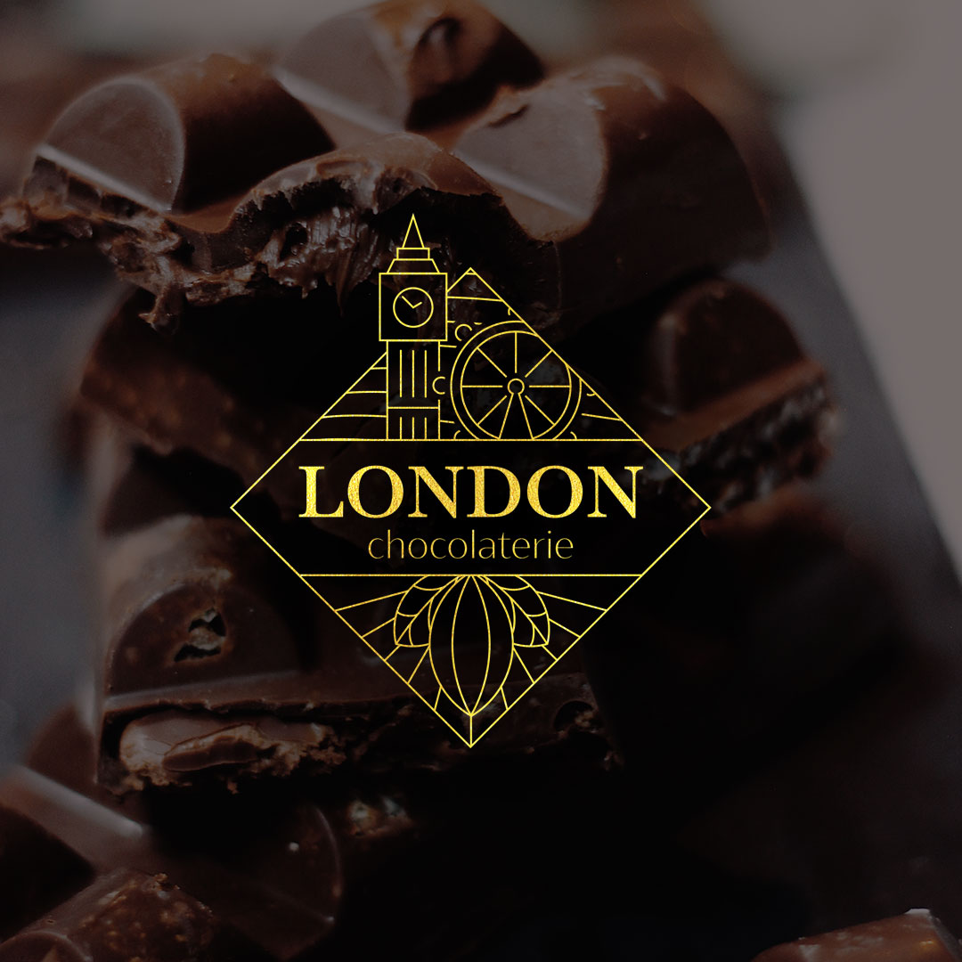
For this combination logo, I used elements representing London in the top half, and a cacao fruit in the bottom half. The full mark is framed in a square/diamond — like a piece of chocolate. It's designed to print nicely on packaging, with the rotated square fitting dynamically on a rectangular block of chocolate.
I picked Baskerville for the main typeface as it's elegant, but the serifs have a "gooey" quality to them to give it a melting chocolate feel.
I picked Baskerville for the main typeface as it's elegant, but the serifs have a "gooey" quality to them to give it a melting chocolate feel.
Hey!
I am Eldridge, owner of London Chocolaterie. For a while now, I've been looking for a good logo for my Chocolaterie. I think a combination mark will fit best with the business. Can you help me out?
I am Eldridge, owner of London Chocolaterie. For a while now, I've been looking for a good logo for my Chocolaterie. I think a combination mark will fit best with the business. Can you help me out?
 3 Likes
 2
2
I'm no critic so the only thing I'll say is that I love love love the yellow you've used. it reminds me of the golden ticket to get to willy wonka's chocolate factory tbh.
1 year ago by Sandra - Reply
Thank you! I did use an image of gold (very much like the golden ticket) as an overlay to get the effect.
1 year ago by Joshua - Reply


