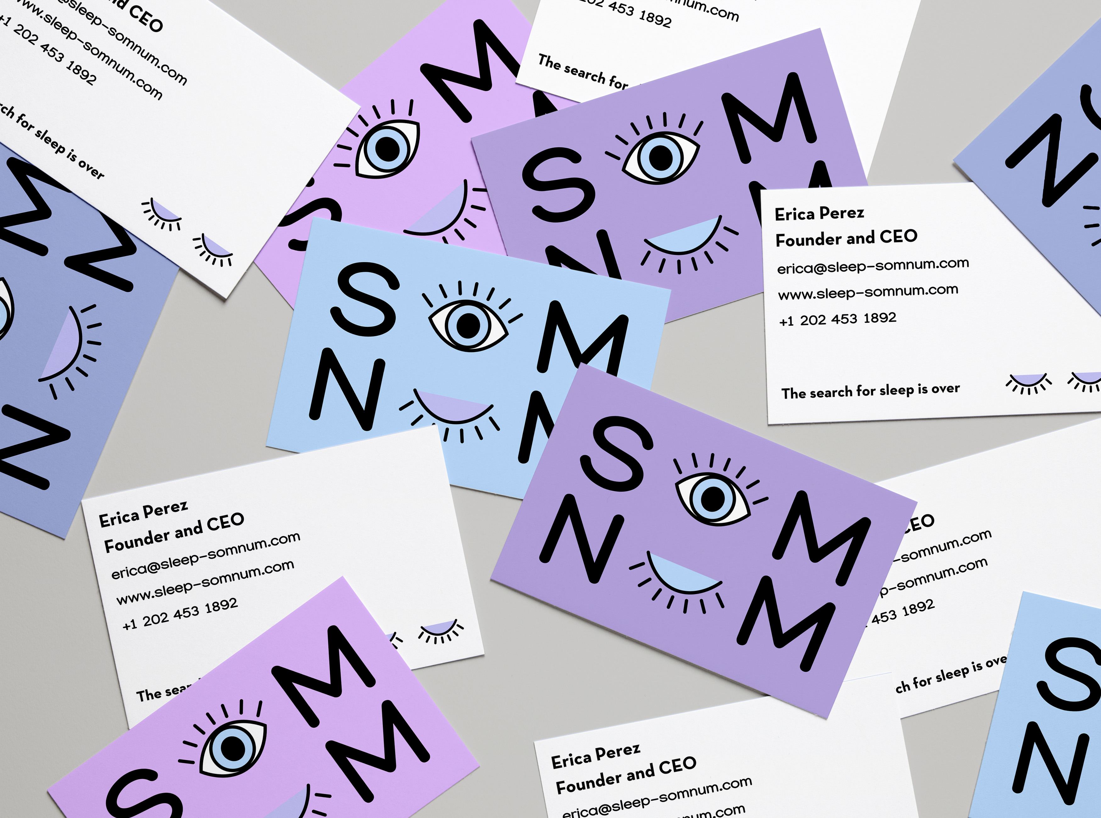
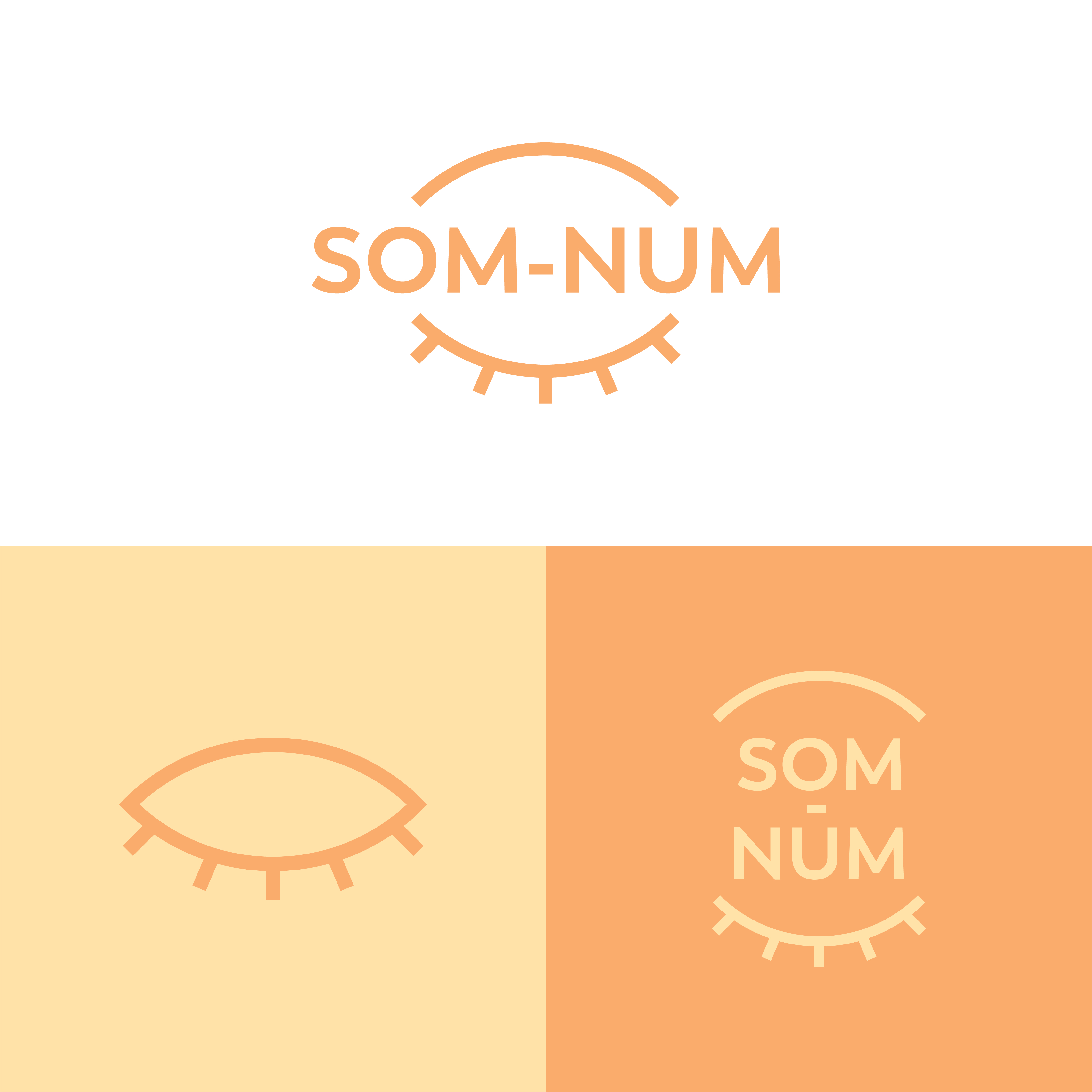
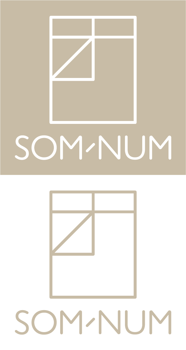
SOM-NUM Logo design
- Report
Elena • 4 years ago
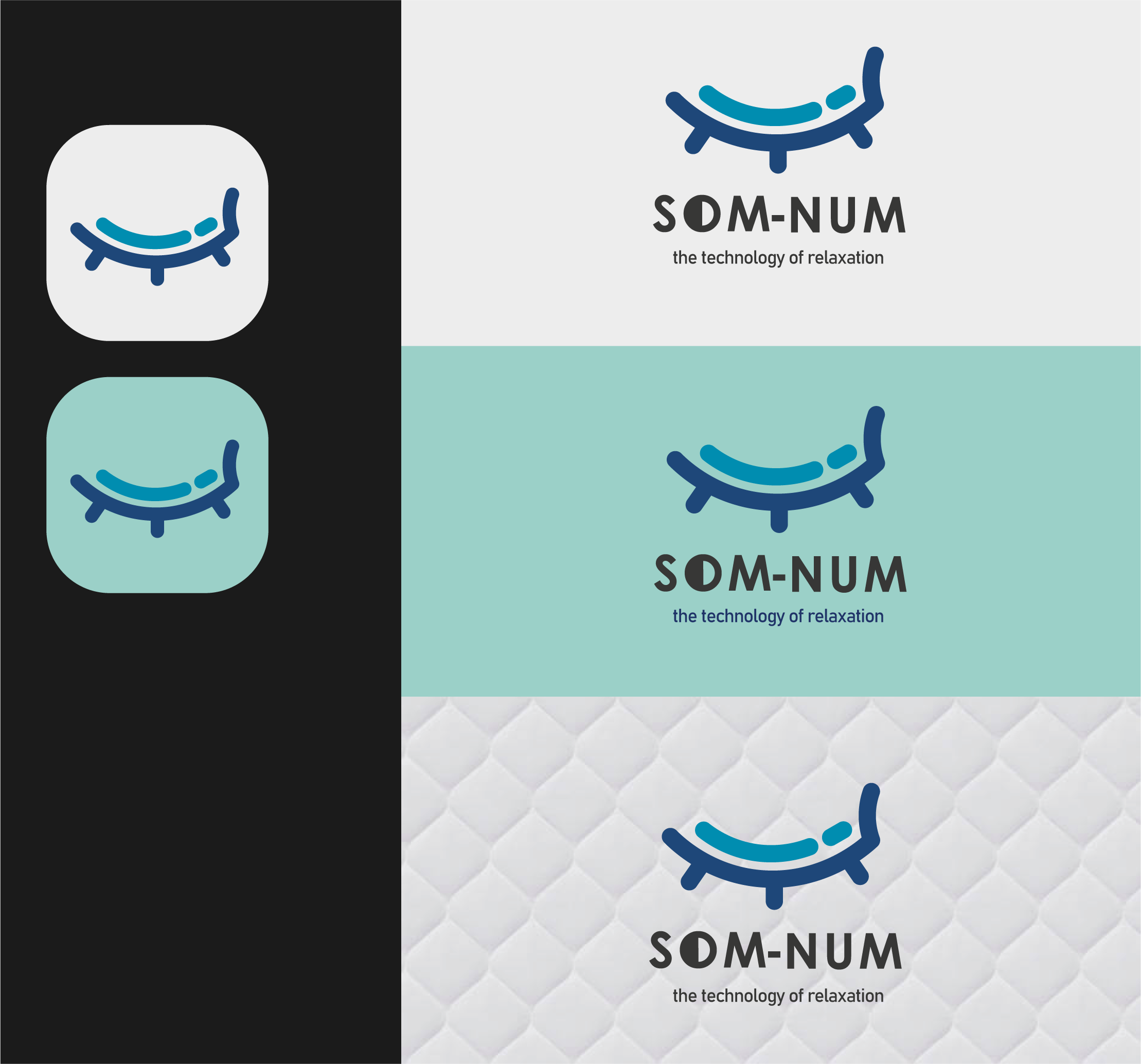
For the Som-Num design I wanted a simple icon that could be easy recognizable and embroidered on the mattresses. It was important that the logo was able to evoke the comfort that comes from a good night sleep. The logo works on smaller scales and as the app icon that the client requested.
Som-Numlogo


Not the biggest fan of that font, love the colors you used though.
1 year ago by Carza - Reply
Well is looking very good as a design work. But is not quite related to the comfort feeling, and the mattresses. Maybe you took a element of them and transform it in a mark for logo. But this is not what people see when go for mattress). Besides, the non-colors as black and grey, are not related to the comfort and warm zone. Great work, but not according to the brief.

2 years ago by Aurel - Reply