Feedback
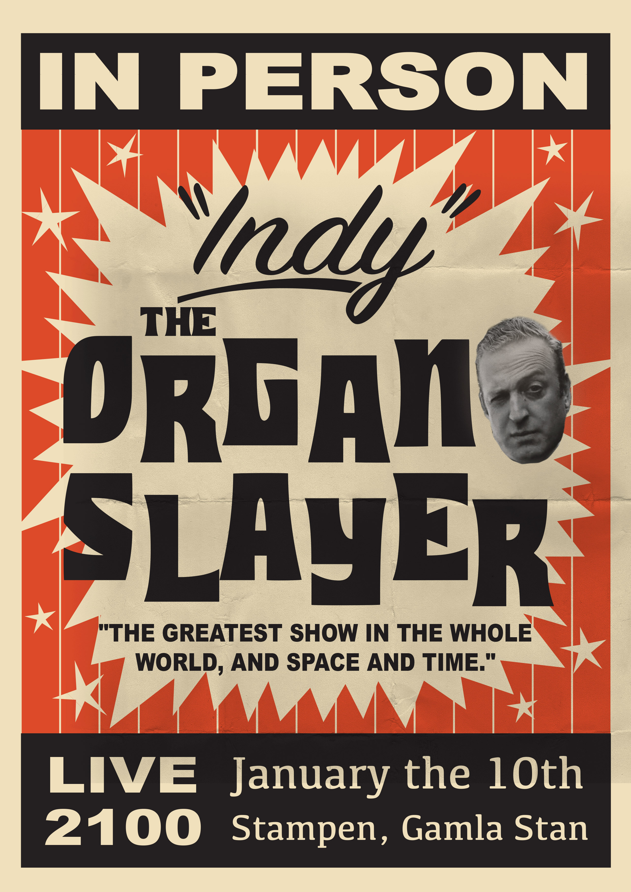
This design would be appropriate for music genres like rock, metal, etc.

4 years ago by Enzo
Definitely captured the 1950's vibe!
4 years ago by Enzo
It's definitely mysterious but what is this design for?

4 years ago by Enzo
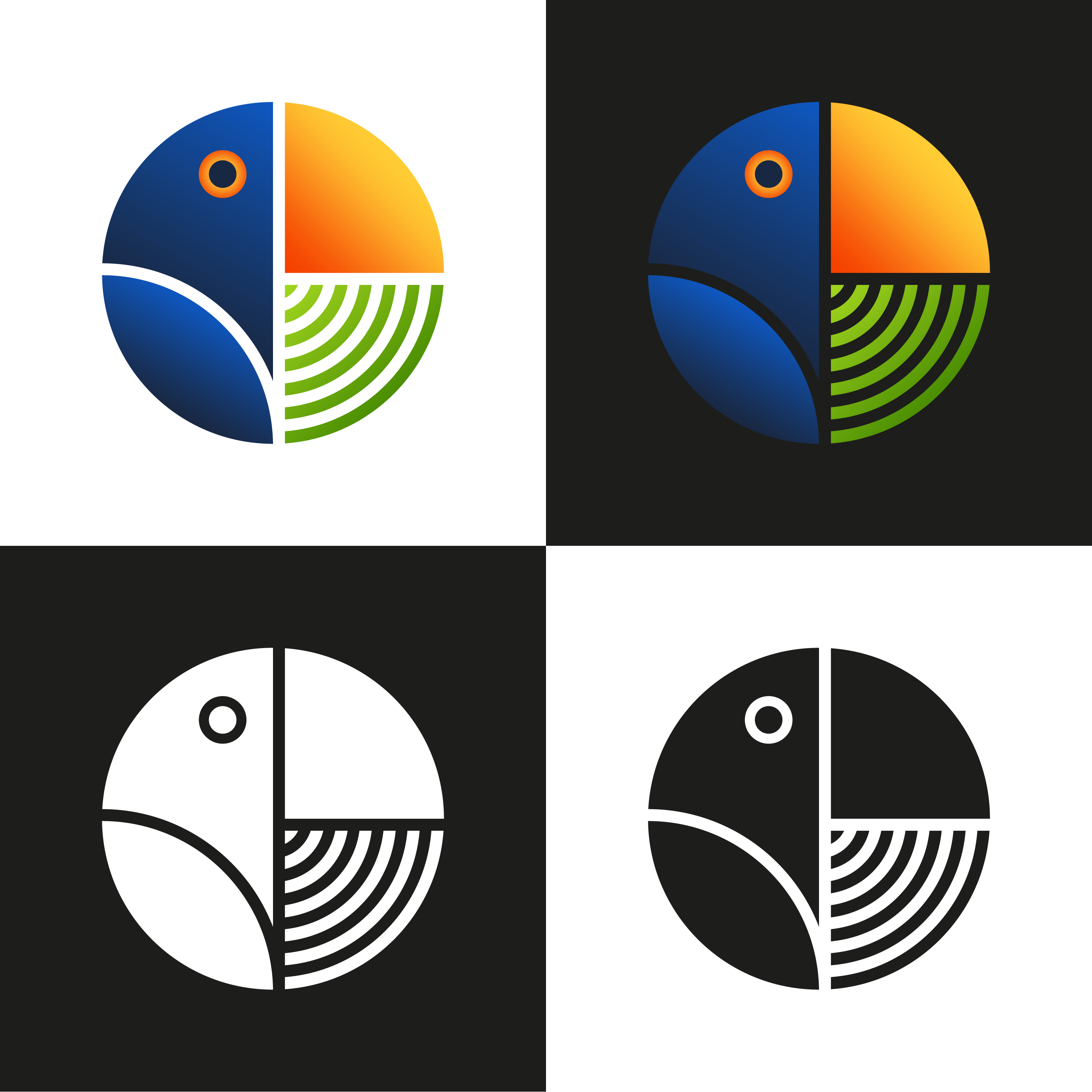
I like how there's a subtle pie chart there.
4 years ago by Enzo
Posts
DTP Shipping Solutions Logo
- Report
Enzo • 4 years ago
Hi!
For this brief, I played around with the initials 'dtp' in lowercase and came up with a monogram logo. I made sure that it would be recognizable, visible, and adaptable in printed formats.
Let me know what you think!
For this brief, I played around with the initials 'dtp' in lowercase and came up with a monogram logo. I made sure that it would be recognizable, visible, and adaptable in printed formats.
Let me know what you think!
Wow, this looks great! very clever
2 months ago by Ashley - Reply
Very cool
2 months ago by Nathan Kromer - Reply
Nice one!
5 months ago by Bikram Basnet - Reply
Great use of negativw space.
6 months ago by Goldylogo - Reply
Great work
6 months ago by Goldylogo - Reply
Very clean and professional.
7 months ago by Stephanie Fabra - Reply
very nice and professional
1 year ago by Hanan - Reply
Great work!
1 year ago by Kawishka - Reply
Amazing work and very professional. Congratulations.
2 years ago by Richard - Reply
Beautiful and creative.
2 years ago by Ijeoma Theodora Osagie - Reply
I really like this logo! Good job!
2 years ago by Sara Alami - Reply
don't get me wrong when I saw the logo first I thought it is related to medical stuff then I read the brief and came to know it's a shipping service provider.
2 years ago by Shaqeeb - Reply
Negative space logos are really hard to get right - but they can look amazing when you do. Bravo!
2 years ago by Anonymous - Reply
Crushed it!!!
2 years ago by Jeffrey Joslin - Reply
It is great. very recognisable. I like the use of the T to create negative spaces on the D and the P. The colour contrast too is great.
2 years ago by Alex - Reply
Damn! That's perfectly awsome👍👍👍👍
3 years ago by Ultima - Reply
👌👌
3 years ago by mahdi - Reply
i love the work , i have seen so many logos on this brief but this one is really eyecatching to me good work.
*would you like to like to give me feedback ? check my recent works.
4 years ago by kunal das - Reply
Som-Num Logo
- Report
Enzo • 4 years ago
Hi!
For this brief, I made sure to maintain the simplistic style that the client wanted and I also took inspiration from the sample pegs the brief provided.
The logomark is a closed eye that implies �sleeping� which is the meaning of the brand name, somnus. The colors were inspired by the night shift mode of the iPhone. It�s a mode that changes your screen to a warmer tone to help induce sleeping so I felt it was an appropriate color choice for the brand.
Overall, I think this design was able to solve the pain points of the client. Let me know what you think.
Som-Numlogo
the colors make me think of day. Second its driving crazy that the letters aren't in line
1 year ago by Garett Noll - Reply
I love the idea behind the color scheme!
1 year ago by May_J - Reply
If those are 3 different concepts, then the first is a suitable concept
4 years ago by Ghalib Putra - Reply
Nice use of colors! I love the sleek and simple design
4 years ago by Helena H - Reply
QTC Fish Market Logo
- Report
Enzo • 4 years ago
I wanted to challenge myself by doing logo sprints when I have time to spare. For these sprints, I'm only allowing myself one hour to accomplish each brief. For this design, however, I spent an extra 20 minutes because I struggled with the placement of the typeface.
Just a disclaimer, this is not how a logo design project should be tackled and shouldn't rely solely on design aesthetics. This is just a way to test myself and see what kind of designs I could come up with under pressure.
Let me know what you think.
Just a disclaimer, this is not how a logo design project should be tackled and shouldn't rely solely on design aesthetics. This is just a way to test myself and see what kind of designs I could come up with under pressure.
Let me know what you think.
Hello,
I am Sook, founder of QTC Fish market. We are looking for someone that can design a professional logo for our Fish market. I think a lettermark will fit best. Would you be interested?
I am Sook, founder of QTC Fish market. We are looking for someone that can design a professional logo for our Fish market. I think a lettermark will fit best. Would you be interested?
Mose's Steakhouse Logo
- Report
Enzo • 4 years ago
I wanted to challenge myself by doing logo sprints when I have time to spare. For these sprints, I'm only allowing myself one hour to accomplish each brief.
Just a disclaimer, this is not how a logo design project should be tackled and shouldn't rely solely on design aesthetics. This is just a way to test myself and see what kind of designs I could come up with under pressure.
Let me know what you think.
Just a disclaimer, this is not how a logo design project should be tackled and shouldn't rely solely on design aesthetics. This is just a way to test myself and see what kind of designs I could come up with under pressure.
Let me know what you think.
Hey,
I am Mose, founder of Mose's Steakhouse. I am looking for someone that can design a professional logo for my business. I think a wordmark would look cool. Can you help us out?
I am Mose, founder of Mose's Steakhouse. I am looking for someone that can design a professional logo for my business. I think a wordmark would look cool. Can you help us out?
I love the color pallete, it has a modern feel and looks very smooth. Great work!
4 years ago by Elena - Reply
