May_J
Posts
3
Likes
4
Liked Posts
23
Given Feedback
5
Feedback
Thank you so much for your feedback! I will take it all into consideration for my next design!
1 year ago by May_J
I was kind of thinking that too. Thanks for the feedback!

1 year ago by May_J
definitely reminds me of fancy chocolate! Great job!
1 year ago by May_J
I love what you did with the car above the brand name!

1 year ago by May_J
I love the idea behind the color scheme!
1 year ago by May_J
Posts
Mew.org
- Report
May_J • 1 year ago
I have been doing graphic design for only about a week, so I would love any feedback! Thanks!
Hi!
I am Ivonne, owner of mew.org. We're looking for someone that can create a simple logo for our business. I think a wordmark would look cool. We would love to work with you!
I am Ivonne, owner of mew.org. We're looking for someone that can create a simple logo for our business. I think a wordmark would look cool. We would love to work with you!
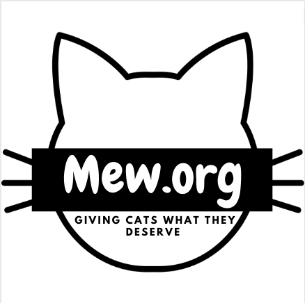


looks nice
1 year ago by Uduak Imoh Bassey Obioh - Reply
Great
1 year ago by Lani - Reply
Gg
1 year ago by Manan - Reply
Ivy's Cafeteria
- Report
May_J • 1 year ago
This is my logo for Ivy's Cafeteria. I am new to graphic design, and I think any feedback from people with more experience would help. Thanks! :)

I think it will be better if the font was a little bit clearer to read. I initial thought it spelt "Juy's"
1 year ago by Uduak Imoh Bassey Obioh - Reply
I was kind of thinking that too. Thanks for the feedback!
1 year ago by May_J - Reply
so cute!
1 year ago by Kristen Brashear - Reply
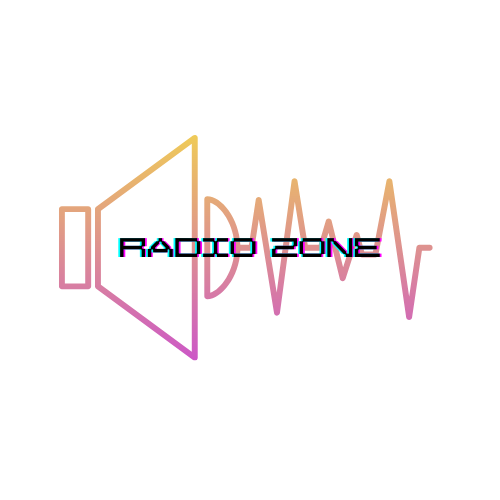
Radio Zone
- Report
May_J • 1 year ago
I am extremely new to graphic design, and I would love any constructive feedback that anyone has for me. Thank you! :)
Hi!
I am Britta, I recently started a new business called RadioZone. For a while now, I've been looking for a good logo for my business. I would like the logo to be an abstract mark. Can you help us out?
I am Britta, I recently started a new business called RadioZone. For a while now, I've been looking for a good logo for my business. I would like the logo to be an abstract mark. Can you help us out?

The design on its own looks Clean (Not sure about the "glitch effect" on the type) - Good job on the Illu. in the bg I like the colours there!
In my opinion its not quite abstract enough - it's kinda obvious to use a speaker and all that for a radio buisness, sadly I wouldn't know a different approach right now :/
Its a good start to work with further but I dont think its finished yet maybe get back on it when you've progressed further in graphic design and compare the results!
1 year ago by Ian - Reply
Thank you so much for your feedback! I will take it all into consideration for my next design!
1 year ago by May_J - Reply
Nice
1 year ago by Lani - Reply
Gg
1 year ago by Manan - Reply