Uduak Imoh Bassey Obioh
Posts
1
Likes
0
Liked Posts
4
Given Feedback
3
Feedback
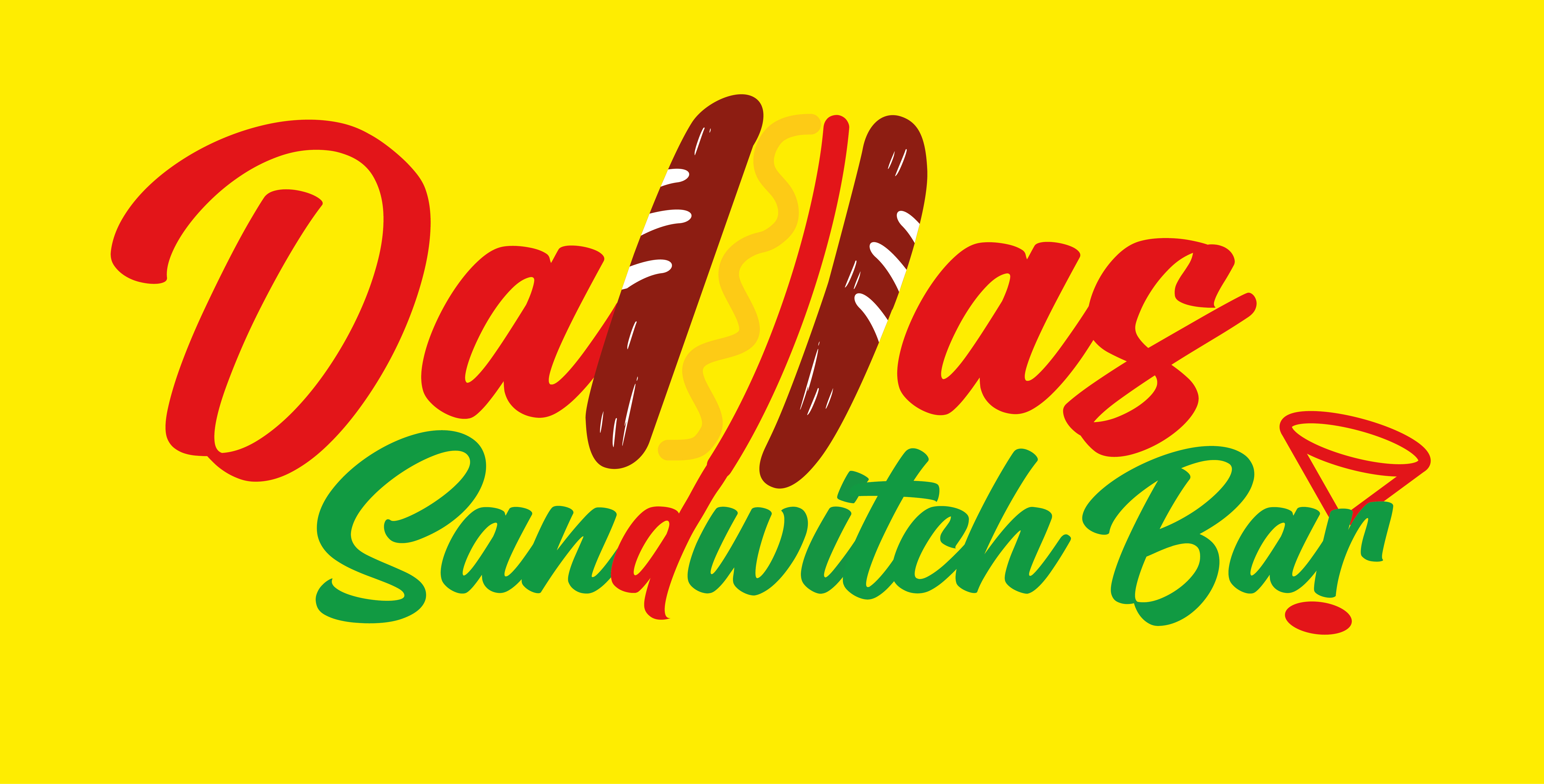
I think it will be better if the font was a little bit clearer to read. I initial thought it spelt "Juy's"

1 year ago by Uduak Imoh Bassey Obioh
looks nice

1 year ago by Uduak Imoh Bassey Obioh
really cool
1 year ago by Uduak Imoh Bassey Obioh
Posts
Logo for caf.com
- Report
1 year ago by Uduak Imoh Bassey Obioh
Hey,
relatively new to logo design. would love to get some opinions on this?? things you guys think i should add/remove/change??
relatively new to logo design. would love to get some opinions on this?? things you guys think i should add/remove/change??
 Like
Like
 1
1
I love it really simple and effective but maybe i would put the dot somewhere else
1 year ago by Anna - Reply