Ian
Posts
1
Likes
4
Liked Posts
8
Given Feedback
8
Feedback
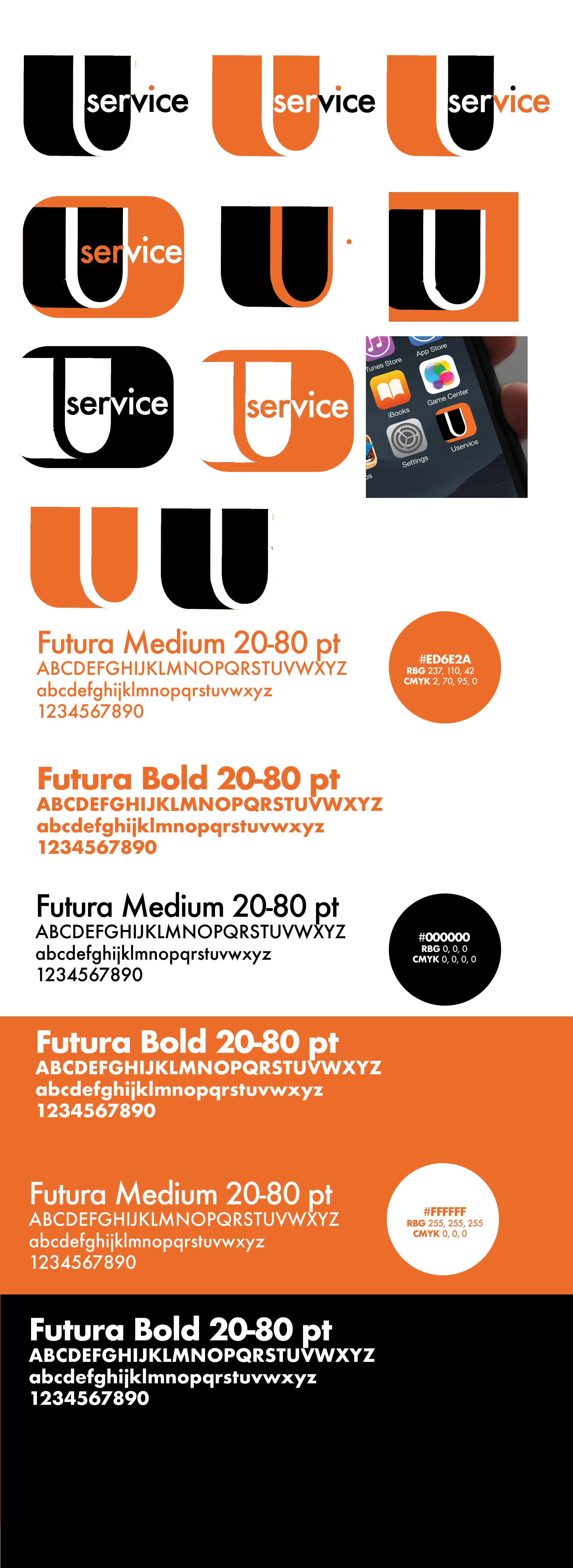
I think that the concept of the icon is great (I like the right one in the 2nd row the most, after that the middle one in the 3rd.) but to me it looks like you either didnt put much effort in the designing process or didnt know how to propperly do it, sorry if it sounds hard but it seems (from the given picture) pretty unprofessional, - the random dots and steps in the curve of the "U", the not even lining of the "U". I like the thought of it though! Give it more time :)
1 year ago by Ian
I like that you went for b&w only on this! The illu. seems kinda mysterious but inviting, clean and its sure to be understood. I like the amount of flowers placed on the back - overall the design looks very good! Maybe you could make one or two more flowers to get more variation going on and also (not sure) you could try using a different font for the small text. other than that great job!
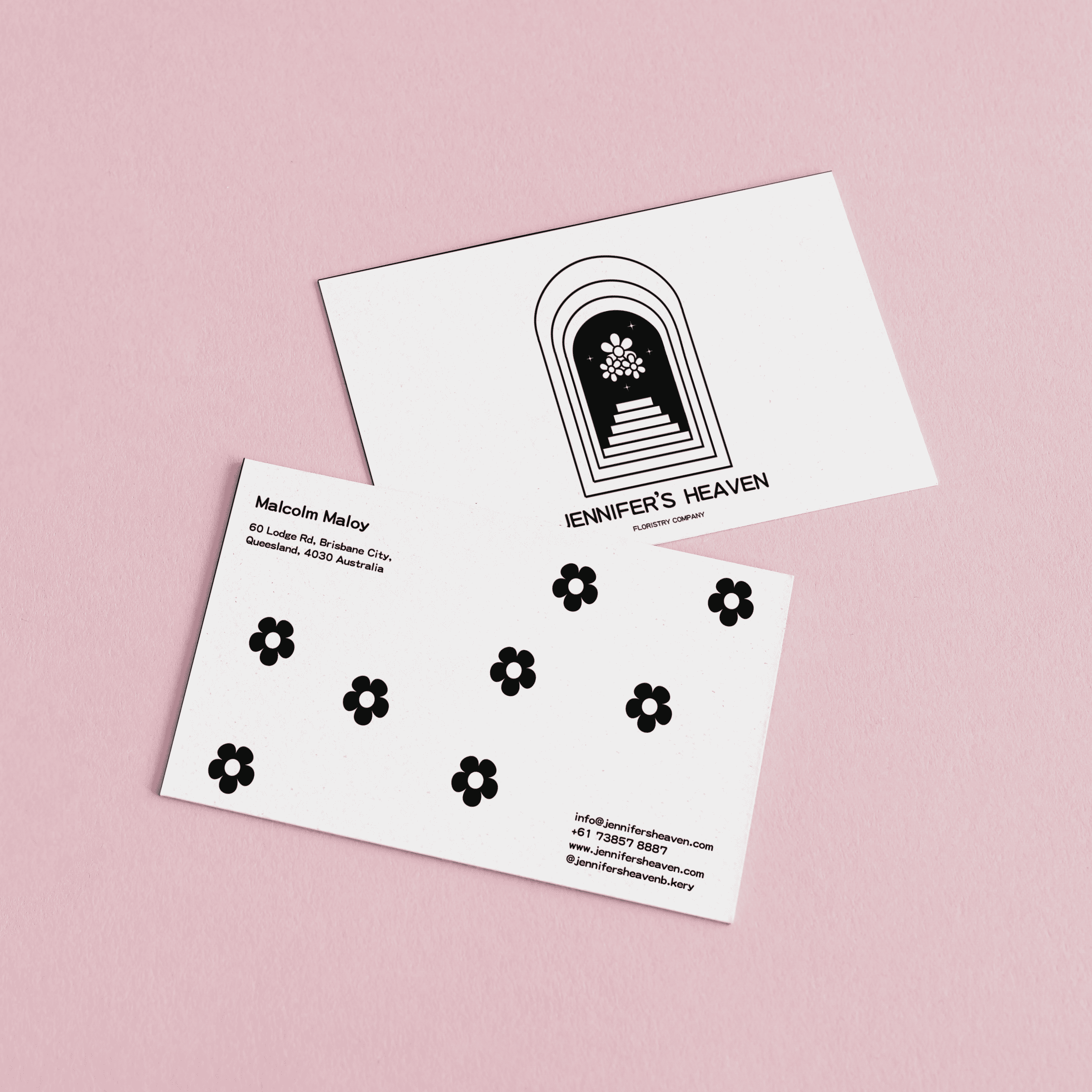
1 year ago by Ian
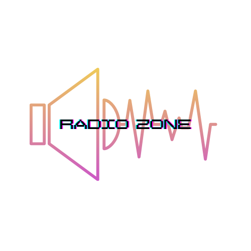
The design on its own looks Clean (Not sure about the "glitch effect" on the type) - Good job on the Illu. in the bg I like the colours there!
In my opinion its not quite abstract enough - it's kinda obvious to use a speaker and all that for a radio buisness, sadly I wouldn't know a different approach right now :/
Its a good start to work with further but I dont think its finished yet maybe get back on it when you've progressed further in graphic design and compare the results!
1 year ago by Ian
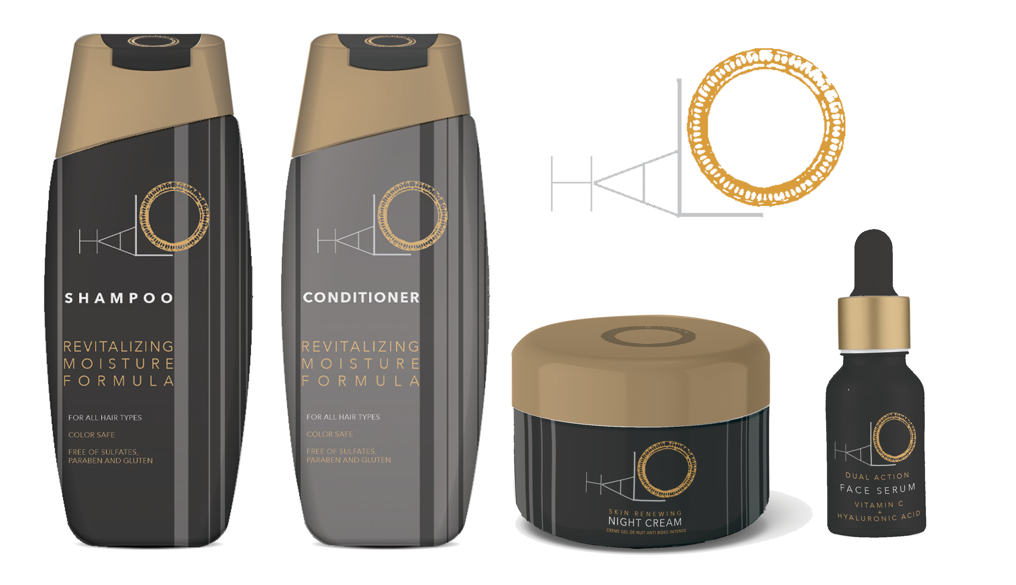
I really like the logo that you made here! the colours feel luxorius and high-end. One thing I would point out though is that the type on the shampoo and conditioner looks kinda squished and trapped - maybe give it more space and adjust the vertical lines [In the very detail the thing I realized is that the logo gets cut by the vertical lines at different spots]
Other than that this is a good design job, especially the logo!
1 year ago by Ian
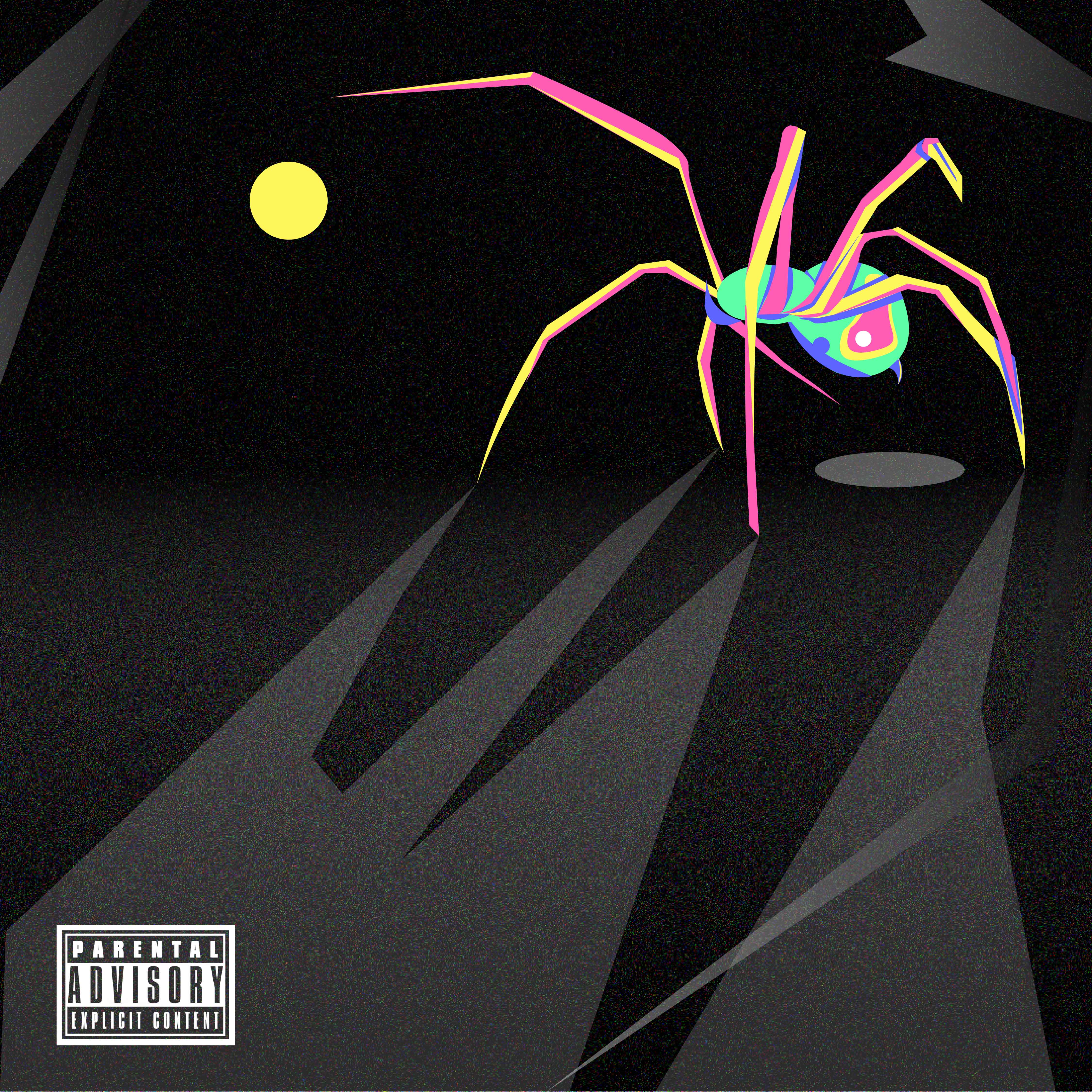
The colours on the spider are chosen well and get complimented by the dark bg colours.
I think it could use some touches on the "shadows"- and the logic of the lightsource considering the yellow dot acts as one. Overall the design is very appealing to the eye and the abstractness sort of invites you to look at it longer
1 year ago by Ian
Thanks for the review, very motivating :D
1 year ago by Ian
I love how the fonts mix in this! Great job
1 year ago by Ian
It shows strengh and feels very assertive - but scaled down it might be a bit complicated, also (might just be me) kinda irritates that some of the character pieces have or dont have outlining

1 year ago by Ian
Posts
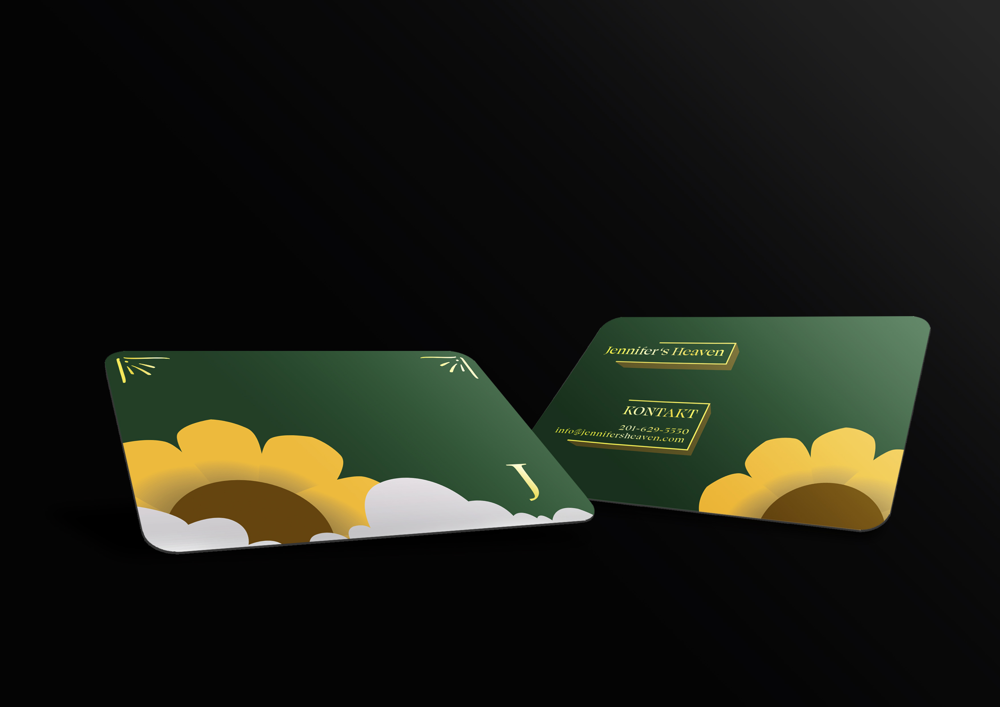
Jennifer's Heaven: buisness card
- Report
Ian • 1 year ago
Jennifer's Heavengraphic


Love it! very modern and minimalist and very eyecatching
1 year ago by Elysannie - Reply
The Heaven Business Card is a unique and eye-catching design that is sure to make a lasting impression. The green color is bright and bold, immediately drawing attention to the card. The sunflower with clouds illustration is whimsical and adds a touch of creativity to the design. The yellow details are easy to read against the green background and help to highlight the important information. Overall, the card is well balanced and the different elements work together harmoniously to create a memorable and effective business card. Great job on the design!
1 year ago by Honey - Reply
Thanks for the review, very motivating :D
1 year ago by Ian - Reply